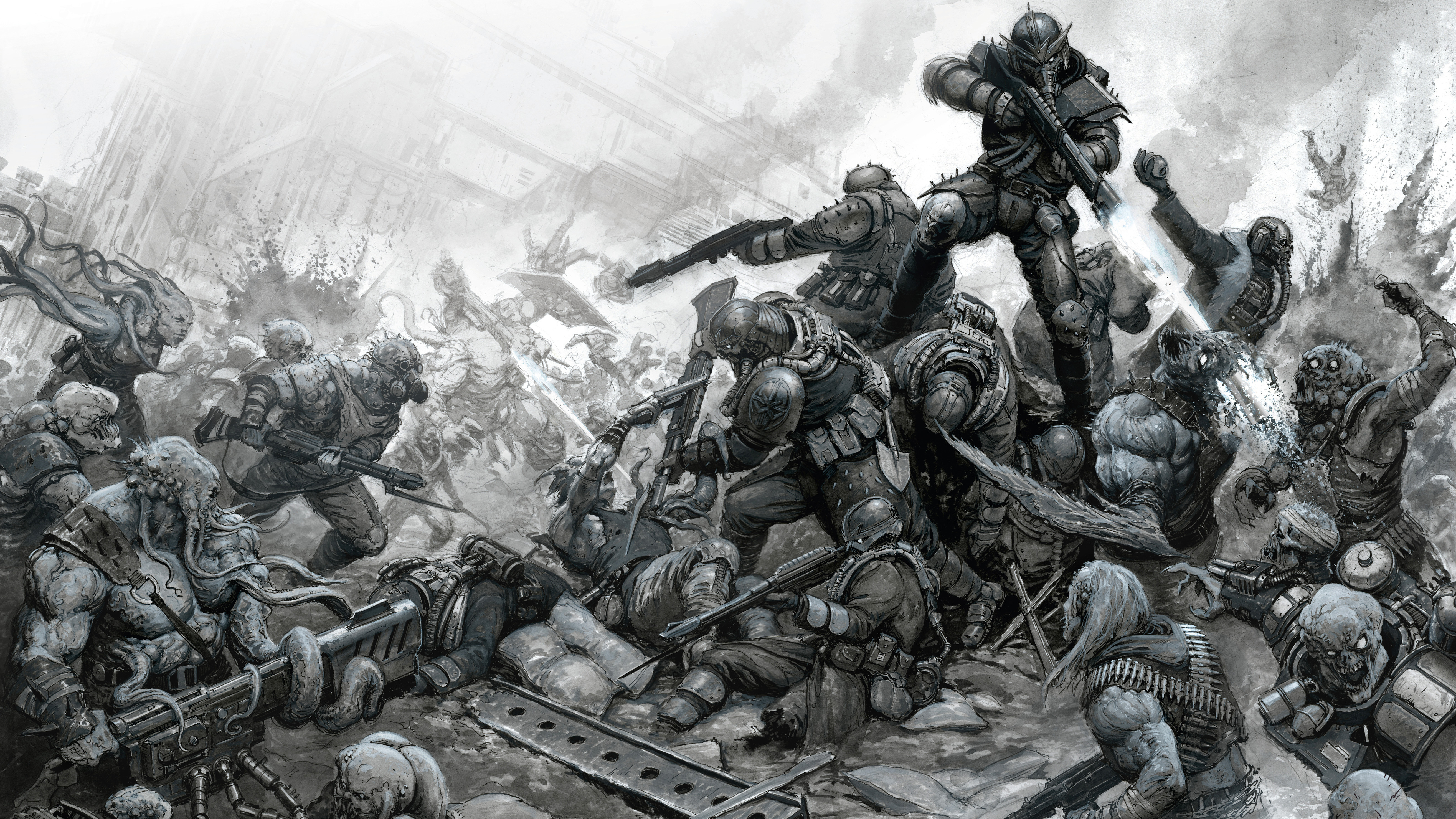
Awe-inspiring battles are one of my specialities, and in this tutorial I’ll be sharing my process for painting one with inks. We’ll cover everything from early considerations like composition and thumbnailing, to talking about materials and how best to create depth and volume. A lot of these approaches are applicable to images of any size and can be used in more than just battle scenes.
If you're inspired by my tutorial, then read our guides the best pens for artists and best pencils for artists. The approach taken can also be adapted to digital art, so read up on the best digital art software that's right for you. Something like Rebelle or Corel Painter has excellent traditional ink and paint simulation.
This painting will be done in acrylic inks, which are flexible and offer a huge variety of approaches. I’ll be sharing the process that I’ve found works the best for me and offers a great end result, both on the page and when scanned in. It’s worth mentioning that it can be hard to undo a mistake in this medium, so it’s worth exercising caution and working in a way that you can construct the picture carefully, making sure that you’re building on top of successful elements.
01. Get started by creating some thumbnails
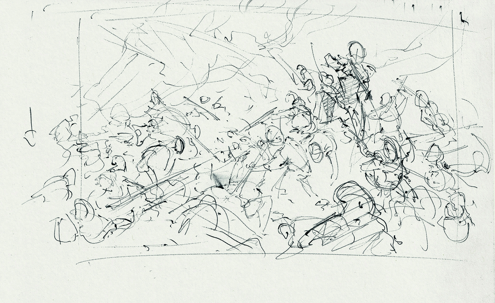
Any good picture begins with a hearty thumbnailing session! This is an important stage as it lets you experiment with ideas and make mistakes without investing too much time. I went into this picture with the rough idea that I wanted it to be an outdoor battle scene featuring a huge pile of figures, with lots of little duels playing out across the image. In my thumbnail sketches, you can see that I’m looking at the general shape of the composition as well as sketching out ideas for individual fights between the characters.
02. Draw an initial sketch
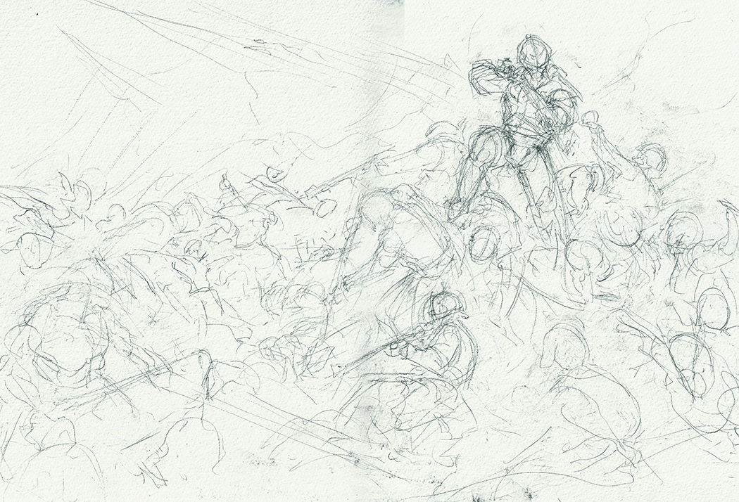
With this being a traditional picture, it’s essential that everything is laid out successfully early on, as it will be hard to move elements once we start painting. To help achieve this, sketch everything super loosely to begin with. This allows you to rub out and move elements around to find the best possible composition. The important thing to get across at this stage is the general pose of the figures and the space they’ll occupy.
03. Refine the image
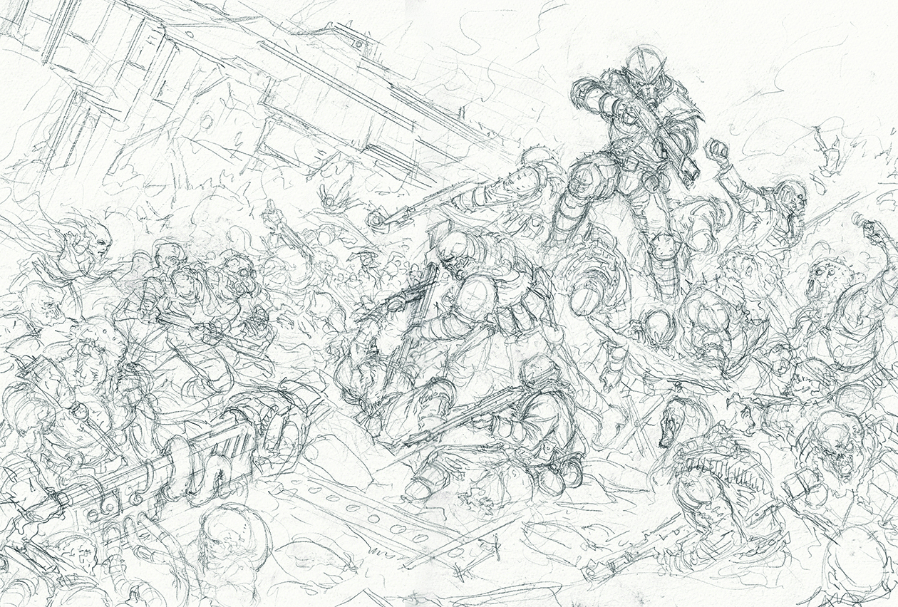
Once you’re happy with the initial sketch, head in and start adding details to the figures. We’ll be refining and adding more details later on, so the sketch doesn’t need to be super detailed or precise. The goal here is simply to have a solid framework that we can paint over.
04. Make a tonal mock-up
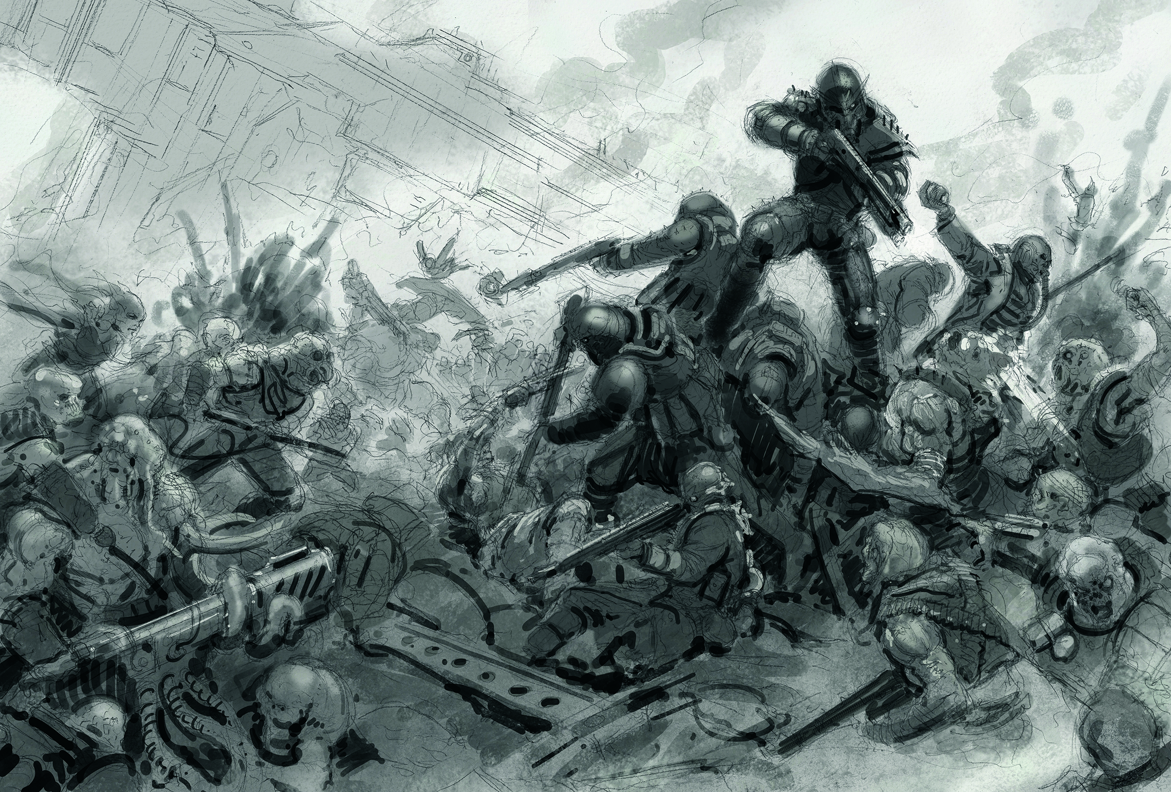
Scan in the sketch and use it as a base for a tonal digital sketch. With this being such a complex piece, it’s helpful to have something to aim for and refer back to while painting. This digital mock-up provides a better idea of what the finished painting will look like, while showing us where the shadows and highlights will need to be.
05. Prepare your ink
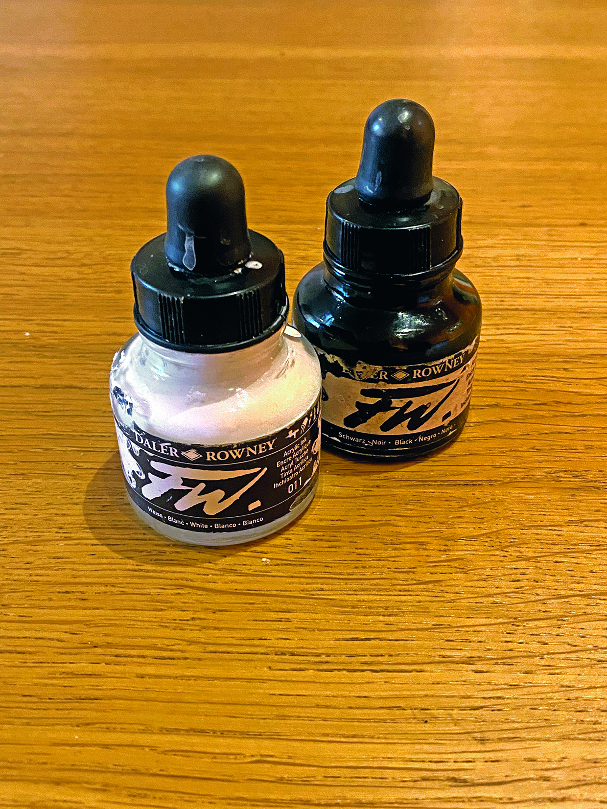
The medium I’ll be using for the majority of the painting is FW Acrylic Inks, which are wonderfully versatile. You can water them down and build up marks using the white of the paper like watercolours, or you can mix the white and black together straight from the bottle and paint with them like opaque acrylic. With this picture, I’ll be using both approaches to create depth and give a diverse visual look to the painting.
06. Lay down the initial inks
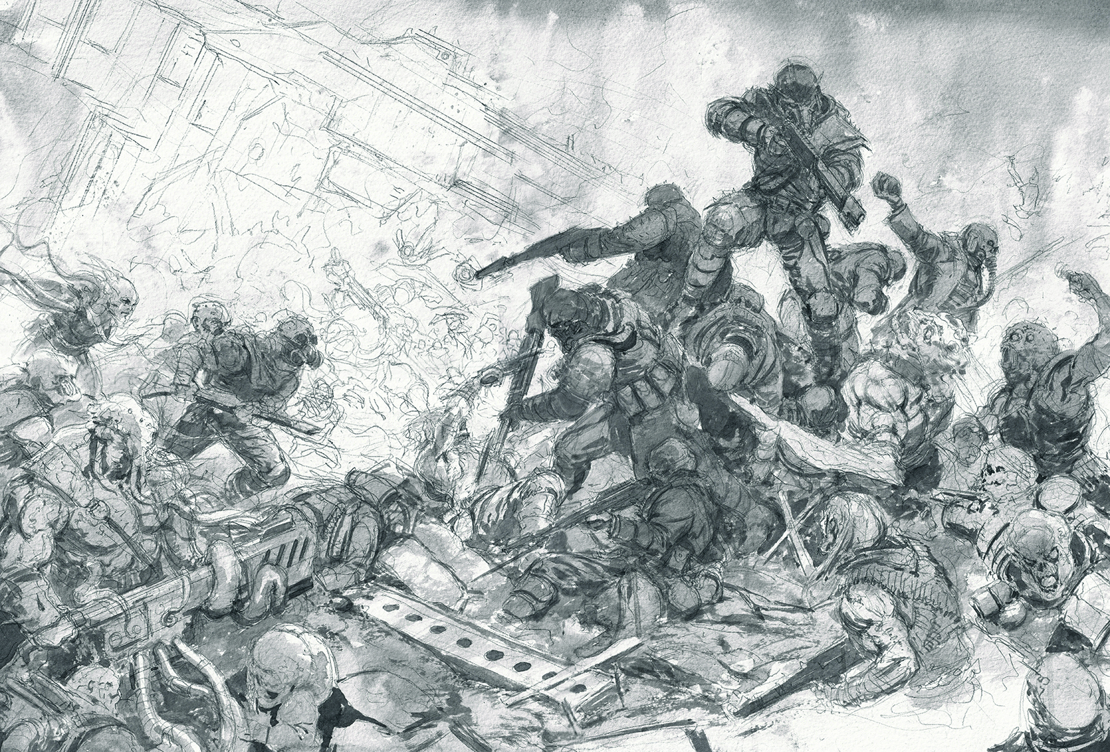
We have our sketch locked in and the tonal mock-up is showing us what we need to do, so now comes the scary moment of applying the first ink to our crisp, white paper. Splash on some heavily watered-down black to break up the white of the sky, then block in the figures and give a first suggestion of shadows.
07. Create depth in your scene with a pen
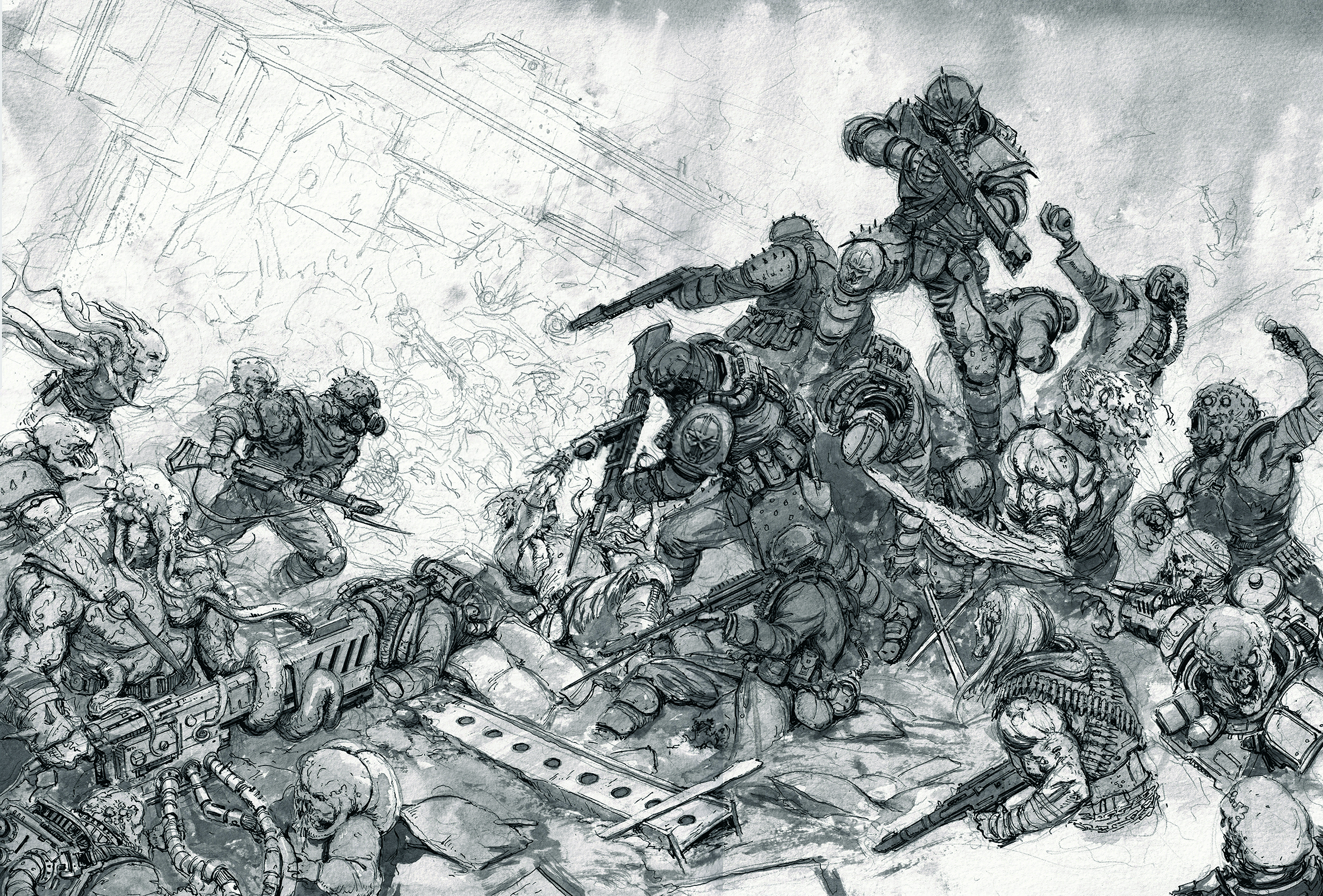
Once the figures have been blocked in, go over the sketch using a fountain pen filled with the same black ink that you’re using for the painting. This gives the image more depth and helps to lock in the details, as the pen will be visible through the layers of ink. This means that we can lavish the picture with plenty of details now, without having to go over them again later on.
08. Use ink marks
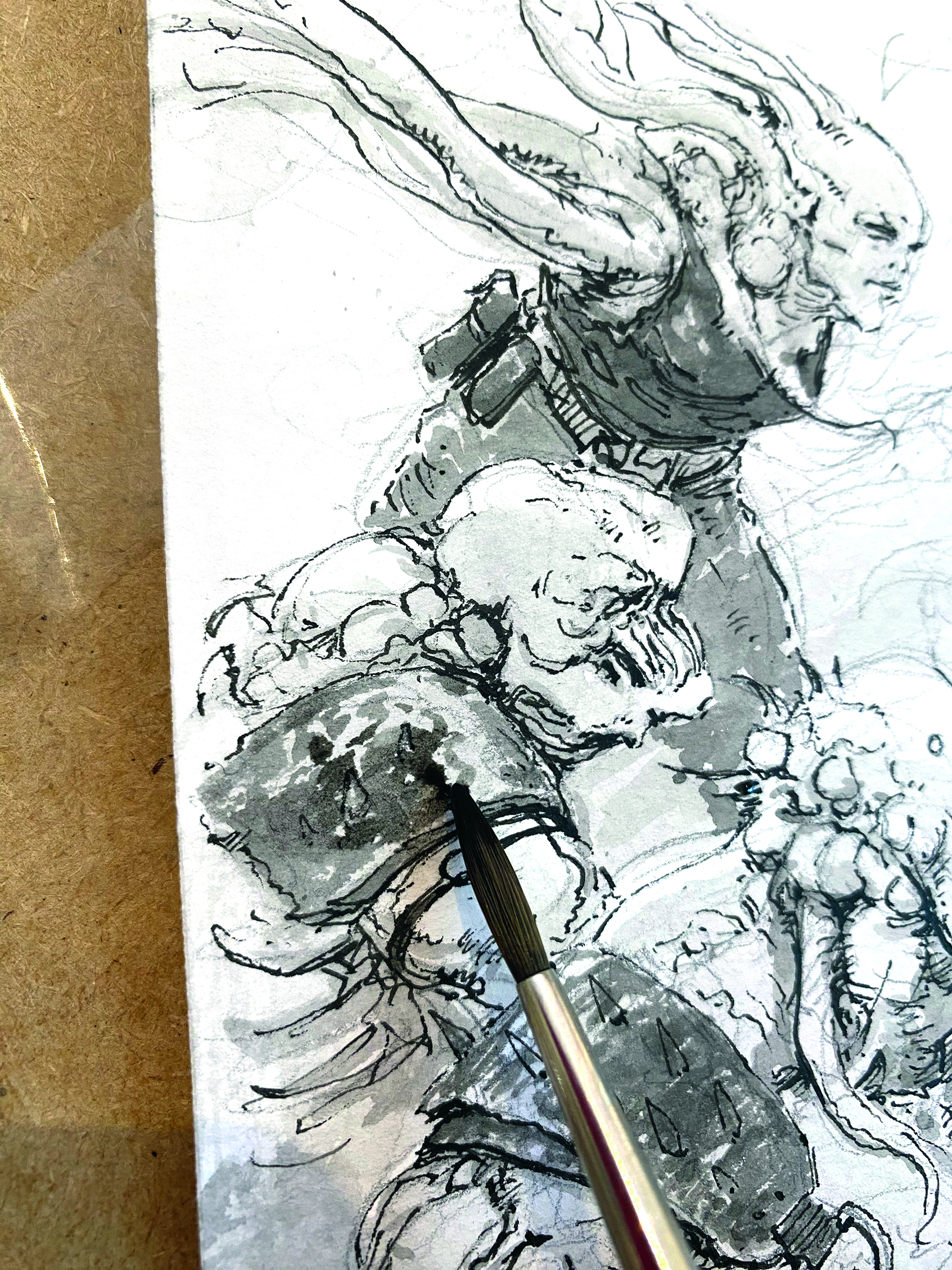
One of the fantastic qualities of painting with the inks is the range of textures you can create with them. As you apply layer after layer of watered-down ink, the previous layers remain visible through them, which gives that wonderful traditional texture we all love. Another thing that can help add visual interest is to put your marks next to each other. Leaving space between the marks and not blending them into each other makes the individual marks more visible, and helps to create planes on the surface that you’re describing.
09. Adjust the tones
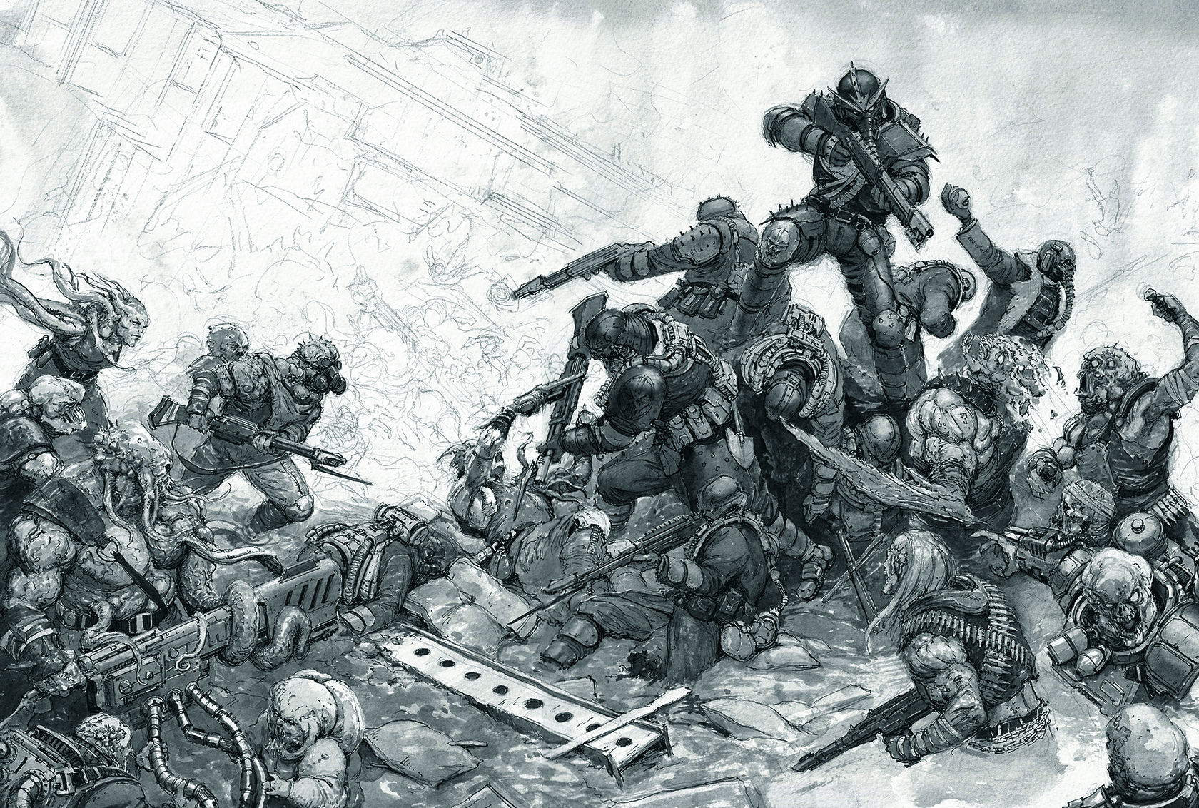
With all the details being locked in with the pen, we can put washes of watered-down ink over the top. This allows us to focus on refining the tonal aspects of the painting while keeping our details. The goal here is to suggest colour though black and white tones; elements that would be brown, red or black will appear darker and lighter-coloured elements will be paler. Looking at black and white photography here can be helpful.
10. Deepen the shadows
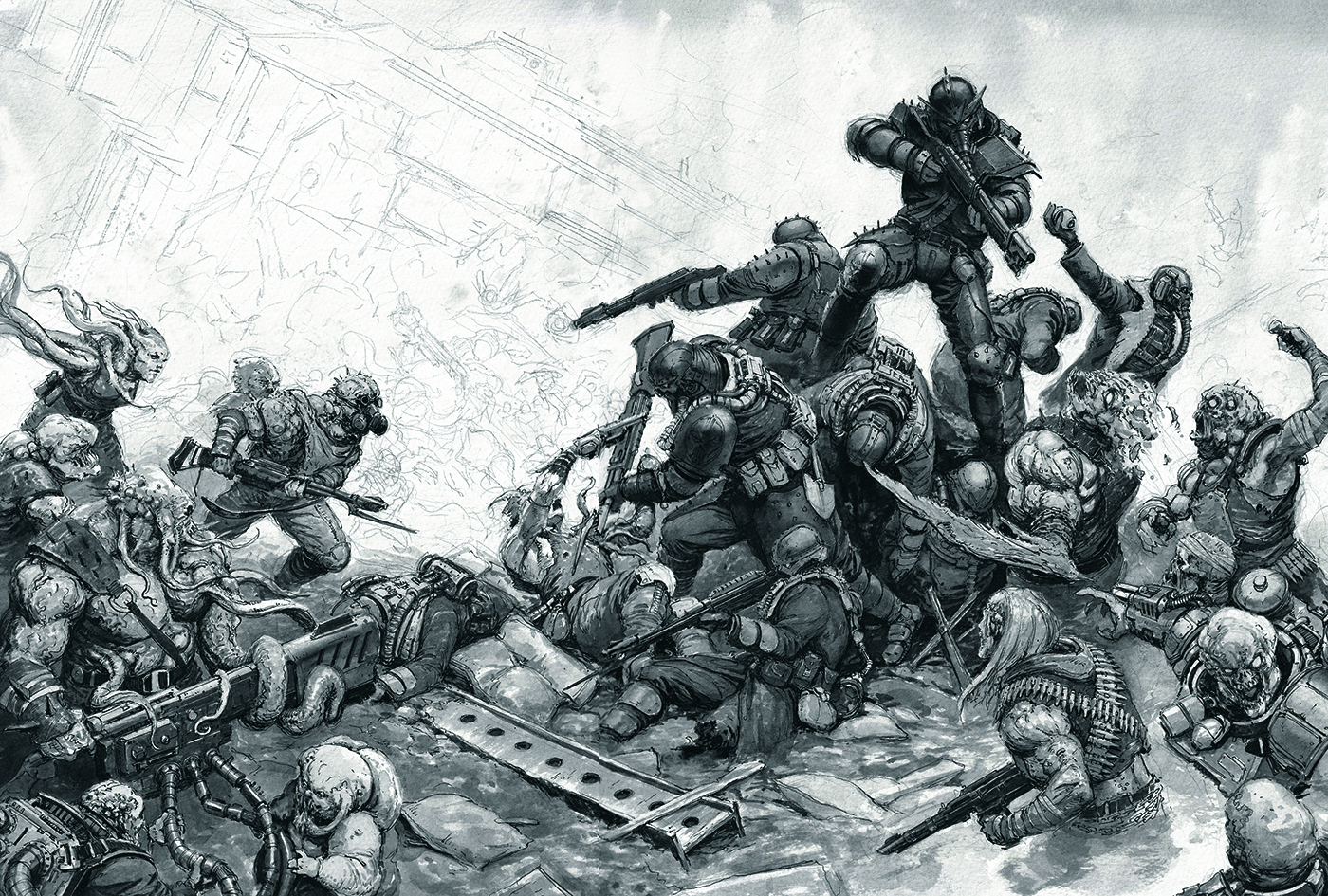
To get the maximum level of depth in a painting, you need to use the full spectrum of values available. Until now we’ve been watering down the black ink, but here we’ll go in with pure black and place it in selective areas. It’s easy to go overboard; less is more here. After this stage, you’ll find the painting begins to pop.
11. Develop background elements
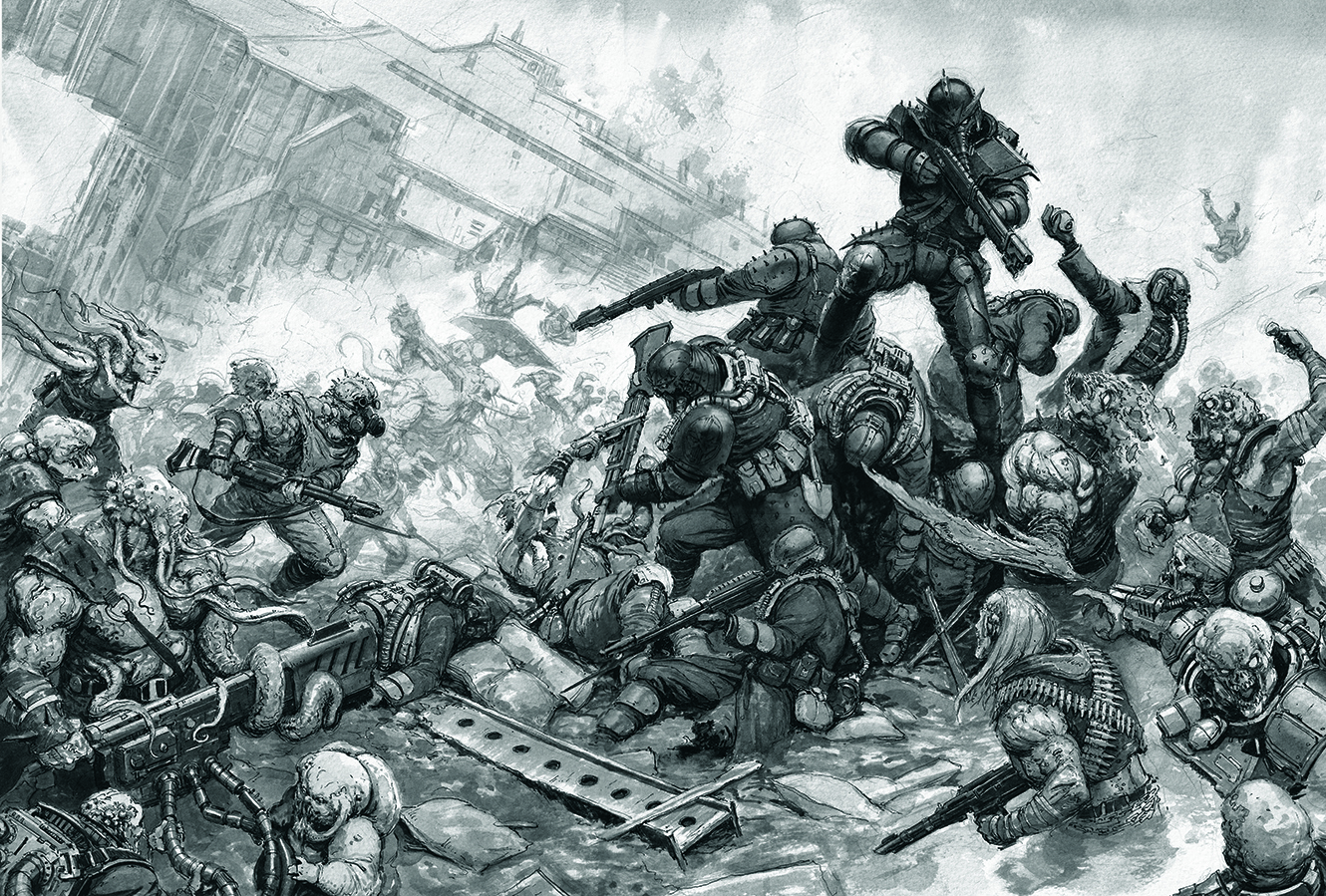
So far we’ve been focusing almost exclusively on the foreground figures, as they’re the focal point and require the most work. We want to give the impression that this scene is part of a wider vista. With super watered down ink, paint the suggestion of figures fighting in the background as well as a huge industrial structure. Try boiling down your background figures into areas of light and areas of shadow, as this will make them easier to read and quicker to render.
12. Add the mid-tones

You might be forgiven for thinking the painting looks finished at this point, but there’s one crucial stage still to be done. I mentioned earlier that these inks can be used like watercolours, but can also be used like typical acrylic paints. We’ll be painting in the mid-tones with opaque grey ink mixed from the white and the black. To achieve this, make a mixture of a big splash of grey and then adjust the exact tone depending on the area that you’re touching in on the image.
13. Complete the painting
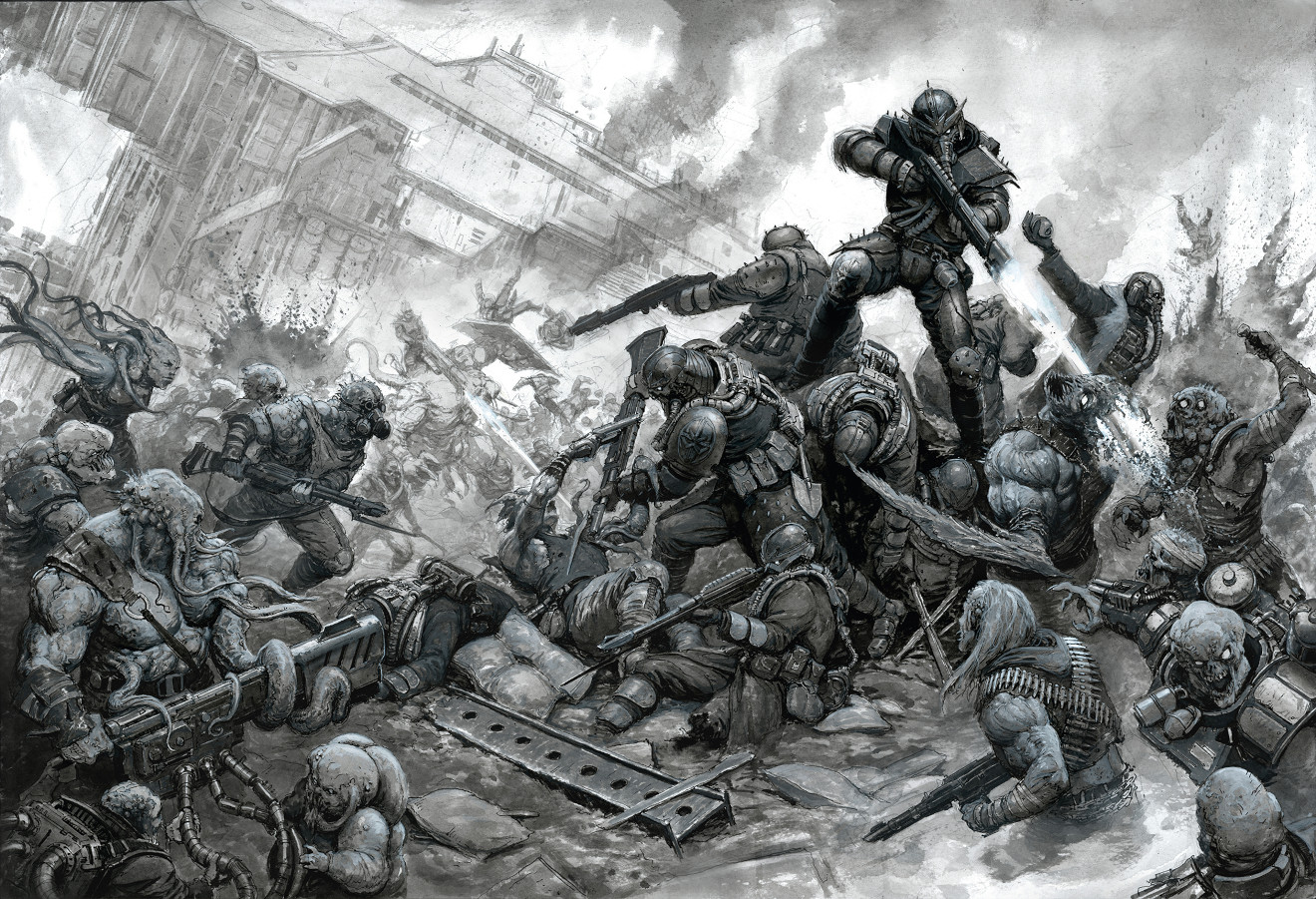
Go over the foreground elements, picking out the mid-tones with the opaque grey ink. This gives the foreground figures a pleasing physicality, which contrasts nicely with the translucently painted background. The other advantage of this is that it’s a last opportunity to adjust the highlights and tones, giving the suggestion of colour to this greyscale painting.
This content originally appeared in ImagineFX magazine, the world's leading digital art and fantasy art magazine. ImagineFX is on sale in the UK, Europe, United States, Canada, Australia and more. Limited numbers of ImagineFX print editions are available for delivery from our online store (the shipping costs are included in all prices).

