Navigating how to make a creative résumé can be a tricky task at first. While you want to stand out against the crowd, you also need to focus on being stylish yet informative, showcasing your talent as concisely as possible. It's especially tricky for designers, as the temptation to demonstrate your unique skills can lead to an over-engineered design – while it's a tough pill to swallow, substance is just as important as style.
As a designer, you'll also want to showcase your original work to demonstrate your skills – that's where our handy list of brilliant portfolio examples comes into play for inspiration. Don't forget to check out our guide on how to make an online portfolio but before you get stuck in, here are the top tips to making a great creative résumé according to industry experts.
How to make a creative résumé: 13 pro tips
01. Ditch the word processor
Microsoft Word is the go-to tool for many people when it comes to making a résumé, and that's just fine if you're applying for an admin position and all kinds of jobs in other sectors, but if you’re after your dream job in the creative sector, it's really not going to cut it. If you're applying for a job as a designer of any kind, then the art directors looking to hire you will be paying close attention to the layout of your résumé as much as the content.
This means you should use the programmes you would use for work (take a look at our pick of the best graphic design software and the best laptops for graphic design if you're not already yet set up with the tools you need). Whatever program you use to design your résumé in, you'll generally want to deliver it in PDF to ensure it looks right on different platforms (unless you're getting very creative with something truly unique, or a real physical CV like in the old days.).
02. Keep it simple
You’re a designer, so your résumé should follow the hottest graphic design trends, right? Hmm, no. Probably not. One of the priorities of any résumé should be easy making it easy to read, and that's true even with a résumé for creatives where you want to show some originality to stand out.
While you don't necessarily need to stick to the timeworn classics, it’s generally a wise idea to stick to simple, readable fonts. Using more than one font isn't necessarily a bad idea either, for example, one for headers and one for the details, as long as the two fonts pair well.
Generally, we'd recommend keeping both type and layout simple. We've seen lots of graphic design résumés presented as infographics, newsletters and more, but remember that the recipient doesn't want to have to spend more than a few seconds finding the information they need. It's not great if they can't decide where to look first. Unless you’re very sure about what you’re doing, keep the typographic flourishes and fanciful designs in check and ensure the layout is clear and simple and the information is clearly presented. You don't need to shell out lots of cash to find something suitable. Take a look at our list of the best free fonts and our guide to the perfect font pairings.
03. Consider colour

For most jobs outside of the creative sector, using colour in a résumé is probably a waste of time that could backfire – not to mention an unnecessary expense if you're going to print it. However, for design positions, touches of colour offer a way to add a discreet personal touch. Use colour carefully, however, and don't go over the top. Green type on a yellow page will stand out for all the wrong reasons, and the last thing you want is the recipient squinting because you thought dark grey text on a black background was a great idea. See our post on colour theory if you're in doubt.
04. Keep it brief
Art directors do not have the time or the inclination to read your entire life story. Your résumé should ideally fit onto one side of A4, and if it's any longer than two pages, you’re waffling and including too much stuff.
Don’t be tempted to mask a lack of experience with verbosity. Clean, well-laid-out résumé will always win over flabby ones – remember, the aim is to intrigue and impress. Point the recipient in the direction of an online portfolio to see more.
05. Don't forget your contact info

This might seem obvious, but a minimum, your résumé should include your name and contact details, including your email address, phone number and online portfolio URL. Don't assume that because these are at the bottom of the email you sent, you don't need to include them. Make life easier for your potential employer. You might also want to include links to social media profiles if you use them to showcase your professional work. These could all be clickable icons.
This should be followed by a breakdown of your work experience, then your education. In both cases, this should be the most recent first. Work experience should include dates, job title and a brief synopsis of your role. Don't bother including jobs you did years ago that are irrelevant to the job you're applying for. References are generally optional and you'll often be asked for them later if you don't include them on your CV.
06. Be honest!

There's always a temptation to inflate skills and experience on a CV, but, while it may sound trite, honesty really is the best policy. You stand a good chance of being found out if you start 'elaborating' in your résumé – and outright lies can get you in a lot of trouble. We know of an agency that once received a résumé from someone who claimed to have created quite a stunning website. The website had been designed by the agency he was applying to work for. Needless to say, that's the kind of creativity that employers DON'T appreciate.
The résumé went straight in the 'no' pile and the applicant was sent with a strongly worded email. It might seem a million in one chance that this will happen to you, but any potential employer is likely to do a bit of digging and to ask you some questions about the projects you mention in your CV if you get to an interview.
We'll also mention plagiarism here. A surprising number of graduates see an inspiring résumé design concept and copy it. Do remember that we all have access to the same internet, and if a particularly inventive résumé design has caught your eye, it's probably done the rounds virally within the industry and your potential employer will have seen it too.
07. Include examples of your work
Not including examples of your work with your résumé is a common mistake. It's all very well telling a potential employer about your experience on your CV, but showing always beats telling, and designers work in a profession where it's possible to do that.
How? You could include images directly in the CV itself, in a separate portfolio document (usually best as a reduced, curated version of your portfolio in PDF format) or as a link to an online portfolio. If you work with motion, stills will usually suffice, unless you’ve been specifically asked to include a showreel.
08. Show your personality

We've recommended keeping it simple, but that doesn't have to mean dull. There's a balance to be found. A résumé is a reflection of your disposition and persona, and the recipient will be scanning it, consciously or not, for elements that distinguish your résumé from the other hundreds they have to wade through. Make your résumé stand out with an idiosyncratic design and personal touches. Just don't overdo it, and be consistent.
Real-world design projects are usually centred around a single, consistent theme or concept that runs through a logo, branding, literature and so on. Your design résumé, portfolio and covering letter should demonstrate that same kind of consistency. For example, are bulleted lists all presented in the same style? Is the colour scheme consistent?
09. But beware the novelty approach
We’ve seen résumés written on scrunched up paper; in the form of jigsaws; and playing cards, as posters or placemats. We've seen inflatable résumés and résumés crafted using complex paper engineering. Off-the-wall CVs are memorable, and if you work in a particular niche, and you're applying for a job in a particular niche, then a novel résumé design can make perfect sense. But for more general roles, they're a risky proposition. On the one hand, you might appear like a creative thinker, on the other, it might seem pretentious, excessive or just plain confusing.
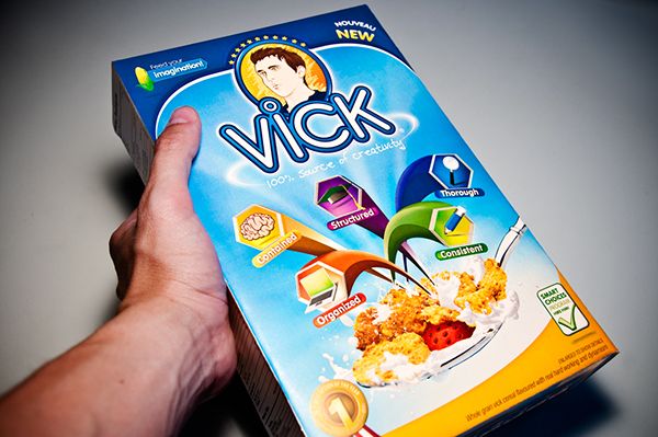
Which way it does can depend a lot on the recipient. If you know the art director who's in charge of hiring you is a massive craft beer fan, then yes, maybe, in that case, it might make sense to put your résumé on a beer bottle (as long as the beer's decent!) Or if you're applying for a job at an agency that specialises in packaging design, then disguising your graphic design résumé as a cereal box might raise a smile, but at other companies, it might just seem a bizarre and completely random choice of presentation.
10. Use proper prints, not photocopies
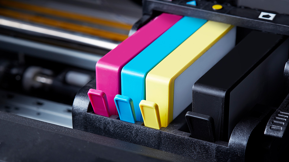
Yes, we know you probably won't be sending it by post these days (although that approach has been known to win a job from directors who don't like having to wade through emails). But, it's still a good idea to take a print copy of your résumé to an interview. Photocopies are cheap, and they look it, so make sure you for fresh laser prints or sharp inkjet prints on the best quality paper available.
If you're planning on printing a lot of résumés and don't want to go to a printer, you could also consider investing in your own machine. See our guide to the best art printers for that.
11. Spend time on the covering letter
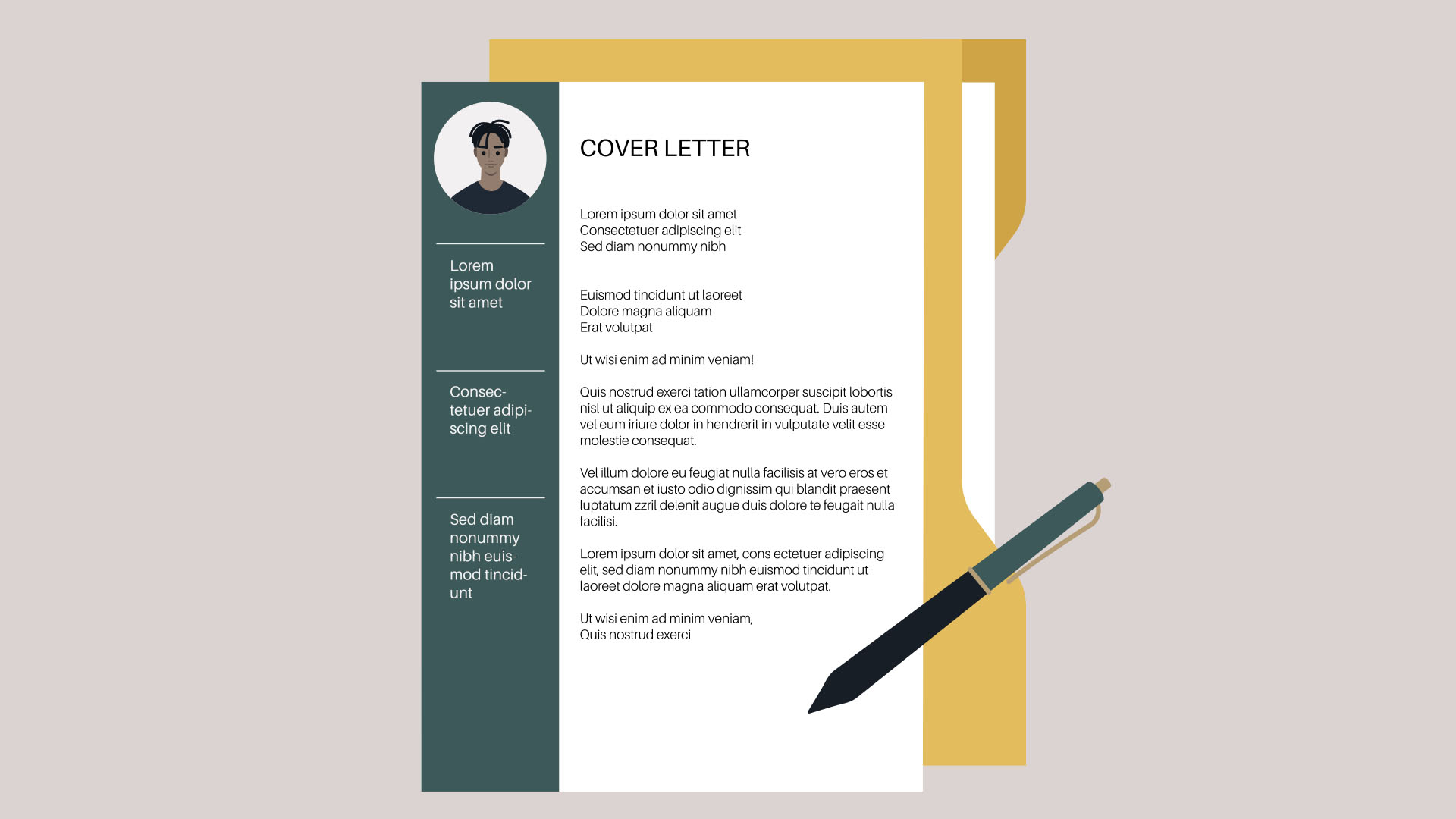
Most of the time, when you apply for a job, your résumé will need to be accompanied by a covering letter. This should look formal and business-like: this isn't the place to showcase your creativity and imagination. The text should complement the CV and it's best to keep it short and to the point (three paragraphs is a good rule of thumb).
Make it obvious you haven't just copied and pasted the same letter you've used to apply for a hundred other jobs. Write it in a way that's personal to the particular job and company you're applying for.
12. Create multiple résumés
One way to allow yourself more flexibility in how you design your CV is to make multiple versions if you're applying for jobs in different sectors or creative niches. That way you can target each résumé for a specific role, both in terms of the design and the experience and skills you highlight. Take character artist Pierre Roger's clever CV above, which could have high appeal to a certain employer. As a more simple example, if the job specifically mentions InDesign as a requirement then you should make this first on your list of skills, and possibly expand the description of how and where you've used it.
13. Check your spelling!
Finally, the last word comes down to spelling. If you're applying for a job as a designer, does it matter how well you write? The simple answer is yes. Spelling and grammar mistakes will make you appear uneducated, ignorant and/or lazy – and none of these represent the image you're trying to convey. Besides that, one of the banes of any creative business is having work sent back by a client because of an avoidable typo.
Always double-check your grammar and spelling, and get others to check it too because it's easy to miss your own mistakes as the eyes roll over errors and interpret the intended meaning. Don't rely entirely on an automatic spellchecker. Adobe has a spellchecker in Acrobat for PDFs, but it's far from infallible, and sometimes. Go over your text yourself word by word to check for mistakes. We've seen far too many design résumés and portfolios with the word "design" spelled "desing".
The best creative resumé examples
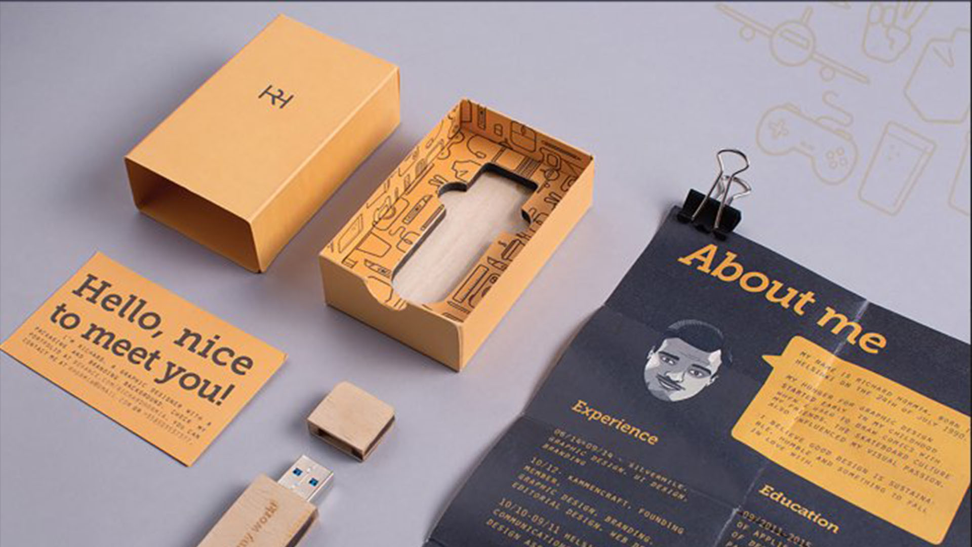
01. Rikhard Hormia
Helsinki based designer Rikhard Hormia, created this nifty Portfolio Mailer so he could carry around his résumé and creative portfolio with ease. The slick kit features a business card, a CV and a laser-engraved USB stick containing selected works from his portfolio, demonstrating his unique practical style and creative prowess for creating engaging yet practical design solutions.
02. Vidar Olufsen Møller

After settling in a new city, freelance graphic designer Vidar Olufsen Møllermade this ultra sleek creative resume that looks like a 'Top Secret' report. Designed to create visual intrigue to drum up new clients, the stylised design has an air of mystery about it, while showing Vidar's playful style.
03. Julia Miceli
Based in Buenos Aires, Argentina, creative designer Julia Miceli's sleek résumé is a prime example of how simple yet bold design can make a big impact. With stylish use of colour and composition, Julia's fold out résumé oozes with class and professionalism, with thoughtful design touches that add an extra layer of refinement.
04. Kenny Barela
Who doesn't love free merchandise? Taking 'thinking outside the box' to a whole new level, designer Kenny Barela designed this slick little package containing a screenprinted T-shirt, infographic, and a cover letter. Portable and playful, the design paid off for Kenny big time, earning him the Best of Show winner in the 2010 HOW Promotion Design Awards and a job as art director at Motive.
05. Andy Morris
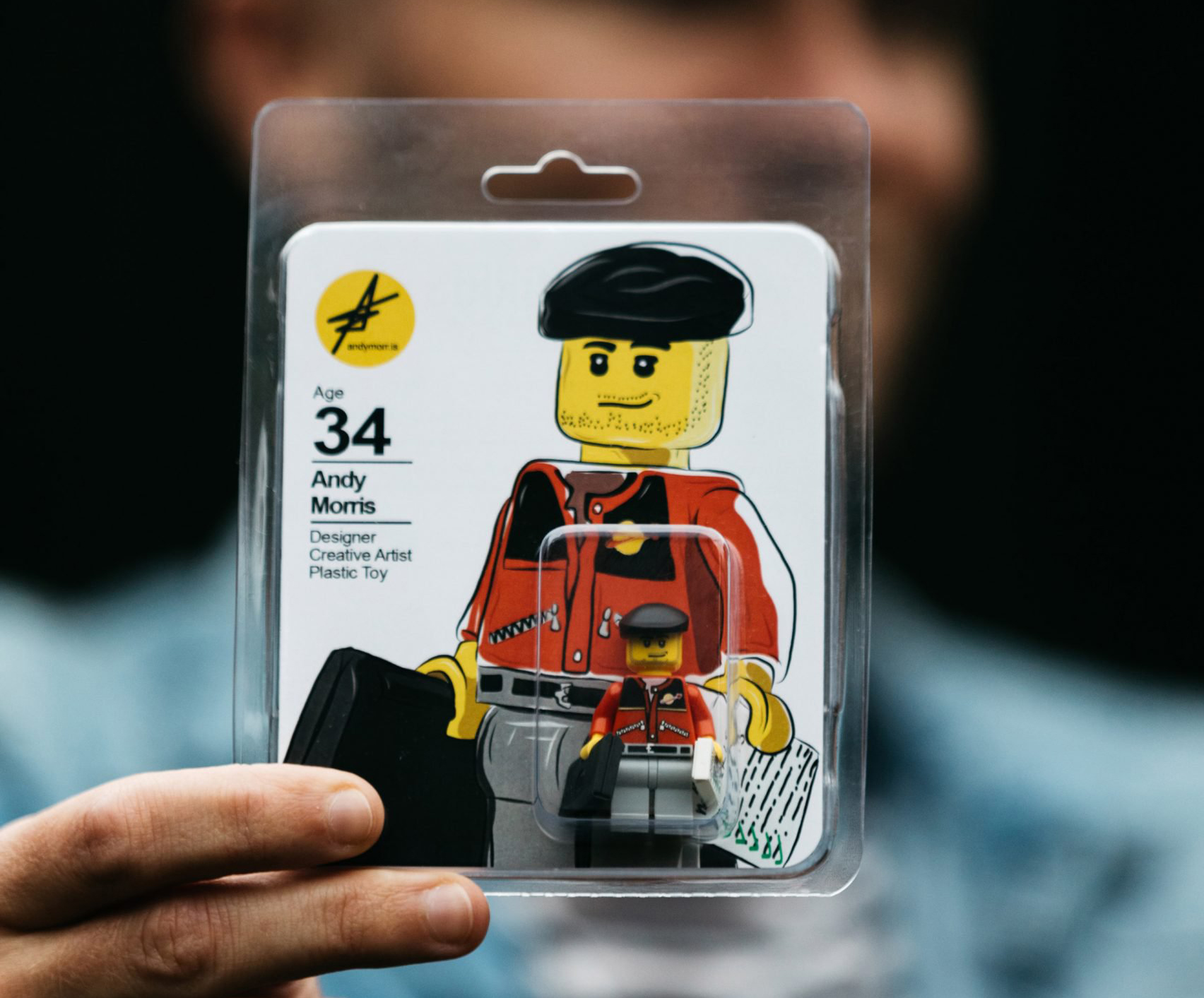
Now if you're thinking inside the box, this is how to do it. Art director, artist and designer Andy Morris created this adorable and ingenious creative résumé featuring a custom lego figure of himself (and of course a bitesized run-down of his skills and plus contact details). The minifigure comes complete with a tiny laptop and résumé, showing off Andy's playful creative style.
For more helpful resources take a look at the best résumé fonts and best website builders to create your own online portfolio.