Blue is a color that never goes away for very long, and we've long extolled the virtues of a blue room. Due to its countless iterations – it's more versatile than you might think. From sky blue to classic navy, some shade of blue is having a moment at any given moment in the world of design.
A moody ocean blue is proving to be a strong contendant for the shade of the season. With green undertones and jewel-like depths, the color is rich and enveloping, without being gaudy. What's more, its hints of purple mean it nicely compliments the warm decorating schemes that we currently favor.
Why moody blue should be your go-to shade this summer
We spoke to color experts and leading interior designers, to find out why they love the shade, and discussed an example of a space where they've utilized an ocean blue to its full effect.
From cosseting living spaces to calming home offices, and uplifting kitchens, these are the reasons why this moody blue should be on your radar if you're redecorating this summer.
It compliments warm accents
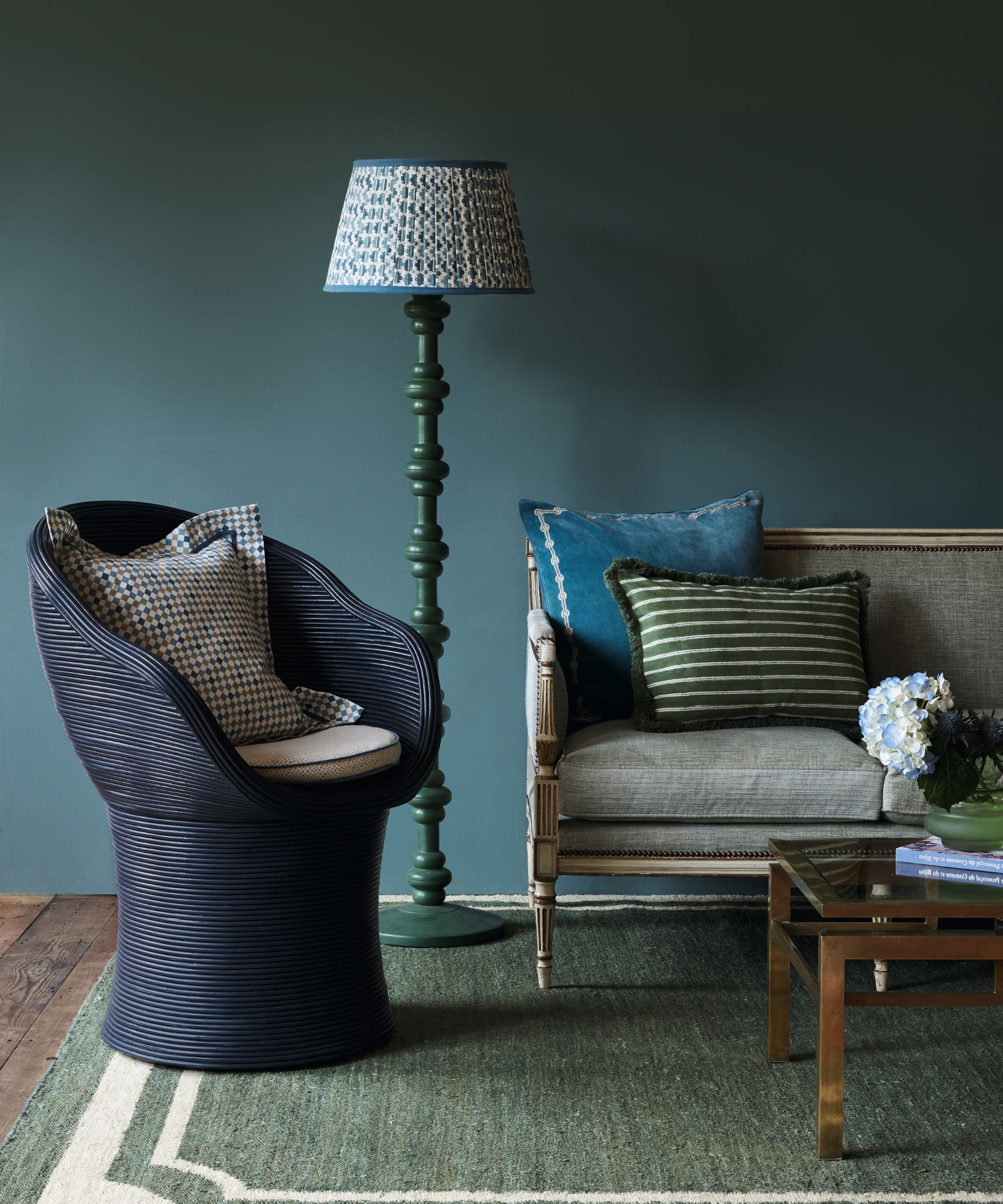
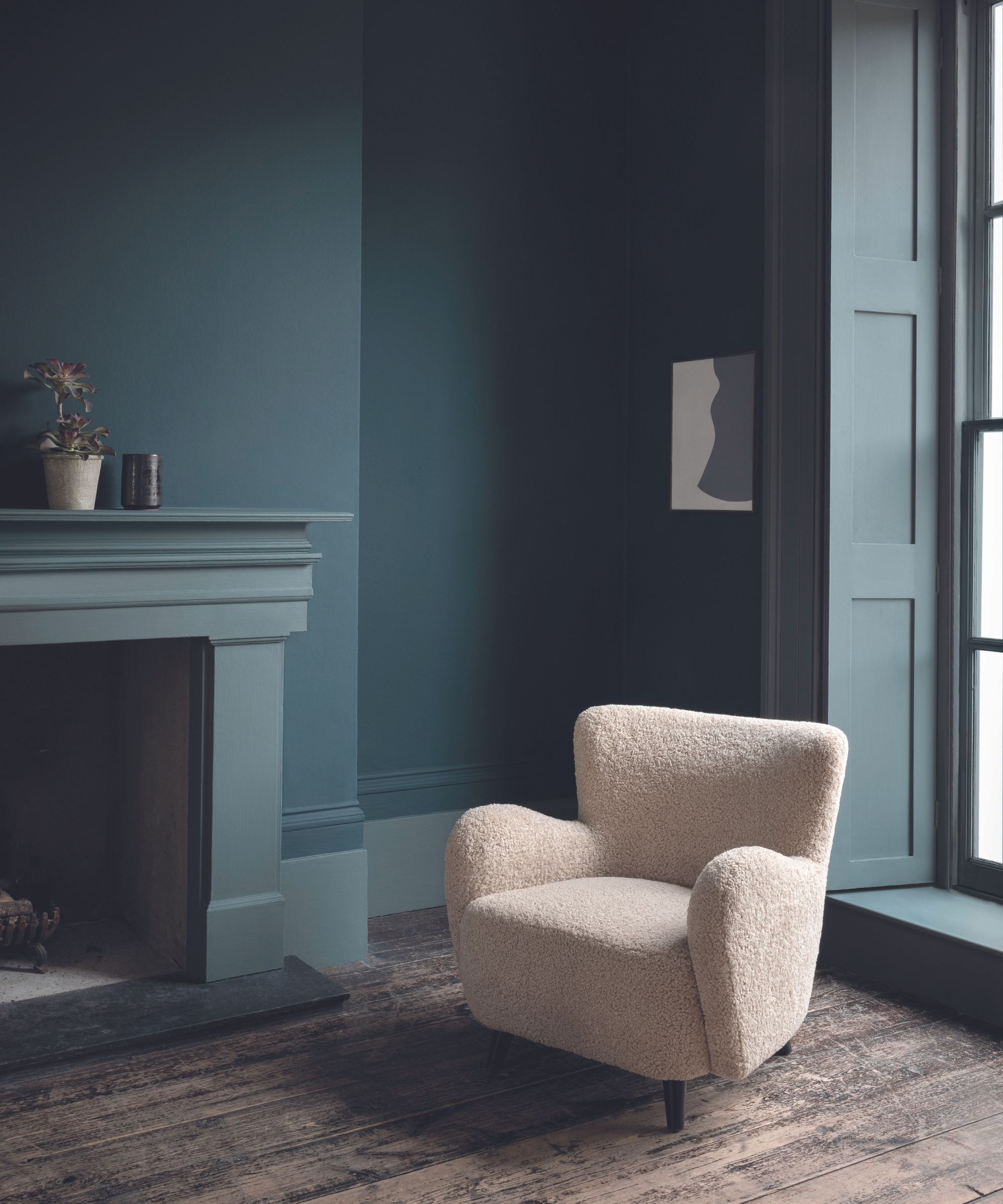
Edward Bulmer, the founder of Edward Bulmer Natural Paint suggests the jewel-like blue for living spaces – particularly Saxony from their range. He explains, ‘Saxony hovers between blue and green in hue and has an intense but not ponderous richness; it’s serious but is designed to be comfortingly enveloping'.
He continues 'For me, this color suits an evening room when one wants a space that heralds nightfall and looks inviting in the lamp light, Yellow-reds will nestle into our Saxony mood – it provides a good backdrop to natural weaves’.
It has restorative qualities
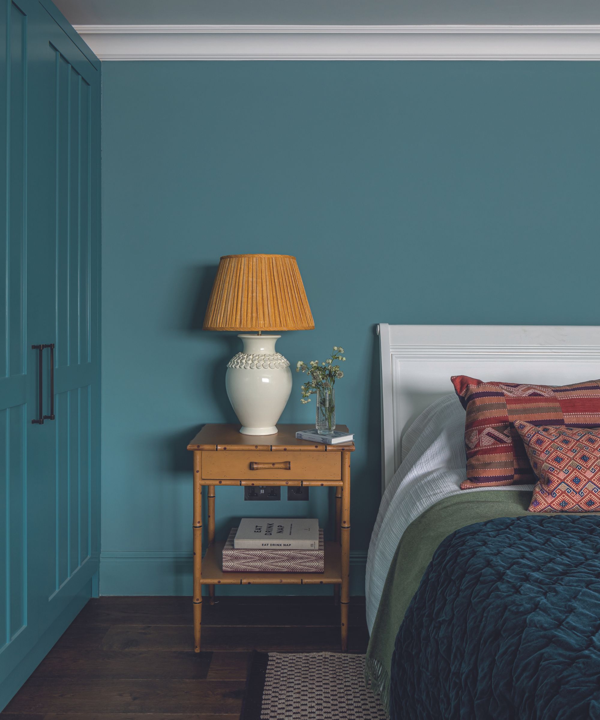
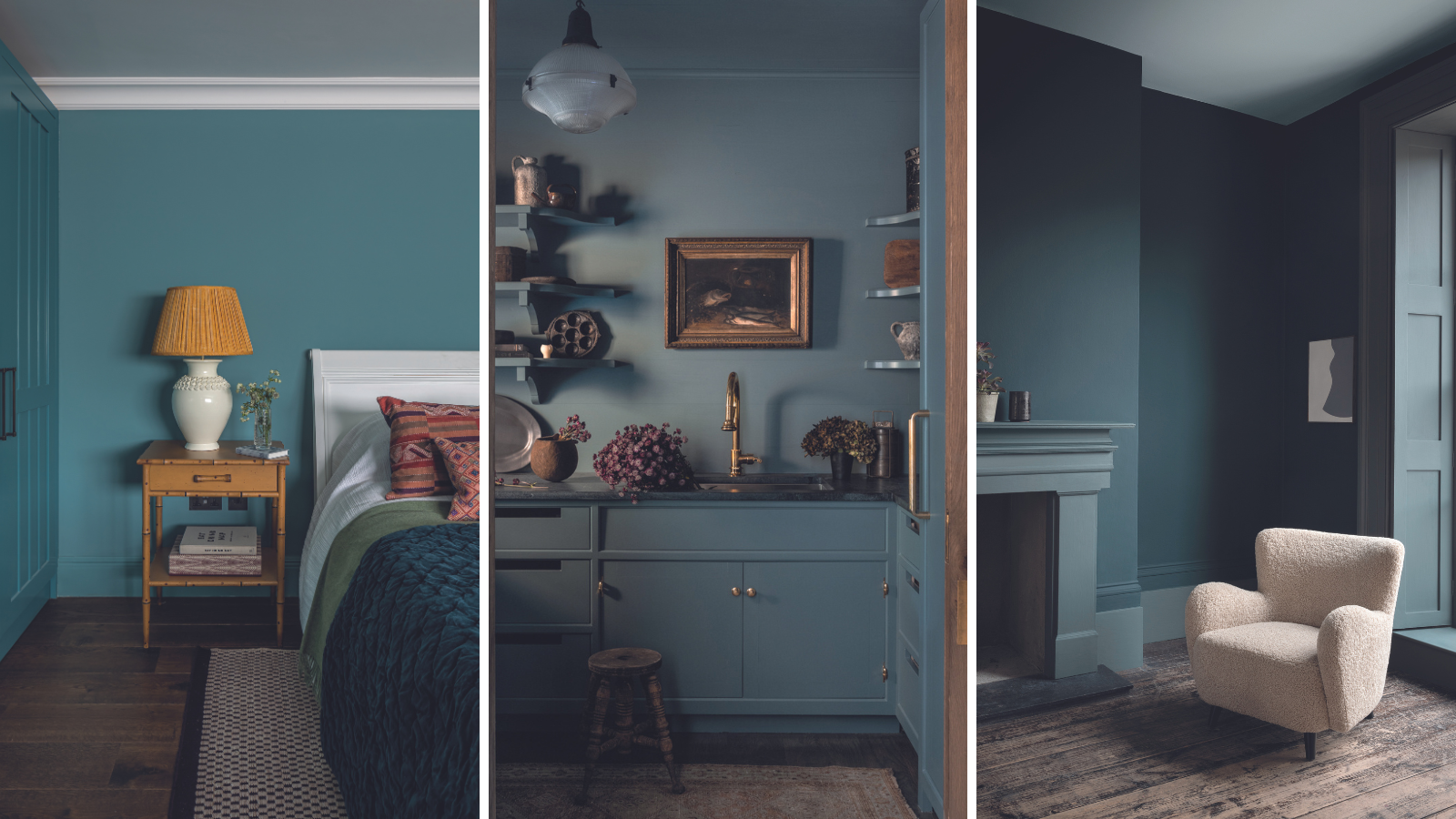
For this guest bedroom, Ali Johnson – the director of Otta Design, wanted to utilize the power of a jade blue to create an enveloping and tranquil space. 'We wanted a guest suite where occupants could sink into a deep, restorative sleep' says Ali.
She continues, 'Edward Bulmer’s Vert de Mer is a natural sea blue that is rich and nurturing without feeling overbearing', and suggests 'For contrast, pair this color with pops of mustard or aubergine.'
It provides a rich backdrop
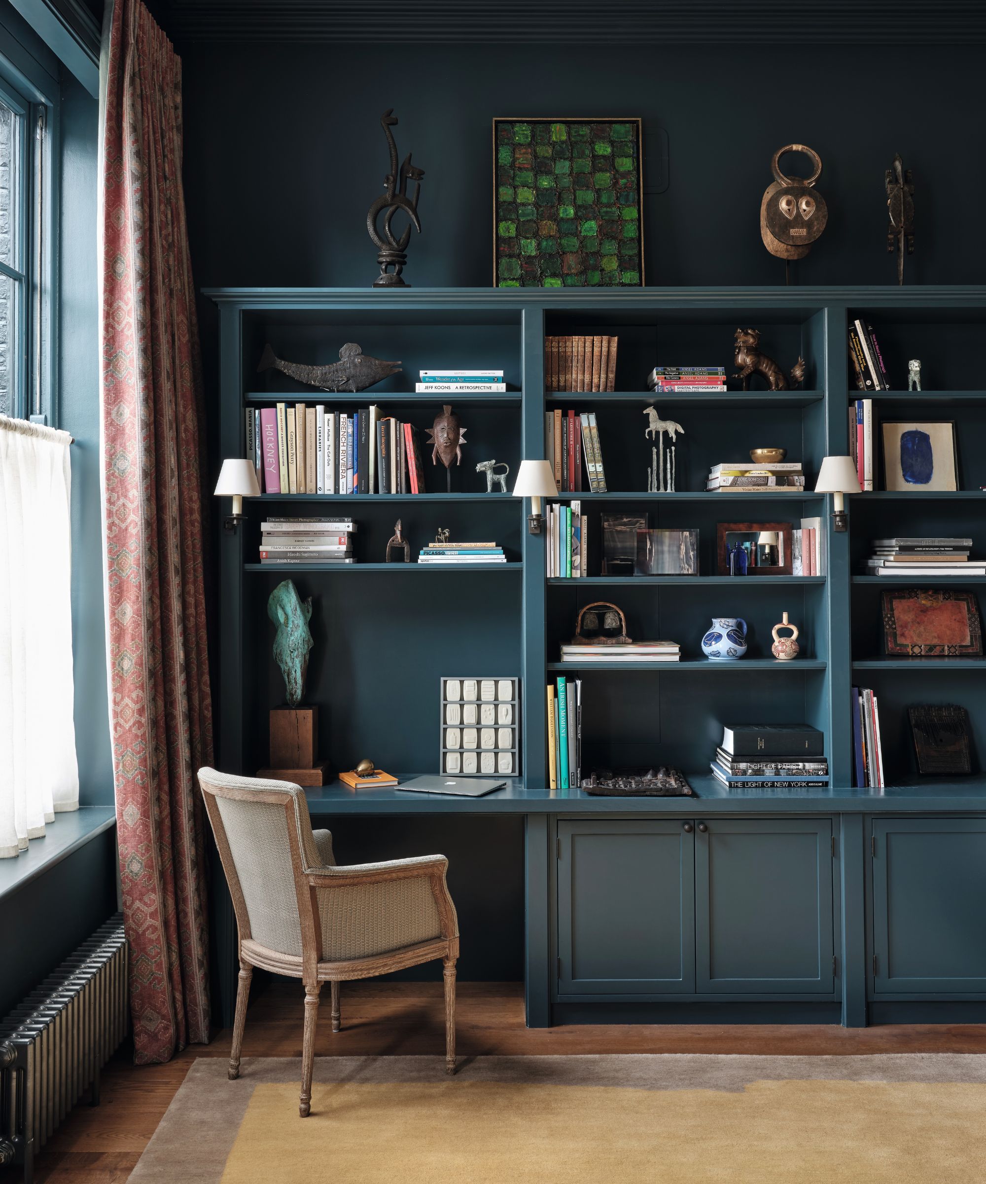
Claire Sá, co-founder and director of De Rosee Sá used the moody blue to create an effective home office space in this project. She points out the virtues of a deep blue in providing a dark contrast to light and colorful objects.
She explains, 'This client had a great collection of objects and art, so we wanted to design a backdrop that allowed these to shine. By using a rich color like Paint & Paper Library's Kigali, it lets the library have its own identity.’
It's perfect for all-year round
Andy Greenall, the head of design at Paint & Paper Library is convinced of the versatility of a rich blue, however, reminds us to pay attention to the natural light levels of the room you're working with when choosing a shade.
He comments, 'Kigali is a wonderful year-round color choice – with a green undertone, it feels neither too warm nor too cool. When choosing blues consider selecting a truer blue in south-facing spaces and a greener teal in a north-facing room.'
It doesn't overwhelm small spaces
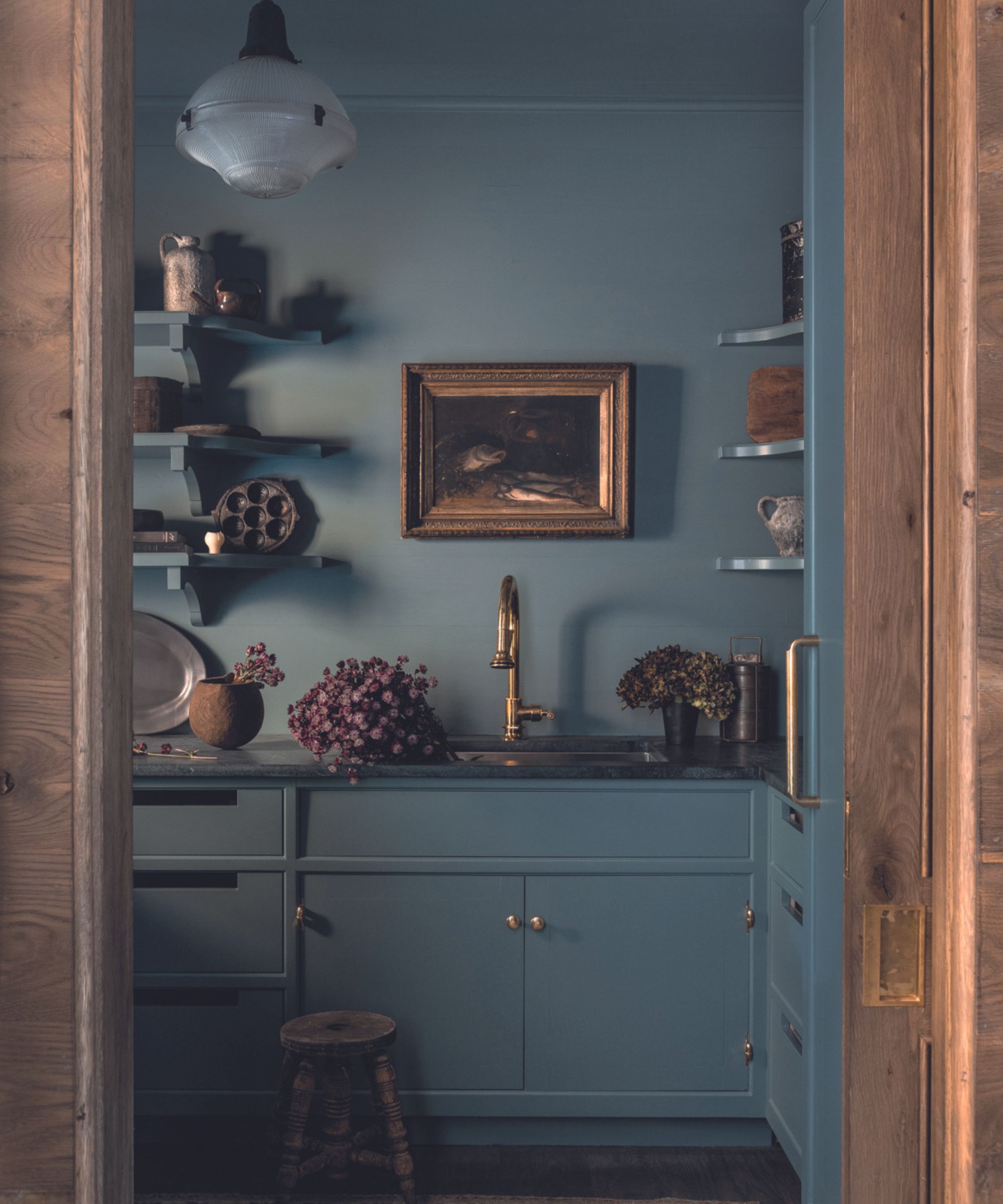
For this modest lakeside house kitchen, Sean Anderson, the founder of Sean Anderson Design embraces a more muted iteration of ocean blue, to create both an impactful but calming space.
He comments, 'I’ve been embracing puttier versions of jewel tones in recent project. Here we used Farrow & Ball’s De Nimes, which is perfect for smaller spaces. We chose to use it over walls, trim, and the ceiling for maximum effect.'
It's not difficult to see why moody ocean blue is becoming a fast favorite for interior designers. The color adds character to a space, yet despite its glittering depths, it isn't attention-grabbing, and in fact - sits happily with natural tones and warm colors as well as bold, bright accents.
Comforting and enveloping, it evokes feelings of calmness, and it's wonderfully versatile - a blue with warm depths will suit the light throughout the seasons, even in a small space.