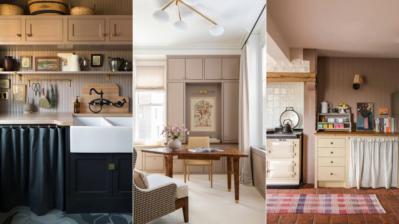
'Dead Salmon' doesn't exactly sound like the most endearing of shades, however, Farrow & Ball's muddy pink paint is a best seller due to its perfect balance of not being quite pink but not being a total neutral either.
It's also one of those shades that completely changes under different lights, so it works in all lighting, sometimes looking like a muted pink, sometimes looking like a light brown, and sometimes looking somewhere in between. It's a really sophisticated shade, and its popularity is a lot down to the fact that it's a way to bring pink into your home without it ever looking overly sweet, you get the warmth and the pop of color but it always looks grown up.
So what's the best way to decorate with Dead Salmon? We asked designers and color experts who have used the paint in both projects and their own homes for tips on how it works best.
What color is Dead Salmon?
Dead Salmon is somewhere between a pink and a brown, Farrow & Ball describe it as a 'deep salmon pink' that can be either 'A strong mushroom steeped in history, or a warming buff neutral'. It's a very muted, earthy neutral paint color that's a real chameleon shade and can look very different in different lights. But that does mean it works no matter what the lighting situation is in a room.
'Our curiously named Dead Salmon, after the ‘dead’ or completely matt paint finish of a salmon shade used at Kedleston Hall, is a brown-tinged drab pink with a beautiful quality that shifts between mushroom, buff and salmon depending on your light.' explains Patrick O'Donnell of Farrow & Ball.
How to decorate with Dead Salmon?
'Dead Salmon is such a beautiful, soft color. Personally, I love it with a slightly creamy white trim to keep it from looking too muddy. Incorporating black accents and a splash of chartreuse somewhere is a recipe for a stylish and cool space.' suggests designer Bethany Adams.
It is one of those shades that there aren't many rules with, it works with plenty of other colors and just adapts to any light. The key with this shade though is to order samples before you commit so you know what color it's going to become in your home.
1. Freshen the muted tones with whites
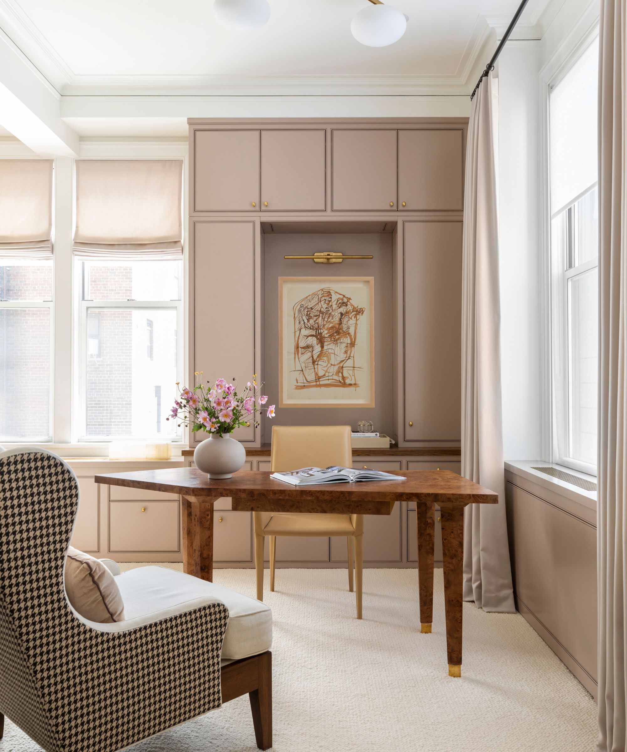
'I am absolutely loving Dead Salmon by Farrow & Ball,' says designer Marie Flanigan. 'While the paint color name is inspired by a less-than-savory part of nature, the color is truly a perfect pop. I love the slight salmon undertones, but the color takes on a new life in different spaces, sometimes slightly more pink or brown depending on the light.'
Everyone seems in agreement this color changes a lot under different lights, but you can lift it or deepen it depending on the colors you pair it with. In this home office, Marie has paired it with a crisp fresh white paint which contracts the deep pink but brightens it too. But it also works as part of a tonal scheme with similar shades or if you want to bring out its darker side a deep red or aubergine works wonderfully.
'It is a wonderful color to play with but does work best in a south or west-facing room to let the warm tones come alive. Pair with a delicate neutral like Joa’s White for a soft scheme, or with Setting Plaster as a warm-toned counterpart on the woodwork or ceiling. Introduce a pop of color with Brinjal or mix it up with an accent of dark blue such as De Nimes.' adds Patrick.
2. Try Dead Salmon to soft a kitchen color scheme
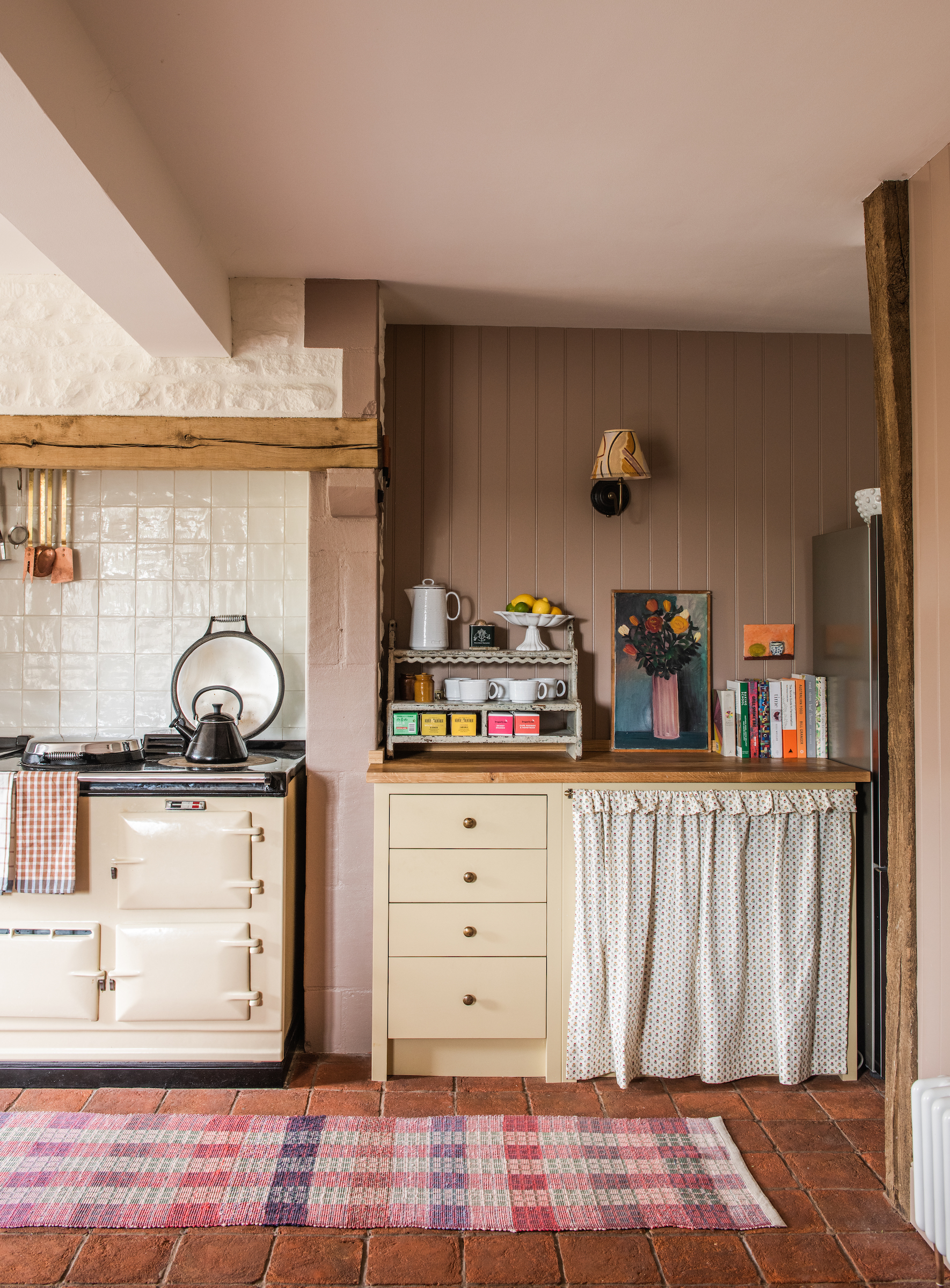
'Dead Salmon from Farrow & Ball is one of my all-time favorite paint colors,' says Lisa Mehydene, founder of edit58 and owner of this rustic kitchen. 'It's such an easy color to introduce into a room scheme, and for me, it works as a neutral, really grounding a space and providing a wonderful backdrop for art, fabrics, and furniture. What I love most about the shade is its magical quality; in some lights or when paired with certain colors it looks brown, in others much pinker.'
'Here, in our Cotswolds kitchen, alongside Atelier Ellis "Pollen' painted kitchen cabinetry I love the resulting Rhubarb and custard effect. It feels right for a country kitchen, traditional yet warm and inviting.'
3. Ground Dead Salmon with darker shades
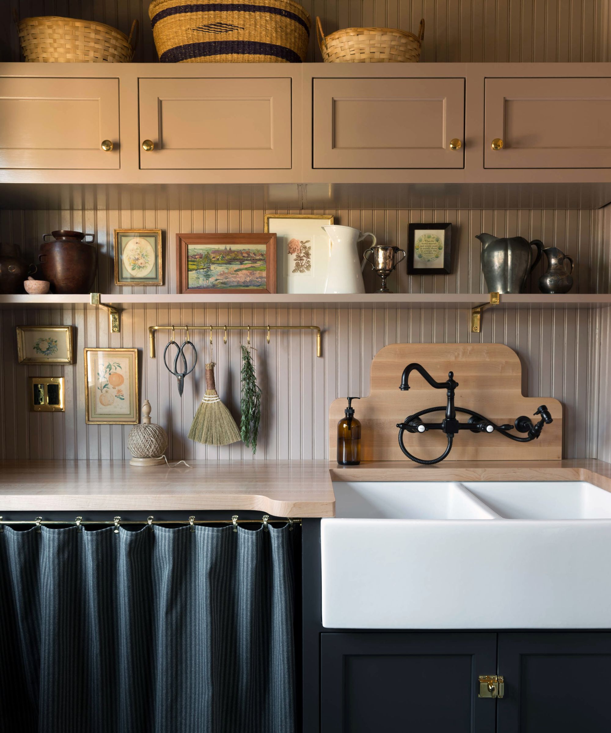
If you want to see Dead Salmon at its deepest and most moody, pair it with a darker shade. A deep blue, a soft dark gray, or a rich red all look lovely with this pink and really work to create a dramatic dark color scheme that still feels livable and cozy.
This pantry designed by Studio Laloc pairs Dead Salmon on the wall cabinetry with Deep Caviar by Benjamin Moore for the floor cabinets. The deeper shade grounds the pink walls and brings out the darker side to the paint - ideally for a room that doesn't get a ton of natural light.
'Dead Salmon is an unexpected warm neutral that we use in many of our projects. It's what we like to call a drab mushroom color that can shift pink, brown, or aubergine depending on the lighting and the other elements that are paired with it. The subtlety of this color causes it to recede while complimenting more saturated or statement colors within a room.' explains the studio's founder Lauren Caron.
4. Colordrench a room for a sophisticated but cozy feel
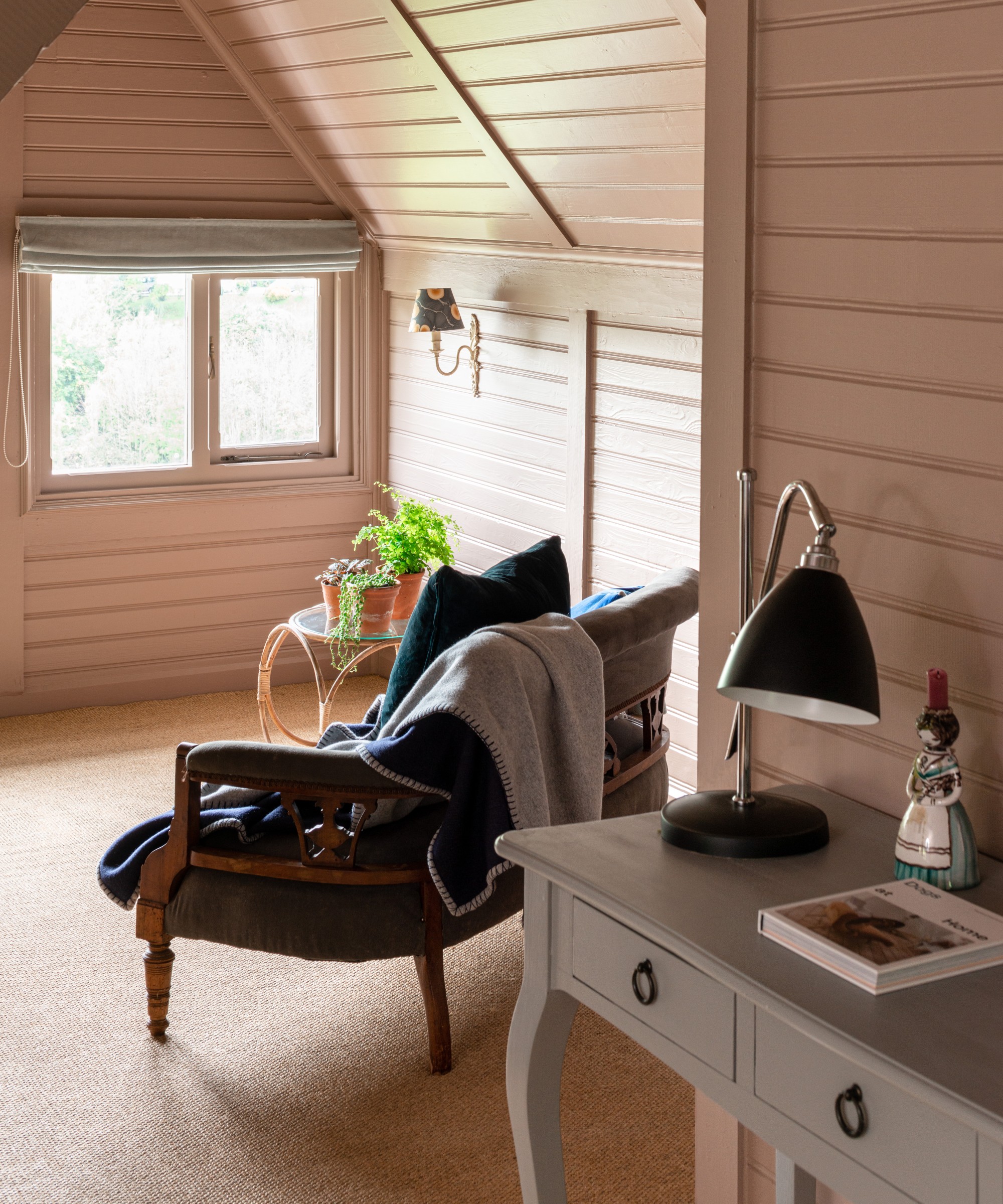
Color drenching a room in Dead Salmon is impactful, but also very warm and welcoming. It doesn't overwhelm a room, and since it's so close to a neutral, taking it over every surface won't limit you to the colors and styles you can bring into the room. This approach works especially well in a small bedroom because it ups the coziness but can also be a way to make a small room look bigger.
'We are big fans of Farrow & Ball at TR Studio; it is a great high-quality paint that you can guarantee is consistent. Dead Salmon has a great matt quality to it which enables this shade of peachy-pink to add both a sense of softness and a fresh, modernity to a space.' explains Tom Rutr, founder of TR Studios.
'Depending on the amount of natural light in a room, it is one of those shades that can change quite dramatically in character. Very much a contemporary neutral in many ways thanks to its brown earthy undertone, it works with lots of other colors, or it can be used on its own and still create impact.'
If you are looking for a pink that's not too pink, in fact, it's much closer to a neutral, then Dead Salmon is definitely one to consider. As all these designers have mentioned, it is very interchangable so it is important to order a sample and test it out in your lighting. In general, it appears more pink the more light and more brown the darker the space.


