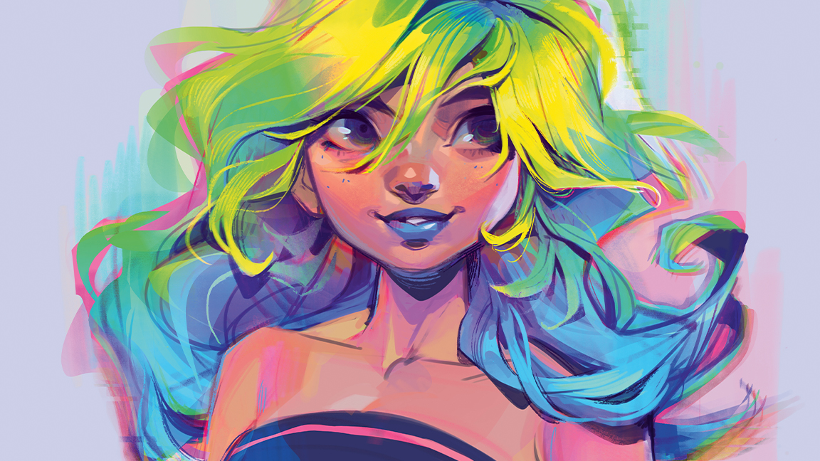
To approach this character design tutorial I am doing a redraw of an older image that I first made back in 2003. For the original character illustration I used highlighters, so when remaking the image digitally, I want the colours to be just as bright and vibrant as the highlighter ink from my original drawing.
When working digitally (here using Photoshop), creating a bright colour scheme is easier said than done, given that there isn’t a specific setting for neon colours. In order to create a similar effect, it’s much more about how the colours interact with one another. The relationships between the highlight and shadow colours are what determine whether the colours look bright, so it’s really important to think about the palette as a whole throughout the process.
Over time, I’ve developed a number of tried-and-true digital art techniques that always help me to create bright colours that still feel unified and cohesive. The best digital art software has so many helpful tools to use for this purpose, including colour-editing tools, which allow me to tweak and modify as I go.
However, at the end of the day, it’s ultimately about old-fashioned colour theory, which applies to any medium you use, whether that be traditional or digital. If you're inspired by the tutorial below, take a look at our guide to the best drawing tablets, and read more workshops in our '71 brilliant Photoshop tutorials' hub.
Creating colourful character design
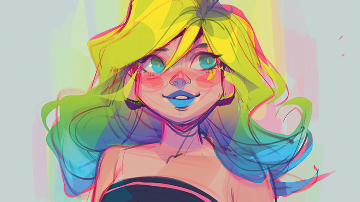
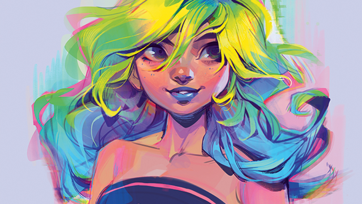
01. How I create a vivid colour palette
First, I add flat colours below my sketch. When choosing these, I like to start with one colour and move on from there. That makes it easier to ensure they interact in a harmonious way. After that, I set my sketch layer to Multiply and change the colour to something that blends well with the flat colours below.
The key to making colours vivid is ensuring that your highlight and shadow choices are interesting and vibrant. Rather than simply making them lighter or darker versions of the base colour, I use Hue Shift. In this case, yellow highlights and purple shadows worked well together.
Finally, I break up any flat areas by using colour variation, for example adding purples, blues and greens to the shadows. This gives an iridescent sort of effect. Whenever possible, I try to use colours already on the canvas so that they are distributed over the painting in a way that catches the eye!
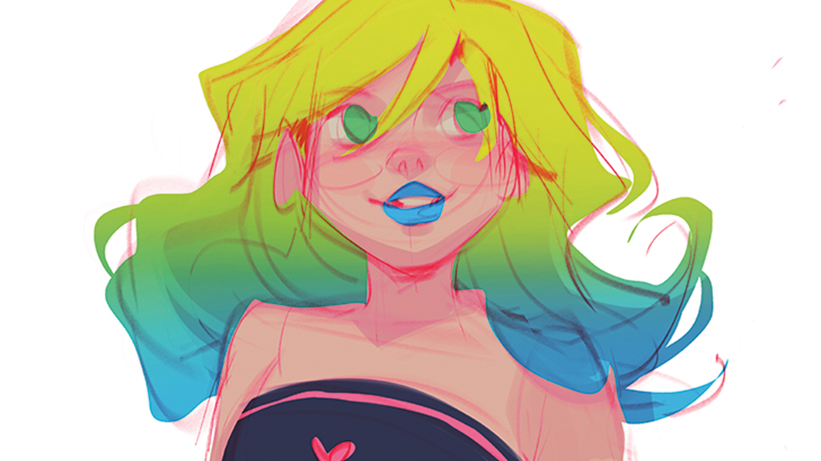
02. I start with my old drawing
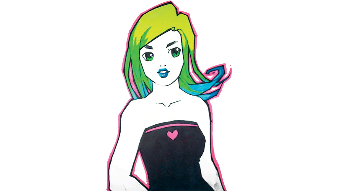
This is the original version of the drawing that I created back in 2003. Back then, I had a much more simplified and chunky style. I like revisiting older pieces every so often. It’s always interesting to see how I approach the same subject with an updated skillset.
03. Making colour modifications
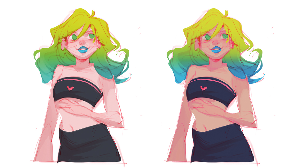
One of my favourite parts of creating digital art is the ability to modify the colours. Tools like Selective Color help me amplify specific aspects of the colour scheme. For this drawing, I found it helpful to tone down the whites and intensify the reds and pinks for an electric, glowing feel!
04. Using a bright highlight
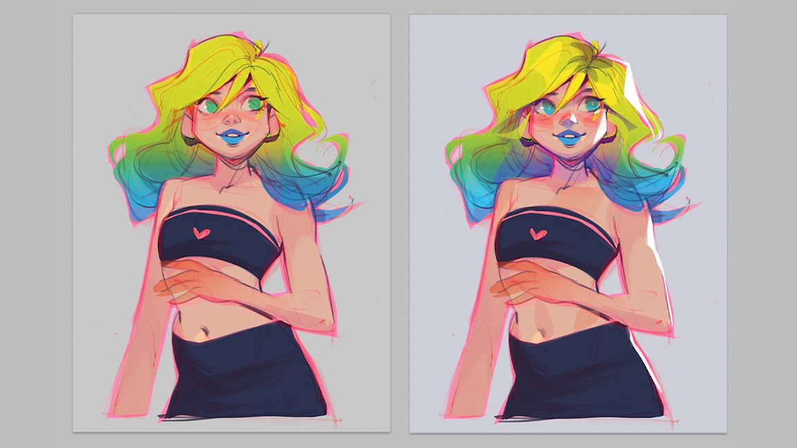
A technique that I often find helpful for giving more dimension to my character art is adding a bright highlight on one side. It’s fairly easy to do and instantly gives a lot of depth. I tend to draw these on a separate layer on top, so I can easily tweak and adjust them.
05. Adding freckles
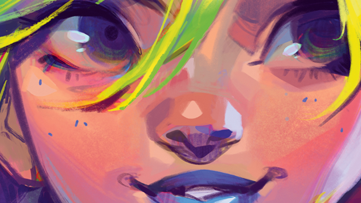
I like to get a rough colour scheme down at an early stage and then use the colours already on the canvas to render and detail. In this case, I used a dark blue for the freckles and a bright teal for the shine on the eye. Those colours were all picked from other areas of the image.
06. Creating a focal point
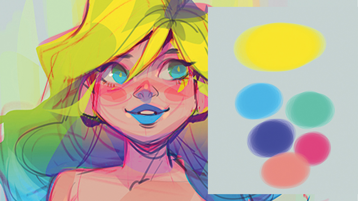
When drawing characters, it’s really important to pick a focal point where you want people to look first. In the case of my art, that’s often the face and hair. For this particular drawing, I emphasised the focal point by applying the brightest, most intense colour to this area!
07. Changing the colour of the sketch's lines
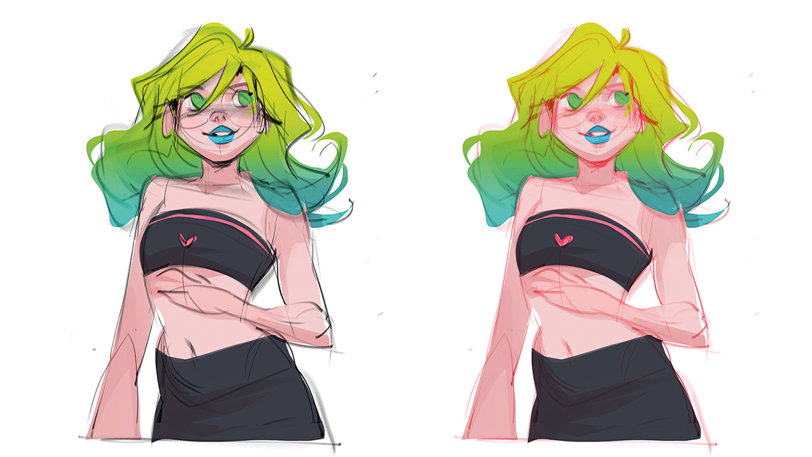
Artists often draw their sketch lines in black, but this doesn’t usually do much for the colour scheme. I always recommend setting the sketch layer to Multiply and then changing the colour of the lines to something brighter. This
creates way more interesting shadow colours and mid-tones.
08. Adding interesting shadow colours
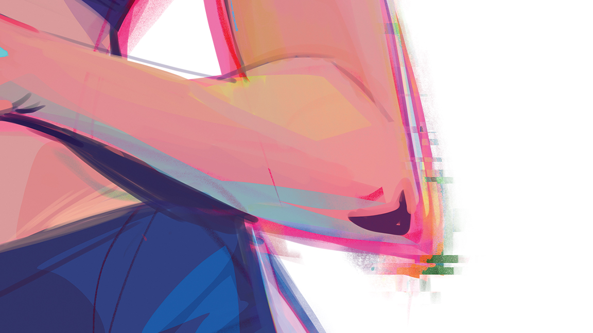
This spot on the elbow is a good example of how I try to add interesting highlight and shadow colours. I’ve added some bright yellow to the highlights, as well as bright blue to the shadows. This combines well with the vivid pink still showing through from the sketch lines.
This article was originally published in issue 222 of ImagineFX Magazine, the world's leading magazine for digital artists. You can subscribe to ImagineFX at the Magazines Direct website and get 3 issues for £3. The magazine ships internationally.


