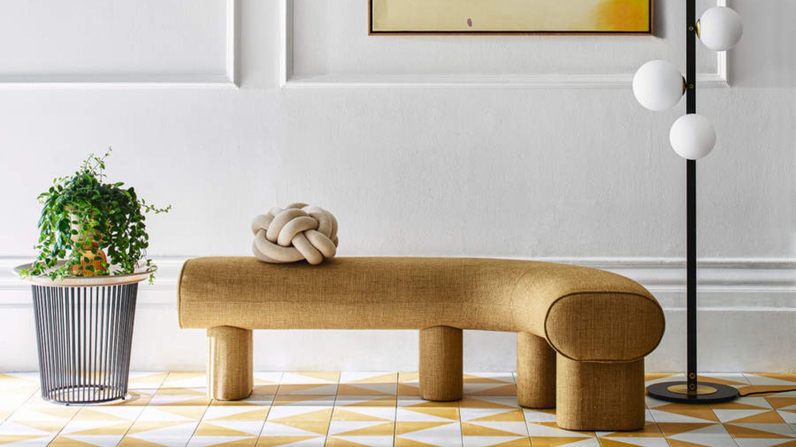
Picking a color for an entryway requires all kinds of considerations — from setting the style and tone for the rest of the colors in your home to practical considerations, such as how much light it reflects, or if it will hide scuffs and marks effectively.
While this combination of aesthetics and practicalities might seem like an impossible challenge, achieving this balance is vital to choosing the best entryway color for your particular space.
We consulted with design experts to uncover how they marry their entryway ideas with their entryway color palette. Below, they share their top tips on how to select the right colors to create your desired atmosphere in this key space.
How to find the right entryway color for you?
As I said above, choosing the right color for your entryway is about balancing functionality and aesthetics while setting the tone for the rest of your home. Once you’ve determined your foundational approach, you can fine-tune your choices based on the atmosphere you want to cultivate, and how your entryway color connects with the rest of your home. This is where to start.
1. Consider the mood you want to create
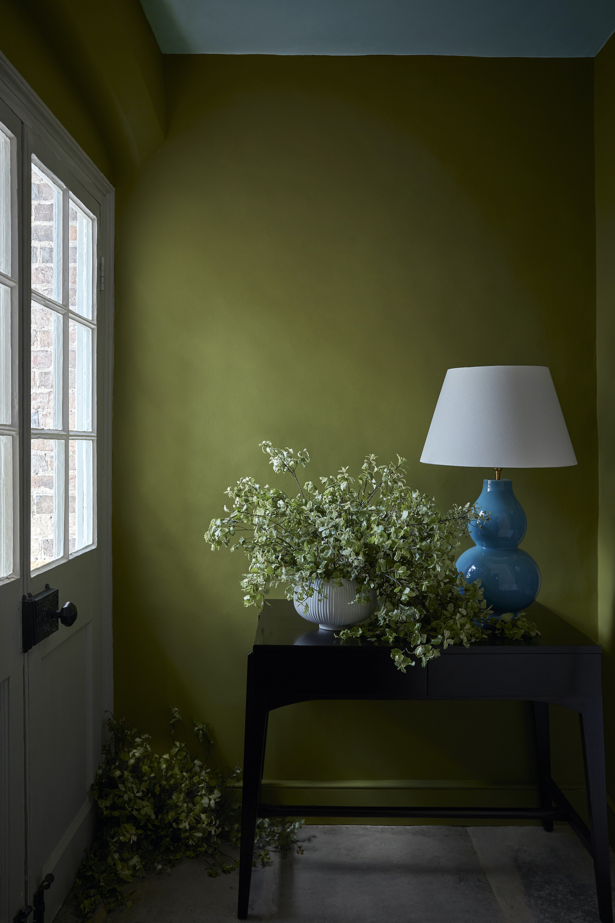
As the first impression guests have of your space, your entryway should be inviting. Your entryway color will set the mood for the overall ambiance in your home.
"Color acts like a subliminal message, influencing your thoughts and emotions," says interior designer Kim Colwell, "Dynamic color combinations stimulate our imagination and when color is dissonant it can trigger a stress response."
You can use color theory ideas to help guide your choices. Typically, for a welcoming atmosphere, warm hues, such as soft yellows or terracotta, work well, whereas cooler tones like blues and greens introduce a calming energy.
Ruth Mottershead, creative director at Little Greene says green is also known to be very calming, soothing our minds and nervous systems, plus it boasts a timeless feel, no matter the period or style of home.
"It’s warm and muted, but not enough that it fades into the background, so it works beautifully alongside paler shades like delicate pinks, clay, and stone, as well as darker, richer colors such as browns, blacks, and deep earthy tones," Ruth says.
For a deeper understanding of color relationships, Color Theory for Dummies on Amazon provides practical insights to help you select the perfect pairings for your entryway.
2. Nail down your color preferences
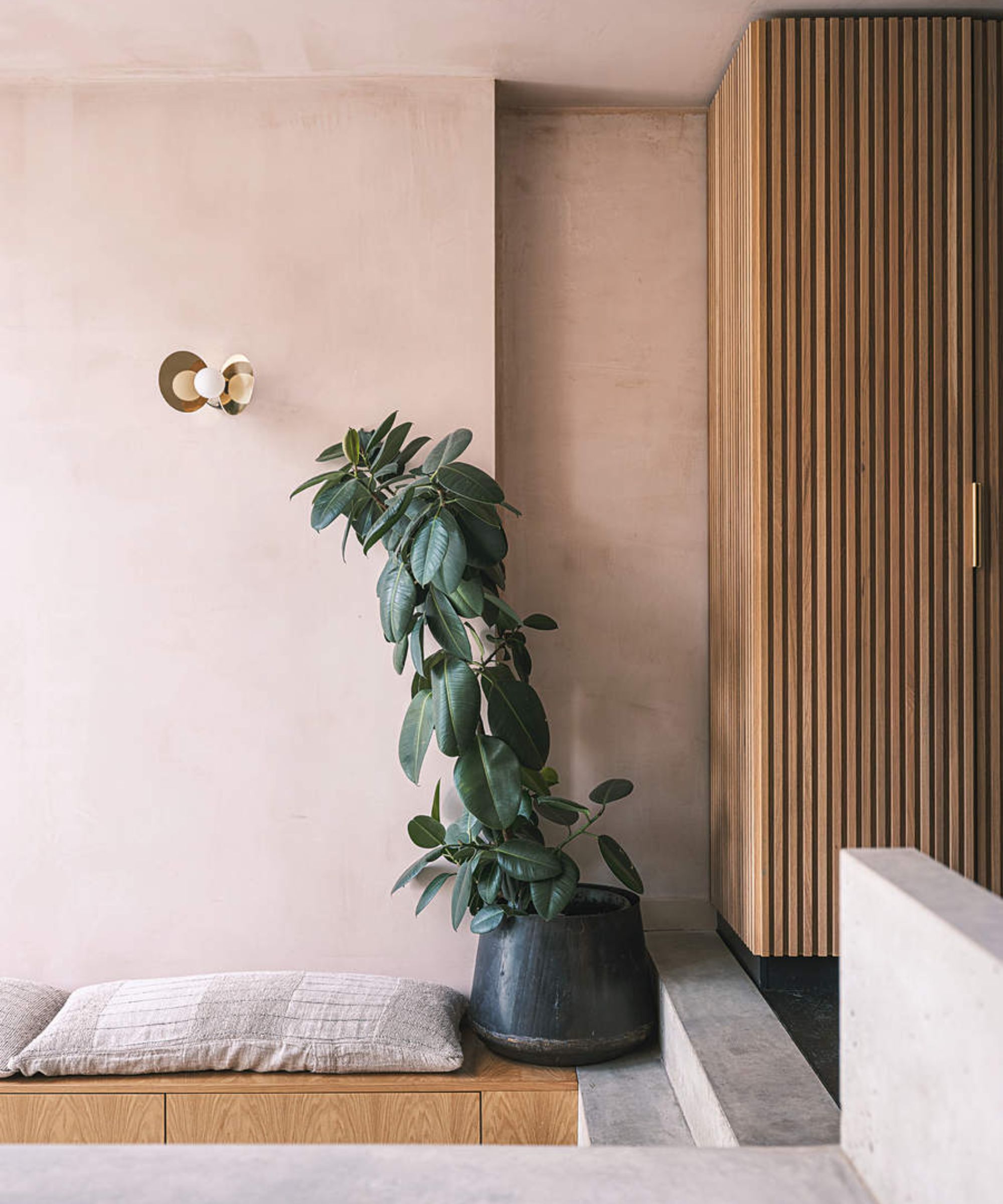
Color psychology aside, what is calming to one person is not necessarily the same for someone else, as Angela Higgins, founder and principal designer at Nourished Home says.
"We can look at options and what they invoke in general but selecting what resonates with you and personal feelings and preference is important," Angela tells us.
Let's start with the basics: do you prefer light colors that open up the space or darker shades that add drama and depth? Are you leaning towards a warm, welcoming palette that exudes comfort, or a cooler, more modern aesthetic?
3. Consider your entryway's natural light

To find the perfect shade, consider the natural light in the entryway, then match that against the mood you want to create, and how the color will flow with the rest of your home’s color palette.
Then, add the proportions and architectural details into your considerations. For example, the best colors for small entryways with low ceilings are often light and neutral, as they can create the illusion of more space. Choose the right color and you can make your entryway look bigger. In contrast, larger entryways with ample natural light and towering ceilings can handle richer, darker tones that add character. Dark colors can make an entryway look more expensive, too.
"Light colors, like soft neutrals or pastels, can make a small entryway feel open and more expansive, while darker shades like navy, charcoal, or forest green add drama and sophistication to spacious entryways, especially those with plenty of natural light," says Lucy Searle, content director for audience at Livingetc.
4. Understand color relationships
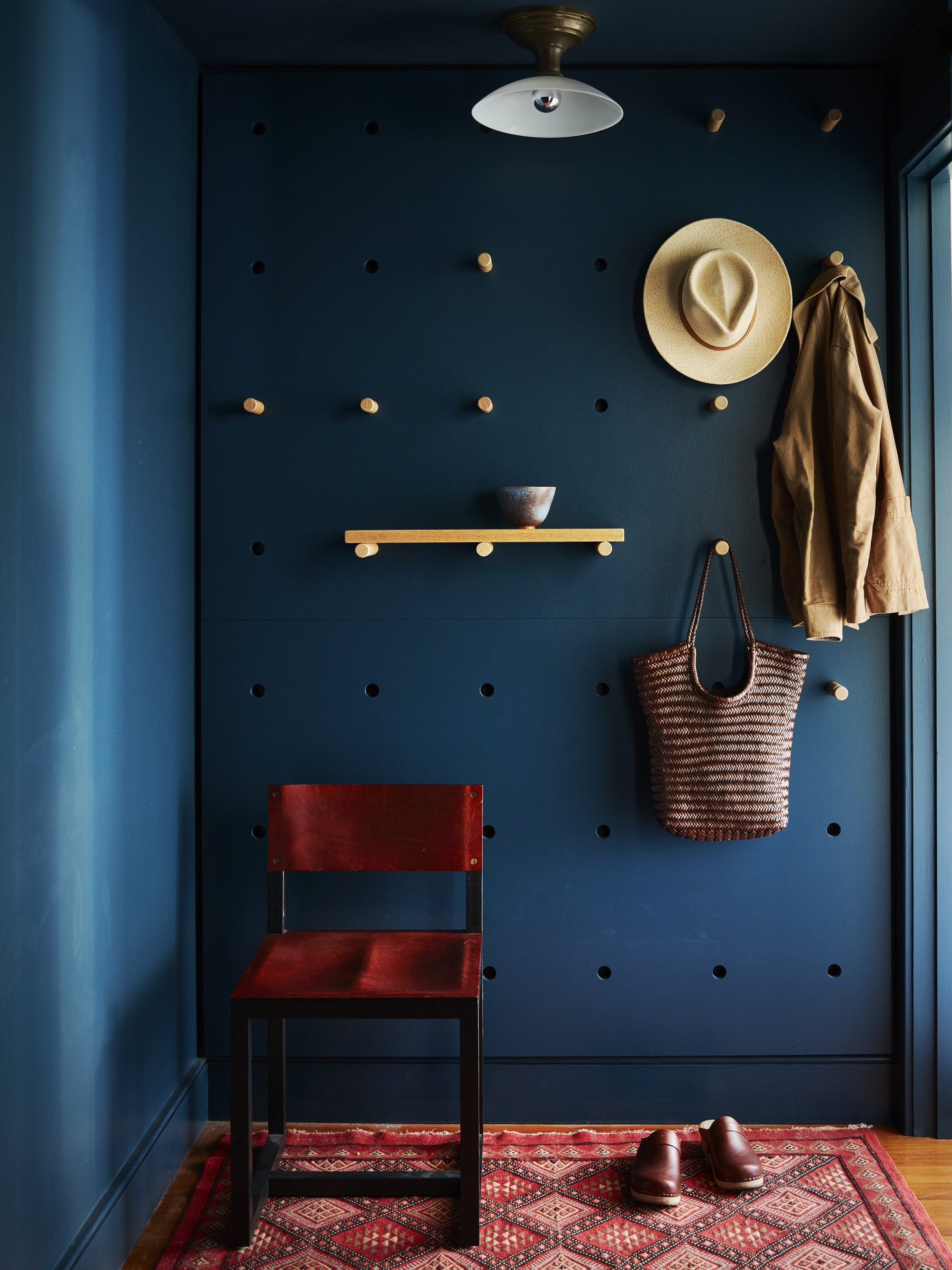
When choosing the right color for your entryway, understanding color relationships is key. Color theory also offers guidelines for selecting the perfect color pairings to ensure harmony within a space, vital in a small or busy space such as an entryway.
Again, consider the emotional impact you want the space to create — whether you want the entryway to feel calming, energetic, comforting, or dramatic. This will guide your choices as you combine tones.
For bolder impact, complementary colors — those opposite each other on the color wheel, such as blue and orange — can create striking contrasts. For example, a navy blue wall paired with copper accents can result in a dynamic, striking entryway.
Helen Shaw, director of marketing at Benjamin Moore adds, "Pinks and greens go hand in hand, and being complementary colors they work to elevate each other yet are far less contrasting and harsh than green and red, for example."
On the other hand, if you prefer a more subtle, cohesive effect, you can use analogous colors — those that sit next to each other on the color wheel, such as green, teal, and blue. These colors blend naturally, offering a softer, more seamless flow which can be ideal for creating an inviting atmosphere that feels calm and unified. This combination can be particularly effective in connecting your entryway with adjacent rooms, allowing the color scheme to flow throughout the space without sharp transitions.
You can also opt for a monochromatic scheme — using different shades of the same color, like transitioning from light gray to charcoal — to add depth and sophistication without overwhelming the space.
If you prefer a more neutral style, Helen Shaw suggests, "Pairing warm neutrals such as whites, beiges, and creams together will ooze comfort in a classy and effortless way." Elevate the palette with layers of texture such as dark woods, tactile bouclé textiles, and sleek stone surfaces such as marble and quartz — and be sure to stick to warm undertones, vital to avoid a cold, sterile feel that could potentially be jarring.
Additionally, to create a real sense of calm and harmony, she suggests nature-inspired shades such as sage or forest green, as colors that go with olive green will set a restful tone and comforting atmosphere. Helen Shaw, recommends a combination of soft pastels: "They will offer the perfect injection of color and their calming tones won’t be overly stimulating, as they require our eyes to do little to no adjusting."
5. Connect your entryway color with adjacent spaces
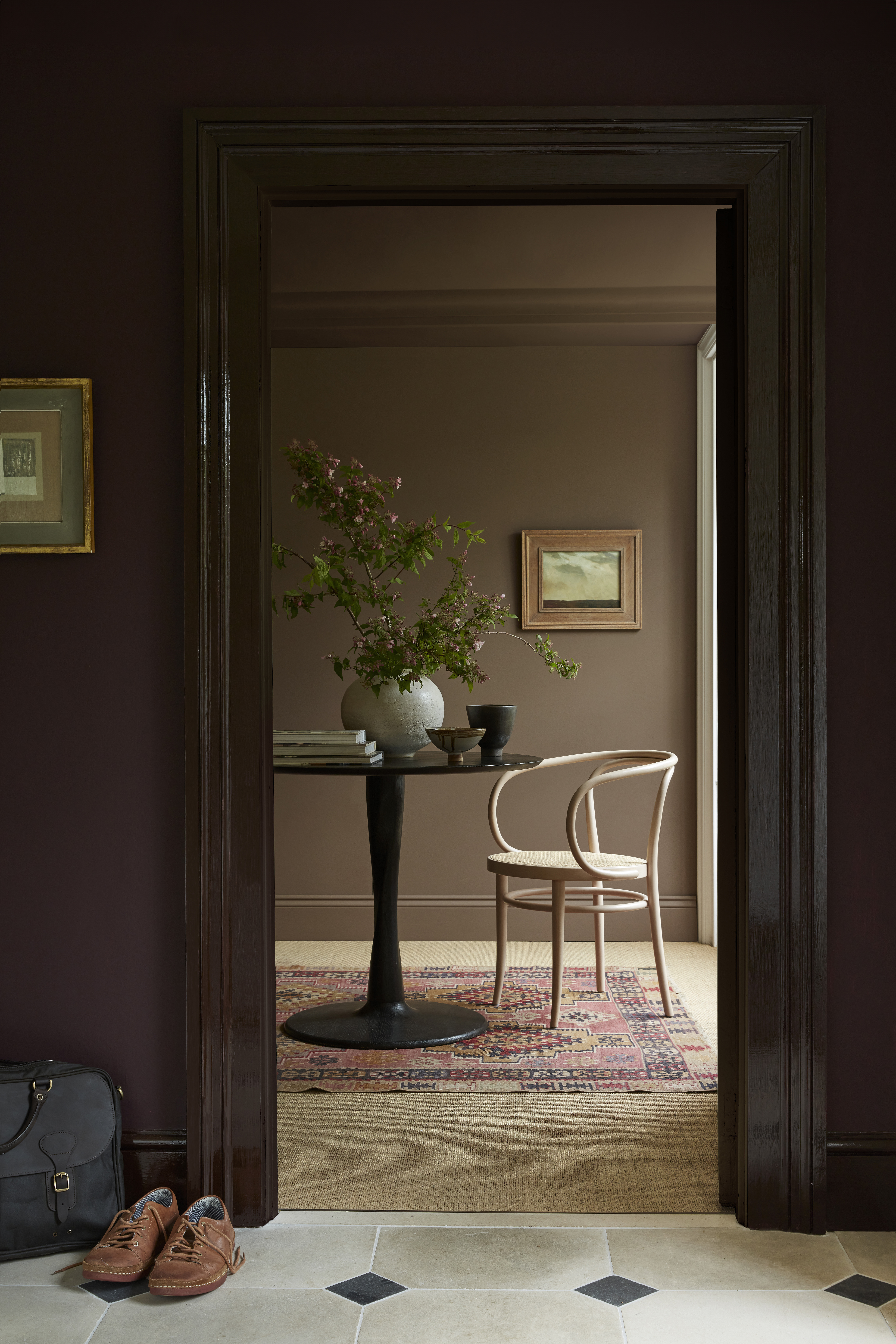
When considering how to connect your entryway with adjacent spaces, it's crucial to account for the visual flow between rooms. It's also important to consider the aspect of the views into and from this transitional space, as a view-through could make or break a color scheme. The way one room transitions to another can affect how cohesive and connected the entire space feels.
For example, if the adjacent rooms have a neutral color palette, Ruth suggests using a statement color on the ceiling of the entryway. Since the ceiling often remains unseen through open doorways, it provides the perfect opportunity to add a touch of drama without disrupting the continuity of the other spaces. By choosing the best ceiling colors you can add personality to your entryway while keeping the flow intact.
Ruth also encourages us not to be afraid to use a darker hue in the entryway, even if it is a small entryway. "Create a uniquely welcoming feel with dark sumptuous colors, selecting a shade that gives a sense of continuity and transitions seamlessly from room to room, providing a sophisticated, cocooning feel." If you are concerned about darkening the space too much, consider the rules for dark entryways to ensure the room doesn't feel closed off or claustrophobic, such as blending it with contrasting shades.
Furthermore, don't forget entryways are the transition from outdoors to indoors, so it’s wonderful to bring the natural environment inside by incorporating nature-inspired hues. Consider introducing shades like leafy greens or soft forest tones.
Ultimately, the color or colors you choose for your entryway should reflect your personal style while enhancing the flow of your home. Whether you opt for dramatic contrasts, cohesive hues, or nature-inspired shades, the key is to create an entryway that welcomes you back each time you return and flows seamlessly with the rest of your living space.
FAQs
How can my entryway color withstand high traffic?
Of course, when it comes to low-maintenance color choices for an entryway, light colors in high gloss finishes are a great option. These finishes are less likely to show scuff marks, dirt, or fingerprints compared to matte or flat paints, making them ideal for high-traffic areas. However, Patrick O'Donnell, color consultant for Farrow & Ball, recommends focusing on practical color techniques such as half-painted walls, rather than just choosing a color scheme.
"Entryways are high-traffic areas in the home, so practicality plays as big a role as aesthetic. However, these two factors can sit happily side by side without compromise and to great effect.
"One easy trick is to use one color in two finishes — paint the lower half of the wall in gloss, carrying over the baseboard for even more drama and accentuated height. Then, paint above in a washable matte — a fully washable finish." This technique can ensure the entire space is easy to maintain and can withstand the wear and tear of daily use.
Ultimately, the best color choice for your entryway will depend on your personal preferences, the atmosphere you wish to create, and lifestyle. While color trends and expert advice can guide you, only you truly know what will resonate with you and your family. That being said, it’s important to remember that your entryway serves as the first impression of your home and should feel inviting and reflect your personality. Whether you prefer a bold statement or a calming retreat, aim to create a space that makes you and your guests feel immediately welcomed and at ease the moment you step inside.


