
Typography is much more than just choosing a font – it plays a fundamental role in shaping a brand’s identity and influencing user experience in the digital world.
From the moment a visitor lands on a website or opens an app, typography helps set the tone, convey personality, and guide users through content seamlessly.
The right typefaces not only enhance readability but also contribute to brand recognition, emotional engagement, and overall usability.
In this article, I will explore the critical role of typography in digital branding and design. As someone who has been working with typography to create identity, brand perception, and convey emotions in design, I will discuss why typography is a key element of brand recognition, how specific typefaces can influence perception, and the impact of good (or bad) font choices on credibility and user trust.
Additionally, I will provide insights into selecting typefaces for digital platforms, taking into account factors such as legibility, rendering across different devices, and the balance between aesthetics and performance.
Typography is a fundamental element of visual communication, and in the digital age, its role in shaping brand perception is more critical than ever. Choosing the right typefaces for your website or app can significantly impact how users perceive your brand, influencing everything from legibility and readability to emotional associations and brand recognition.
Why typography matters for brand recognition

Just like a logo or colour palette, a typeface can become a powerful brand asset. A distinctive and well-chosen typeface can:
Convey brand personality: A playful script font might suit a children's brand, while a bold sans-serif could convey strength and modernity for a tech company.
Enhance brand recognition: Consistent use of a specific typeface across all platforms creates a cohesive brand identity, making your brand instantly recognisable.
Increase trust and credibility: A professional and well-crafted typeface enhances the perceived trustworthiness and credibility of your brand.
A poorly chosen typeface can significantly damage a brand's image in the digital world. It can make a brand appear unprofessional, outdated, or even untrustworthy. If a typeface is difficult to read, it can frustrate users and drive them away. Inconsistent use of typefaces can also confuse users and dilute brand recognition.
Ultimately, a bad typeface can negatively impact a brand's credibility, user experience, and overall success in the digital environment.
For examples of brands that do it right, like Uber (above), see my piece on brands with brilliant typographic identities.
Choosing typefaces for the digital world
Designers face unique challenges when selecting typefaces for screen-based media. Here are key considerations:
Readability and legibility: Prioritise typefaces that are easy to read on different screen sizes and resolutions. Factors like x-height, letter spacing, and line height contribute to optimal readability (see this typography glossary if you're not sure about these terms).
Font rendering: Different operating systems and browsers render fonts differently. Test your chosen typefaces across various platforms to ensure consistent display.
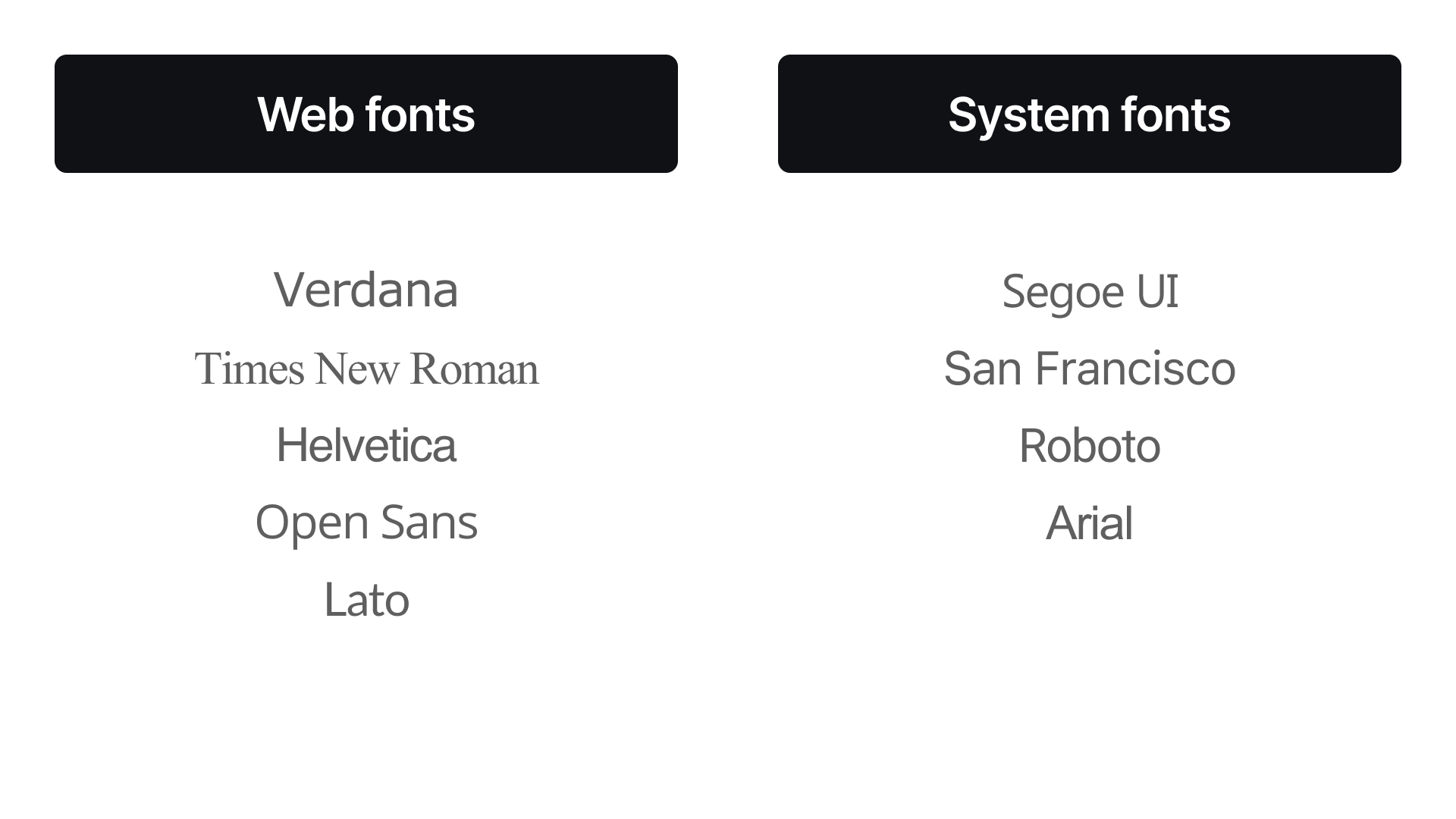
Web fonts vs. system fonts: Web fonts offer greater design flexibility, but they can impact page load times. System fonts are pre-installed on user devices, ensuring faster loading but limiting design choices.
Hierarchy and visual flow: Use different font weights, sizes, and styles to create a clear visual hierarchy and guide the user's eye through the content.
The typography trio for a great user experience
Typography plays a crucial role in shaping user experience (UX) and engagement. This crucial role extends far beyond mere aesthetics. Thoughtfully chosen typefaces are fundamental for crafting user-friendly and accessible online experiences. By prioritising readability, clear navigation, and inclusivity, designers can leverage typography to enhance comprehension, streamline user journeys, and ensure that digital content can be enjoyed by everyone.:
Improved readability: Well-chosen typefaces make content easier to read and digest, enhancing comprehension and reducing eye strain.
Clear navigation: Typographic hierarchy and visual cues guide users through the interface, making it easier to find information and complete tasks.
Enhanced accessibility: Selecting typefaces with good legibility and sufficient contrast benefits users with visual impairments
Accessibility in digital design is not just about inclusivity; it's about providing a positive experience for all users. When brands prioritise accessibility, they demonstrate a commitment to inclusivity and cater to a wider audience. This not only benefits users with disabilities but also enhances the overall user experience for everyone.
By considering factors like font size, line height, letter spacing, and colour contrast, brands can create digital products that are both user-friendly and accessible to all. When choosing typefaces, consider accessibility guidelines.
Font size: Provide options for users to adjust font sizes to suit their needs.
Line height and letter spacing: Adequate spacing improves readability for users with dyslexia or other cognitive differences.
Colour contrast: Ensure sufficient contrast between text and background colors for users with low vision.
Emotional typography
Different typefaces evoke different emotions and associations:
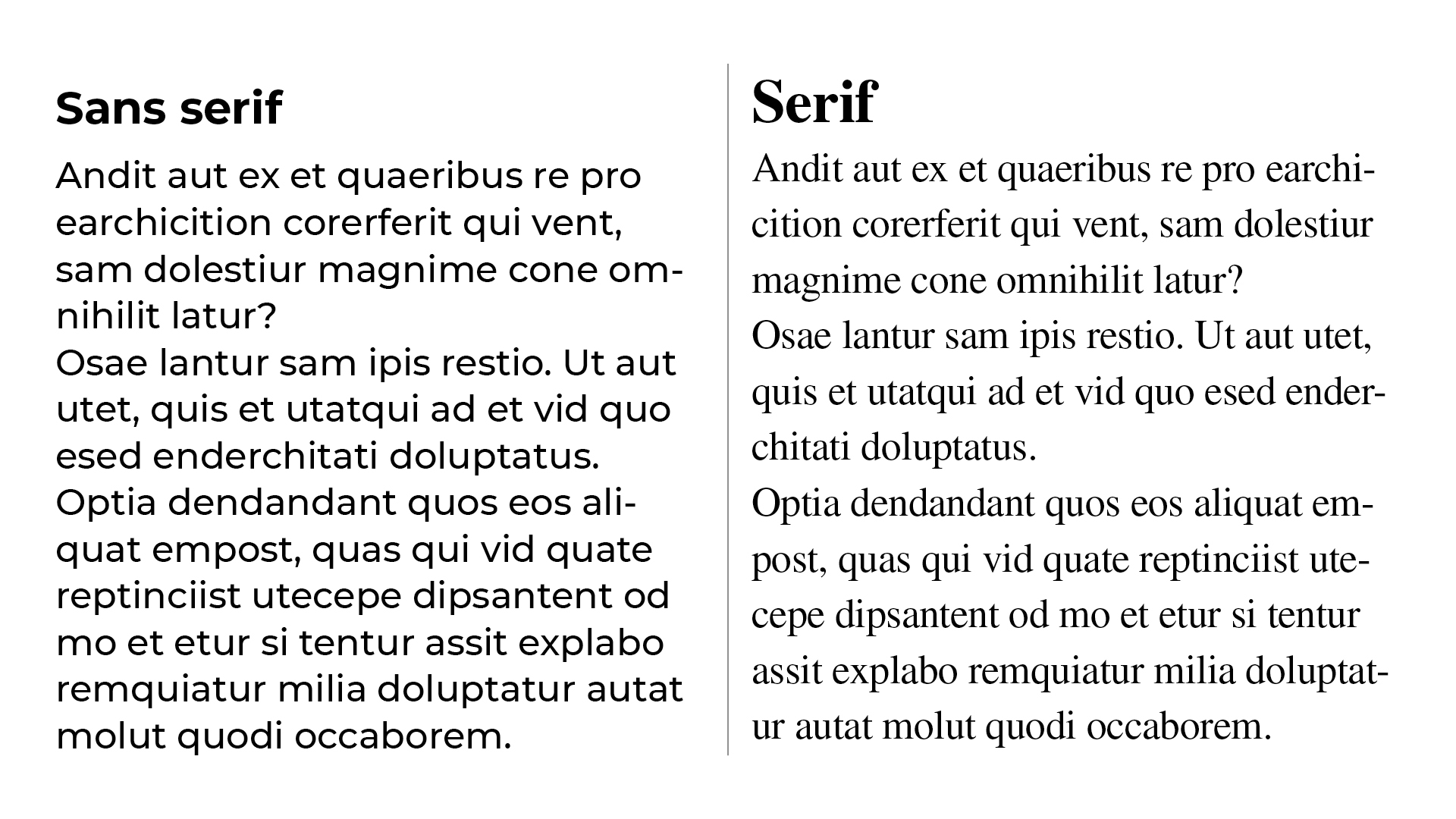
Serif fonts: Often associated with tradition, sophistication, and authority.
Sans-serif fonts: Convey modernity, cleanliness, and simplicity.
Script fonts: Can evoke elegance, creativity, or playfulness.
For more on different types of font, see our serif vs sans serif explainer. And if you want to use fonts in your work, make sure you read this piece on font licensing.