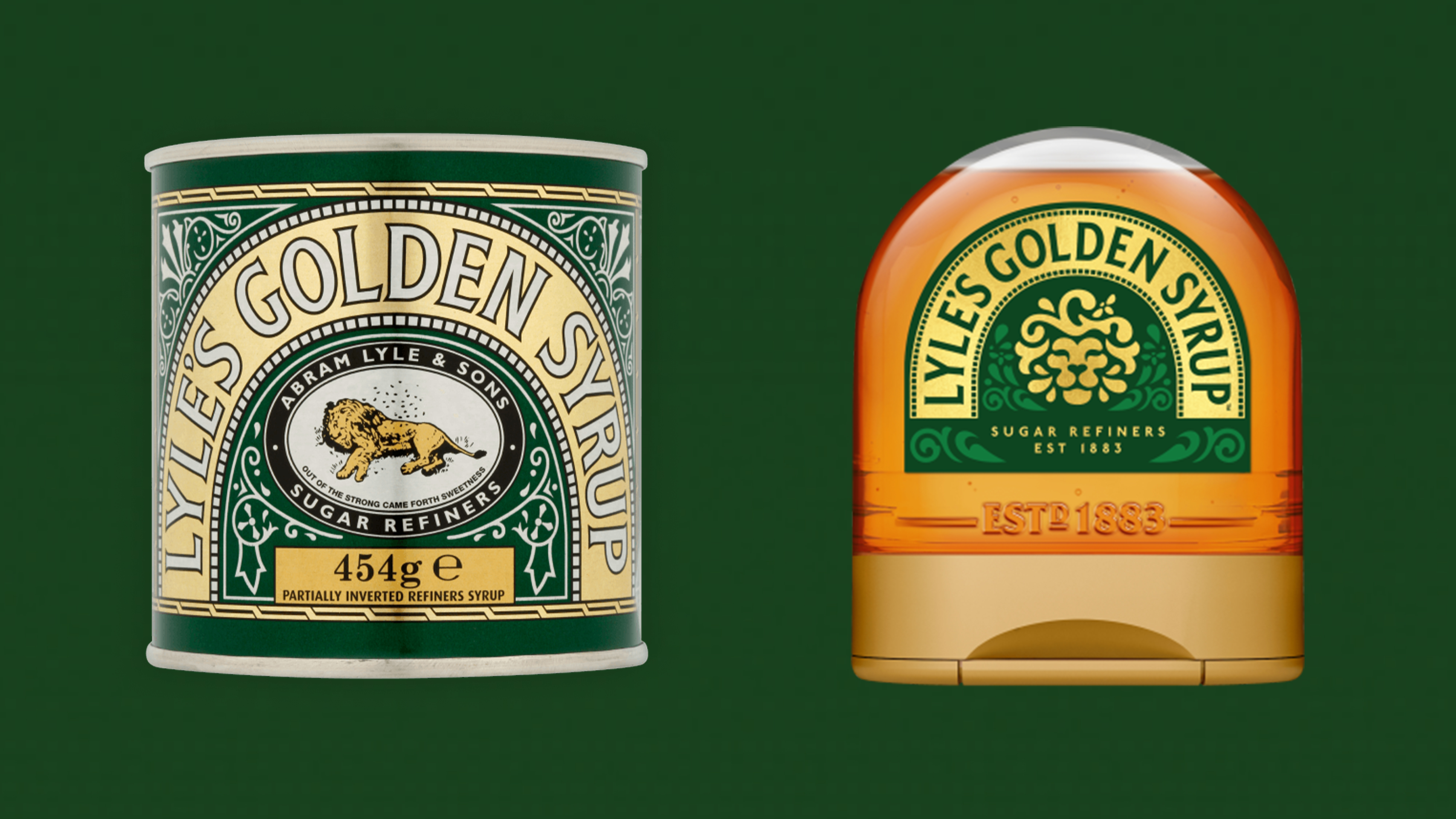
Brand heritage has been in the news lately, with the controversial Lyle's Golden Syrup rebrand causing many to lament the loss of a heritage brand (in this case, a dead lion with flies around it) and WHSmith choosing not to use some golden design from its archives, consisting of a beautiful brand icon (below), and instead going for a rather boring white on blue typeface, a choice which baffled many.
But how can brands get it right when using archival material? Can you ever go back too far? And what happens when brands overlook their heritage? I spoke to Karl Wills, creative director at Taxi Studio to get his top tips for using brand archives.
01. Find the magic

There's no use pulling out any old design from a brand's archives, you've got to find the one that strikes the right chord. "To create unforgettable brand design for our clients, we regularly look to the past to uncover, or rediscover the brand’s core values and the memory structures that may have been lost over time," says Karl.
"Often, you’ll find the brand’s magic lying dormant in its history and, if it still resonates with the audience you’re now targeting, that magic can be made relatable to new customers."
02. Respect the past
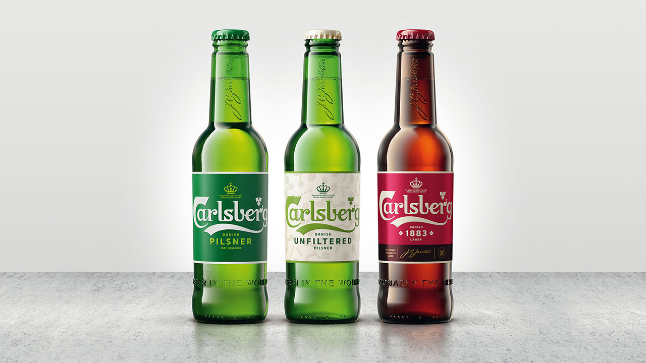
If there are elements of a brand that you want to use to refresh an identity, make sure you respect them. Karl gives an example: "We collaborated with Carlsberg to strategically reposition its global identity and portfolio. Our brand and design strategy was to travel back in time and revisit (and respect) Carlsberg's illustrious past.
"Embracing Danish design principles and J.C. Jacobsen's fervent belief in striving for better became the brand’s new driving force. In looking back, we were able to rejuvenate Carlsberg’s identity system for a better future. "
03. Tread carefully

But if you have a brand that people already love and respect, think twice before you refresh it. "Gap’s attempt to refresh its logo in 2010 received significant backlash from customers and the design community for abandoning its brand history and identity," recalls Karl. "A brands logo is often the first thing that springs to mind, and so changing this with little to no warning can really damage a brands awareness. Gap’s quick decision to revert to their original logo said it all. This is a valuable lesson in the importance of a brand's history."
04. Don't go too far back
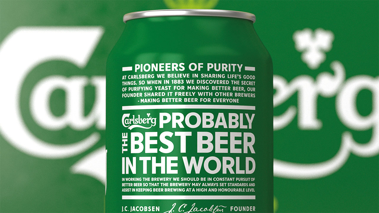
When looking at a brand's archives, you need to pick the era that you want to utilise carefully. "Designers should identify the visual era that best aligns with the brand’s identity, values, and target audience," says Karl. "While drawing inspiration from the past can be effective, going too far back risks feeling outdated or disconnected from the contemporary context. It’s crucial to balance honouring heritage and crafting a fresh, relevant visual narrative that aligns with today."
05. Keep the values in mind
You also need to ensure that you're adhering to your brand's core values when you're evolving brand positioning, says Karl. "By deploying distinctive, consistent, relatable brand assets, values can remain relevant to new audiences. It is much harder to sell a superficial brand story; we need a reason to believe, and that is found within a brand’s heritage."
06. Find other ways to engage
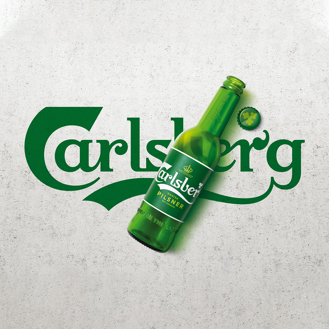
If you want to attract new audiences, particularly Gen Z, then it's not all about nostalgia. You need to find other ways to engage. Karl suggests finding ways to authentically embrace beliefs that are important to consumers, such as diversity and inclusion, championing social and environmental causes, leveraging user-generated content and interactive experiences, and fostering genuine engagement and connection.
Learn more about Taxi Studio or see our reaction to the Carlsberg rebrand in 2018


