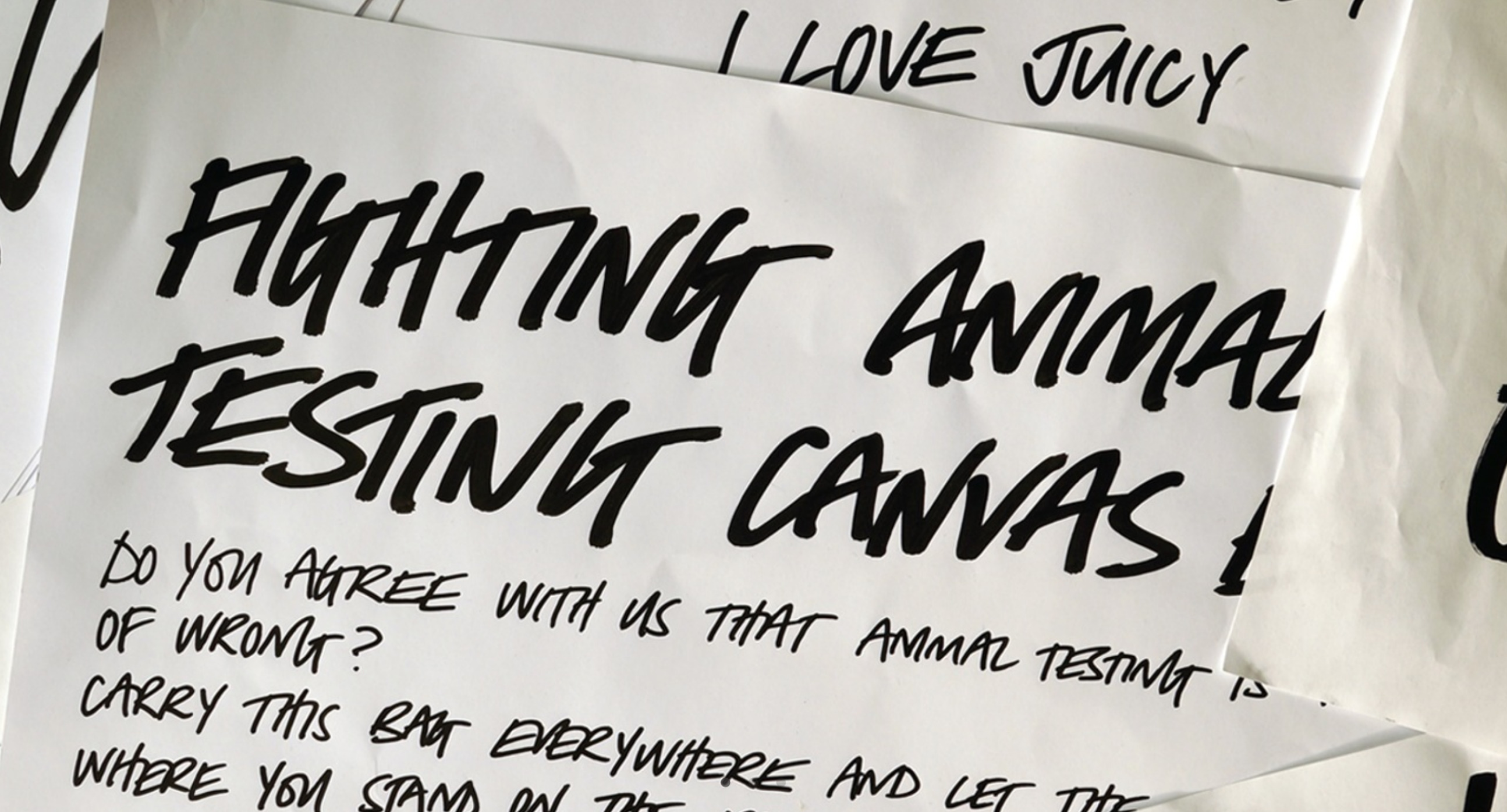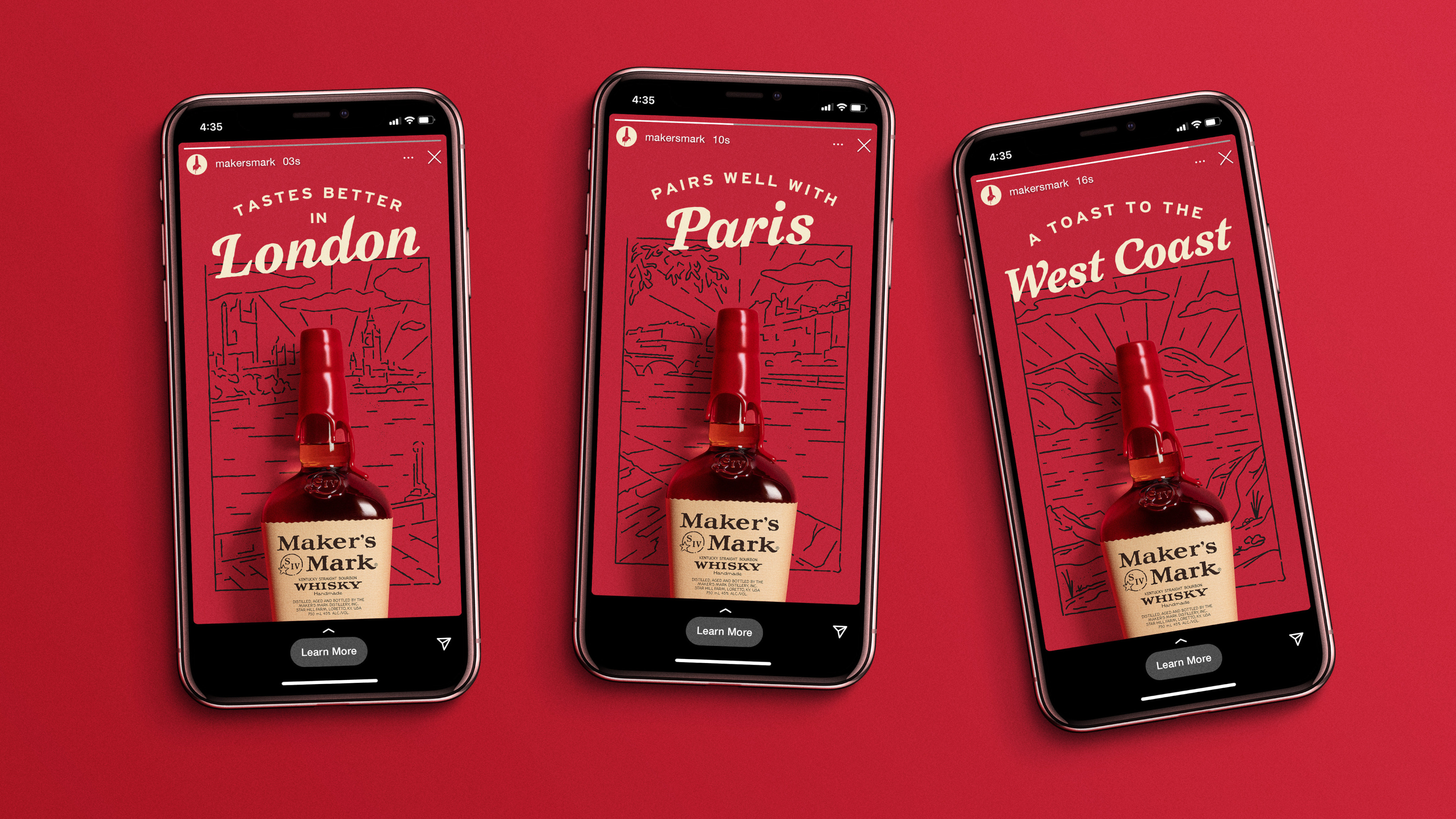
If there’s one thing we hope we’ve demonstrated during Typography Week this week, it’s that good type still matters. Pundits have been predicting the death of the written word since the advent of television, and are still doing so in the era of TikTok. However, for businesses and brands, text is still one of the first and foremost ways their users and customers are going to interact with them, and that means it’s vital to pay attention to how that text is delivered.
As director of Brand Design at Squarespace, Satu Pelkonen sees first-hand the ways that businesses are communicating with their customers — and good typography is still a hugely important component. “Typography in branding is vital because it conveys much more than just words,” she says. “Good typography enhances readability, establishes a brand's tone, and ensures that its message is communicated effectively. Well-chosen typefaces can evoke emotions and associations that align with a brand’s identity, making the brand more memorable and distinct.”
Of course, while people still read, they don’t necessarily read the way they used to, and the needs of modern typography designers are quantifiably different than they were even just a few years ago. We spoke to professional type designers William Richardson of Studio DRAMA and Lukas Paltram of Dalton Maag to find out more about how typography is designed in the 2020s.
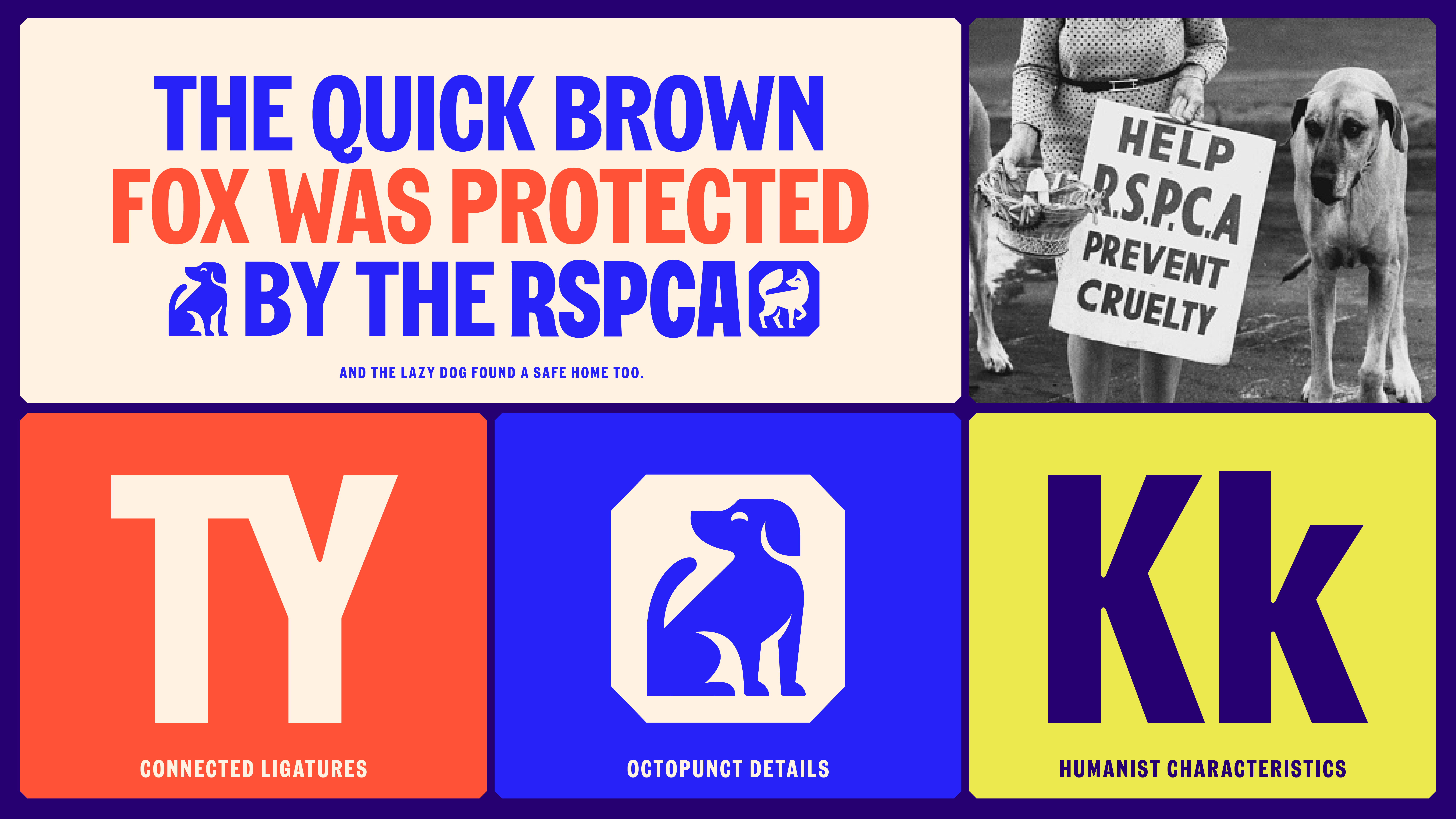
Modern typography design: getting started
Something that’s key to understanding how agencies design type in the modern era is that a huge amount of work happens before a single line or letterform is drawn. Agencies do their research in order to understand exactly who they are designing for.
“We begin by immersing ourselves in the client’s brand,” says Studio DRAMA’s William Richardson. “The first step is a discovery phase where we gather insights into the organisation’s values, mission, and target audience. We conduct workshops to ensure we deeply understand what makes the brand unique. From there, we move into research and ideation, studying the brand’s industry, archives (if applicable), competitors, and cultural context.”
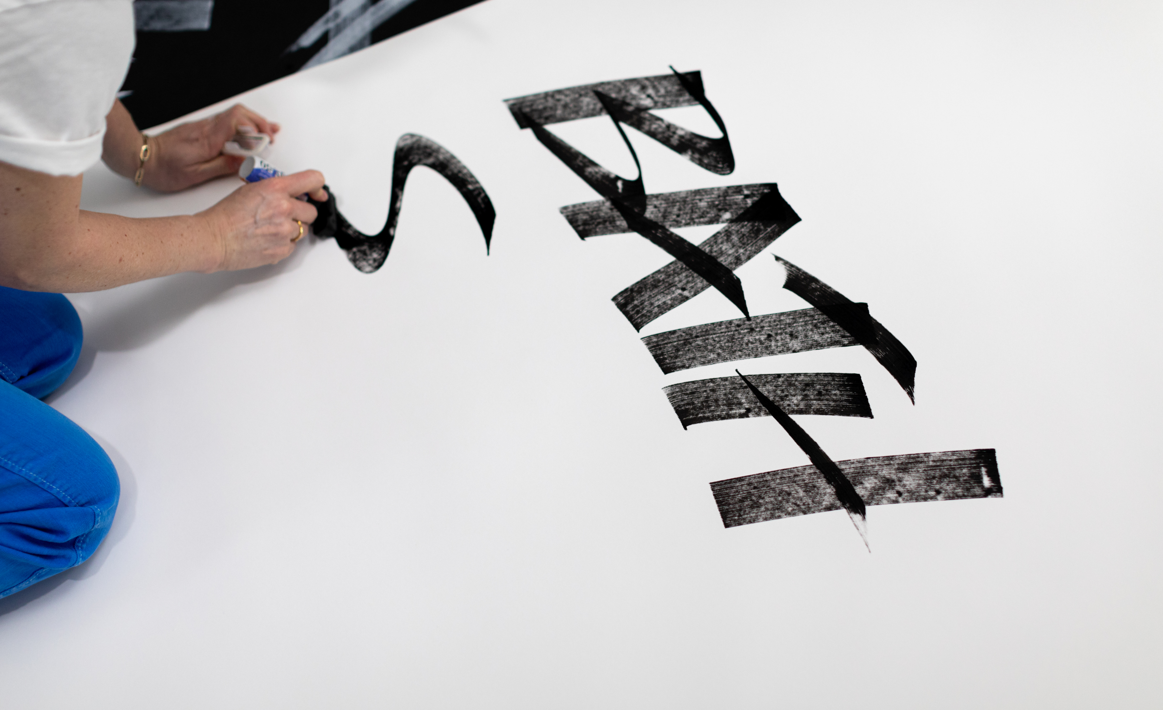
As Lukas Paltram points out, this stage of the process is also an ideal opportunity for collaboration. “Our process typically begins with a research phase that includes a workshop with the client,” he says. “This helps us understand the brand and its creative, technical, and logistical requirements. Together, we set the design direction and build trust. As a type design process isn’t something most people go through more than once, establishing a common language and mutual understanding is crucial for a successful outcome.”
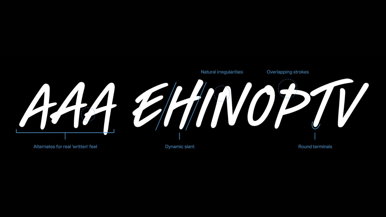
Modern typography: modern needs
Working in the digital age means that type has to be readable across all sorts of different qualities. Type for a brand’s website, for instance, needs to look good on a 5-inch budget smartphone and look good on a giant, curved 4K monitor. For type designers, once initial concepts are nailed down, the next step is to
“Once we narrow down the concepts, we refine a few options, considering factors like distinctiveness, readability, scalability, and usability across different applications,” says Studio DRAMA’s William Richardson. “Testing is crucial — each option is tested across various formats, from digital and print to large-scale applications and small-scale uses like business cards or app icons.”
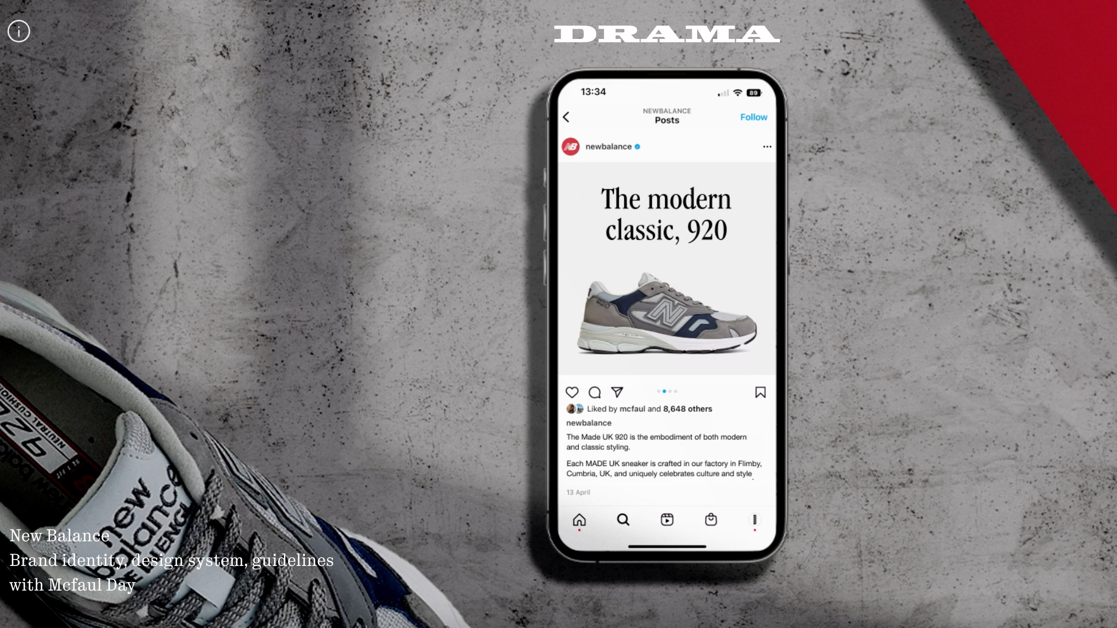
It’s a similar story at Dalton Maag. “After the design is completed, we proceed with precise font engineering and screen optimization to ensure the technical excellence of the files,” says Lukas Paltram. “This is a quality that is often overlooked in the industry.”
“Custom fonts are built to last for years, sometimes decades, so we do everything we can to build software that is solid and futureproof with methodical testing and quality assurance. We provide beta files before the final delivery in all required file formats, including web, app, desktop files, all in traditional static font files as well as dynamic variable fonts.”
Modern typography design: modern technology
Naturally, the world of modern typography is pretty different from the days of hand-cut letterforms and printing presses. Studio DRAMA’s Will Richardson explains: “Modern technology has certainly transformed type design, and while it introduces new complexities, it has largely made the process easier and more innovative. One of the most significant advancements is the software we use. Applications like Glyphs have streamlined the process of designing and developing typefaces, offering a user-friendly interface that allows us to create and refine type with great precision.”
“Another major innovation is variable font technology, which has opened up a world of experimentation within the digital space. This technology allows a single typeface to have a range of variations — such as weight, width, and slant — all in one file. The flexibility of variable fonts offers designers more creative freedom and adaptability, especially in responsive digital environments, making it a powerful tool for both branding and usability.”
“We’re also keeping a close eye on the potential of AI, particularly in its ability to assist with the rollout of more generic typefaces and complex language scripts. While AI is still in its early stages in terms of type design, it holds promise for automating more routine tasks, such as creating multilingual type systems or refining existing typefaces for broader use.”
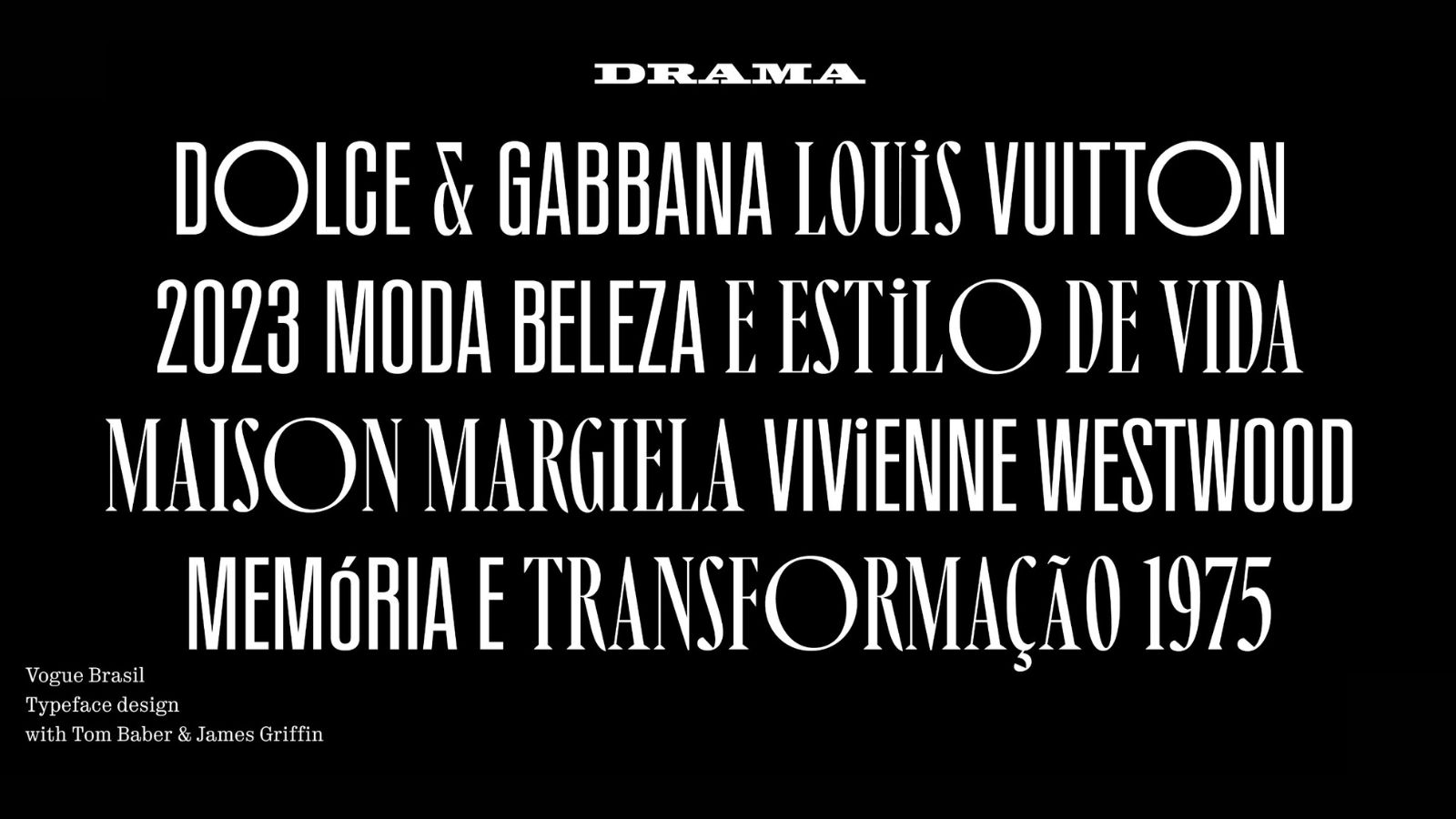
Like other disciplines, typography has also become more accessible to the average person. Just like the way that programs like Adobe Premiere took video editing from something that could only be done in select studios in Soho to something anyone could do on a laptop at home, typography and type design are much easier to have a crack at than they used to be.
“The barriers imposed by expensive and clunky software get lower, and also there’s a huge amount of training resources, online courses, videos, and tutorials available, and there have been significant advancements in the possibility of collaborative work,” says Dalton Maag’s Lukas Paltram.
Of course, there is an important caveat: “It’s as true as with any other design discipline — if you’re interested you’ll need to keep going. there’s no shortcut or way to avoid the need to put in the hours and learn the basics.”
