If you’re currently decorating or redecorating your home or even just a single room in it, you might be wondering, how many colours should you have in a room? And while no rules are necessarily set in stone, there are guidelines that even experts recommend sticking to.
In this case, three is the magic number of the best colour combinations that all the pros agree upon when asked how many colours one should ideally incorporate into a single room. And the formula that the number is best applied in is the 60-30-10 colour rule.
‘In interior design, the 60-30-10 rule is a popular guideline for applying colour effectively within a space,’ says Caroline Woolmer, head of design at I Love Wallpaper. ‘It divides your palette into 60% dominant colour, 30% secondary colour, and 10% accent colour. This approach helps create visual harmony and depth and is especially useful when working with bold or contrasting hues.’
Why the three-colour rule?
Simply put, the three-colour rule dictates that you stick to a main palette of three colours when decorating any room. This will ensure that the end result is visually appealing and not an overwhelming riot on the senses – or conversely, overly coordinated and dull.
'The three-colour rule is one that you should probably aim to break in the long run,' Marianne Shillingford, creative director at Dulux, tells us. 'But basically, it’s all about sticking to three colours and varying tones of the same colours in the accessories to create a coordinated look. It’s an elegant and simple solution for when decorating choices are bamboozling you.'
Marianne continues, ‘The more confident you are the more colours you can add but it needs to be considered, or the outcome can look very busy and overwhelming.’
Once you’re no longer a beginner and you get more comfortable with creating a colour scheme, learning how to use the colour wheel and various tones of the same colour family will be invaluable in adding more colours to your space.
The alternative way the three-rule is often referred to - other than the 60-30-10 rule - is actually the 70-20-10 rule instead.
'The 70-20-10 rule is really just a reminder to first use your dominant colour in the room, then add the complementary colour and then add a disruptor colour,' adds Ann Marie Cousins, interior designer and founder of AMC Design. 'Your dominant is often a neutral.'
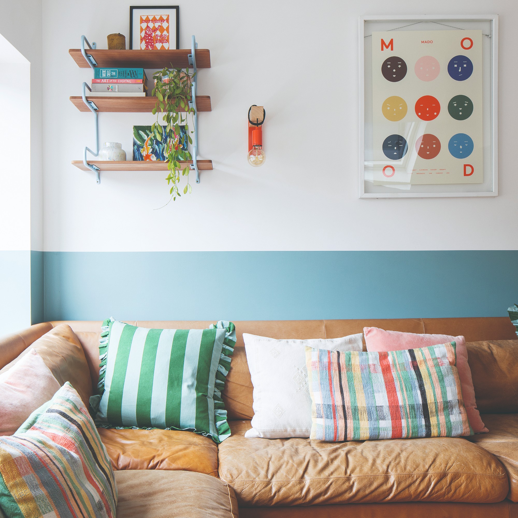
Three-colour example:
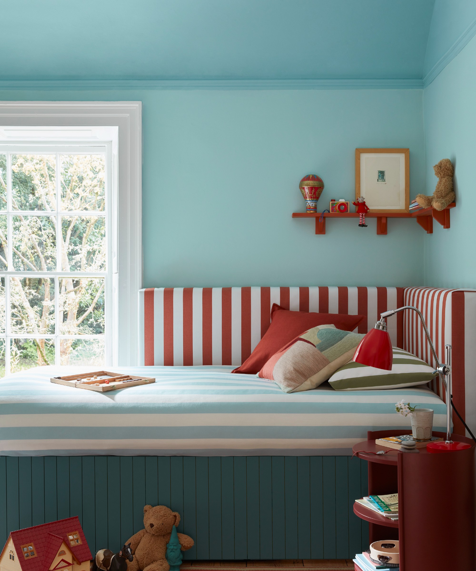
Part of Lick's colour palette for 2025, this soft blue with cool grey undertones is the perfect calming, soothing shades for the walls of your living room or bedroom.
Baby blue paired with rich chocolate brown is a match made in heaven. So it would make a great secondary colour for your space, seen on some of the larger pieces and/or features of the room like this beautifully curved sofa.
This lovely glossy lamp doesn't just look like a designer piece, its on-trend dark cherry red colourway also pairs perfectly with baby blues as an accent colour for your room.
Can you use more than three colours?
Even though three is the golden number, that doesn’t mean you should necessarily feel tied down by it. Think of three colours as a starting point and as you get more confident with colour paletting and choosing the likes of accent colour ideas, you can freestyle a little more.
‘Using different tones of the same colour on different elements of the room or different harmonious shades that sit next to each other on the colour wheel can build on the power of three to create a look that is distinctly you, makes the most of your style and you will love for ever. Make three colours your starting point,’ Marianne at Dulux advises.
But with the arrival of colour drenching and this year, a new take on the look, double drenching, using colour in interiors is becoming increasingly more about experimenting and less about rules.
‘Our understanding of the emotional and atmospheric impact of colour has grown immensely in recent years,’ says Ruth Mottershead, creative director at Little Greene. ‘Since we introduced the concept of colour drenching in 2021, we’ve witnessed a remarkable shift in how people approach decorating – moving away from rigid contrasts to embrace richer, enveloping hues used across multiple surfaces. Now, with double drenching, we’re seeing even greater confidence with colour – layered tonal schemes using two or more related hues, creating sophisticated interiors full of character and subtlety. The key to this approach lies in thoughtful pairing – harmonious undertones allow colours to flow seamlessly together, resulting in spaces that feel both curated and comfortingly immersive.'
But the experts agree that going over five different colours in one room is likely too many to handle, ‘Once you go beyond five colours, a room can start to feel visually overwhelming. Too many competing tones can make the space feel busy rather than vibrant. If you’re drawn to bold designs, try using variations within the same palette or complement the look with neutrals,’ Caroline at I Love Wallpaper recommends.
FAQs
Do different tones or shades count as different colours?
Each of our experts views this slightly differently. 'When considering whether different tones or shades counters different colours, it really depends on how different those shades are,' says Ann Marie. 'If you are going for a monochrome palette – for example, only using shades of green to decorate your room – and those shades are very close to another, we would normally count them as one colour, at least for the purpose of adding interest. So if you had a forest green sofa, and a forest green armchair, perhaps with a texture, but very similar colour, we would count that as one colour because of the visual interest it provides.
'You therefore need two other colours in order to add interest to the room. If your shades are only fractionally different colours the eye will read them as all being the same colour.'
Rob Abrahams, founder and CEO of Coat Paints, on the other hand, believes that all tones and shades can count as different colours. 'Tones are pure colours with the addition of black pigment,' he says, 'and a shade is the addition of grey pigment. Adding black will make the colour darker, and adding grey will reduce the "chroma", making the colour appear more muted – effectively taking the brightness out.'
'The amount of black or grey pigment you add to a colour can have a wild impact, making the same pure colour look entirely different. So different tones or shades of the same colour can, in effect, look like completely different colours to most people.'
'In essence, "shade" is another word for describing a colour and ‘tone’ is a version of the same colour that is lighter or darker,' adds Marianne. 'Different tones of one colour can be used effectively in a room to alter the way it looks in terms of size, height and width. Use light tones to make walls and objects look further away from you and deeper tones to make walls and objects look closer to you and more impactful.'
Top tip: 'We all see colour differently,' says Sophie Clemson, interior designer at The Living House. 'If you’re an interior designer or a colour expert, you're more likely to pick up on different tones within one colour. For instance, some greys can have purple or blue tones, which can affect how a room feels. This is why studying the paint colour is important when choosing a colour for your room – they can look different depending on the natural light.'
When it comes to adding colour to your home, it's always encouraged to be bold and have fun. But at the same time, consider your choices before taking the leap and make sure the colours you're choosing work well together and don't overwhelm the space in their number.