Colourful dopamine decorating and maximalist aesthetics might be having a moment, but nothing makes a home feel calm and comforting than decorating with neutrals.
This is easier said than done. Of all the best colour combinations, neutrals can be the trickiest to get right. Caroline Milns, head of interior design at architecture consultancy Zulufish explains, ‘Neutrals are often seen as an easy palette to introduce, but in fact they can be the hardest to get right as there is nowhere to hide mistakes and the scheme can easily slip into being beige and boring.’
Interior designer (and neutrals enthusiast) Poonam Shah advises, ‘Varying the tones within your neutral colour palette can bring a room to life. For example, combining warm taupes with cool greys and soft beiges or more earthy tones adds depth and keeps the eye engaged. Neutrals offer a timeless and versatile colour palette that can transform any space into a calming and elegant sanctuary.’
Decorating with neutrals
They might be easy on the eye, but neutrals can be surprisingly hard to get right. We asked experts including interior designers, stylists, paint and colour experts for their advice on making them look up to date and utterly gorgeous every time…
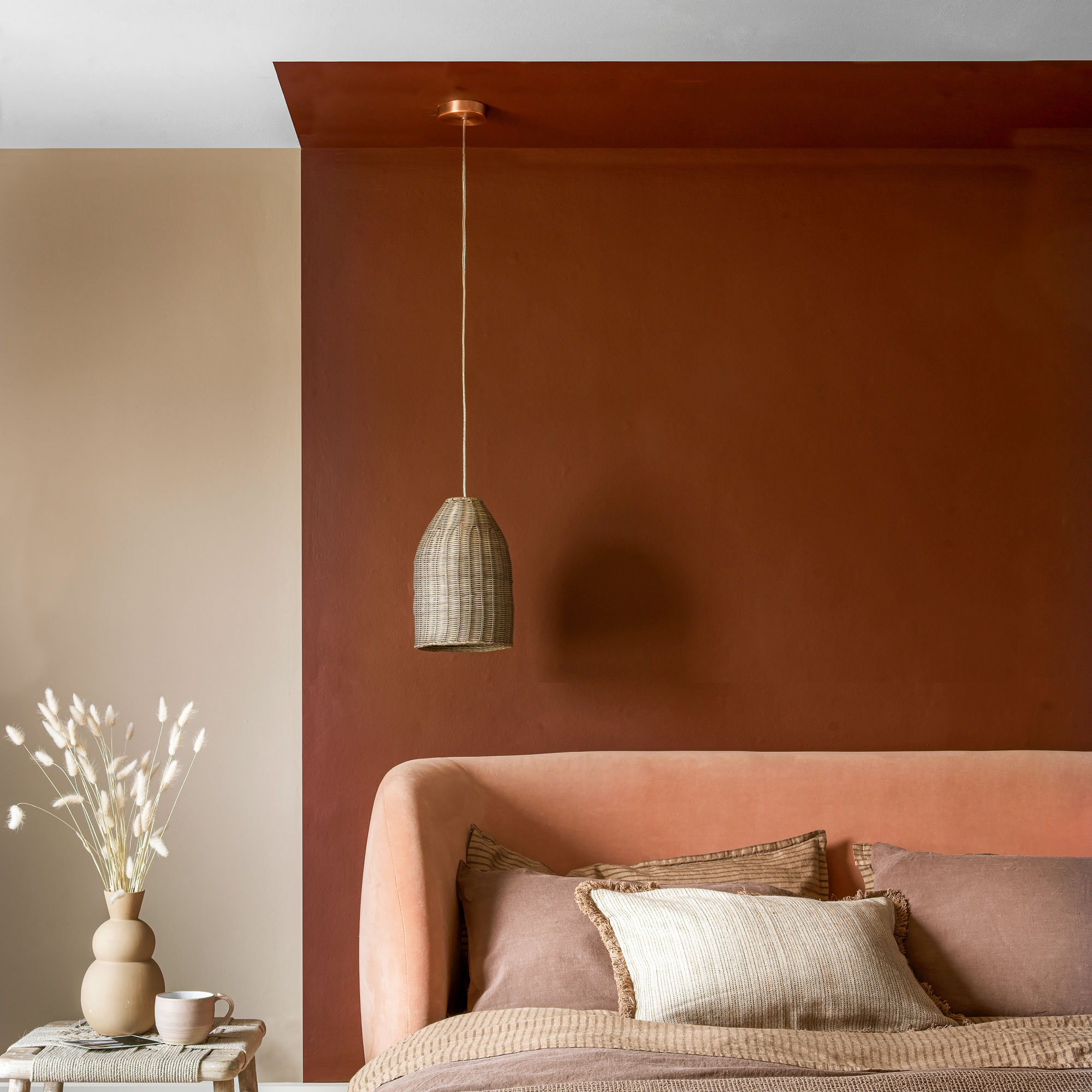
1. Add drama with dark brown
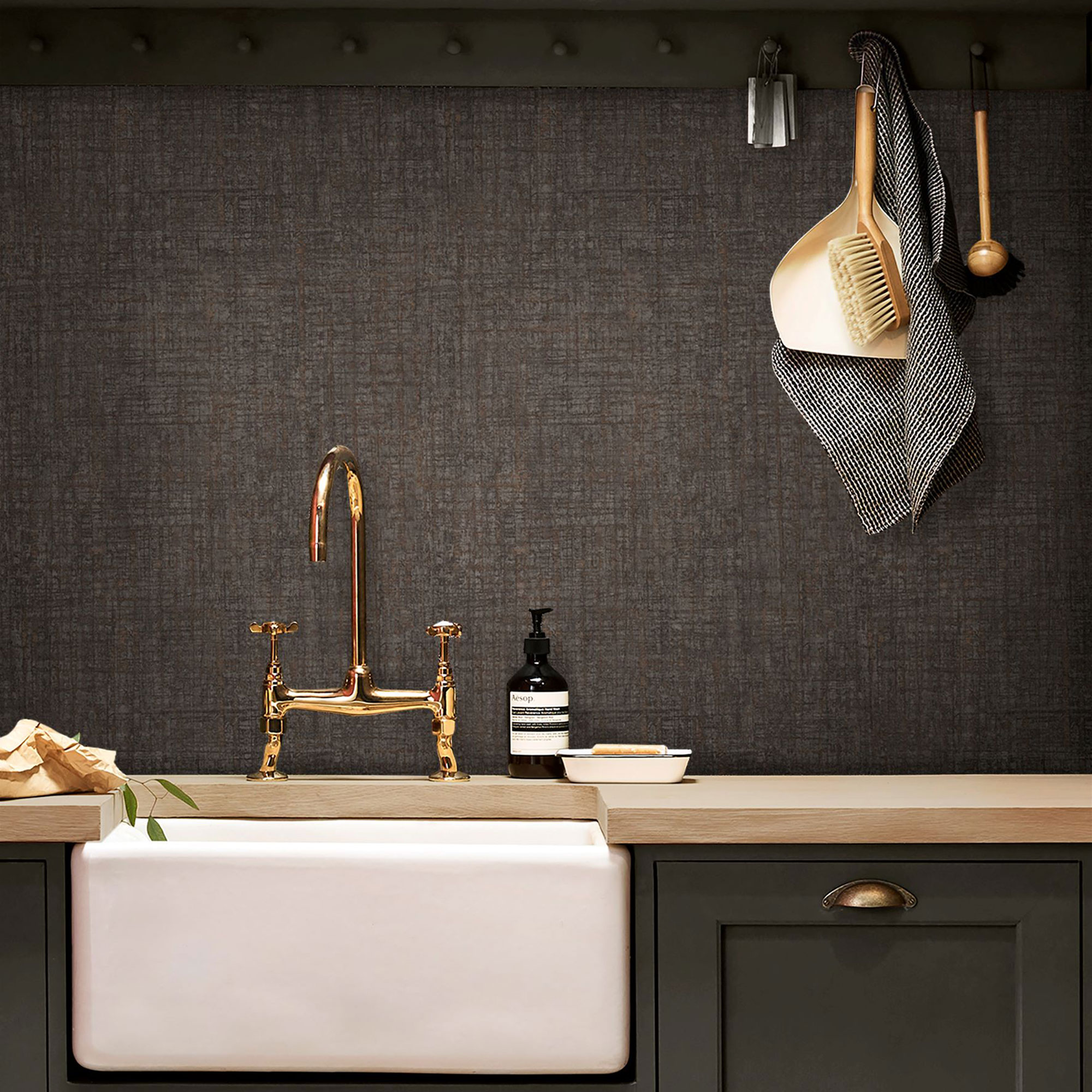
Chocolate browns are trending as a feature wall idea or as an accent on panelling or woodwork trim. Try Claybrook’s Bailey Brown or Earthborn’s Rocky Horse. Interiors stylist Sara Bird explains, ‘Darker neutrals make a great starting base for a soulful room scheme. Bringing depth with their richer tones, they are particularly useful for creating character in contemporary schemes or new builds. They also add atmosphere which can be manipulated with lighting and shadow. Great for cosy vibes in a reading nook, a TV snug or for creating intimacy in a dining area.’
If putting dark shades on the wall doesn’t appeal, consider using a statement piece of furniture in a dark wood finish instead. Danielle Le Vaillant, a member of Cox & Cox’s creative team, comments, ‘Dark wood furniture brings a sophisticated “inherited” look for lovers of old-money style. A bold piece like our Teya sideboard will add both warmth and drama to your room.’
2. Use earthy pink as a neutral
Move on from ‘Millennial pink’ – the best pink paint for a neutral scheme isn’t cutesy or sugary, it’s raw and earthy. Patrick O’Donnell, brand ambassador for Farrow & Ball says, ‘Pinks can work wonderfully in the place of a traditional neutral. Setting Plaster, or the slightly deeper Templeton Pink, are flexible enough to bring warmth to a north-facing space or “knock back” to a gentle neutral in sun-drenched spaces. Earthy pinks are also a great choice for kitchen cabinetry.’
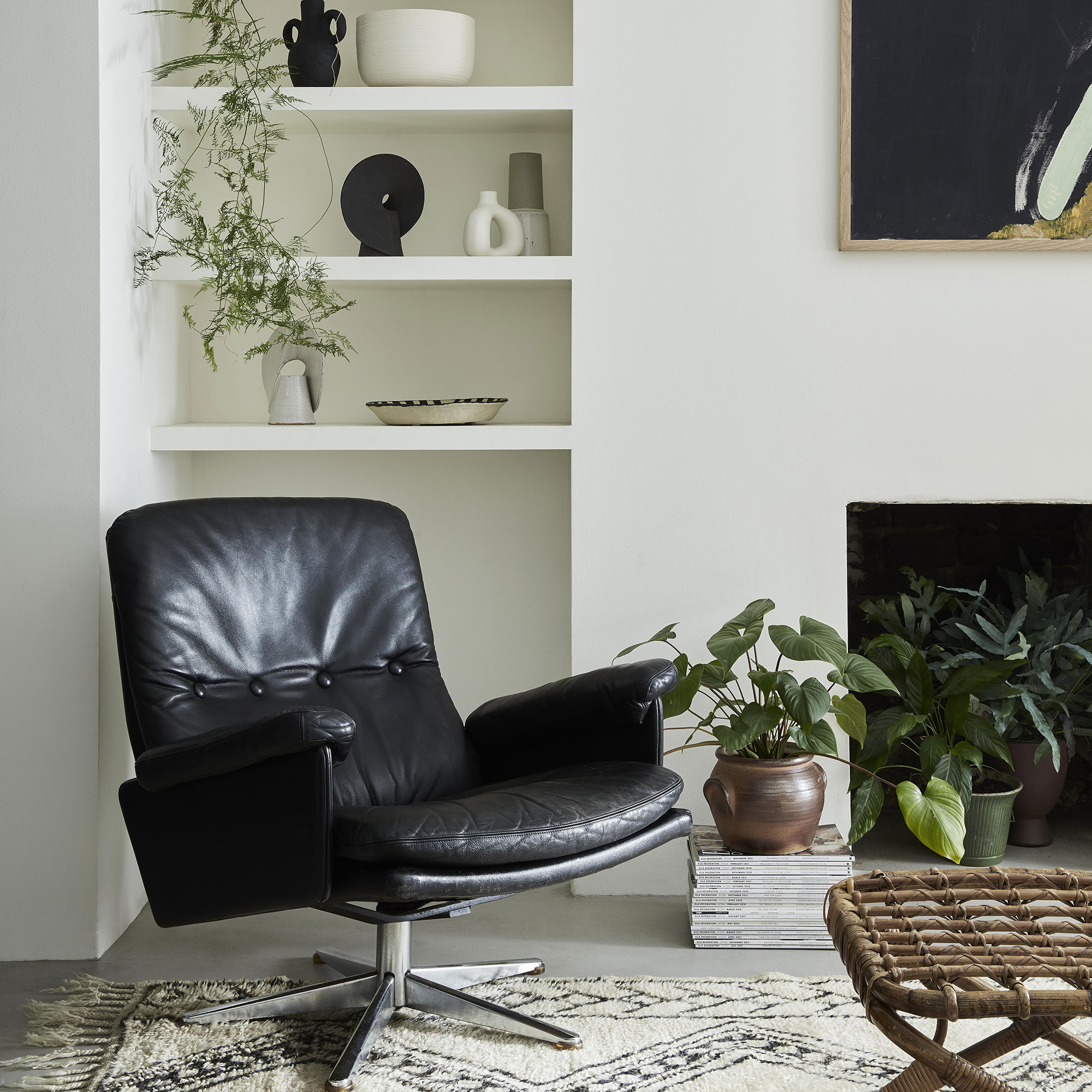
3. Get an upscale look with black accents
Chances are, you’re using neutrals because you need a small space to look bigger and brighter. The danger here is that your room will end up beige and blah. Adding black accents will give it structure without going over to the dark side. Interiors stylist Laurie Davidson explains how to make it work: ‘Adding black is a great way to add contrast in a neutral scheme. You don’t need to overload it. Small hits, from black-framed artwork to stripes on a cushion or a pair of table lamps can be enough to make an impact.’
In a hallway where accessories aren’t in abundance, painting trim in a black such as Mylands’ Woodnight JB.12 is a smart way to highlight period door frames and deep skirting or try taking it up the staircase handrail and newel posts. Black and white kitchens also look particularly sharp and simple.
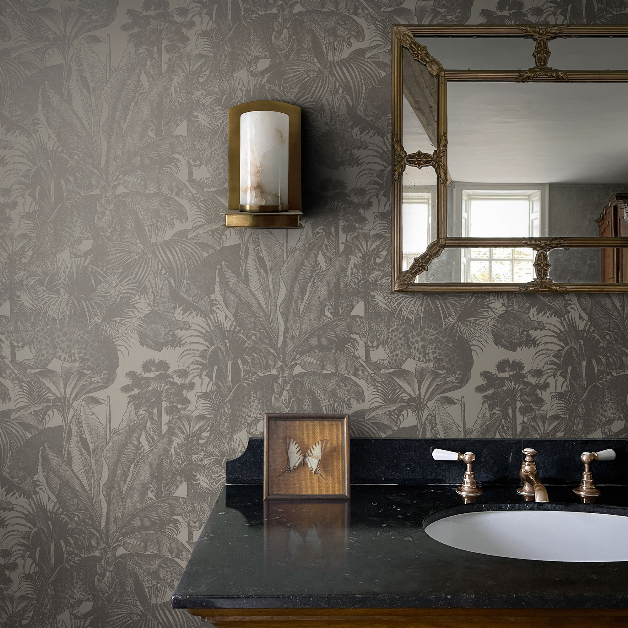
4. Start with a gentle pattern
‘Incorporating tonal patterns into a neutral colour scheme can add depth, interest and texture to a space without overwhelming the serenity and balance that neutrals provide,’ says James Greenwood, colour and interior expert at Graham & Brown.
Take the pattern as your starting point and repeat neutral colours from it on other surfaces and upholstery. ‘This ensures harmony and prevents the pattern from clashing with the rest of the decor,’ explains James. ‘Ensure that areas of the pattern are balanced with solid neutral colour. For example, if you have a patterned sofa, have plain neutral walls and flooring.’
For a modern neutral look, a wallpapered feature wall will create a great backdrop for a bed, sofa or dining table. Or add a textural pattern to a bedroom with tonal curtains or a rug. For a traditional aesthetic, look at classic William Morris patterns reworked in modern neutrals or for a crisp, contemporary style try a monochrome mural from Graham & Brown.
5. Layer tones of one colour

Kelly Collins, interior designer and Head of Creative at furniture company Swyft reports, ‘Something I’m seeing at trade shows and across the industry is using one neutral in different tones within the same room. For example, using taupe on the walls but bringing in a warm brown for the woodwork. Playing with different tones of the same neutral adds interest without being overstimulating, and creates a really relaxing yet luxurious feel.’
Interior designer Sophie Clemson of The Living House brings all five walls into play: ‘I use several depths of one neutral across the walls, woodwork and ceiling.’ Some paint companies make this easy for you. For example, says Sophie, ‘Little Greene has different depths of one colour, such as Slaked Lime in Mid, Deep and Dark.’
Also look out for Paint & Paper Library’s colour ‘families’ featuring five tones for easy mixing.
6. Mix an earthy palette
Laurie Davidson notes, ‘There’s been a real shift towards dusty, desert colours of late. Think sunset pinks, browns, terracotta and rusts. This trend is ideal for bringing a neutral interior to life.’
Encompassing ‘dirty’ neutrals from greige through to deep, mahogany tones, it’s a palette that works in spaces designed for relaxation, such as living room colour schemes and bedroom colour schemes. Farrow & Ball’s Patrick O’Donnell loves these shades in kitchens, too: ‘Earth shades from mid neutrals like Bone or Stony Ground to darks like Pantalon deliver subtle warmth. They make a great choice for kitchens, small or large.’
Flora Hogg, interior designer and colour consultant at Craig & Rose interprets this trend as a wider palette including brownish yellows and greens, too: ‘Lucienne Olive, a subdued peat green, makes a versatile foundation for an intimate and welcoming feel. Teamed with a burst of yellow like Jarosite, it imitates the dappled light filtering through the trees. Earthy colours rekindle our connection with nature and have grounding properties.’
7. Swap flat colour for metallic
Gold, silver bronze… nothing lifts a room like the shine of precious metals – especially in a small space like a downstairs bathroom. James Watkins, co-founder of Divine Savages comments, ‘We love using Faunacation wallpaper in Savannah Gold on the walls in a living room or bathroom. With a soft cream base and stunning gold print detail, it’s sophisticated and definitely not boring! Muted tones create a calm feel, but the soft shimmer of a metallic creates a magical effect as the daylight changes in a room.’
8. Create a sensory experience
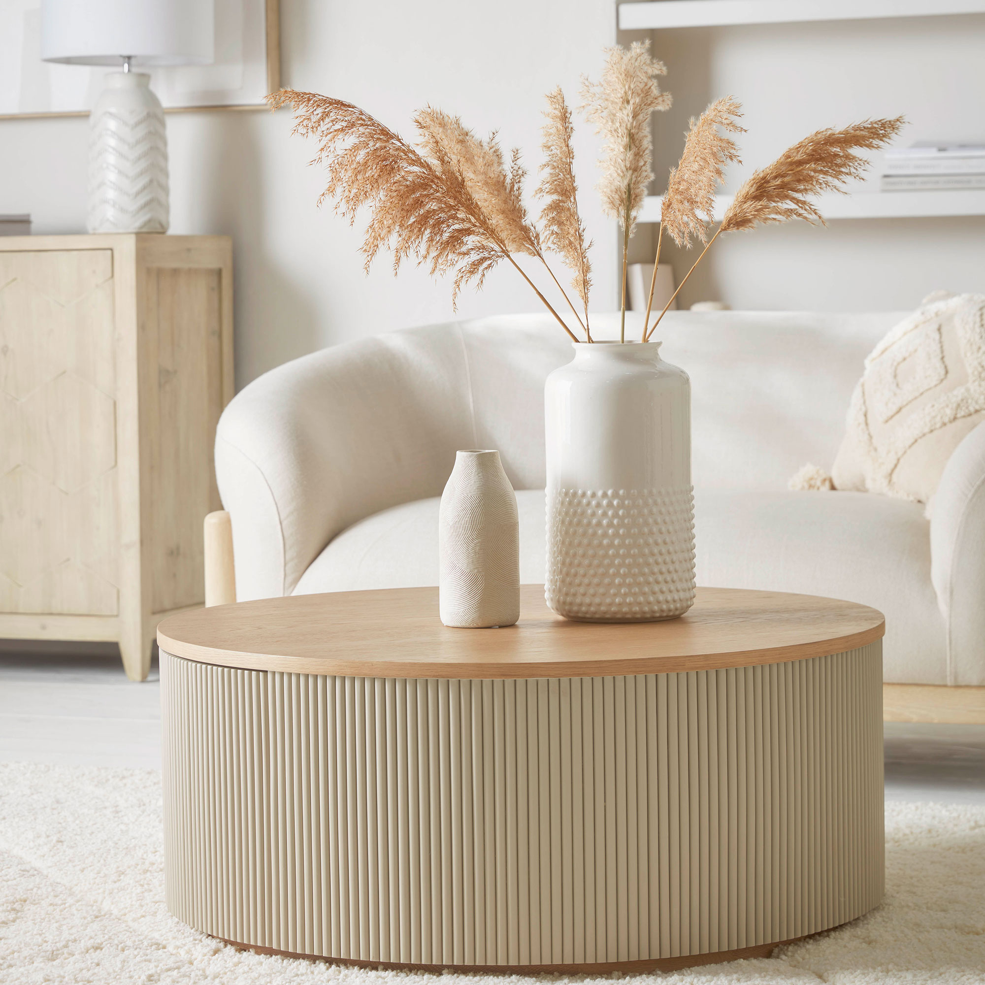
‘To prevent a neutral colour scheme feeling “flat”, we often layer textures through the soft furnishings, each piece making its own statement,’ says interior designer Louise Bradley. ‘Textures bring a sensory element to an interior. Where colour makes an instant impact, texture builds a soft and harmonious feel, imbuing a room with calm and turning it into a sanctuary to improve your wellbeing.’
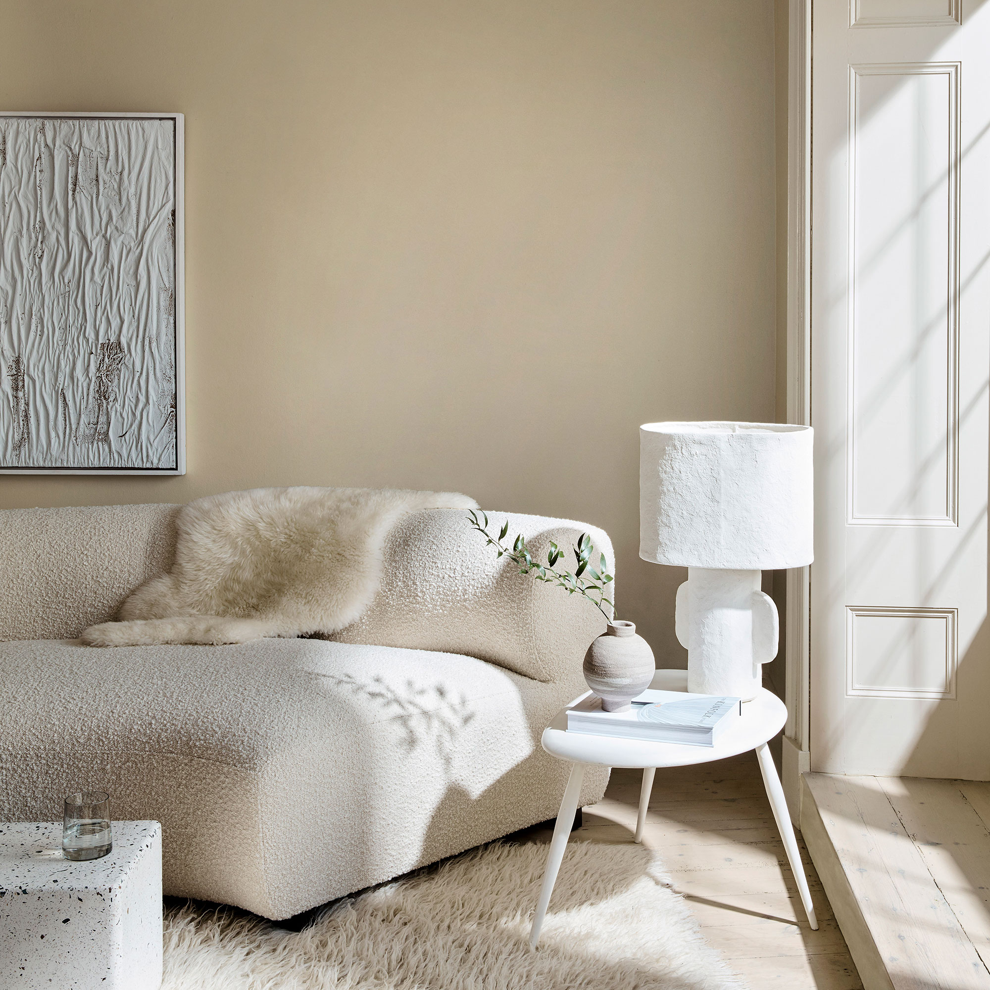
There are many ways to add texture to a neutral living room idea. Danielle Le Vaillant from Cox & Cox recommends, ‘raised textures such as tufted cushion covers. For a premium look, natural fabrics such as cotton, wool and sheepskin are the most considered choices as they are pleasurable to the touch as well as the eye.’
For interior designer Poonam Shah, elements from nature are equally important: ‘Wood, stone and greenery add warmth and organic beauty to a neutral colour palette. For example, you could add a rustic wooden coffee table, a stone fireplace surround or an oversized plant to create an inviting atmosphere.’
9. Update cool greys with warmer shades
Those steel-and-concrete mid-century greys had a hold on us for a long time and it proved challenging to warm up those blue or purple-undertoned shades for a look that felt as soothing as it did sophisticated. Now, pale tones with warmer hints of brown, yellow or khaki tints are the neutrals of choice.
So, what paint colours do interior designers love? Poonam Shah shares, ‘My personal favourite, go-to neutral paints are Egyptian Cotton by Dulux, Skimming Stone by Farrow & Ball and Collingwood by Benjamin Moore.
Louise Bradley reveals, ‘We often opt for Little Greene’s Slaked Lime as a soft and warming neutral. It’s bright but not too harsh and works well for all rooms in the home, particularly a bedroom or hallway.’
Sophie Clemson advises, ‘If you have a north-facing room, choose a colour that has yellow undertones to add warmth. Look at Farrow & Ball’s White Tie and Slate III by Paint & Paper Library.’
10. Swap out Pure Brilliant White
The absence of pigment in Pure Brilliant White means that it reflects and enhances the properties of the light in the room and the shadows cast in it. In a north-facing room it will look blue; in a south-facing room, pink; in an artificially lit room, yellow or blue, depending on the warmth of the bulb used. Choosing a white that works with the light will make all the difference, especially if you want to create a cosy-feeling white living room or bedroom.
Patrick O’Donnell says, ‘When choosing a white, the most important factor is the light coming into your room. A “clean” white can feel too chilly, so consider whites that have underlying red or yellow notes, such as Pointing or the more nuanced Joa’s White with its mellow red notes.
Secondly, if you are using white on your trim and mouldings, make sure it goes with your wall colour. It should have underlying tonal notes to match it. For example, if you are using a dark green such as Green Smoke, try a slightly dirtier white with green undertones, such as Old White. This will create a softer contrast than a “true” white.’
Get the look
FAQs
What colours go best with neutrals?
Ruth Mottershead, Creative Director at Little Greene, says, ‘Neutrals are a fantastic foundation for introducing a highlight colour or pairing together with deeper shades. A gentle, warm neutral such as Little Greene’s Mochi is highly versatiles and allows you to add deeper accent colour or gentle, fresher whites to help zone areas and add interest. Consider pairing it with a deeper brown on skirting and doors, and a fresh, bright white on the ceiling. Alternatively, bring out its tones by pairing it with pinks, gentle greens or cool greys.’
Do neutrals ever go out of style?
No, says Poonam Shah: ‘Neutrals offer a sense of quiet luxury and, used correctly, can elevate any space.’
However, home decor trends do come and go within neutrals. Ruth Mottershead explains, ‘Today’s neutrals are not bland. It’s not about a return to beige, greige or even magnolia, but a new way of mixing warmer, natural shades to create schemes with longevity.’