
A living room color scheme can be sometimes tricky to get right, especially if you're trying to juggle a lot of bright tones, and are using color as the anchor to lift the room's look. The good news is, there are several interesting ways and design tricks that can solve that issue for you. After all, color doesn't only need to come from paint – furnishings, furniture, light fixtures, accessories, and artwork too can be a great place to start building a scheme.
We spoke to design pros from around the world to give us a lowdown on interesting living room color ideas, and how to create one that looks timeless and always on-trend. Here are the spaces that show how it's done.
1. Contrast the walls with the ceiling
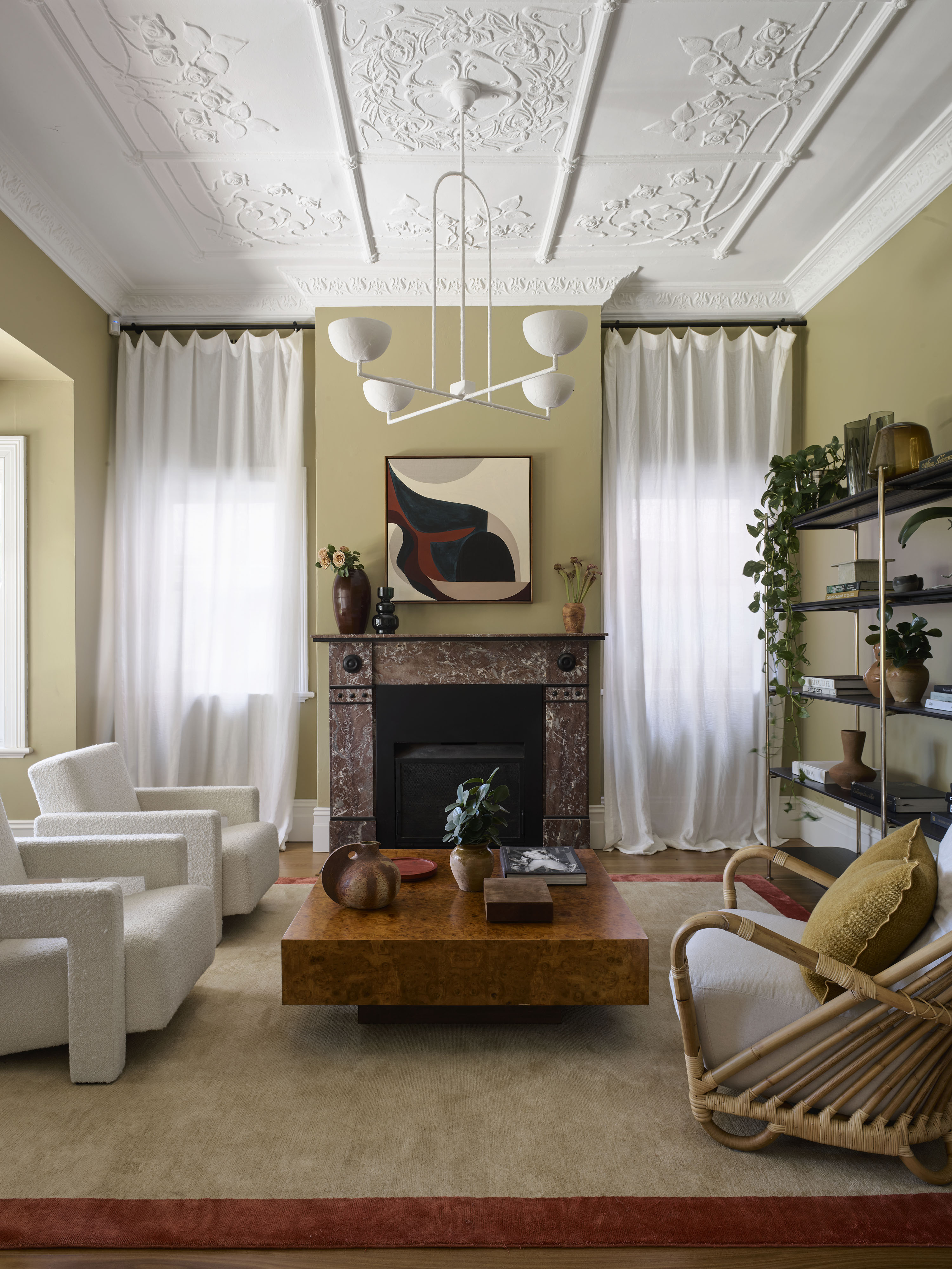
A room wrapped in a rich, warm color can make it feel like a hug. For a cozy living room, consider a tone that reminds you of nature. The inclusion of green or yellow is a wonderful way to give the space a pleasant and inviting look. To make the scheme feel timeless and not too stark, especially if you're drenching all walls in the same hue, think of paint with a grey, brown or black undertone. Add wooden elements to further warm up the scheme. For a lovely contrast, go with a neutral ceiling.
'The palette of eucalyptus greens and greys is a calming reminder of the house’s connection to its landscape,' say Juliette Arent and Sarah-Jane Pyke, founders of Arent&Pyke. 'These beautiful tones intensify or soften as the light changes, with two spaces in particular – one old, one new – revealing their range.'
2. Bring in color via art and decor

Want to liven up a living room without redecorating or painting? Colorful accessories such as curios, vases, artworks, and more can be the perfect way to change a room's tone. Choose a nice, grounding backdrop color such as grey, cream, or beige for an elegant living room. The mix of both light and bright colors, along with eclectic accessories will create a one-of-a-kind living room.
A great color to accessorize interiors with is pink – versatile, available in several incarnations, and full of personality.
'When it comes to choosing living room colors, I love the tone of pink as it is fashionable and available in several shades such as pale pink, nude, terracotta, candy, coral, salmon, and more,' says interior designer Patricia Bustos de la Torre. If you're looking to lift a muted scheme, a peppering of pink can give the room a classic twist. 'It is a positive color and I believe an irreplaceable tone in interiors.'
3. Inject color with floor tiles
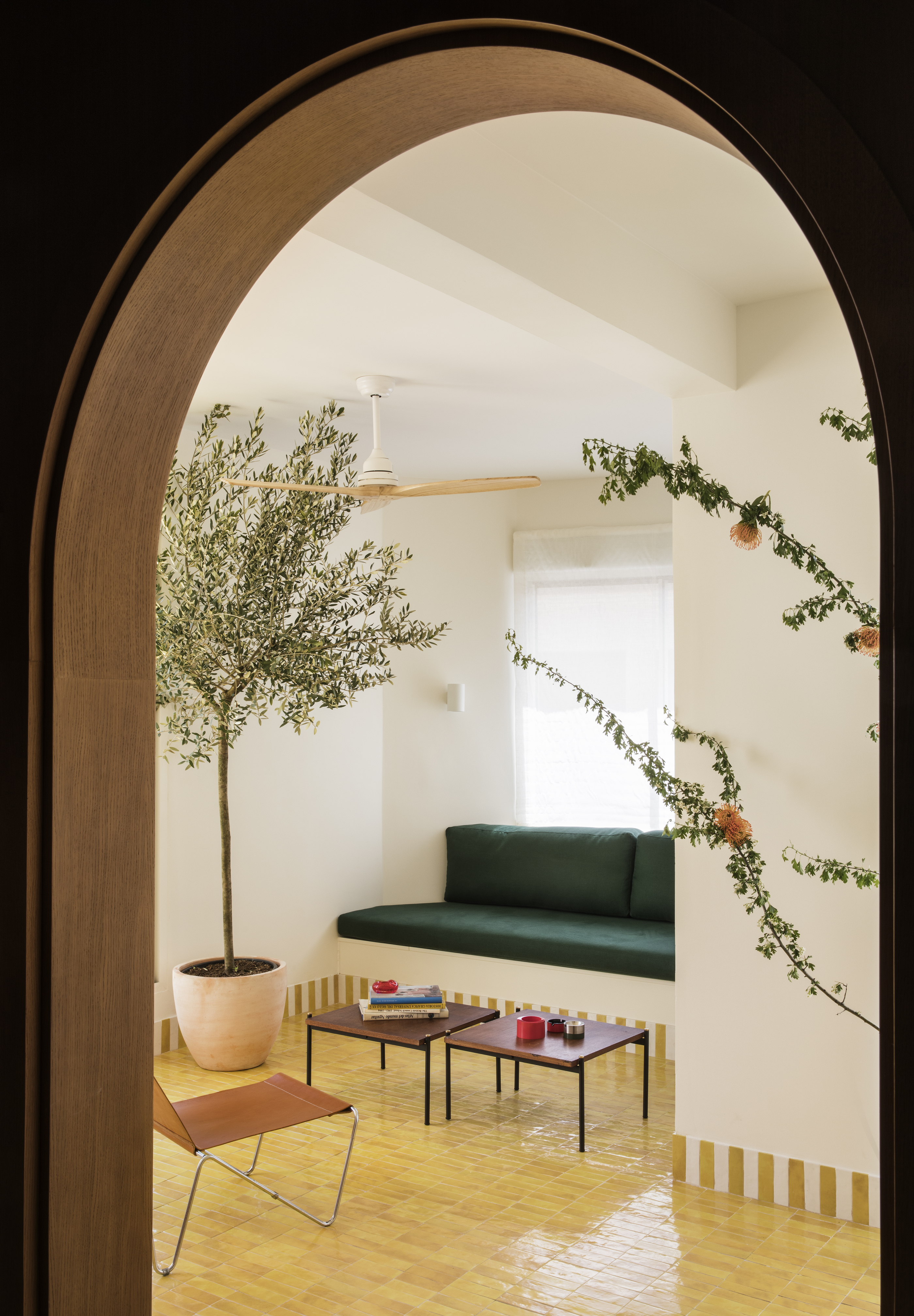
A dose of unexpected color can convert a regular room into an exciting new place. Forget painted walls or bright accessories for a moment and look at the floors. Consider creating a playful combination of color and pattern on living room flooring and build a joyful scheme from the ground up.
Colorful tiles not only add color to an interior but can also change the visual perception of the space, adding more height or depth to the room. Deep colors such as dark blue or charcoal grey can do that. In a small living room, the floor is a good place to put saturated color. In any case, it's better to use strong hues on the ground than crowd your peripheral vision with it.
4. Color block your room
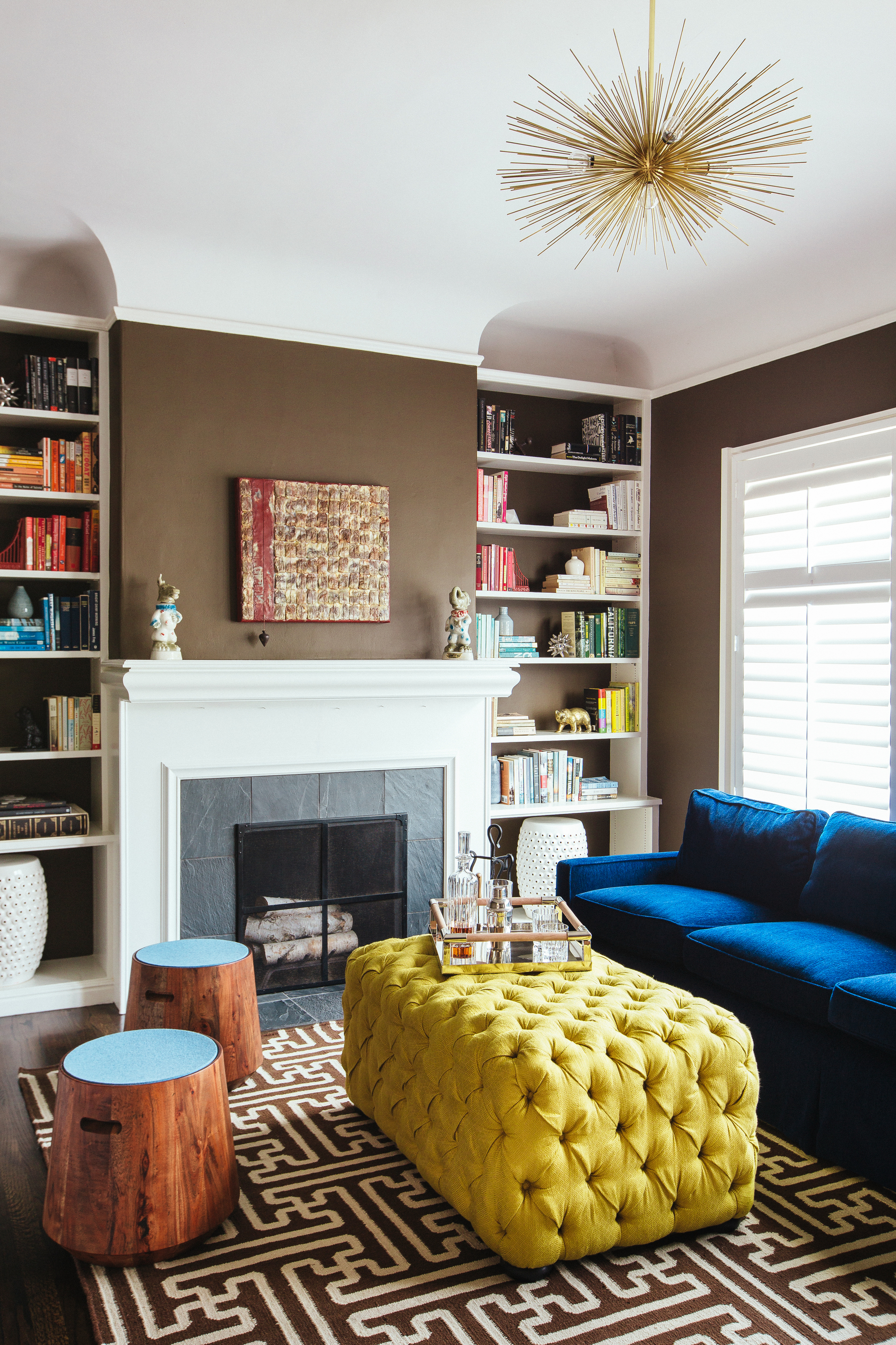
Color-blocking walls are one way to play with tones, but another is with color-blocked furniture. This especially creates a surprising and refreshing landscape and can be used to great effect in interior design. For an eye-catching scheme, choose complementary tones for sofas and ottomans – colors that sit opposite to each other on the color wheel. Think red and green; yellow and purple; orange and blue; green and magenta.
'There are a few ways to create an eye-catching color block in the living room,' says Juliette Thomas, founder & director at Juliettes Interiors. 'For those who favor a more pared-back and minimalist aesthetic, embrace neutral-toned walls in beige, off-white, or taupe for a crisp and sophisticated look, especially when paired with natural, rustic textures and earthy tones of red and brown. Monochrome is also a classic color block and looks especially elegant when complemented with interesting detailing in a brass or gold finish.'
5. Or with paint
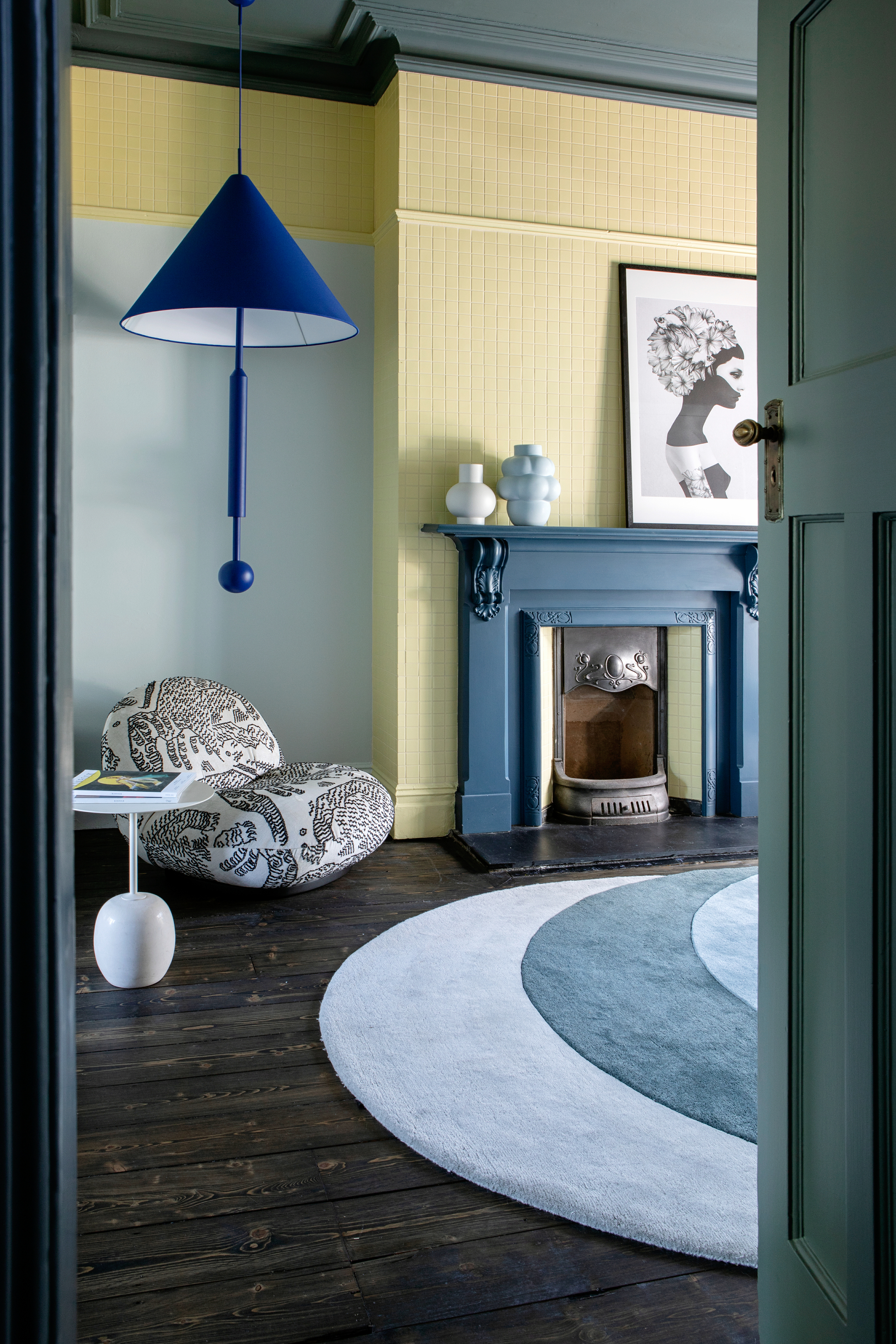
If you're wondering how to design a modern living room, a good place to start is with walls and ceiling, and choosing a fantastic color scheme for them. One of the best things about choosing contrasting colors is that there are no stringent color rules for the number of hues you can use in the space. You can choose as many tones although experts suggest keeping it limited to three.
While choosing tones, create color blocks of contrasting mid-strength colors to create a dynamic and bold scheme. For tonal colors, perhaps using a deeper shade of the same color or a complementary color will create a softer interior.
'There are so many different ways to add color pops to your living room,' says Roisin Lafferty, founder of Kingston Lafferty Design. 'Paint is the most transformative of them all, as it helps you create something bold and new. Consider painting your ceiling and walls in opposing tones.'
6. Make a focal point of a fireplace
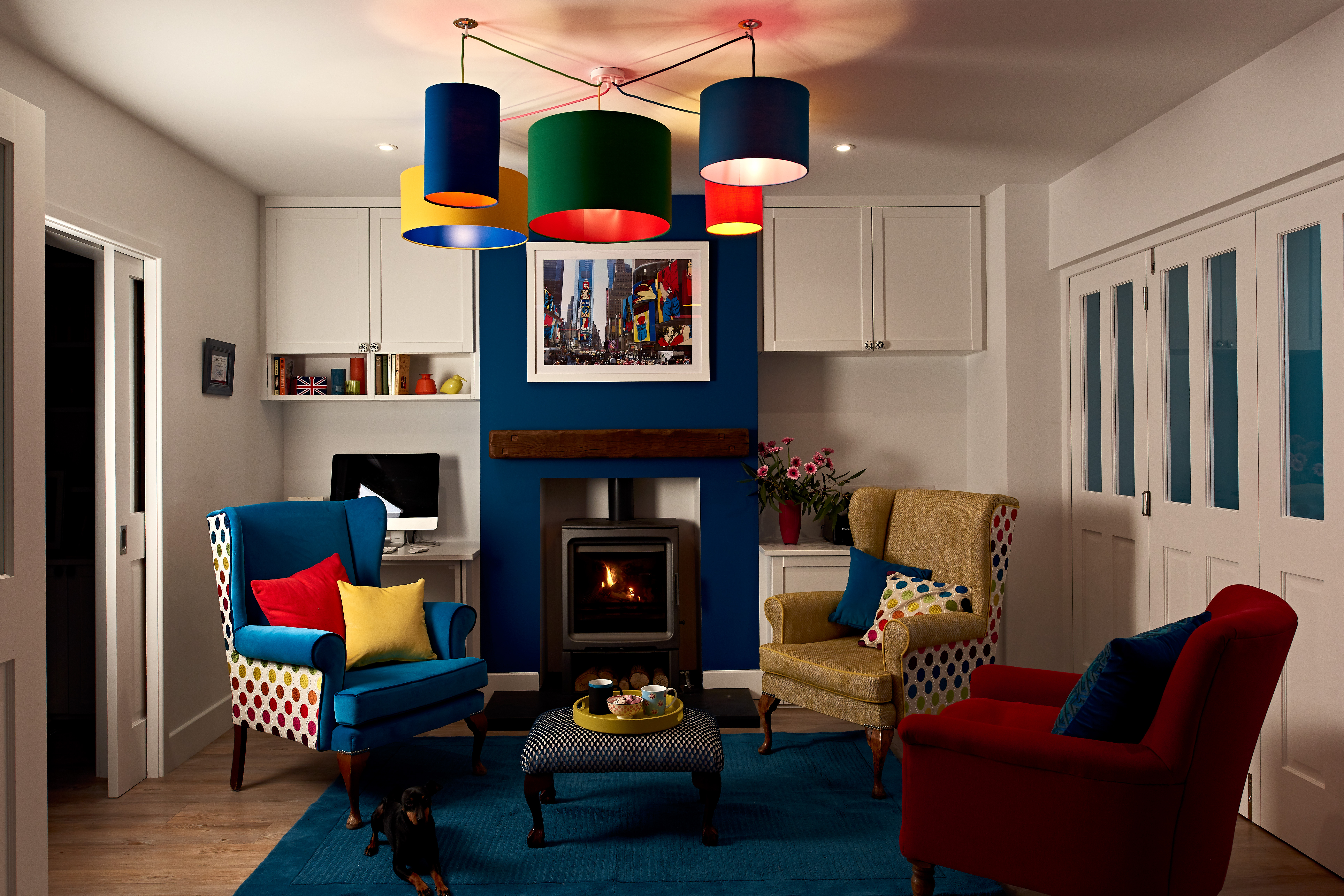
A fireplace can truly become the heart of the space with a lick of paint.
'The inspiration for the whole house was based on a mood board that started with an image of vibrantly colored converse hi-top boots,' says Vicky Tallon, founder of Tallon Perry Interiors. 'In this room, we went for one of the darkest colors in the palette to make a feature of the fireplace, as it is at the center/heart of the house – warming the house from the outside in. The furnishings and accessories were designed to create a vibrant pop/contrast of color against the blue – representing the vibrant personalities of the family who own the house.'
If you want to bring color and texture, you could also consider tiling the fireplace with brightly colored tiles.
7. Go softer with a pastel palette
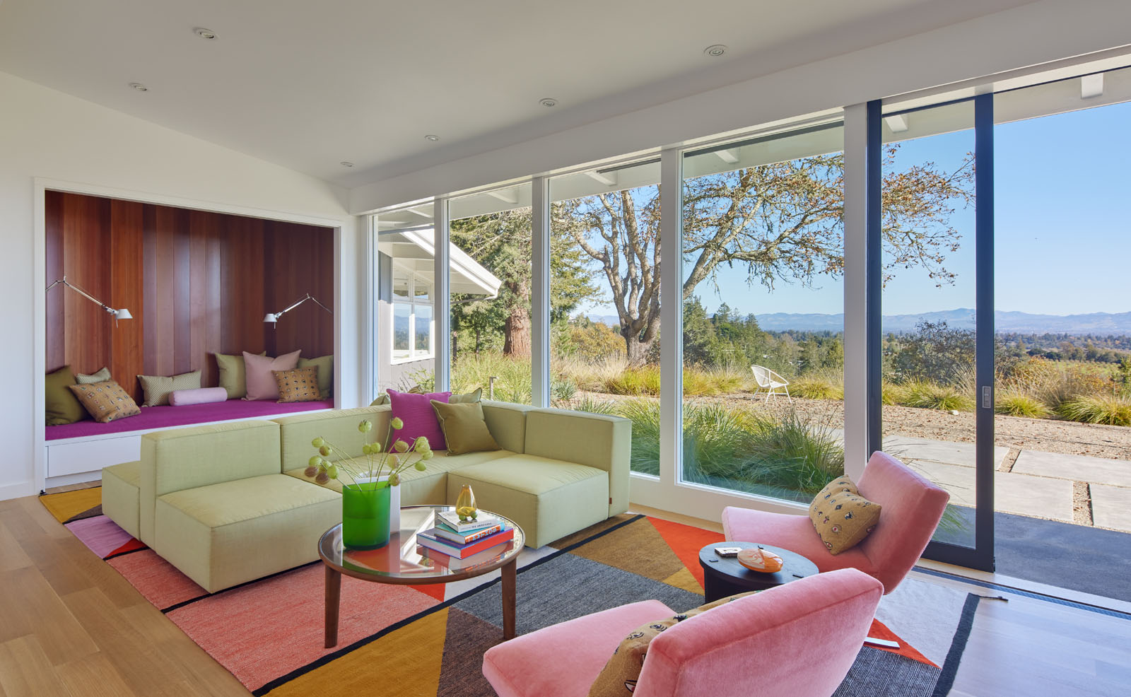
While conventional decorating wisdom says to go with neutral sofas and colorful walls, architect Malcolm Davis demonstrates that the opposite can work just as well. In this living room, a wonderful pastel living room palette flows across the room, complemented by an equally vivid carpet. The shell of the room remains neutral, and all the colors get a lift up with the ample sunlight flowing inside.
'Originally, the structure and interiors were stark white with mostly nondescript furniture from DWR, Room & Board, and the like,' says Malcom Davis, founder of Malcom Davis Architecture. 'The homeowners worked together with the design team to bring in unique antique pieces and furnishings, art, and bright pops of color that translate the very essence of the family’s bright and cheery personality. A variety of local and regional artists and vendors that the couple holds near and dear to their heart can also be found throughout the residence.'
8. Even a lighting piece could add color
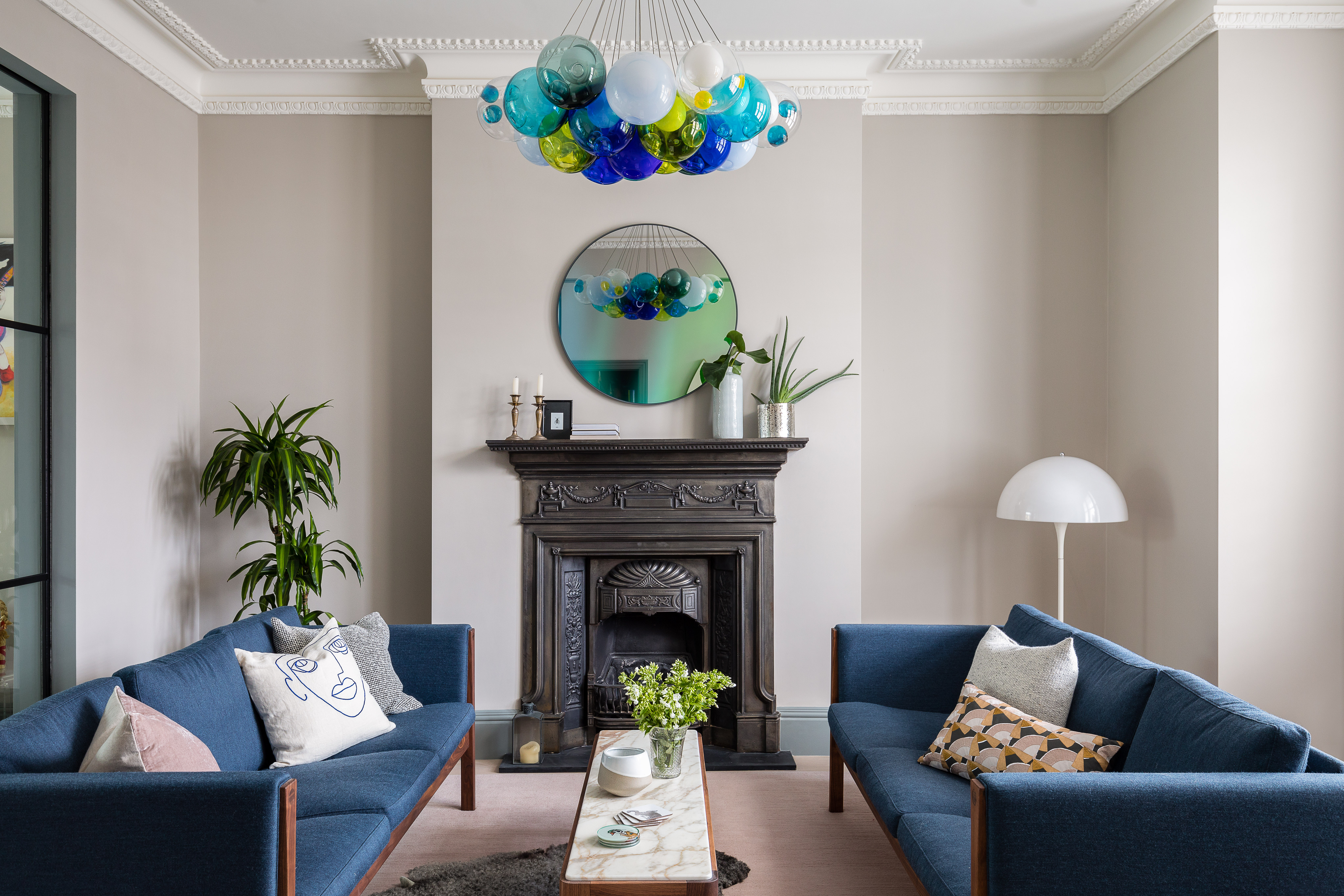
Nothing brightens a space like a splash of color, especially if it's used on an unexpected element. Walls, ceilings, and furnishings aside, another great contender to bring in color is the living room lighting. Choose a statement chandelier or pendant, and infuse the room with a bright tone.
'This room was connected to a TV snug, and so we wanted to define the two areas with a different feel,' says Cat Dal, founder of Cat Dal Interiors. 'Working with a light tone on the walls, we brought in the contrast to the room with a vivid lighting feature and, color and pattern in the furnishings and cushions.'
9. Anchor the room's scheme with a multicolored rug
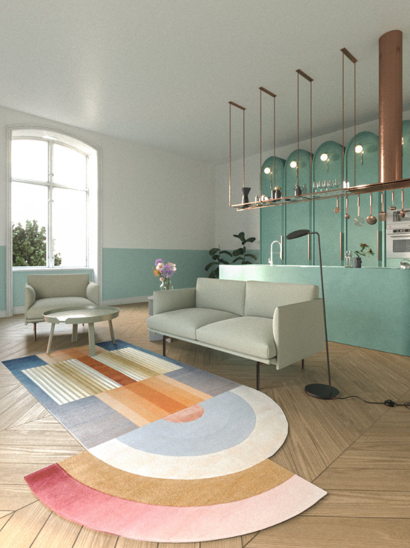
If the ceiling is considered a room’s 'fifth wall,' then the floor is the sixth. And so, this surface too should be given due attention. Carpets or living room rugs can give your space a finished look, and also introduce great accent colors to the room. The hues of the carpet can also alter how your white paint looks. If you want to introduce a lot of shades to the room, a great way is to bunch them up with a multicolored area rug.
'The biggest advantage of carpets and rugs is that they add a wonderful layer of texture and color in a room, and even define a zone,' says Reena Sotropa, principal designer at Reena Sotropa In House Design. 'Rugs are also a great way to support a foundational color scheme.'
10. Want to go fully dramatic? Try technicolor interior

Today's modern-day interiors showcase brave and daring designs. Experimentation, eclecticism, and glamor are big staples in homes where owners believe in thinking out of the box. When it comes to maximalism in interior design, a major trend at the moment is technicolor interiors.
Of course, the terms borrow from filmmaking, where three strips of film with the primary colors: red, green, and blue were used to create a bright, full-color image seen on the screen. But the concept has moved into interiors, of course with a difference.
Technicolor interiors point to spaces filled with high-octane colors, bright palettes, and stark hues. Brave as it may seem, pulling off this scheme is no easy feat. Ideally, a large, double, or triple-height room could be a good choice for it as it can accommodate multiple colors yet look breathable and airy.
Take for instance this room designed by BHDM Design. While the strong colors are spread across the flooring, furniture, and furnishings, the tall windows in muted tones ensure that the brightness is balanced, and the room gets a sense of relief. The bright sunlight too stops the room from feeling too caved in and OTT.
'We approached this space with a 'nature meets neon' concept,' says Dan Mazzarini, Principal and Creative Director of BHDM Design and ARCHIVE by Dan Mazzarini. 'We incorporated the colors and textures found in Hawaii’s flora and wildlife and filtered them through a neon lens to create a colorful and unique experience for the millennial-minded traveler. Try incorporating the palette of your favorite getaway destinations for your own year-round retreat at home.'


