We already got a glimpse of the new Warner Bros logo in the studio's 100th-anniversary graphics last year, but now the design is officially rolling out as the main logo for all consumer-facing Warner Bros brands. And it's a welcome return.
Chermayeff & Geismar & Haviv's revamp for the brand feels as much like an art restoration as a logo redesign, fattening the shield up again, bringing back its border and generally bringing the design back to life (see our pick of the best logos for more inspiration).
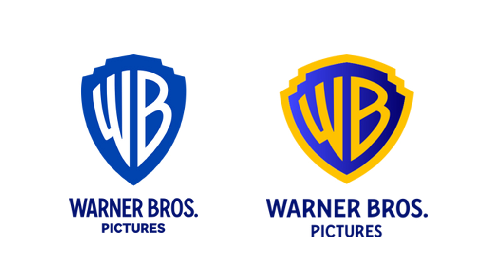
When the Warner Bros logo was last updated in 2019, it was made slimmer and flatter. The shield lost its border and became elongated. This wasn't actually a radical innovation but was in itself a return to a previous logo, resurrecting the taller letters of a 1930s design. But for many who grew up with the Warner Bros logo, it didn't look right. It looked gaunt, emaciated and flat.
Just three years later, the branding and graphic design agency Chermayeff & Geismar & Haviv has fixed things. The logo is still flat, simple and modern, but it's much closer to the Warner Bros logo that many will know. The video below shows some of its process.
Haviv describes the new logo as a " distillation of the classic 1948 Warner Bros. emblem", refined through “reductive geometry, streamlined curves and bright colours".
"Reimagining the shield from its original three-dimensional rendering involved redrawing it from scratch, and equalizing the weight of the W and B letterforms with the stroke of the encasing shield shape," the agency said of how it sought to improve the harmony and consistency of the logo's line weight.
The banner that used to decorate the Warner Bros shield is still absent, but the logo redesign benefits from the creation of a new typeface, Warner Bros. Bold Condensed. The strong sans serif is used in all caps in the logo, echoing the letterforms in the mark itself.
There are two versions of the new shield: solid for corporate communications and with the outline for movie, TV and games. Both are designed to adapt to background colours and textures. I think this redesign will make Warner Bros feel like Warner Bros again for many – we've seen in the recent Nickelodeon rebrand how people love the nostalgia of revisiting classic logo designs, and this has that timeless quality.