Hitachi has unveiled a new visual identity that places digital at its core, representing the brand's future-proof evolution. Celebrating its development in the world of technology under the new brand ethos "True One Hitachi," the new brand design reflects Hitachi's commitment to innovation, bringing all its businesses under one strengthened identity.
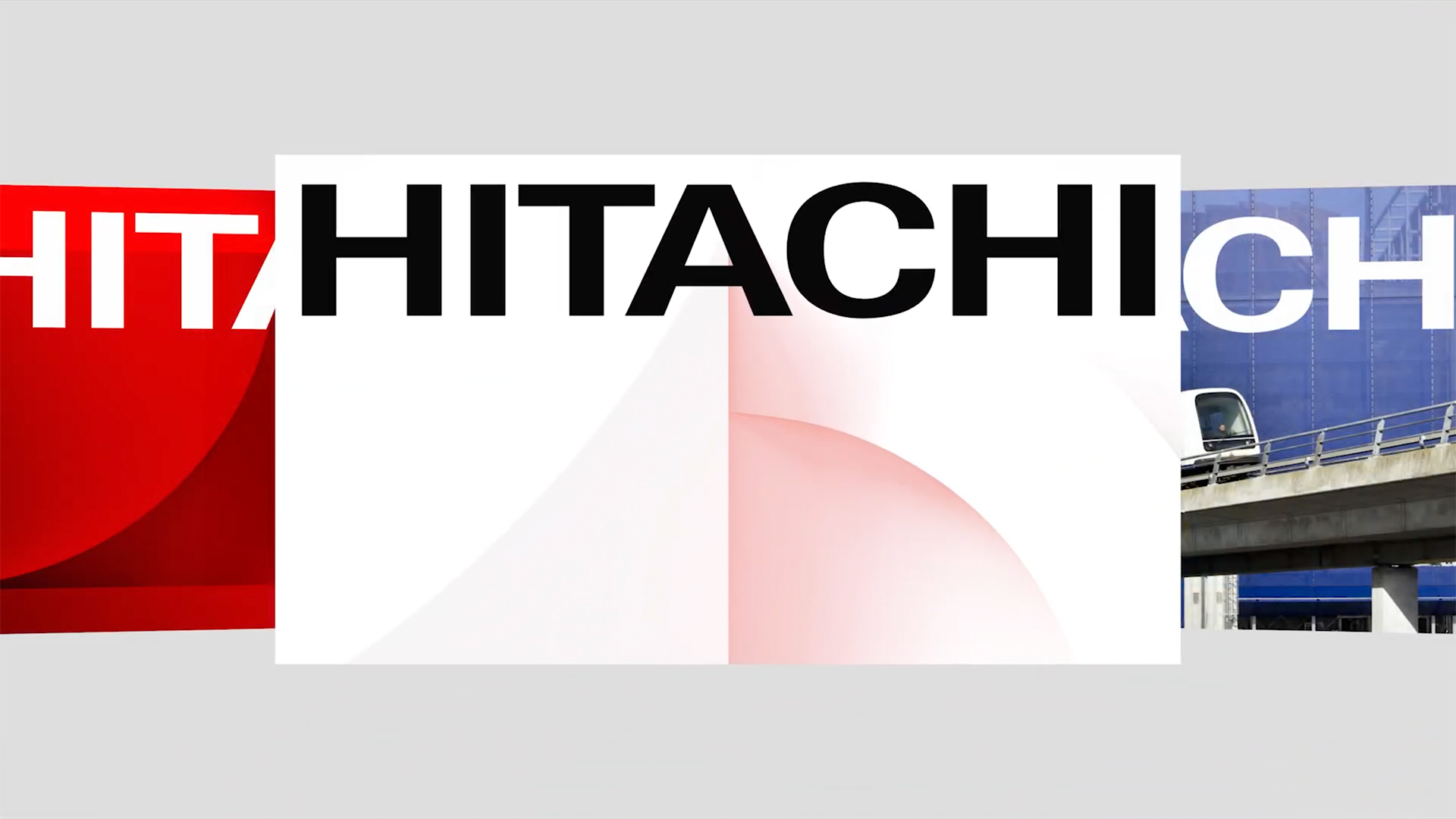
As with the best rebrands, Hitachi's new visual identity expertly balances heritage with modern momentum to create a dynamic brand evolution. With a refreshed logo, slick new typography and dynamic graphics, Hitachi's new look is its first visual revamp in 25 years, ushering in an authoritative new era.
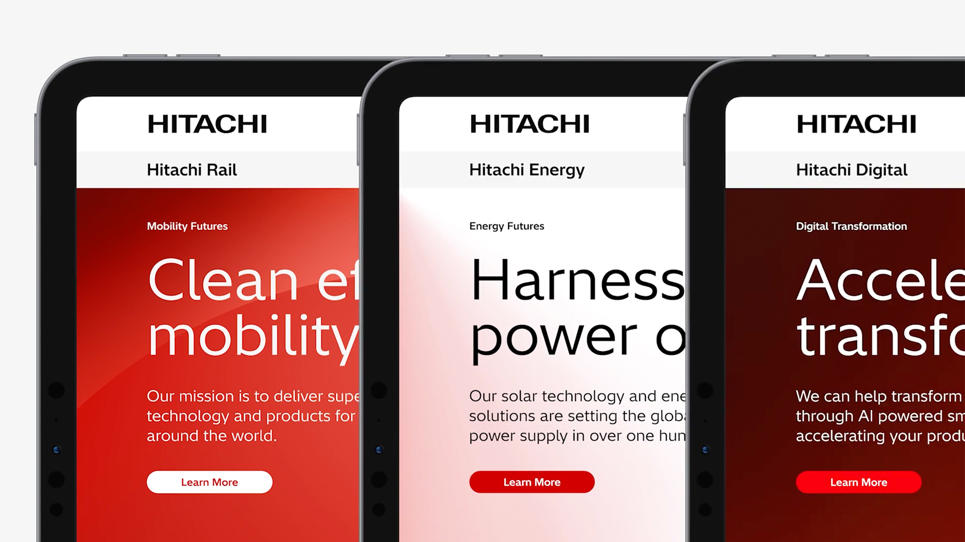
At the centre of the new brand identity is an evolved logo design that maintains the same boldness of Hitachi's heritage wordmark. Once adopted by all Hitachi businesses, the new logo will create a unified brand identity to symbolise Hitachi's expansive innovations. In tandem with the logo tweak is the new custom typeface Hitachi Sans – a bold sans serif that acts as the signature for Hitachi's brand.
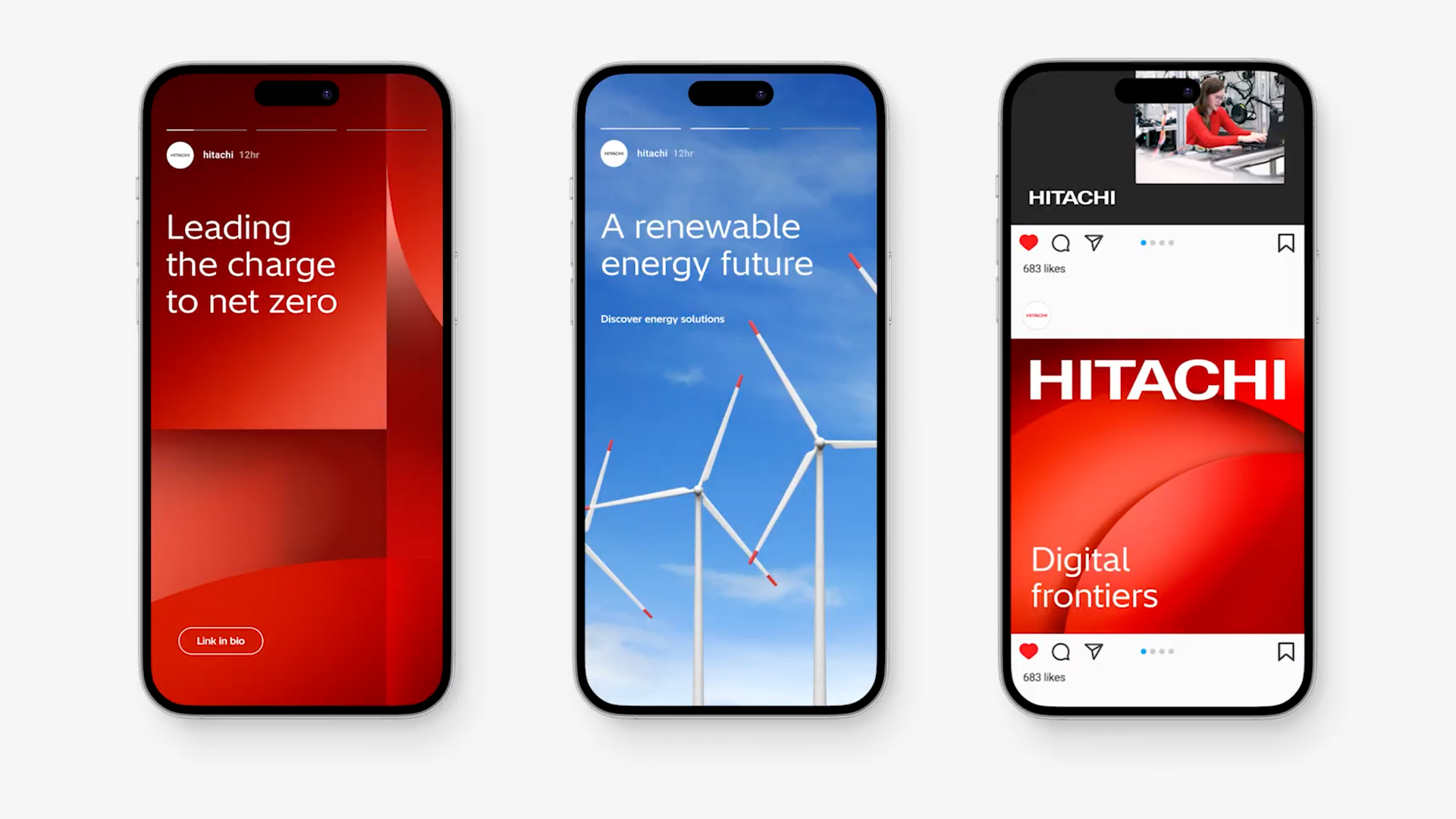
Bringing a sense of cohesion and visual intrigue, Hitachi has embraced a stripped-back colour palette of blues and reds which appear on its suite of new visual assets. Appearing in both static and motion form, the 3D tonal textures bring life to the brand while maintaining a sense of corporate refinement. "This new brand design demonstrates Hitachi Group's determination to unite and challenge itself for a new stage of growth, by leveraging the transformation it has already undergone," says Toshiaki Tokunaga, Hitachi's new president and CEO.
Hitachi's new brand identity will debut on 1 April 2025, in line with Toshiaki Tokunaga officially becoming CEO. For more branding news take a look at Korean Air's slick rebrand or check out why Severance’s Lumon logo is the perfect pastiche of corporate design.