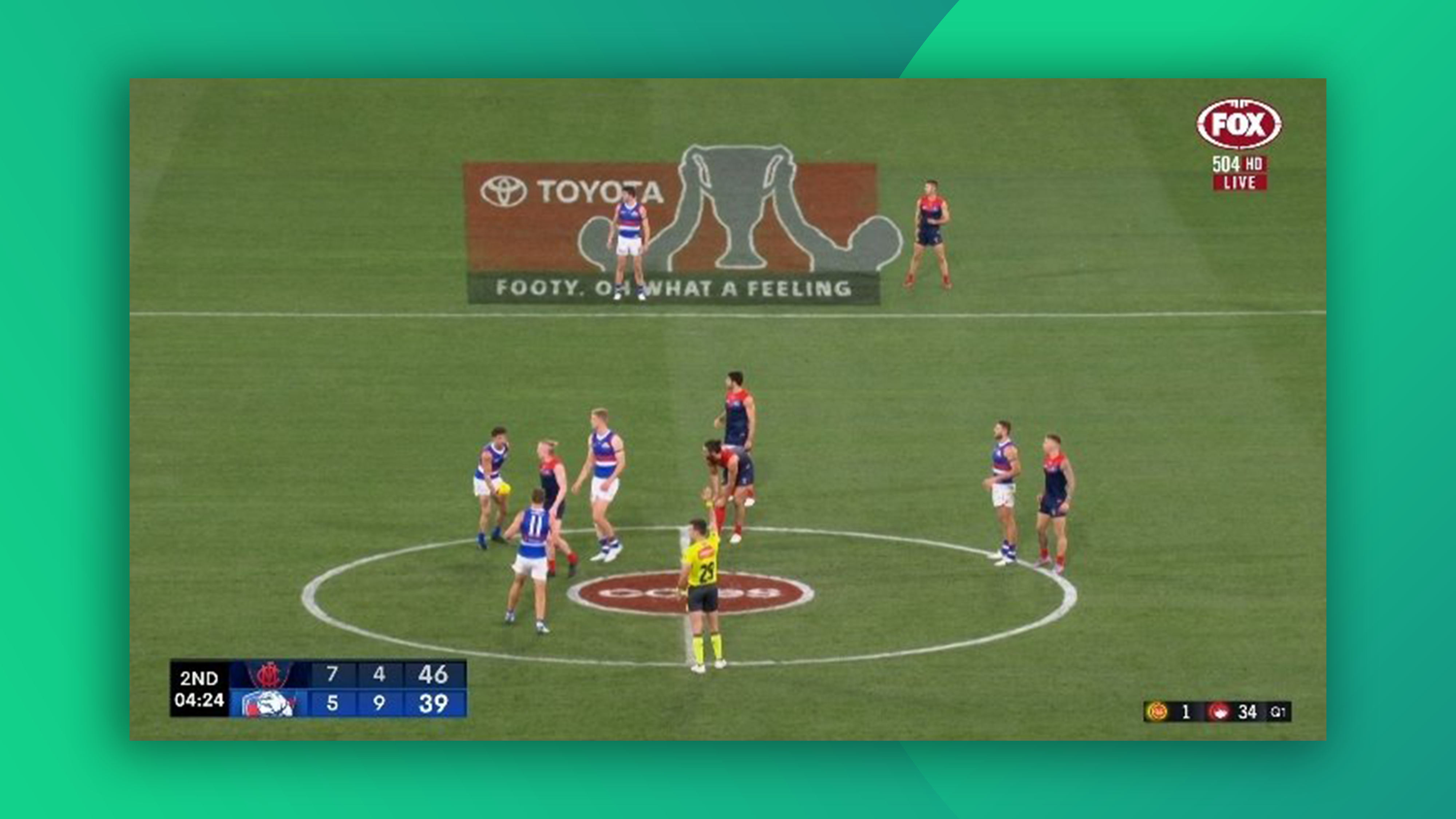
If your logo is going to be seen by millions during the 2023 AFL season, you probably want to run it past a few sets of eyes first. But fans are speculating that the Toyota AFL design – currently sitting squarely in the centre of every pitch – perhaps wasn't checked over by any women.
The logo appears to depict a trophy being lifted into the air by a pair of symmetrical arms and heads. But at first glance, it rather resembles something else – namely, a drawing of a uterus and fallopian tubes. Many of the best logos of all time have double meanings, but they're usually intentional.
Toyota is the biggest sponsor of the Australian Football League season, so it's no surprise the logo is being beamed into homes across the country. And as countless tweets are attesting right now, the anatomical resemblance cannot be unseen.
Surely the AFL Toyota up logo was not run past any women… @AFL #AFL23 pic.twitter.com/aXo13hsx4pMarch 19, 2023
Is there a rough sketch of a uterus and fallopian tubes on the pitch? Very progressive of the afl 👏 pic.twitter.com/eW9OPlfZTIMarch 16, 2023
Anyone else think the Toyota ad looms like a diagram of an uterus? #AFL pic.twitter.com/EWodPOGeBUMarch 18, 2023
Yep, it seems the Tesla logo's hilarious IUD resemblance has finally met its match. And this is by no means the first time we've seen a sports logo that looks like something else – remember the blood splattered Super Bowl design?