Herman Miller has unveiled a stylish brand refresh for the new year featuring an expanded colour palette, evolved typography and a thoughtfully revised logo design. A pioneer of function and style in its product design, the refreshed look captures a modernised evolution that maintains the brand's timeless identity, staying true to its creative ethos as it looks towards the future.
Famed as the leading provider of the best office chairs, Herman Miller's brand refresh proves that considered design is at the forefront of maintaining a creative legacy. Alongside a visual revamp, the brand shares a renewed commitment to human-centred design, weaving superior functionality with stunning innovation.
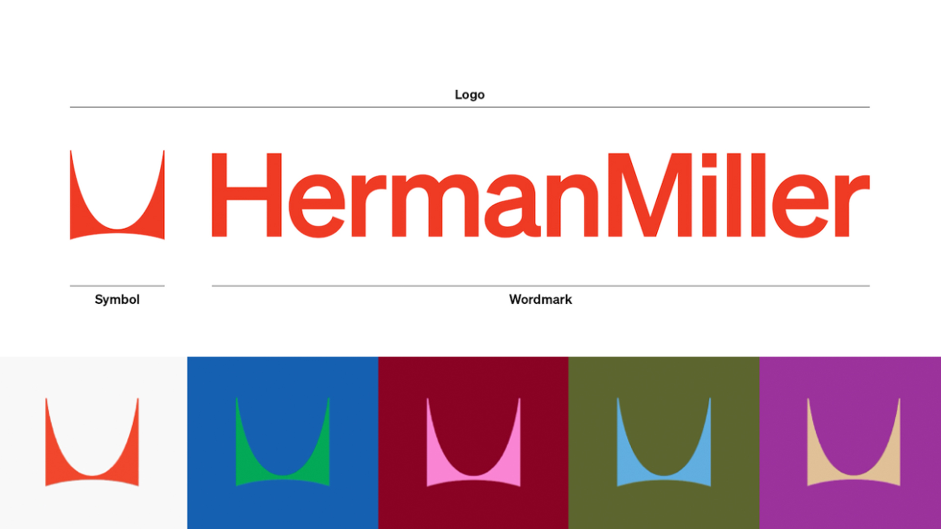
Herman Miller's iconic 'M' logo was created in 1946 by Irving Harper and has continued to be a key component of the brand's identity throughout its evolution. The most recent brand refresh has left the intricate design untouched, accommodating the original logo with a refreshed wordmark in the form of the Söhne type family from Klim Type Foundry.
Depicted in red, the logo colour has been an integral identifier that gestures to the brand's history while maintaining a sleek, contemporary feel. An extended palette accompanies the refresh, featuring jewel tones and dynamic shades that enforce the brand's strong visual communication, reflecting a history of diverse colourful design.
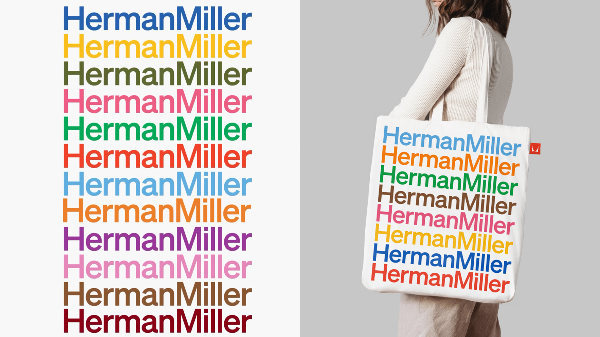
The contemporary brand refresh simultaneously elevates Herman Miller's modern identity while reinforcing its historical legacy. Its greatest success is capturing an essence of timelessness within the brand refresh, that feels confidently classic. With an extended spectrum of colour, the brand feels renewed in a manner that transcends fleeting trends, cementing its identity as a beautifully unfussy, functional designer.
For more inspiring design, take a look at the delightfully imperfect National Landscapes rebrand or check out our Herman Miller Aeron review to see if the classic design maintains its icon status.