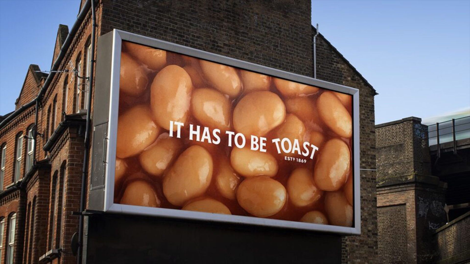
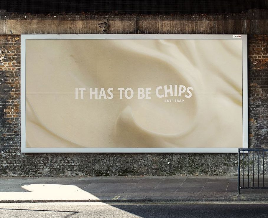
Heinz has unveiled a tasty new billboard campaign that boldly ditches its iconic logo. Featuring close-up shots of its most popular products – from baked beans to the humble tomato soup – the campaign is ingeniously understated, showcasing the instant recognisability of the Heinz brand.
In line with the best billboard advertising examples, Heinz's confident new campaign is a daring move, bucking the trends of conventional billboard branding. Represented only by its distinct typeface, Heinz proves that heritage design will always be timeless, iconic and instantly recognisable.
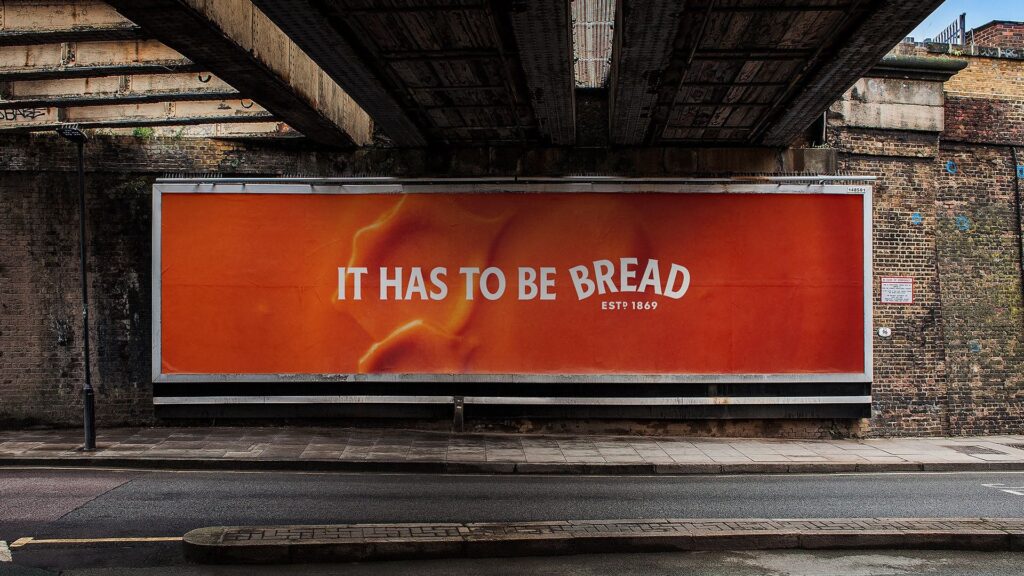
Created by advertising agency Wieden + Kennedy, the crafty campaign plays on the idea of perfect pairings, with each image accompanied by a classic culinary accompaniment. Slick copy plays on these iconic duos, with statements like "It has to be toast" and "It has to be fries" referencing Heinz's famous strapline.
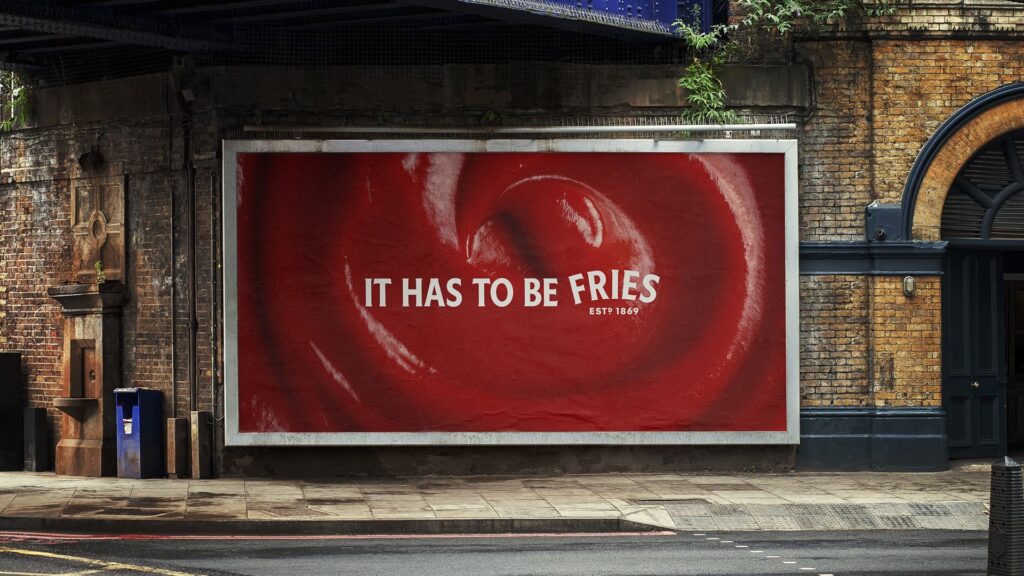
The genius of the billboards is in their composition, with the end of each strapline featuring the Heinz logo shape. The silhouette alone is instantly recognisable, demonstrating how subtle design can create a bold statement without being explicitly heavy-handed with branding.
It's not the first time we've seen a brand ditch its logo for a more minimalist billboard – Tesco's bold logo redesign ads received an outpouring of praise for their clever design. For more billboard design news take a look at these bizarre AI billboards that are a dystopian nightmare.