
Thomas Heatherwick surveys the scene at the new Azabudai Hills district in Tokyo: 'We are sitting, at this moment, just a few metres from the tallest building in Japan. Thousands of square metres of gallery are beneath us. But look – it’s like we’re sitting in a small park. Your emotions change when the landscape becomes three-dimensional.'
The British designer (who brought three-dimensionality to Wallpaper’s 20th anniversary cover back in 2016) is seated at a small table, surrounded by a textured patchwork of nature and architecture. Flowing all around are slopes of greenery, with art installations, plants and citrus trees – all woven into the curved undulations of a grid-like structure, layered with intimate walkways, courtyards and pavilions. This is the multi-dimensional scene that lies at the heart of Azabudai Hills, a major city-in-a-city development that opens its doors this week in central Tokyo after more than three decades of meticulous urban planning.
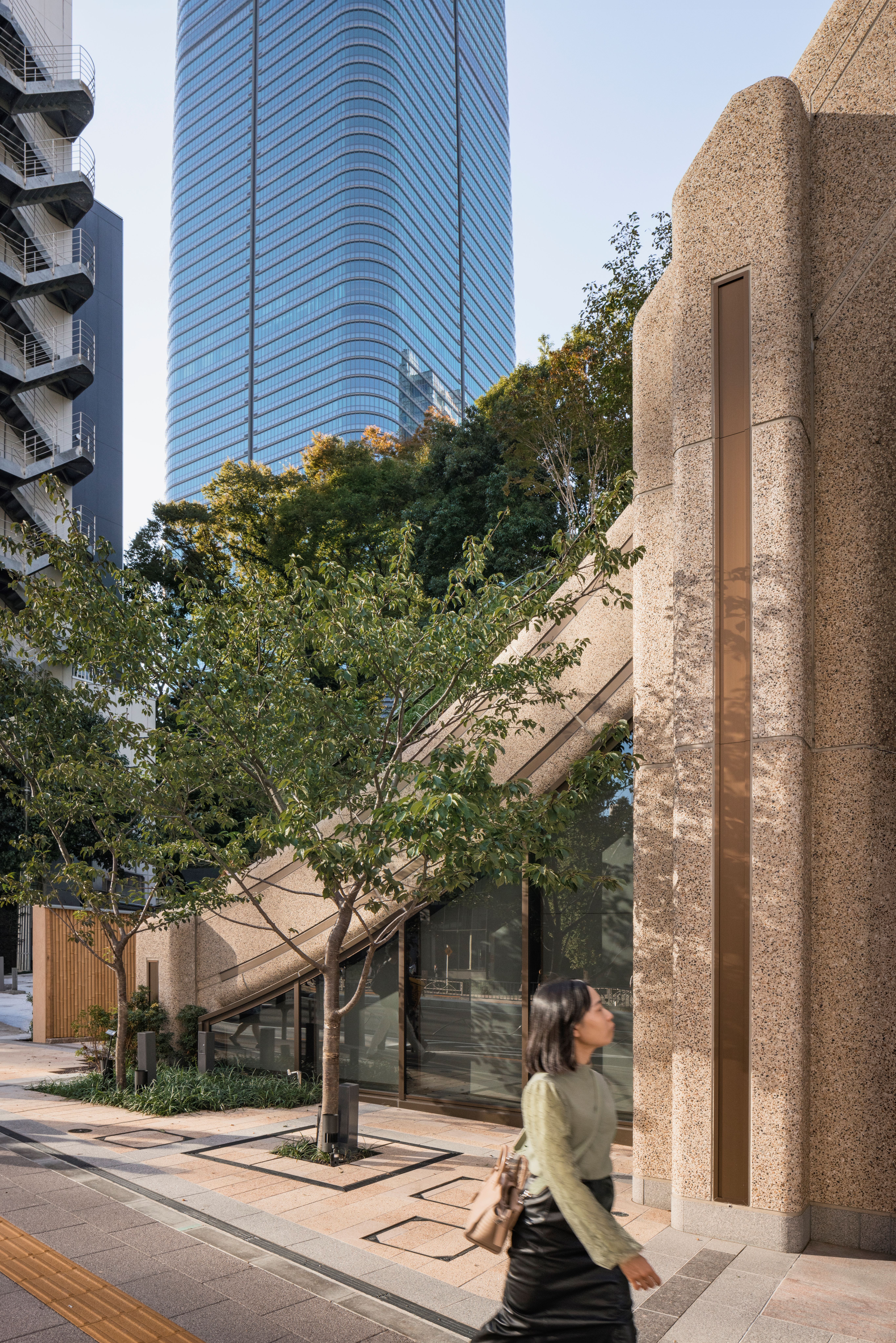
Azabudai Hills district: conceived as a paradigm for urban living
Aiming to create a new paradigm for contemporary urban living in one of the world’s most densely populated cities, the complex, spanning eight hectares – and the latest in a string of landmark developments by Mori Building – is home to a constellation of elements.
Rising into the skies is a trio of new skyscrapers, with reflective façades by Pelli Clarke & Partners (including Mori JP Tower, now Japan’s highest building at 330m). New office space can accommodate 20,000 workers, while 1,400 residences have also been created, with interiors by Yabu Pushelberg.
Other ingredients include 150 stores (of which 100 open this week), a cutting-edge medical centre, several major galleries (Pace and teamLab’s new Borderless launch here next year), and new premises for the British School. It even has a new road winding through it – Sakura-asa Dori – lined with ten species of large trees, from maples to white oak, plus a relocated temple.
Yet underpinning its complex DNA is the lower-level architecture and landscaping that threads it all together. More precisely, a connective grid-like network of organic structural curves, elemental materiality and bursts of green – all designed, with a focus on the human-scale, by Heatherwick Studio, for its first major project in Japan.
Showing Wallpaper* around ahead of its opening, Heatherwick says: 'My hope is that no one will call this a shopping centre but can feel it’s a new district. Twenty-four hours a day you will be able to walk through here, the landscape is always open. I hope it just sort of stitches into Tokyo.'
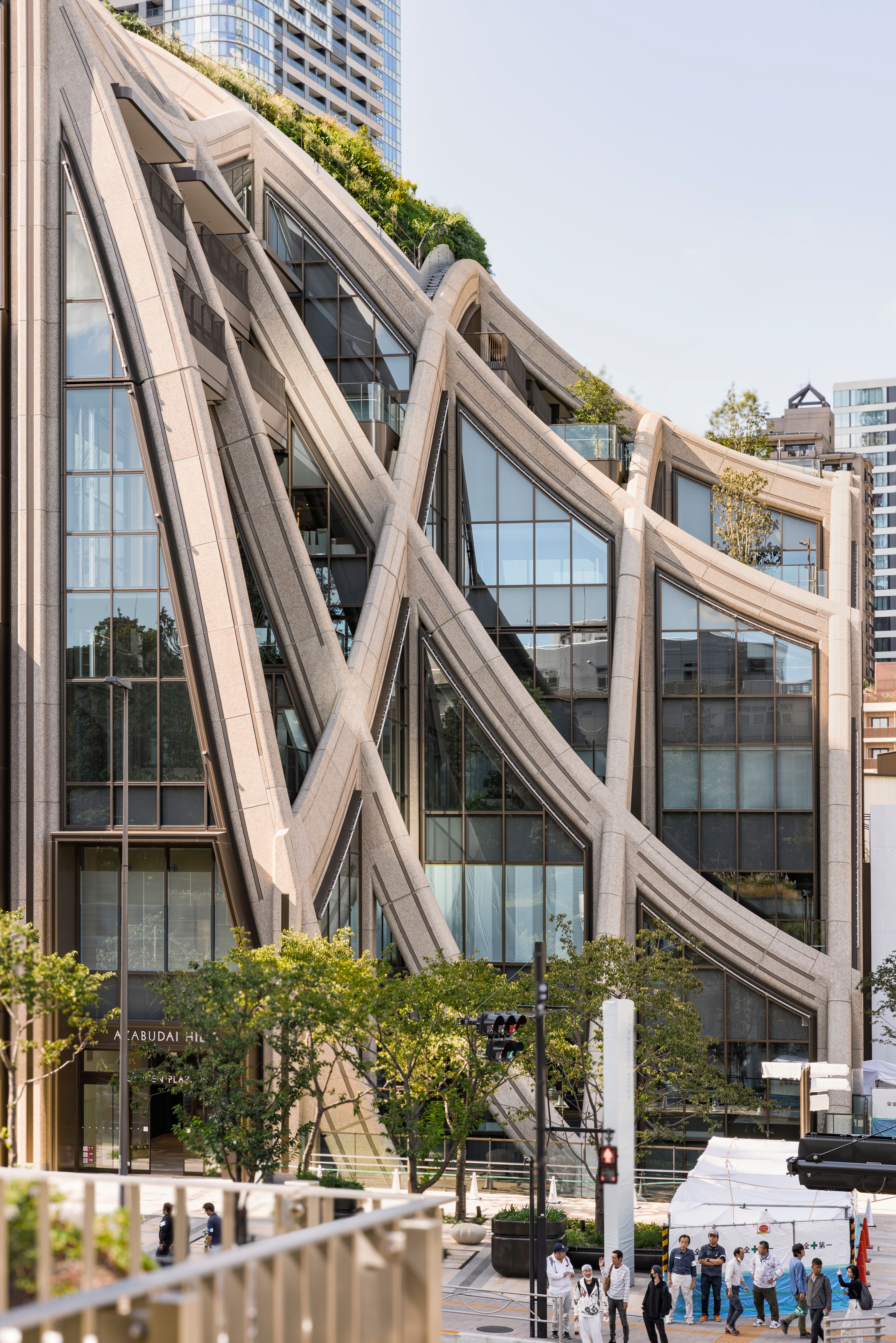
The idea of creating a garden, not a box, was the starting point. Centre stage is a plant-covered lattice-like grid which flows and twists, like a tablecloth, through a 6,000-square metre central green with 320 plant species.
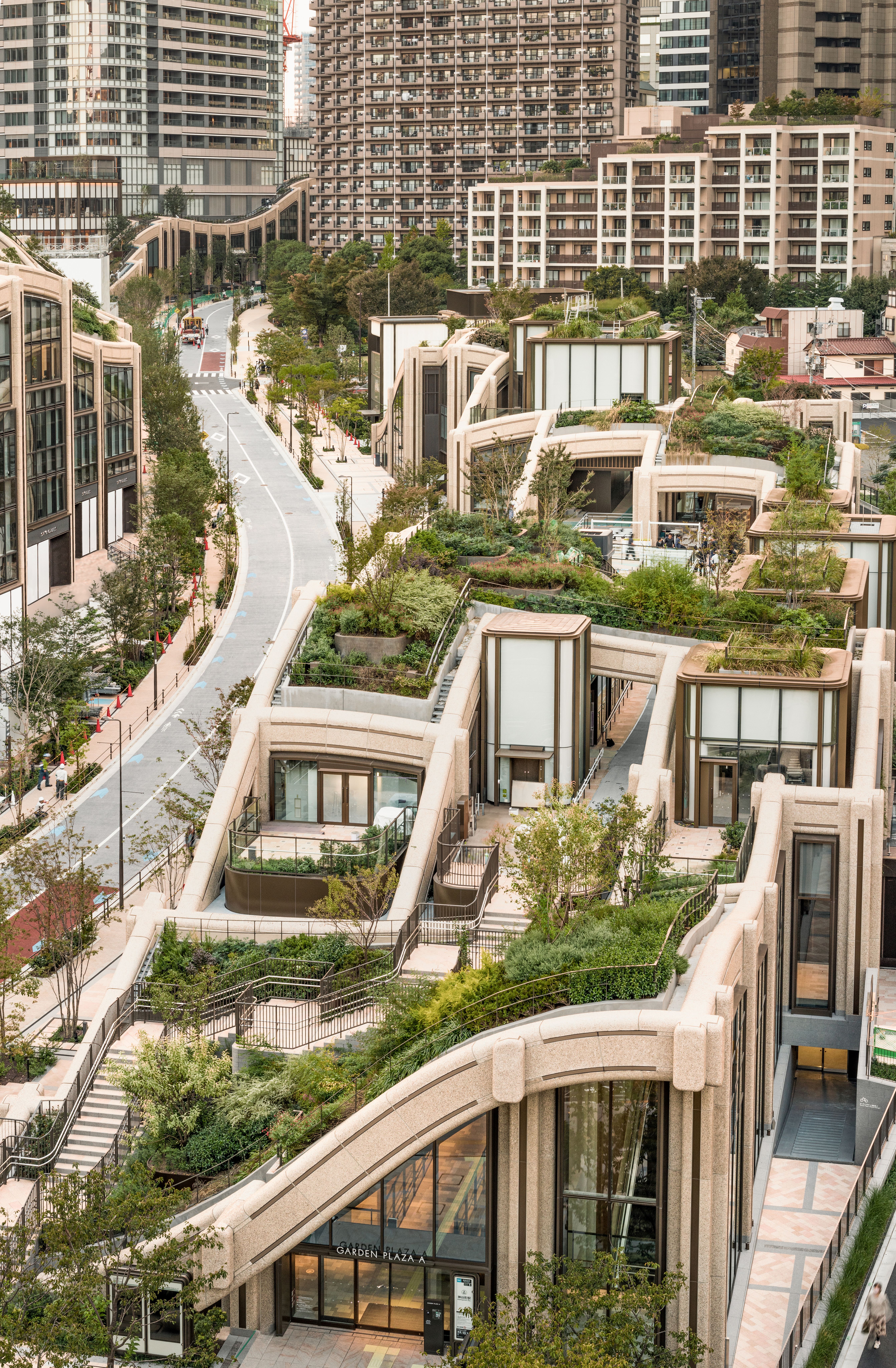
The structure is punctuated by a scattering of pavilions, containing shops or galleries, which push vertically through the surface up towards the sky; as well as openings that drop down into light-flooded courtyards and sunken passageways.
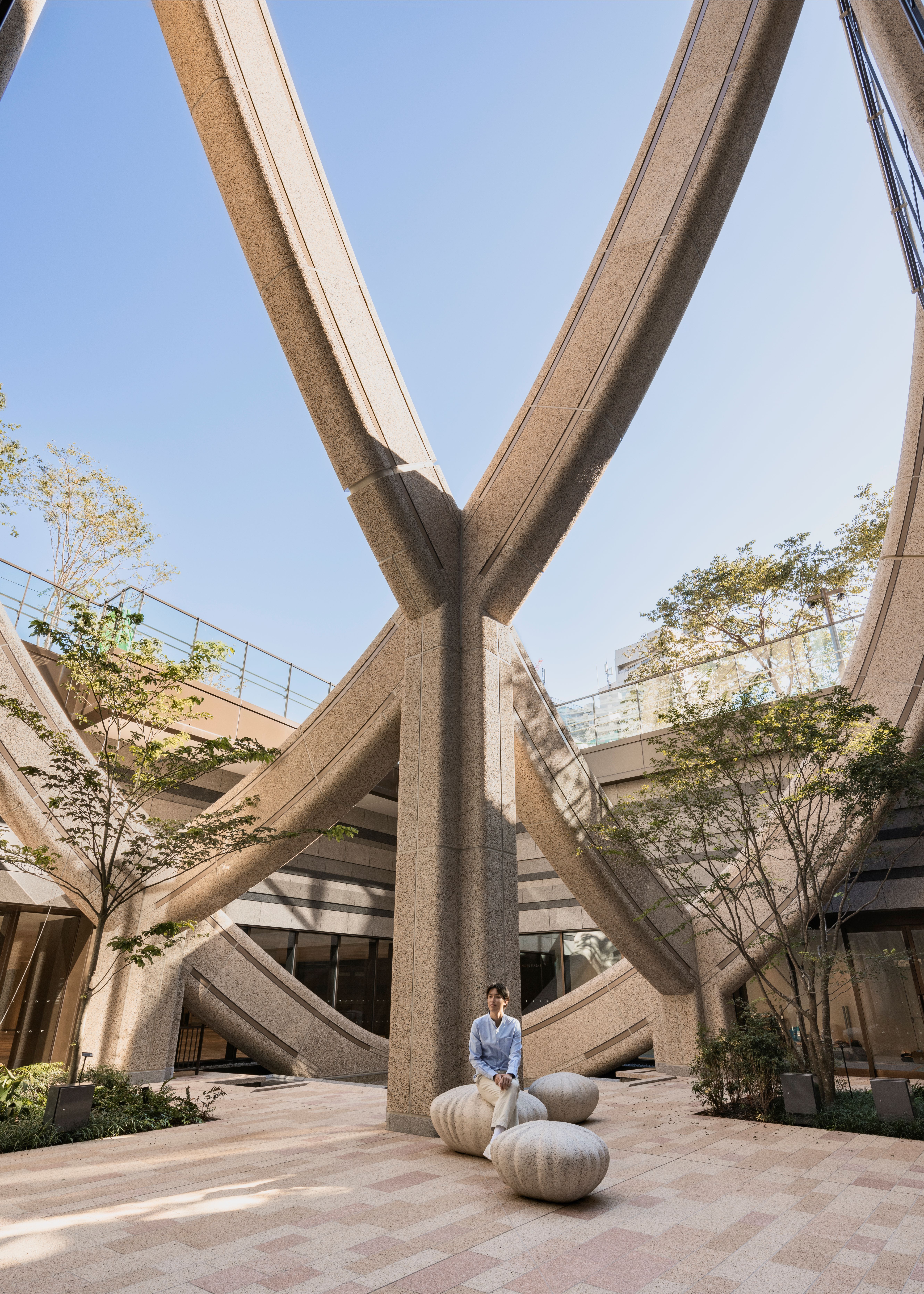
The grid’s organic dynamism is softened further by materials and construction techniques. It’s made of glass reinforced concrete, with warmly tactile surfaces packed with multi-toned aggregates, while shadow-casting curves replace sharp edges and corner lines; and it’s all pulled together through the slot-like connections of its modular components, a modern structural riff on the beauty of nail-free Japanese joinery.
'This notion of creating a net frame, which we could pop these pavilions through – and even towers – is about trying to humanise and soften the site,' explains Heatherwick. 'It could all be flat here – but by breaking down the flatness, it expresses the structure.'

'It’s like a piece of fabric that you can push and pull. Because we’re using a grid, like a warp and a weft, when we take it around the corner, it creates a zigzag. We wanted it to be curved, but also create unexpected articulations.'
Neil Hubbard, group leader and partner at Heatherwick Studio, adds: 'The system visually links the whole district together.' At the same time, each pocket contains something completely different – whether it’s a cake shop, a florist, a canopy for a hotel entrance or a residential entrance. 'It's also three-dimensionally soft. This is how we approach our projects – by exploring how people will feel around them as opposed to what it looks like.'
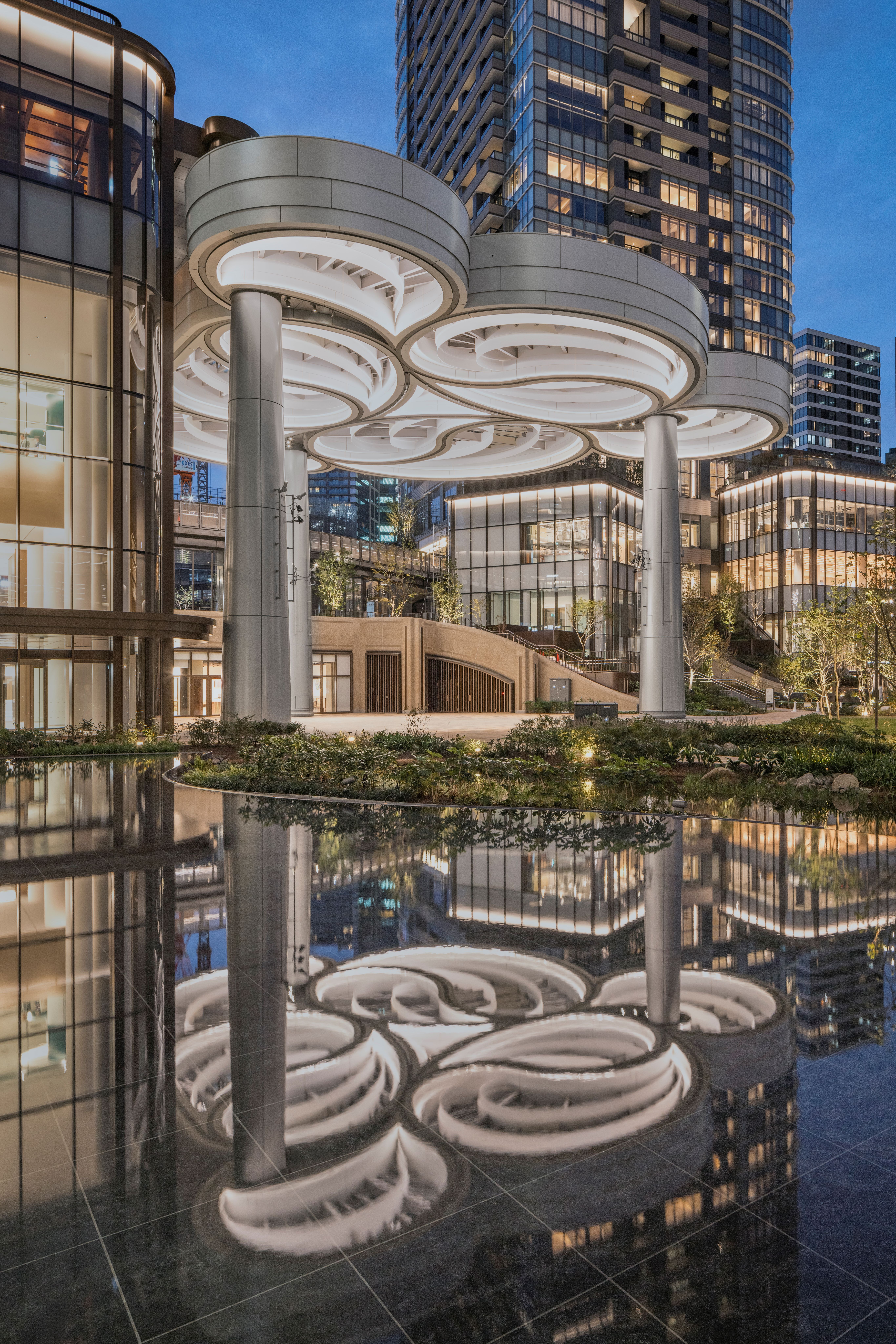
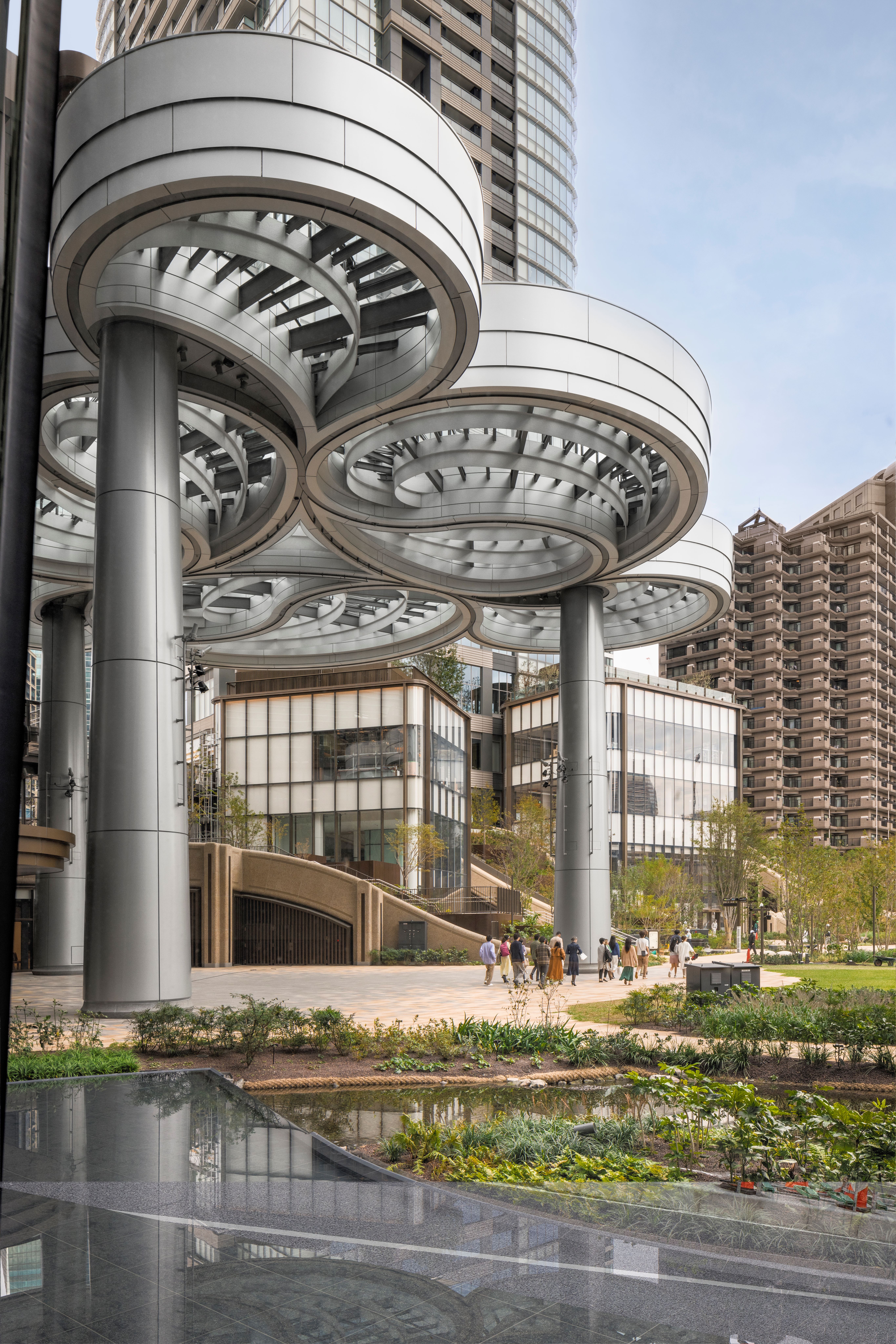
In the central green area, at the base of the Mori JP Tower, is Heatherwick’s 16m-high canopy dubbed The Cloud, with intricate looping formations inspired by paper quilling, while a pointy white 'forest spirit' – Miss Forest in Tokyo, by artist Yoshitomo Nara – sits on grass nearby.
The façade of Janu Tokyo – the first outpost of Aman’s soon-to-launch new hotel brand – also blends into the soft flow of the landscape; and exterior brick tiles on the British School were sourced to exactly match those on the post office which once stood there.
The tile detail is a perfect example of what Heatherwick describes as the 'nutritional value' of structures – as outlined in his recently released book Humanise, which explores the deep imprint that buildings leave on human lives, even through the simple act of walking past them every day.
'If people care about something, they’re more likely to repair or adjust or extend it, rather than knock it down,' says Heatherwick. 'Tokyo is an extreme city. The average age of a commercial building is about 30 years. In the 1980s, it was even less, maybe 20 years. So how do you make something that society might care enough about to say don’t knock it down? Would your grandchild, or someone who none of us know yet, stick up for this when we’re no longer around?'
Exploring the site, Heatherwick walks past a farm, and trees weighed down with paradise-perfect citrus fruits ('They look like they’re hot-glued on – but we checked and they’re real,' he quips), before passing the grid at its highest 15m cantilever, entering passageways and pausing to observe gaps framing Tokyo views.
Stepping inside to survey a fan-vaulted ceiling of white folded steel sheets marking the internal entrance of a supermarket, Heatherwick highlights the craftsmanship, skills – and patience – of his Japanese partners: 'We could only make something like this in Japan, I don’t think it would be possible in the UK, it’s too complicated.'
For all its greenery, the backdrop is resolutely Tokyo, with views of temple rooftops peeking between skyscrapers, the eclectic cityscape harmonising with the project’s layered complexity – a quality relished by Heatherwick.
'One of the things that neuroscience is teaching us is that human brains need complexity. If you don't have it, you’re starving your brain and it starts to go into stress. That also echoes the intuition that many of us have, when people start talking about places feelings sterile and stark. But it’s different when you have shadows and textures and high points of light – which nature automatically does, as nature is incredibly complex.'
Pausing to smile as a couple stops to peer into a courtyard, Heatherwick says: 'There are some big heroic bits but also humbler parts. I like the smaller, lower, humbler parts almost more because of the intimacy. That's the bit that really improves daily life.'

'What's exciting about this project is that it's not one building – it’s a district. Its job is to pull in all the other ingredients that are fascinating in areas that we haven’t designed – and create vistas and views and cherish that.'
The journey of working on this project for close to a decade has also clearly left an imprint on the studio. As Heatherwick explains: 'We’ve learnt many lessons. And we are now even more convinced of the small scale and the importance of the district, rather than the building. This is a line we’re interested in exploring in future projects – trying to find the things that might connect or mean something to people. We have newer clarity about this now.'


