NYC-based inclusive theatre group CO_LAB has unveiled a fresh brand identity spotlighting the power of creative expression in setting a stage for accessibility and inclusivity. The non-profit organisation centres around creating a performance platform for individuals with developmental disabilities, anchored by the inspiring concept that CO_LAB is “Everybody’s Stage."
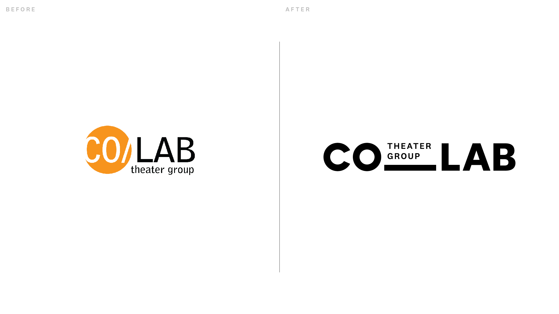
While we might think the best rebrands are about grand reinvention, CO_LAB's thoughtfully rejuvenated brand positioning is quite the opposite, creating a stripped-back identity that lets its diverse theatre talent shine. With flexibility, subtle flair and accessibility at its core, CO_LAB's rebrand is a prime example of design as a platform to nurture creativity and shape personal expression.

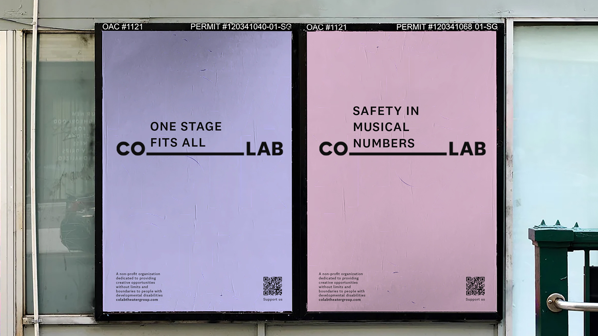
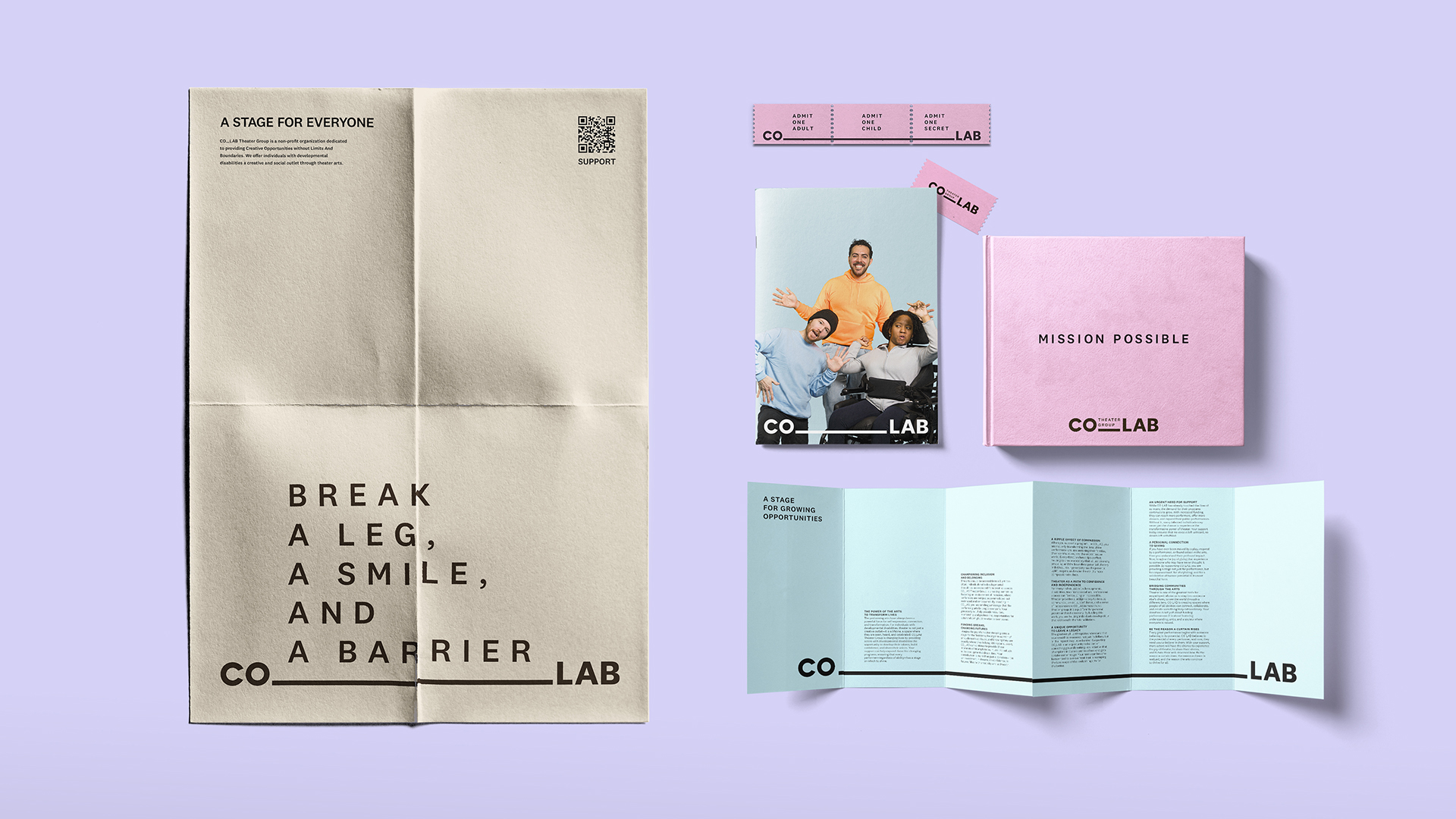
Created by Design Bridge and Partners, CO_LAB's new visual identity centres around the people and performances that shape the organisation. The rebrand's underscore motif gestures to a stage, acting as a flexible framework to highlight and uplift Co-Lab's creative talent. Functional and scaleable, this unobtrusive design feature allows the organisation to grow as CO_LAB scales its presence across fundraising, partnerships, and community engagement.

At its core, the rebrand has been thoughtfully engineered with accessible design, including ADA-compliant colours and National 2 typography. "CO_LAB has always been about creating a sense of belonging – our community deserves to see themselves in the arts," said Chris Pesto, founding member of CO_LAB and client business director at Design Bridge and Partners. "Every design decision was made to serve the needs of our community; more than just a new look, this identity helps CO_LAB grow, reach new audiences, and continue advocating for a more inclusive theatre world."
"Great design isn’t always about making a statement – it’s about creating the right conditions for others to shine," said Scott Lambert, creative director at Design Bridge and Partners. "With CO_LAB, we intentionally took a step back. The best thing we could do as designers was create a brand that gets out of the way and lets the work and the people speak for themselves." The project also provided a unique opportunity for Design Bridge's emerging creative talent to build a nonprofit identity system from the ground up. “Our interns played a major role in shaping the strategic foundation of the final product,” Chris shares.
In an era shaped by fleeting trends and noisy, style-over-substance visuals, it's refreshing to see a rebrand shaped by nuance and brand ethos, rather than flashy design. "The arts should be a space where everyone feels seen," Scott says. "This rebrand isn’t about aesthetics – it’s about creating a stronger, more inclusive theatre world.”

For more creative inspiration from Design Bridge and Partners, check out the ingenious design story behind this women’s health brand. If you're after more design insight, take a look at our interview with Design Bridge's chief creative officer Emma Follett to find out the main challenges designers face today.


