What you need to know
- Google is reportedly working on a News app redesign that brings minimalism to its feed by introducing a "Home" tab.
- The feed appears less structured as Google could implement larger hero image cards and remove the "For You" and "Headlines" tabs.
- The latest addition to Google News arrived last year when the company brought in the "Following" tab.
It looks like there are plans to overhaul yet another one of Google's apps, but this one seems more minimalistic than anything else.
Notable X tipster AssembleDebug (Android Authority) tore down version 5.115.0.670880469 of the Google News app and discovered a redesign. Some aspects aren't functioning (due to its development), but it seems that Google plans to revamp the app's main feed and available tabs.
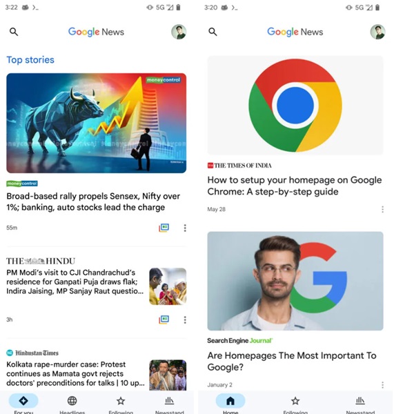
The News app redesign in question seemingly throws away the program's current section headers for "Top Stories," "Local News," and "Picks for You." Instead, the changes bring the articles up slightly and widen the hero image. Beneath that, users may find the article's title and the date it was posted. All of this is contained within a new "Home" tab as Google may forgo the current "For You" tab.
The three-dot menu is still available on the side. Additionally, the app's colorful "Full Coverage" icon on specific articles is likely still there, but not photographed in the provided screenshots.
Another strange change is the design discovered within the code seemingly removes the "Headlines" tab. The tab lets users browse through the top "latest" headlines and more from the U.S., Sports, Technology, and more.
Google News app users are no strangers to recent changes, as they had to say goodbye to digital magazine access last year. Users had until last December following its announcement a month before download/export their magazine before they disappeared for good.
We're likely a ways off from seeing this Google News redesign, considering certain aspects aren't functioning properly. The current look of the app feels very reminiscent of the basic news cards Android users see from their home screens or those in Chrome.
The good thing is that Google might stick by its current "Following" and "Newsstand" tabs in the News app. While the latter lets users browse an assortment of news outlets, the former is a relatively new addition. The tab brought in a new star icon beside website names that users can tap.
Doing so will ensure that you see articles from places you find interesting, so you're not scrolling for an eternity for something to read.