What you need to know
- The latest beta of Google Messages sees many UI changes to the app.
- These design updates include revamping the profile section with Material You design elements, as well as repositioning new icons on the bottom chat bar.
- There's no word yet on when these changes will reach users.
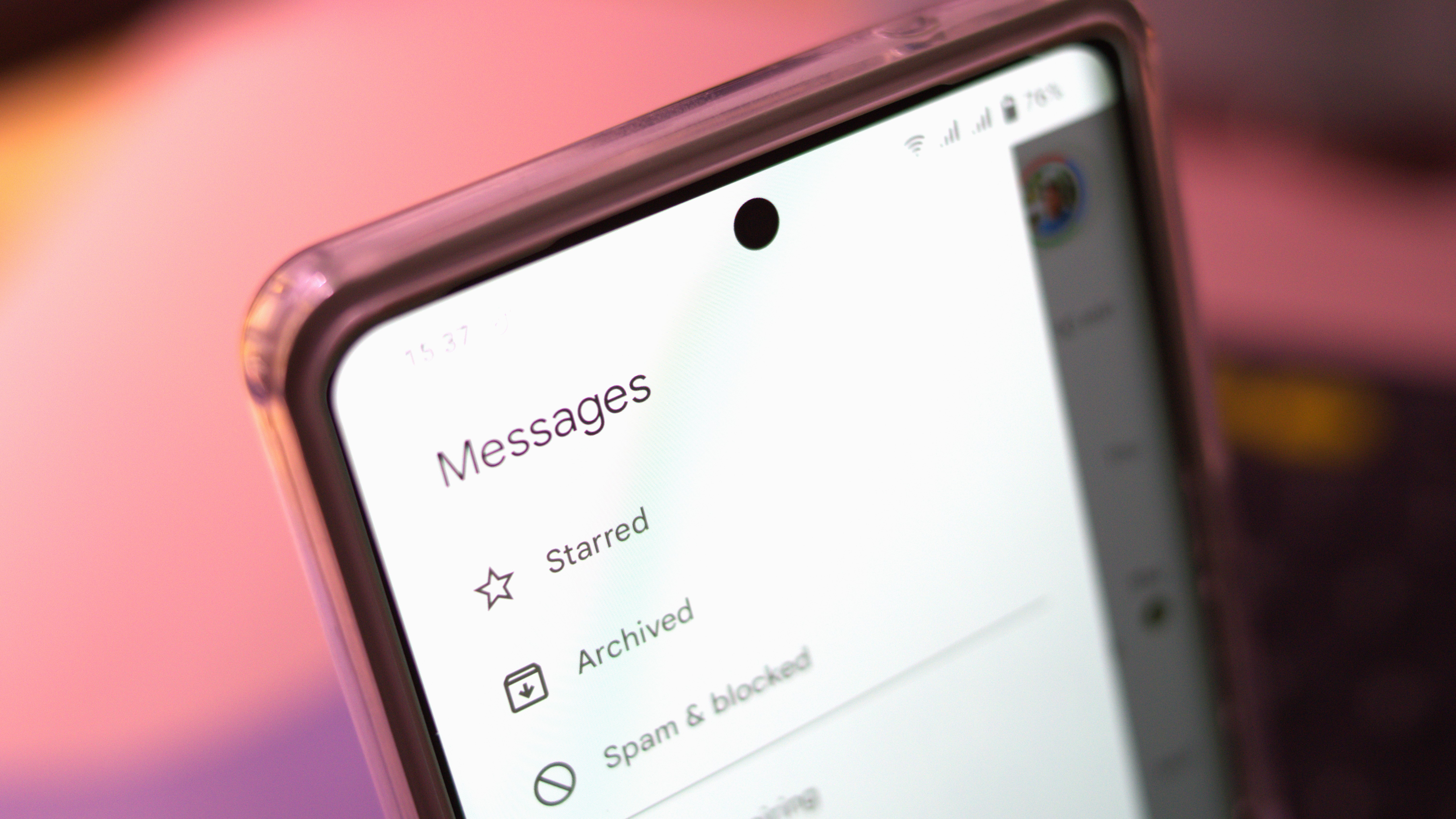
Google Messages has seen prolonged energy these last few weeks in the form of new functionality that has reached users. Now, new intel has indicated that the search giant is turning its attention to the app’s UI, with design changes to the profile page and search bar currently in the works.
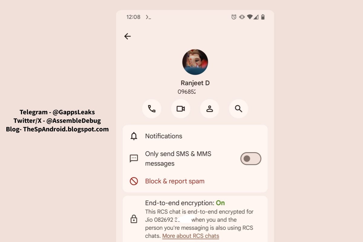
As reported by TheSpAndroid, Google appears to be sprucing up the messaging app’s contact page and bottom chat bar with some key design changes. First off, the profile page for contacts received a facelift, picking up elements of Google’s Material You design language that “matches the overall design of the rest of the Google Messages app,” notes AssembleDebug, who spotted the changes in the beta app and shared them on The SpAndroid.
Among the design changes to the profile section, it also includes a toggle for defaulting to SMS and MMS (in case they use RCS) and a section showing the E2EE status of the conversation with said contact.

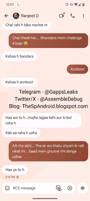
In addition to the new contact page, the update also repositions the app’s icons to give it a sleeker aesthetic. This includes amalgamating the bottom compose bar, the + button, and the gallery icon into the input field layout. Further, the voice messaging icon finds a new position on the right-hand side while the emoji button migrates to the left.

These changes, as well as the broader functionality updates to the Android texting app, clearly point to the company’s intentions to enhance the messaging experience for users who rely on RCS. Recent updates include the ability to ping more conversations to the top of the app, as well as expanded capabilities such as markdown text formatting and noise cancellation for voice messages.
As for the spotted UI changes, the latest updates are currently hidden behind feature flags so they are not yet available to users, but they could roll out to beta testers soon.


