What you need to know
- The latest Google Home app version includes several UI improvements that make devices you added to each room much easier to access.
- Google has also rolled out the new light controllers, including a pill-shaped slider that replaces the arc control for brightness.
- These changes are part of version 3.1 of the Google Home app on Android, which is now available to users.
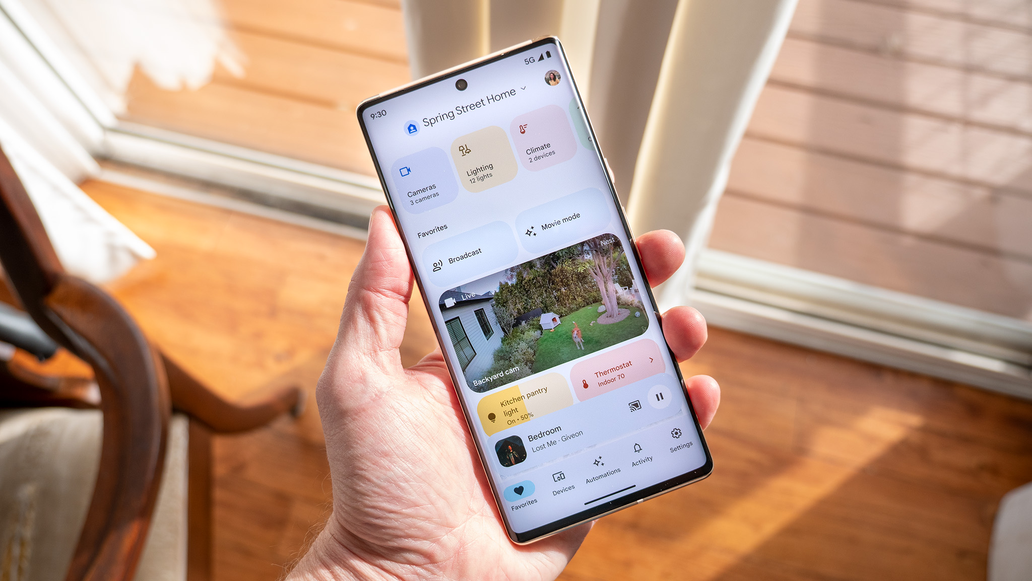
Google promised both form and function for the Home app during its I/O conference earlier this month, and the smart home controller platform has finally released these improvements outside of public preview.
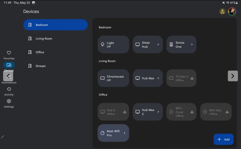
The latest version of Google Home (version 3.1) has introduced a UI tweak that makes each room in the Devices tab much easier to navigate thanks to a secondary side menu that houses all your rooms, as spotted by 9to5Google. When you tap on a specific room, the app brings up all the devices in that room.

This means it is now a lot faster to access every device that you added to a specific room, which comes in handy if you have tons of smart home devices. However, the secondary side panel only shows up in landscape orientation and disappears in portrait mode.
Speaking of side panels, the main navigation bar on the left side has gained a minor visual makeover. This means that the buttons for the Favorites, Devices, Automations, Activity, and Settings tabs are housed within a refreshed container with rounded corners. The latest change makes it easier to identify which tab you're currently viewing.
Meanwhile, the main left-side navigation bar and top app bar have a light blue background color that makes them distinct from the rest of the interface with the light theme turned on.
As for the revamped light controls (which were first spotted on the dogfood release a few weeks ago), the old circular control for brightness has been replaced with a pill-shaped slider. Below the slider are six temperature buttons that you can choose from to adjust the color of your smart light on the fly. There's also a palette icon that provides more granular color wheel control when tapped.
All of these updates have been in public testing for several months since late last year, so those who haven't joined Google's public preview program for the Home app may be delighted to finally get their hands on the refreshed platform in the stable release.


