What you need to know
- Google Drive has received a visual refresh on Android tablets.
- The cloud storage app has moved its navigation bar to the left side of the screen to take advantage of available real estate.
- The latest UI change is rolling out to users, with everyone expected to see it beginning on April 3.
Google is rolling out a new Drive update for Android tablets that includes a handful of tablet-friendly capabilities, some of which are consistent with the desktop version of the cloud storage app.
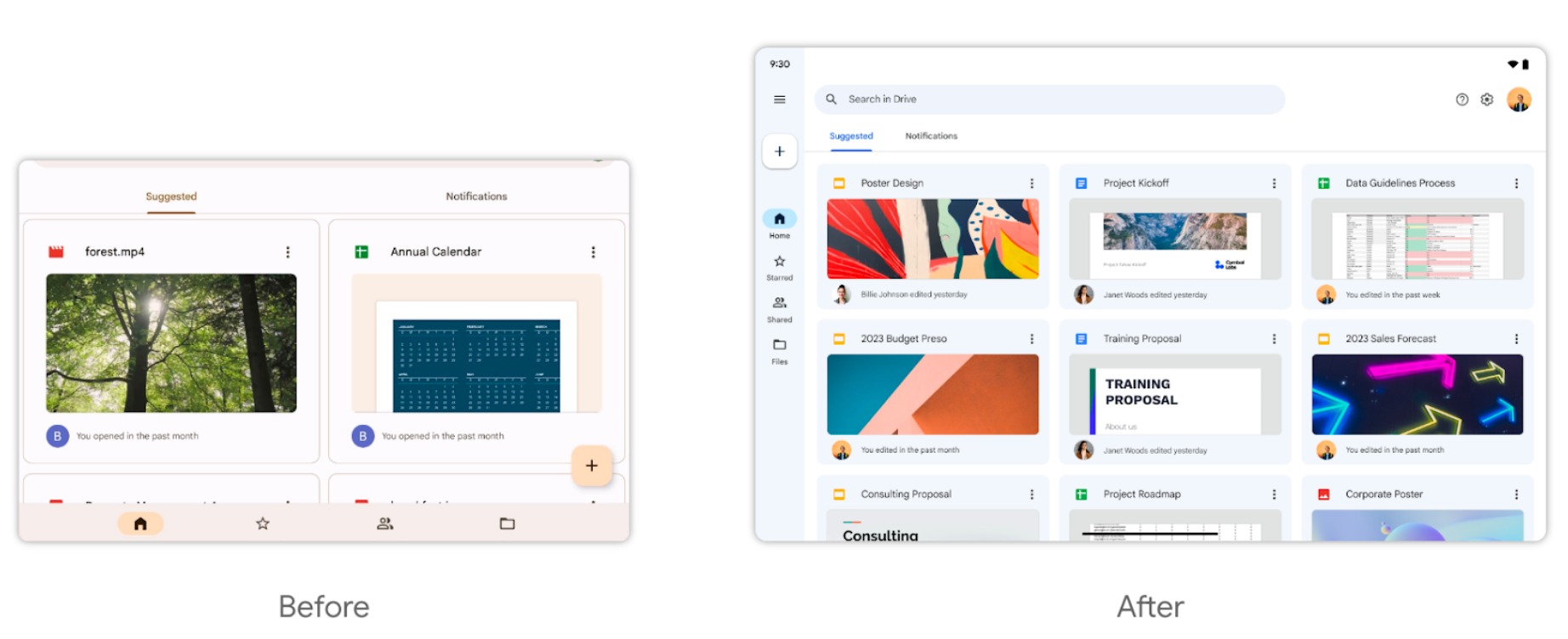
First up is the left-side navigation bar, which was previously located at the bottom of the screen. The navigation bar houses all the usual tabs for Home, Starred, Shared, and Files, with the floating action button sitting at the top like its desktop counterpart. There's also a hamburger menu above the FAB that allows you to navigate to various locations, including recent files, offline documents, backups, and the Trash folder.
Google notes in a blog post that this visual redesign aims "to take advantage of the larger screen" and make it easier to view file details. This means that the home screen now shows nine recent files. Before this change, you could only see two files at a time on the home screen.
In addition, the "Suggested" and "Notifications" tabs no longer take up a large portion of the interface. More specifically, each tab now displays three files in a row versus the previous layout's two files per row.

Google Drive also displays three small icons in the top right corner for Help, Settings, and your Google profile picture.
Google is now rolling out the new redesign in the Rapid Release domains, while the Scheduled Release domains should start seeing the UI change on April 3. The latest update should provide users with a tablet-friendly experience as part of Google's broader effort to make its first-party apps look better on larger screens.


