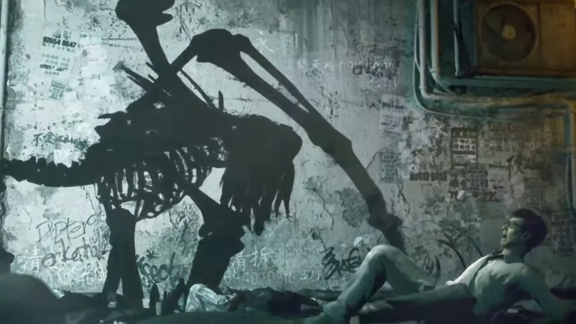
There might be no single video game director more keenly associated with Japanese horror than Keiichiro Toyama. His directorial debut, the fog-choked Silent Hill, introduced a cloying, small-town-gone-bad aesthetic that remains urgent and immediately recognisable today. And while the Siren series – designed by Toyama once he had recovered from the ordeal of making Silent Hill – is less widely known in the west, in Japan the games remain fiercely beloved cult classics. It's a legacy on which he's continuing to build with his next project, Slitterhead, currently in the final stages of development, albeit a rather unlikely one for a designer who, by his own admission, has "always been a bit apprehensive about horror".
Born in 1970 in the city of Miyakonojo, in the southern part of Kyushu, Toyama grew up in the mountainous countryside – the sort of rambling, sparsely populated rural location to which he has been drawn repeatedly in his games. His parents owned a general store that sold everyday goods such as vegetables and rice – "nothing to do with art or technology". So when he encountered his first arcade game at the age of six, it felt like a momentous occasion. "I felt astounded when I first saw these games," he recalls. "I can't quite put it into words, but it was incredibly impactful."
As well as arcade games, Toyama grew up alongside another revolution: Hollywood-produced horror films. "I must admit I wasn't particularly fond of them at first," he says. But when Japanese studios began to adopt and reshape American horror to more local sensibilities, Toyama was drawn in. "Horror began to infuse both Japanese cinema and Japanese television. It introduced this fascination in the culture with ghosts and the unknown – stories about the remnants of people who once lived. So when I was a teenager, there was a constant stream of mysterious and supernatural content. Looking back, I suppose there's a foundational connection there from my childhood, something that I was exposed to during that time."
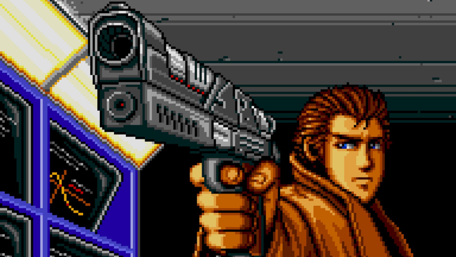
Snatcher
This feature originally appeared in Edge magazine. For more in-depth interviews, reviews, features, and more delivered to your door or digital device, subscribe to Edge magazine.
Platform: Mega CD
Year: 1994
I attended an art school during my college years, Tokyo Zokei University, which had been founded in the ’60s by the Japanese fashion designer and journalist Yoko Kuwasawa. To be honest, I wasn’t entirely sure about what I would pursue in terms of my career. While I was an art student, there was also this simmering passion for video games within me, but it wasn’t a path I had firmly decided upon right from the outset. During the ’90s, a pivotal time when the gaming industry was transitioning into the realm of 3D, video game companies were actively recruiting fresh graduates. They regularly conducted seminar sessions at educational institutions to scout new talent.
Two notable companies, Sega and Konami, made appearances at my university. Sega was a prominent player in the arcade industry; on the other hand, Konami was associated with the kind of games I had loved as a child, shooters such as Gradius and Salamander. Konami was also beginning to shift its focus towards creating video games for the US market, with titles such as Teenage Mutant Ninja Turtles. I decided to apply to both companies, and eventually I received an acceptance letter from Konami. That’s how I found my path into the videogame industry. The Snatcher project marked my entry into the company. Although it wasn’t exactly an internship, it was a program designed for new recruits. My role primarily involved porting the PC Engine version of Snatcher to the Mega CD – or, as it’s known in North America, the Sega CD. I had a deep affection for the Mega Drive system. As you may be aware, it had limitations when it came to the number of colours that could be utilised, especially in comparison to the PC Engine. What I did was essentially rework the colours of characters, backgrounds and various elements in the game. In some respects, I stood out from my fellow new hires because I was already familiar with this process, which made me fast and efficient.
This proficiency bought me some extra time, which I then used to create new artwork for the game. The original version of Snatcher had numerous elements that had to be cut from the game due to various constraints. So, during any available free time, I made it my mission to include these cut elements in the Mega CD version. This absolutely hadn’t been part of the original plan, and required reworking the art. Additionally, it came to our attention that the design of the Snatcher character in the original release was inaccurate – it wasn’t intended to be that way. Given the time constraints involved with the game’s initial launch, these design issues had to be addressed post-release.
Consequently, I took it upon myself to rectify the design in both the first and second parts of the game, which got me into some trouble with my superiors. Nevertheless, the improved designs found their way into the final product version. I must admit there was a sense of satisfaction in that accomplishment for me. In our version of the game there was a scene which could be played with a gun controller peripheral – I was responsible for creating the artwork for these scenes as well. Because I was working on the port of Snatcher, the game’s director, Hideo Kojima, had already moved on to other projects, so I didn’t have the chance to collaborate directly with him. But I was a huge fan of Metal Gear on the MSX – it was one of the reasons I had wanted to join Konami. To be honest, I was just pleased to be working at the same company as him.
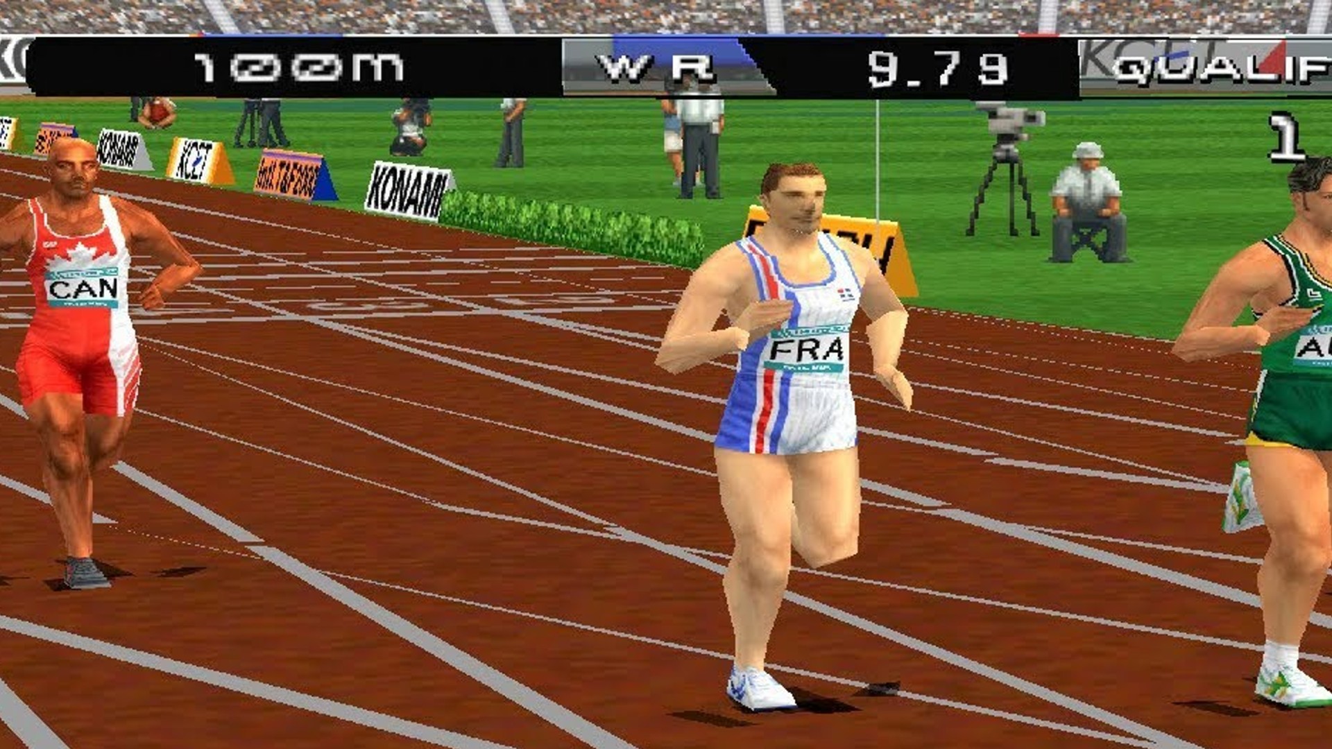
International Track & Field
Platform: PS1
Year: 1996
The video game industry was undergoing a significant shift as it transitioned from 16bit machines like the Mega Drive and Super Famicom to 32-bit platforms such as the PlayStation and Sega Saturn. Konami’s Tokyo team was redeployed to work on this new hardware, while the team in the Osaka-Kansai region continued their projects for the Nintendo 64. My initial project was related to American football, but this game got cancelled due to this shift in focus at the company.
I was then presented with a list of game projects I was allowed to choose from. I noticed ‘Track & Field’ on the list. I didn’t think too carefully and assumed it must be a war-themed game, so when I found out it was actually an Olympic sports game I must admit I wasn’t too thrilled about my decision… It left me feeling dejected, which is not the ideal way to join a new project. In retrospect, though, I am pleased with that period of my working life. This was one of the first games where Konami decided to incorporate motion-capture data into the game. I take pride in having had the chance to work with and implement this data, and looking back at my career today, it proved to be a hugely valuable experience, despite my initial misgivings.
Silent Hill
Platform: PS1
Year: 1999
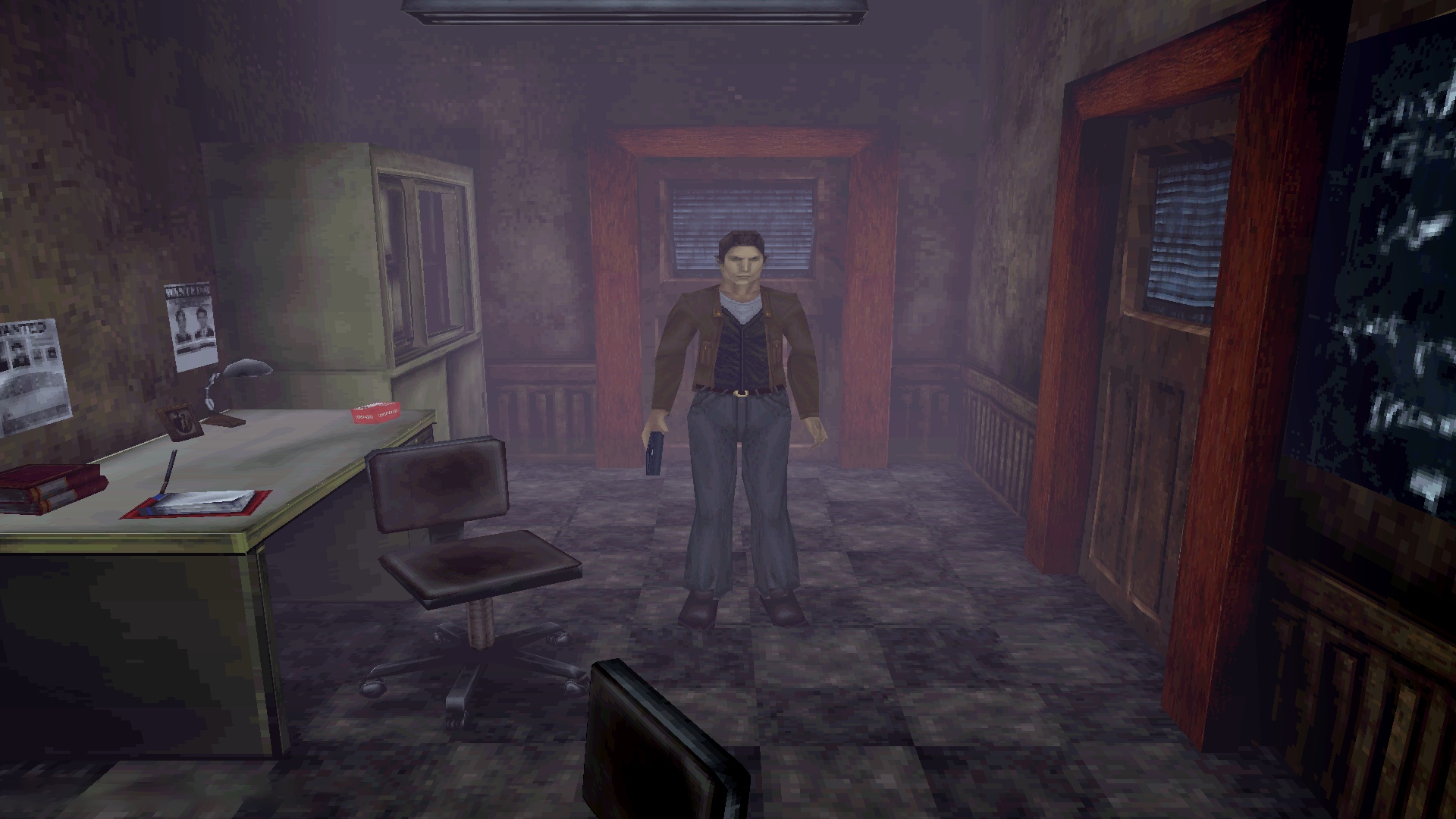
Resident Evil made a significant impact on the videogame market, and Capcom was thriving with this new horror series. Konami felt the need to step up and take on the challenge. It meant venturing into unfamiliar territory with the PlayStation and 3D games, especially in the realm of survival horror, which was a genre they hadn’t explored before. To be honest, I’m not entirely sure why I was chosen for this role. But Konami seemed to prefer having young individuals in charge of genres they weren’t yet familiar with, and I benefited from this policy. When Resident Evil came out, it triggered a surge of developers trying to make their mark in the survival horror genre.
The key was to distinguish your game; simply emulating Resident Evil wouldn’t lead to the same level of success. Konami was determined to make its mark in the genre. I recalled my college days, when I worked part-time at a video rental store, and I remembered the popularity of movies adapted from Stephen King novels. These works hadn’t been effectively incorporated into games yet, and I believed taking some of those ideas could bring a unique dimension to the game. One key element we focused on was the artwork. In Resident Evil, the backgrounds were pre-rendered in 2D. When I initially conceived the concept for the game, I decided to use darkness as a central theme, as it wasn’t a prominent feature in Resident Evil. I believed that by incorporating darkness effectively, we could create a distinct atmosphere.
At first, I contemplated using 2D backgrounds with lighting layers on top of them. However, during the development of another project, a colleague was working on a lighting system that wasn’t real-time but employed a point lighting system. When I saw the prototype of this lighting system, I was extremely impressed and felt that we should use it for our project. There was a limitation to how far the lighting could reach: roughly ten metres. I had concerns but was also confident that it would work well, because in a horror game you don’t need to see too far – darkness is part of the atmosphere. However, the team believed that having just darkness might become monotonous. I decided to use fog as an element to add depth and intrigue. That was the point where all the ideas came together. I left Konami shortly after the release of Silent Hill. It wasn’t just the game’s success that weighed on my mind, it was the entire process of creating the game that was incredibly challenging.
I was filled with uncertainty about how the game would be received, and during production I often felt like I was crafting something incredibly peculiar. This stemmed from the fact that games of this nature weren’t common at the time. By the time Silent Hill was launched, my mental health had taken quite a hit. I couldn’t help but feel that if I had managed things better and looked after my team more effectively, my colleagues and staff might have received more recognition and appreciation. In short, after the game’s release, I found myself in need of time to recuperate. However, I take great pride in how the Silent Hill franchise has continued to thrive.
Forbidden Siren
Platform: PS2
Year: 2003
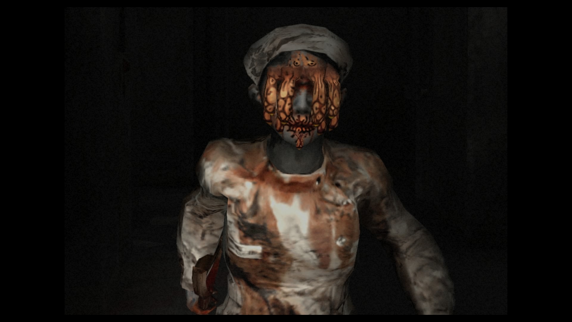
Eventually I joined Sony, which helped me rebuild my confidence as a creative person and a team leader. But when I first transitioned to Sony, there was a period where I wasn’t actively involved in game development. After I made the decision to become a director once again, it was a different company with new people, and the management structure was different. This made it easier to embark on the journey of creating a horror game at Sony. It was simpler to convince people and secure the necessary funds for production.
During my dark period, when I felt unable to make games, I still had ideas brewing. One of these ideas resulted in a new project: Siren. When asked if it was entirely different from my previous work, I confirmed that it had a different theme and a distinct identity. I enjoyed working on it, but the game didn’t perform well overseas at the time. This was partly due to Siren having many Japanese-oriented elements, and perhaps not being marketed as effectively abroad. However, it has since gained a cult following in Japan, and remains very popular to this day. So I certainly take pride in Siren and the impact it had.
Forbidden Siren 2
Platform: PS2
Year: 2006
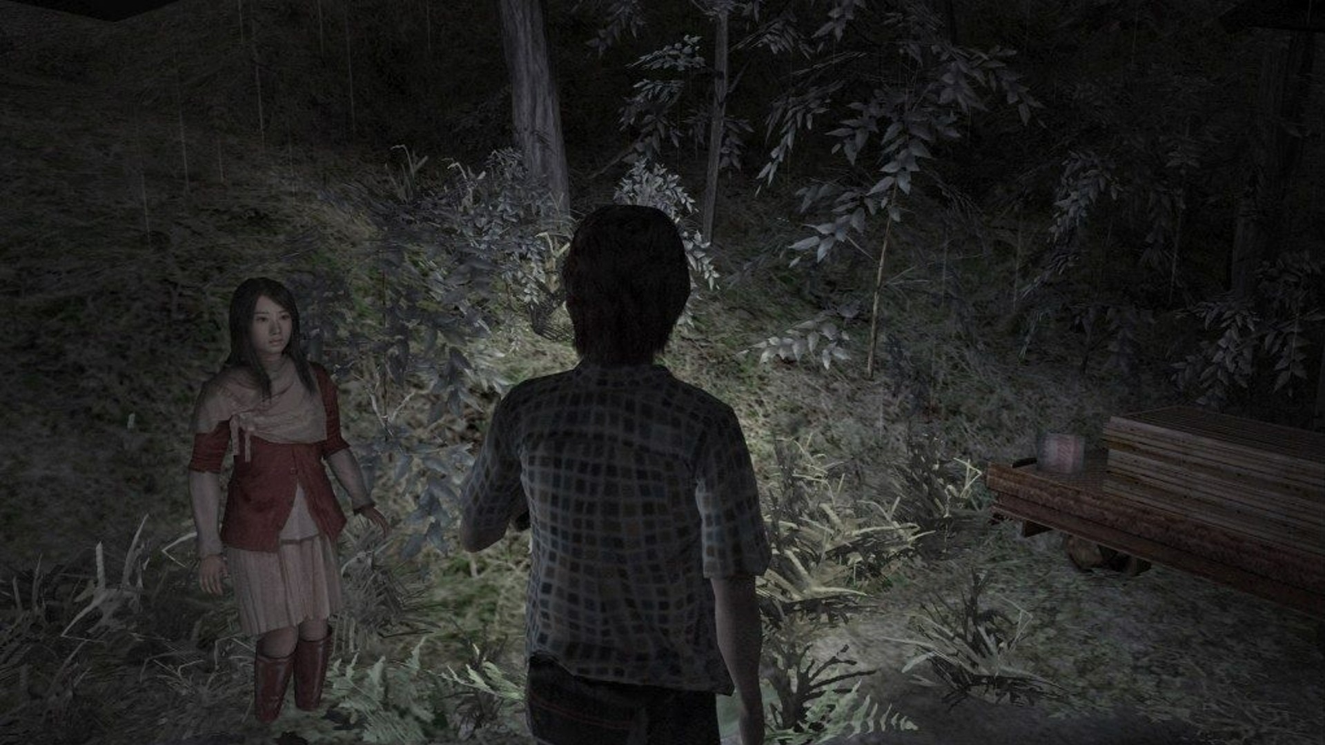
With the sequel, we introduced the concept of changing perspective between different characters. It was an interesting design choice, and implementing it was a challenging process. While we’ve seen such shifts in perspective in films and books, of course, it wasn’t very common in games, and it took a lot of prototyping to get right. The initial concept involving changing the perspective seemed relatively straightforward because it’s essentially just switching cameras. However, when we tested this approach, we found it lacked the desired horror element, so we modified the concept.
We wanted to create a situation where something threatening or dangerous was approaching the player, but the player couldn’t yet see it. Just switching cameras wouldn’t suffice to make it truly terrifying. To achieve the desired effect, we had to simplify the movements of the characters when changing perspectives, regardless of the distance between them. This involved seemingly mundane actions like opening doors and closing them. Surprisingly, this turned out to be one of the most challenging aspects of the project. However, it created a unique feeling that was not prevalent in other videogames at the time, which ultimately contributed to its success, despite the difficulties we faced.
Gravity Rush
Platform: PSVita
Year: 2012
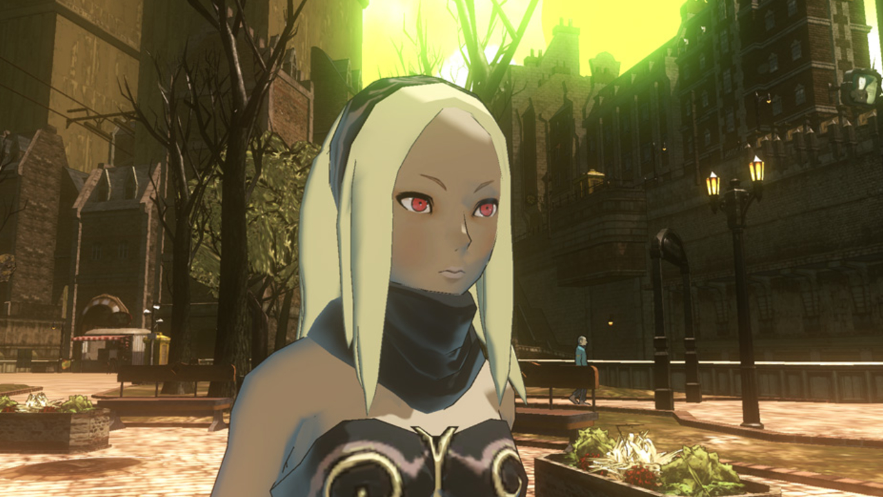
When it comes to the world-building and visual aspects of the Gravity Rush series, I drew inspiration from various sources. I’ve had a fondness for French comics, also known as 'bandes dessinées', since I was a child, and I had always aspired to create something connected to that visual style. Fortunately, Sony wasn’t micromanaging my creative direction or dictating what kind of game I should make. Following my success with the Siren series, I had the freedom to work on whatever I wanted, to a degree.
The concept of gravity control in the game originated from my daily experiences in Tokyo, where Sony Interactive was located. Walking amid skyscrapers and buildings, I often found myself frustrated by the need to navigate around these structures. I thought, ‘Wouldn’t it be so much better if I could just fall upwards, or glide across them?’ That’s where the initial idea for manipulating gravity came from. We initially developed the game for the PlayStation 3. However, during that period, Sony made the decision to introduce new mobile hardware.
The decision to switch to PS Vita wasn’t mine; it came from upper management and decision-makers. They believed that the game would be better suited to this powerful handheld platform. At first, I was concerned about the challenges of adapting a 3D action game to a portable device. It seemed like a challenging task. However, it turned out surprisingly well. The transition from the PS3 to the Vita took quite some time, but we used this time effectively to refine the worldbuilding and the visual aspects of the game, and it ultimately turned out to be a success.
Slitterhead
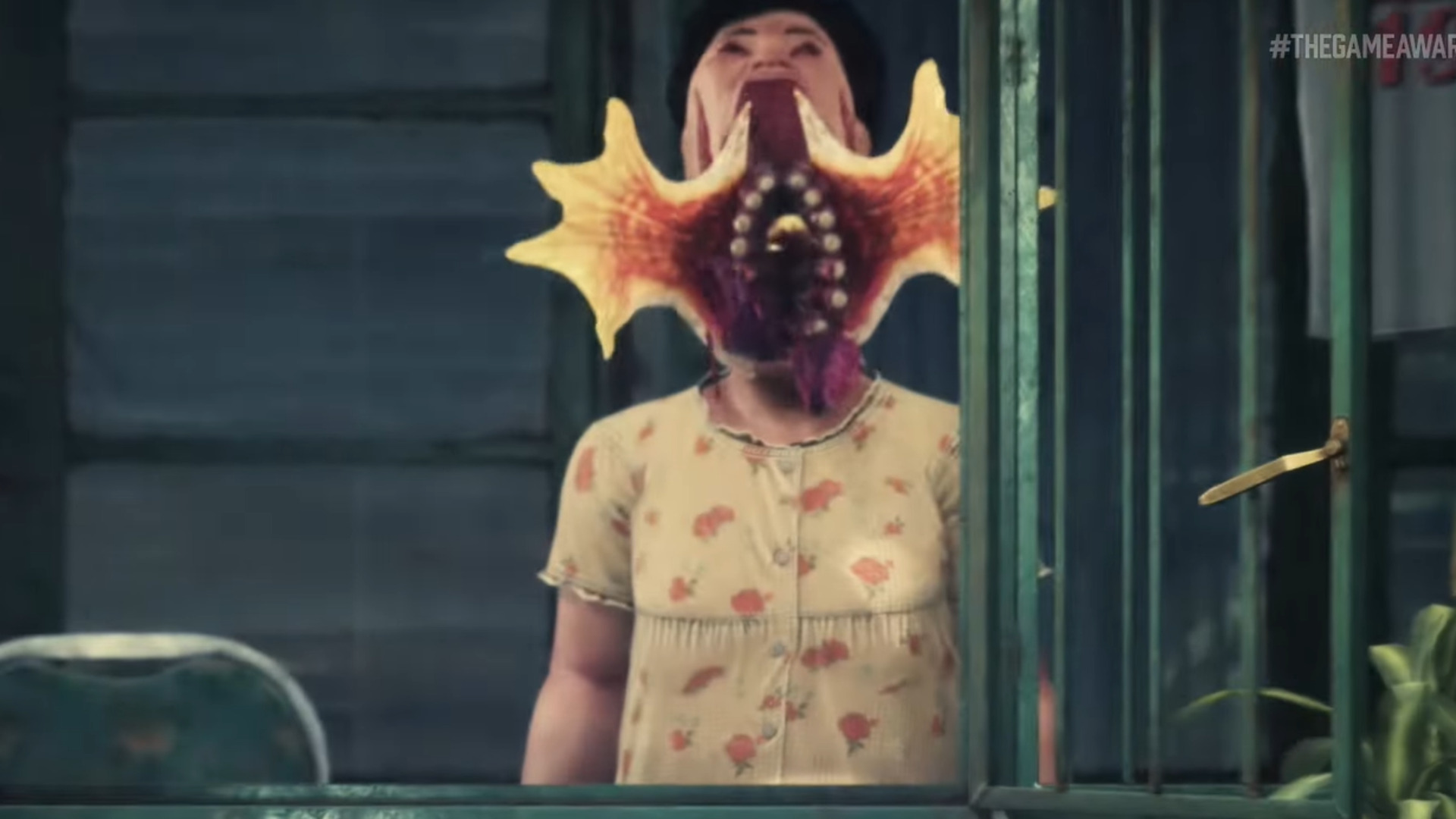
Platform: TBA
Year: TBA
As I moved into my 40s, and the later stages of my career, I noticed a significant shift happening in the industry. Many of my former colleagues and friends, who had been part of larger companies, were leaving to establish their own studios. This wasn’t entirely new – but when you reach your late 40s, you face critical decisions. It’s often a choice between climbing the corporate ladder within a company or going solo. Seeing friends venture into the indie scene, I felt that it was a more appealing option for me because, ultimately, I wanted to create games. Furthermore, Sony was in the process of restructuring, especially within Japan Studio where I was based.
In larger companies, you often sense the winds of change blowing, and it seemed like a suitable time to explore new opportunities. I thought I might end up working on my own or collaborating with other companies, as I didn’t envision establishing a studio. However, as the pieces fell into place and people started to move in different directions, I spoke with some colleagues and producers at Sony and we realised that we could create something together. It was unexpected but it turned out to be a great opportunity, and I’m thankful for it. As we are reaching the final stages of development for Slitterhead, I feel that it’s an appropriate time to share more details about the project [and the decision to] go back to my roots in horror.
I’m fully aware that developing a survival horror game in today’s market is challenging, given the abundance of horror games available. However, I’ve been striving to create something that sets itself apart from the traditional survival horror experience. It’s taking a shape that’s different from my previous work, incorporating elements and themes that are genuinely horrifying. While I cannot predict how players will perceive it, I believe we are crafting something unique, far from generic, and imbued with a new and distinct feel.
This feature first appeared in Edge Magazine, which you can pick up right now here.


