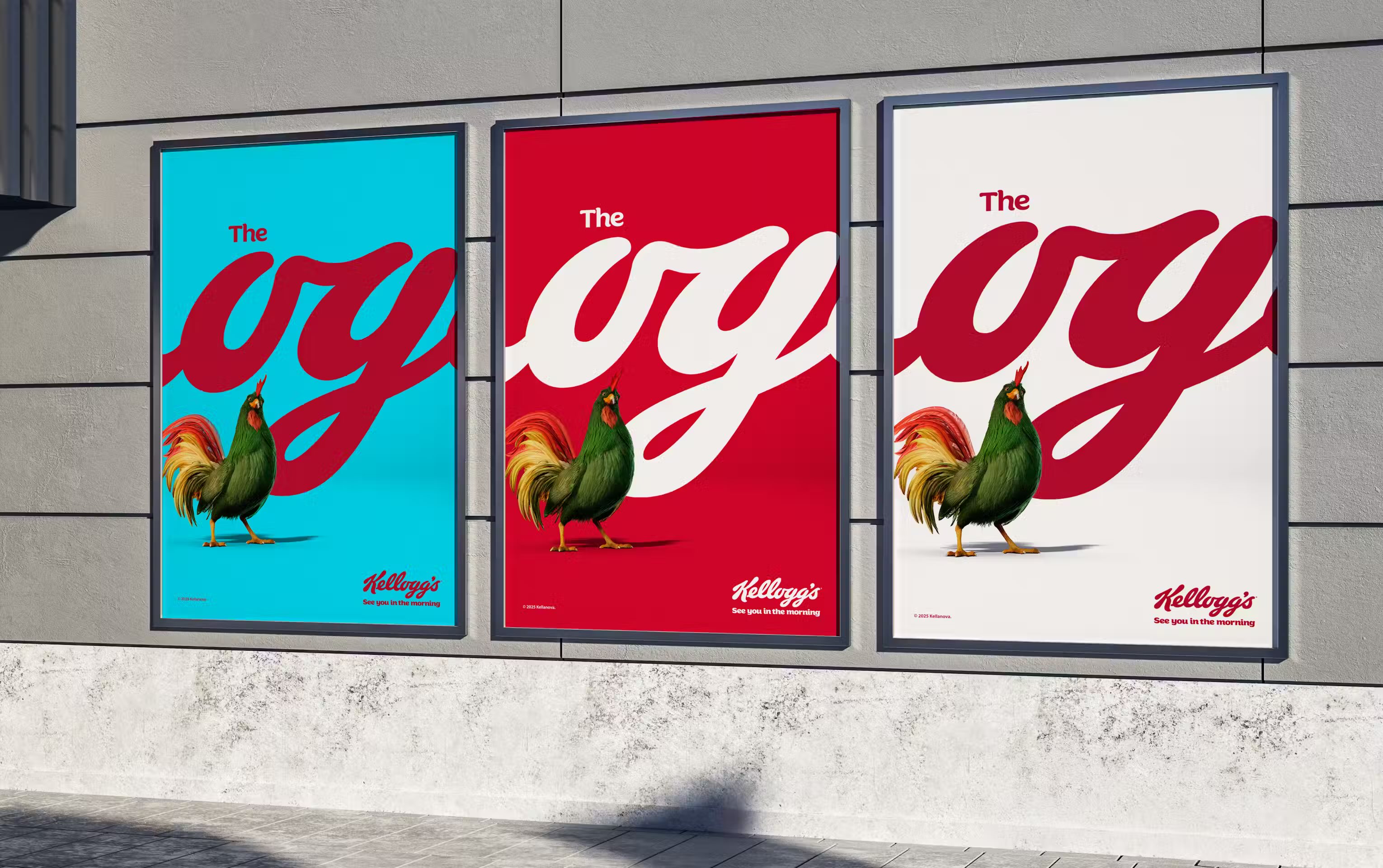
Kellogg’s recent See You in the Morning campaign has sparked a lively debate: is it a masterstroke or a brand mishap? For me, it’s the former. It exudes confidence, stripping the brand promise back to the essentials—their iconic script wordmark and a tagline that owns the morning.
By declaring themselves “the OG” breakfast, Kellogg’s isn’t just selling its cereal; they’re staking a claim on a cultural moment in time and flexing the strength of their relationship with consumers by trusting the type to do the heavy lifting. It's a brand-focused play, leaving room for product-specific ads to follow. Is having one of the best logos becoming less important than weilding a strong typeface?
While nostalgia might tempt consumers to resist change, savvy brands know they must continuously evolve, particularly in their quest to connect with millennial and Gen Z consumers, who often favor pared back, clean and authentic design. But that’s led to many familiar and trusted brands ditching their historic font and “blanding” their identity, much to the chagrin of those who feel affinity—and yes, nostalgia—for the brand.
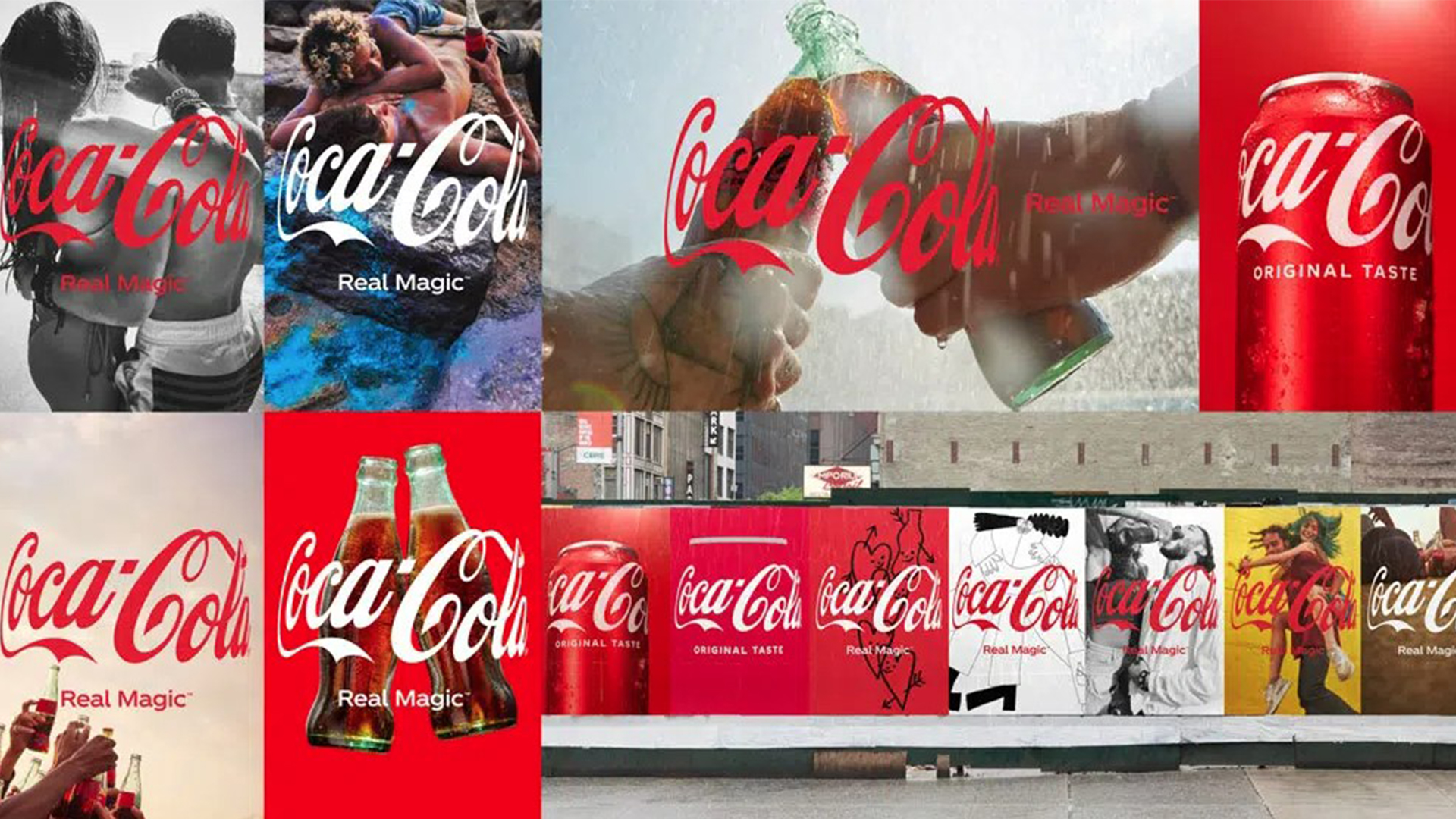
The biggest risk isn’t in altering visual identity, it’s in becoming irrelevant. The trick is to evolve without abandoning the elements consumers have come to know and love. Coca-Cola, for instance, has managed to stay fresh while maintaining its core identity and iconic script word mark for over a century. The lesson? Adapt or fade away.
Why Are Logos Taking a Backseat?
The move away from logos represents a broader shift in branding. We’re entering a golden age of typography, where fonts are not just a design element but a defining aspect of brand identity for large and small organisations alike. 83% of designers and creatives say that typography is one of the top three critical components in design decisions when working on a design project.
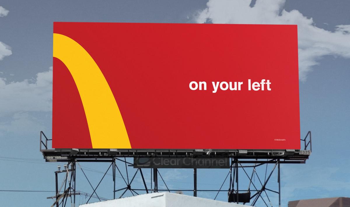
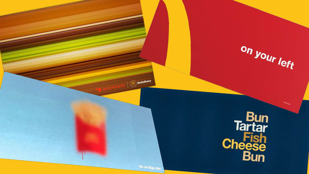
Typography is a brand’s visual tone of voice. Big names like McDonald’s, British Airways and easyJet have recently relied on typography—not their logo—to carry their identity in bold campaigns. A strong typeface can be as recognisable as any logo. Dropping the logo and leaning into the brand’s type in a campaign is like someone recognising your voice when you call, before you’ve even said your name. It shows you’re close—a sign of true brand confidence, conveying emotion, authenticity, and values, all at a single glance.
For years, the design world was fixated on abstract logos, which require time and repeated exposure to build recognition. The challenge? Many of these symbols are ambiguous. For example, a mountain or a fox. But what do they actually represent? Typography, on the other hand, immediately communicates a brand’s name while still allowing for distinctiveness.
Another factor driving this shift is accessibility. With democratized design tools, anyone can create a brand today. Emerging brands often skip the logo altogether and rely solely on type-based branding. This strategic choice shows that legibility and clarity matter more than an abstract mark.
The rise of typography-led branding also aligns with the digital-first era. With millennials and Gen Z's interacting with brands largely via social media and apps, a brand’s first touchpoint with consumers is now more likely to be via a screen than on packaging or in-store displays. First impressions matter and for many brands, type becomes their primary ambassador!
That said, physical brand experiences still hold value. Just as vinyl records and handcrafted goods have enjoyed a resurgence, tangible brand assets such as packaging and signage retain their power. The key is in balance.
The Road to Iconic Status
The more constraints and values that are established, the easier it is to select or design a typeface that fits with a brand’s personality. Is it human-centered or technical? Fast or luxurious? Each answer narrows the field, ensuring that the typography authentically reflects the brand.
Creating an iconic typeface requires time, consistency, and cultural resonance. McDonald’s type looks playful and friendly, reflecting its affordability and mass appeal. Kellogg’s script looks lovingly created in a kitchen, hand-made and comforting, reinforcing its nostalgic breakfast connection. Coca-Cola’s cursive typography is both elegant and timeless, almost a fashion statement. So, what makes these typefaces iconic? Emotion, loyalty, and generational recognition.
Building a typeface that is truly “ownable” relies on differentiation. A typeface doesn’t have to be the most unique in the world, but it needs to stand apart from its competitors. Consider The New York Times and its signature Cheltenham typeface—it’s instantly recognizable.
Leaning into custom typefaces has given Kellogg’s an ownable typographic look, and this campaign puts it front and center, as the most valuable brand asset they have.
However, brand status isn’t permanent. Once-mighty brands like Kodak and BlackBerry serve as cautionary tales. Even the most recognisable typography won’t save a brand that fails to innovate and stay relevant.
The bold future
Typography-led branding isn’t just a passing trend, it’s a strategic shift that will continue to shape the future of design. In millennial and Gen Z focused industries like fintech and SaaS, where concepts can be abstract, typography provides clarity and instant recognition. Meanwhile, legacy brands like Kellogg’s prove that when done right, a well-crafted typeface can be just as powerful—if not more so—than the logo itself.
As branding evolves, one thing is clear: typography isn’t just a design choice. It’s a bridge that connects message to user and a powerful statement in brand confidence, authenticity, and identity.