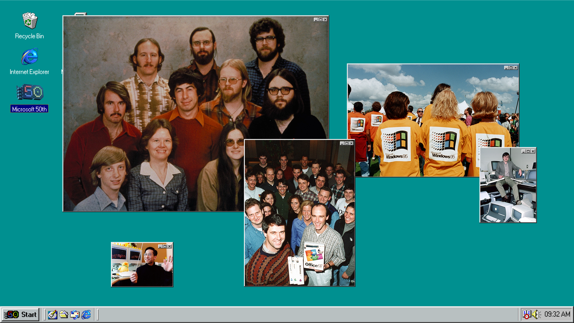
Celebrating 50 years of technological ingenuity, Microsoft has launched a brand new campaign as a heartfelt homage to its past and an invitation to its innovative future. Founded in 1975 by Bill Gates and Paul Allen, Microsoft has evolved into a household name, weaving itself into the fabric of the tech world – now, 50 years on, the company still maintains its founding pioneering spirit and optimism.
Capturing a sense of nostalgia, Microsoft's anniversary celebration spotlights the "dreamers, builders, and changemakers" that built it to inspire a new generation of thinkers. With immersive motion design, playful graphics and a vibrant colour palette, the new campaign evokes a sense of joy – a wholesome tribute to the people central to its 50-year success.
Created by brand and digital agency Koto, Microsoft's 50th Anniversary campaign is rooted in the sentiment that “change needs makers.” With an empowering visual language, the campaign centres around Microsoft's history and the people who shaped it, hinging on the themes of "Worlds", "Iconic Moments", and "Then & Now". More than a mere empty homage, the new campaign is a "visual conversation about progress, impact, and the endless potential ahead."
"Microsoft’s 50th isn’t just about looking back –it’s about reinforcing what has always set the company apart: its spirit of continuous innovation," says Cassidy Moriarty, Koto's strategy director. "This campaign had to honour Microsoft’s legacy without feeling nostalgic for nostalgia’s sake. ‘Change needs makers’ encapsulates that idea – a recognition of those who shaped the last five decades and a challenge to those defining the next, she adds.
Artifacts tell the story of Microsoft's evolution, featuring early UI to today's Copilot AI (and of course, a cameo from Clippy). This design motif is reflected in the campaign's central artifact – the 50th Anniversary logo inspired by the original OG Windows design. Pairing retro aesthetics with contemporary motion graphics, the design embodies the campaign's dual spirit of celebration and forward-thinking. "The challenge was to create a system that felt expansive yet cohesive, able to flex across history and the future while always keeping the changemakers at its center," says Joe Ling, Koto's creative director.
Featuring Segoe Sans Display, the campaign's typography is a nod to Microsoft’s heritage while capturing a modern feel. Paired with a collection of six heritage-inspired gradient backgrounds, the visuals unite Microsoft's identity across the campaign's touch points, "injecting warmth, optimism, and continuity."
"Bringing this campaign to life was about translating strategy into a compelling and immersive campaign identity," adds Joe. "Every design decision – from the dynamic worlds to the way artifacts frame people’s impact at Microsoft – was intentional. We wanted to show Microsoft not just as a company, but as a catalyst for creativity, innovation, and achievement. The challenge was to create a system that felt expansive yet cohesive, able to flex across history and the future while always keeping the changemakers at its centre."
For more design inspiration from Koto, take a look at the studio's Microsoft Copilot+ PC branding or check out its slick new website that reveals the recipe for branding success or check out its