Design trends tend to move in cycles, and if a style seems garish and dated right now, there's a good chance it'll be cool again in a few years' time. Just look at the resurgence of the Y2K aesthetic, with compact cameras and iPods having another moment in the sun. And it isn't just hardware – if recent UI/UX developments are anything to go by, software is just as susceptible to cycles too.
The world of logos and wordmarks has already begun moving away from the flat design trope, with countless decorative heritage designs making a comeback in the last couple of years. And now there are hints that software design is becoming more tactile again too. Could it be that, whisper it, skeuomorphism is coming back?
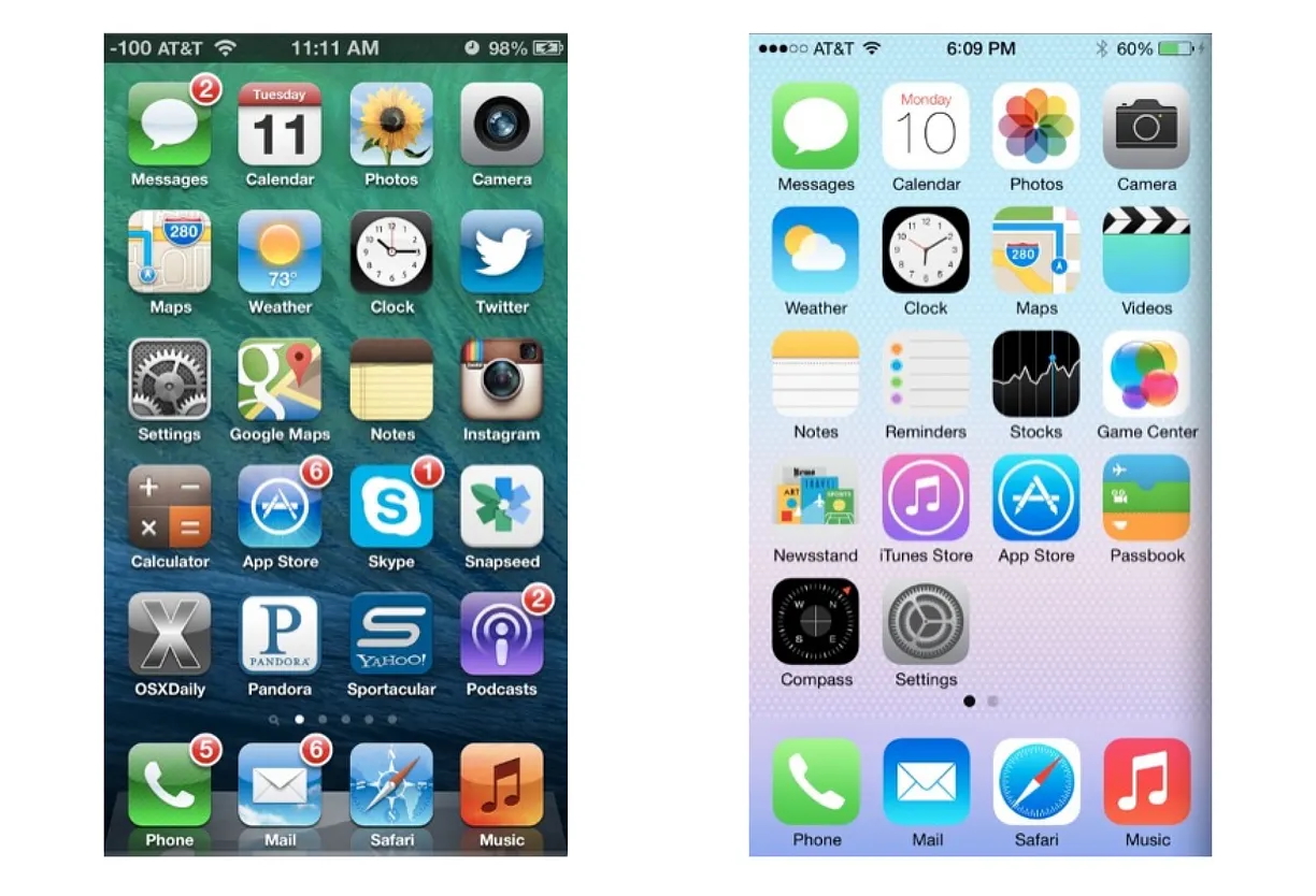
When Apple dropped iOS 7 in 2013, it marked a sudden shift in direction from the detailed design language that had defined the iPhone for the last six years. Gone were realistic and tactile textures, replaced with smooth, cold and minimal iconography. But the tide might finally be turning – partly thanks to Apple. We've seen examples of the company getting a little more 'extra' with its menu screens and animations over the last year. Even the macOS icons are slowly but surely gaining extra dimensions, and shadows.
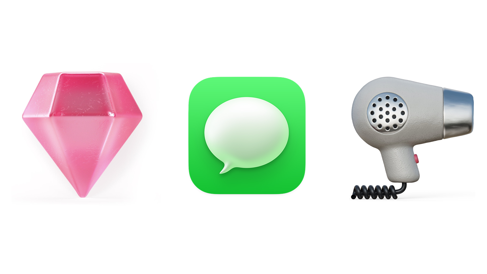
And it isn't just Apple. Last year, Airbnb launched a new icon set feauturing unbelievably tactile detail. As one X user commented on the tiny but textured images of hairdryers and fireplaces, "I want to lick and touch them all".
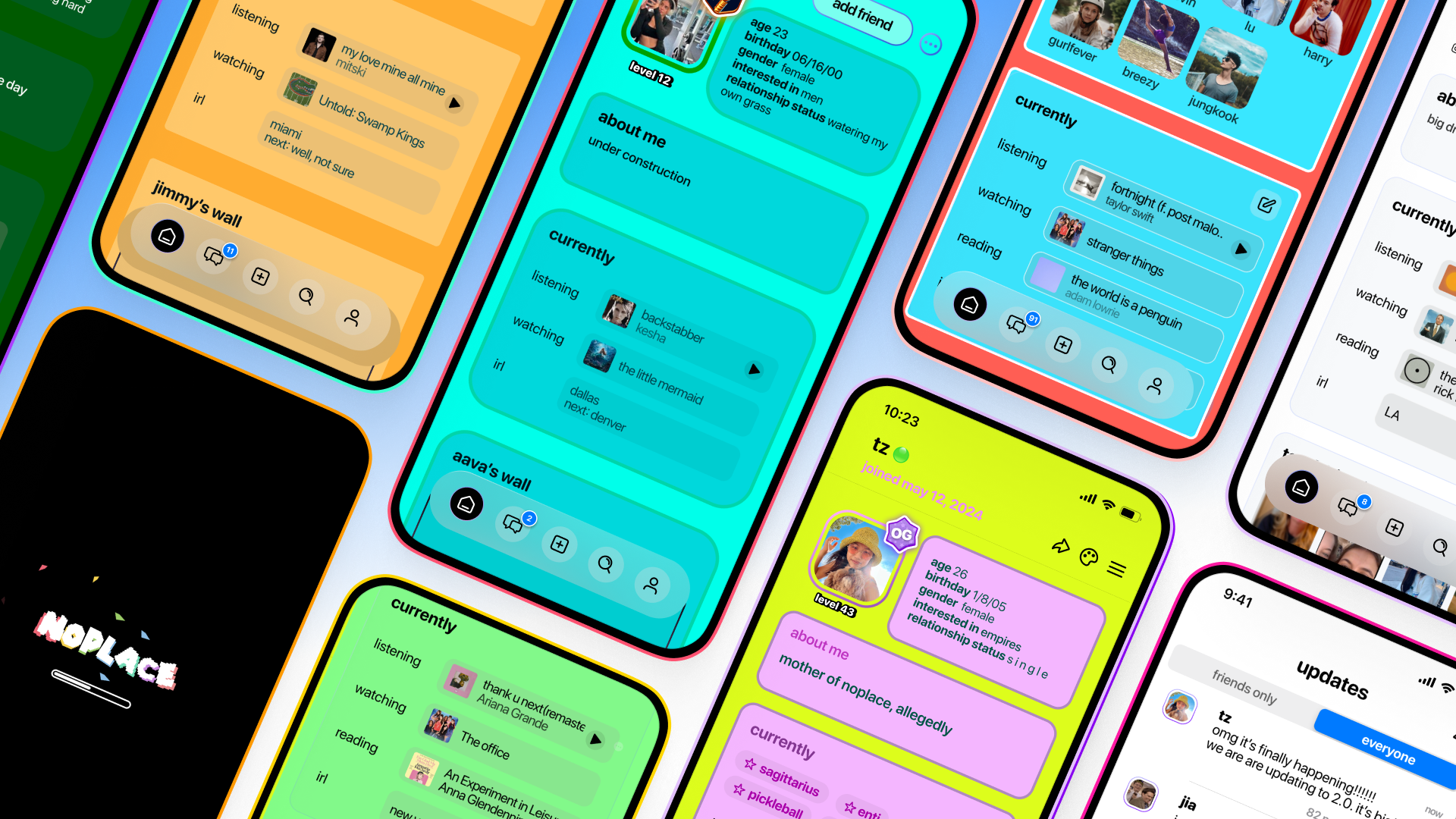
And then there's web design. Nostalgia is everywhere right now, with Wix even declaring it a bonafide design trend last year. From MySpace-inspired social app Noplace to the Web Design Museum, it seems everybody's yearning for a time when the web was less uniform and a little more chaotic. No wonder Gen Z is apparently going wild for the Frutiger Aero aesthetic.
a new aesthetic pic.twitter.com/kDR3x0TQZvSeptember 25, 2024
I have to share some details of our beautiful new icon set. Tiny but unbelievably mighty. The level of detail, lighting, tactility. Chefs kiss, so proud. pic.twitter.com/cWpRXd9yAXOctober 17, 2024
I think the return of retro aesthetics isn’t just about nostalgiaIt is sure a factor. Like @gregisenberg said: “Nostalgia is a hell of a drug”But they’re also a reaction to modern sameness in product designLoud colors, chunky typefaces, and blocky designs bring warmth and… pic.twitter.com/yJMpy3hggAJanuary 28, 2025
Indeed, while UI design might be a little behind logo design when it comes to this backward shift, it seems the rationale is similar – rejection of sameness. The argument that the minimal logo trend is killing brands has gathered pace over the last few years, leading to the sharp left turn we've seen in logo design. And it looks like UI design is finally following suit.
As for why we're all so nostalgic for a messier, more physical design language, it might have something to do with the fact that smartphone use has increased to such dizzying (or is that worrying?) levels. If we're all spending so much time in sterile and minimal digital environments, it's no surprise that we're starting to turn towards designs that remind us not just of the past, but also of the real world.
All of which is to say, skeuomorphism for the win. Bring on the texture. Give me a faux leather Notes app, a Calendar app that looks like it's made of paper, a Podcast app that resembles a wireless. UI has been too polished for too long. Now excuse me while I go touch some grass.