
As one of Hollywood's most talked about personalities (not least after her recent role in Oppenheimer), the world is watching Florence Pugh's design decisions. Naturally, this is often in the shape of her fashion and beauty choices (as seen on her Instagram), but once every so often, the actress shares a look at her interiors, too.
Florence, who lives between Oxfordshire and LA, shared a look inside her open-plan living space – complete with statement artwork and patterned rugs. However, while these accents are worth a mention, it's Florence's mint green color palette that has got designers the most excited.
But what makes it so noteworthy? Dunn-Edwards' color expert Sara McLean says its versatility and tranquility have allowed this hue to stand the test of time.
'Using mint green in design takes us back to the peak 1950s –where we often saw soft, pastel colors (usually paired with Marmie Eisenhower Pink) in virtually any home across America,' Sara says. 'In 2023, we're seeing that many are revisiting this hue in a fresh way to re-create classic motifs in other sociable areas.'
It's hard to know precisely which hue Florence chose for her home, but with any variation of this tone, it's hard to go wrong. However, if you're working with wood, like Florence, Sara has some suggestions.
A few of my favorite mint hues that can also beautifully showcase the wood grain include Mint Condition, a blue-toned mint color reminiscent of chocolate chip mint ice cream and joyful summer nights, and Faint Clover, a green-toned mint hue that brings you back to nature by bringing grounded, but bright tones into any space,' Sara comments.
Florence has chosen to taint her otherwise natural-hued space with this cool color trend; however, as Sara explains, we don't need to ensure we paint onto wood, as the actress demonstrates. Instead, the expert says the color is what matters.
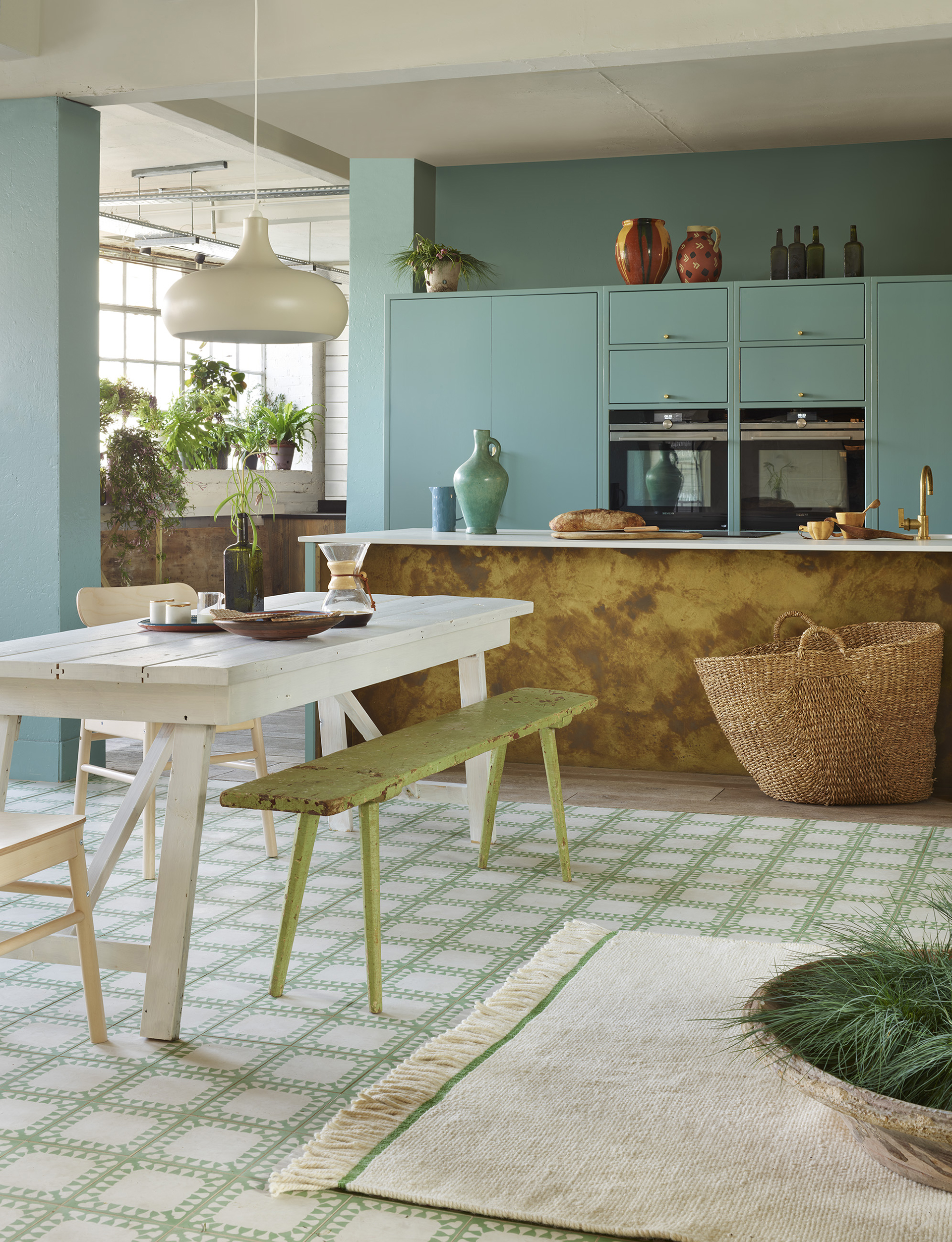
'For homeowners looking to incorporate the mint color in their homes, whether on wood or any surface, I suggest pairing the hue with various accent colors based on your design style,' Sara explains.
'My go-to pairing for these hues is Vanilla Shake, a natural, milky white color with mildly warm undertones that is inherently versatile and tranquil.'
Or, for yet another bold yet vintage-inspired look, the expert recommends incorporating black hues through trims, accent colors, and hardware reminiscent of '50 checkered floors seen in mint kitchens.
'For those looking to incorporate mint more subtly, consider using the color on an accent wall or in a smaller-volume room such as a powder room, playroom, or study,' she adds. Wherever we play with this tone, we're safe in the knowledge that Florence would support our color choices.