What you need to know
- Fitbit's new "redesigned" app gets shown off on its help page.
- The changes are minimal with some changes to certain icons on the "Today" page going from circles to rounded-edge squares.
- The "Discovery" page appears to have gained larger information cards.
Evidence that Fitbit is flirting with a new redesign for its Android and iOS app sneaks through. It looks like Fitbit's "How do I use the Fitbit app?" page showed off some changes coming to the app (via 9to5Google).
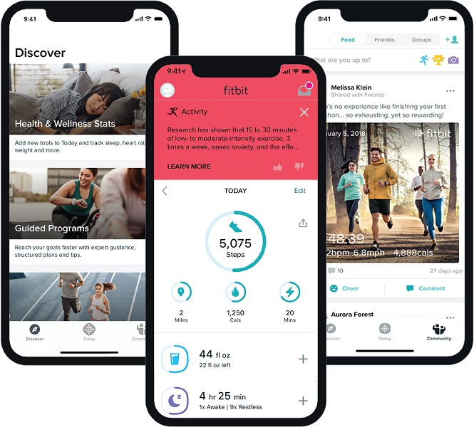
At first glance, not much appears to have changed. The three iPhone mockups used for the example show the "Today" page of the Fitbit app in the center. Much of it is the same, save for the icons on the left for hydration and sleep, not as total circles but taking on a squircle shape instead. The different metrics on the Today tab are also no longer spaced out between each other.
The bottom bar, despite not being displayed in the center image, displays three options: "Discover," "Today," and "Community." There's also a slight inconsistency with the icons, but it could be due to human error.
The cards appearing on the Discover page are larger, filling up the width of a given phone's display, and listed one after another instead of horizontally. That side-scrolling feature appears to be gone. The tab's example shows Health & Wellness stats — an option to add more tools to the app — and Guided Programs for workouts.

The Community page, again, looks pretty much the same. Instead of the need to navigate over to the "Friends" tab at the top to add someone, Fitbit has pasted that option at the top right of the "Feed" view.
This "redesign" for the Fitbit app is one that's been a thing for some time now. Back before the Pixel Watch officially launched, Fitbit showed off some early looks at its new Wear OS app, and there was even mention of a change in design for the Android phone version. Even back then, the changes were incredibly minimal; there was also the odd, curved navigational bar which seems to have been tossed.
Perhaps, now that an early look at the redesign is showing on Fitbit's help page, we may be near a full rollout of the changes. Something that is certain is Fitbit's mandatory migration to Google accounts, set to go down this summer. The merge will offer security and privacy controls directly through the Google Privacy Center. Additionally, all of your health and witness data, including its extensive history, will come right along with you.
The Google Pixel Watch is a hub of AI intelligence and smart home controls. With the Pixel Watch's glass-domed display, users can enjoy health and fitness data and workouts, courtesy of its deep Fitbit integration. You can also control every smart home device and ask Google Assistant anything you may be wondering about.


