Farrow & Ball is the go-to brand for beyond-the-trend paint colors that bring a relaxed and earthy quality to home decor, and this spring, it's expanding its signature palette with 12 new paint colors.
Comprising nine brand-new shades and three selected from the Farrow & Ball Archive, these new colors offer an exciting way to embrace color in a relaxed and earthy manner that nods to the natural world.
Here, you can learn all about each of the new colors, which range from calming blues to earthy browns. Whether you prefer a neutral scheme or something more lively, these timeless shades have your paint ideas covered.
Explore the new Farrow & Ball paint colors – 9 new shades
‘Over the last few years, we’ve relished living with color,' says Joa Studholme, Color Curator for Farrow & Ball. 'It’s opened our eyes to all the shades surrounding us, which we often don’t think about. The treasures right under our noses. Now, we’re ready to embrace more color and celebrate these unsung heroes in our homes.' And that's what these new colors reflect.
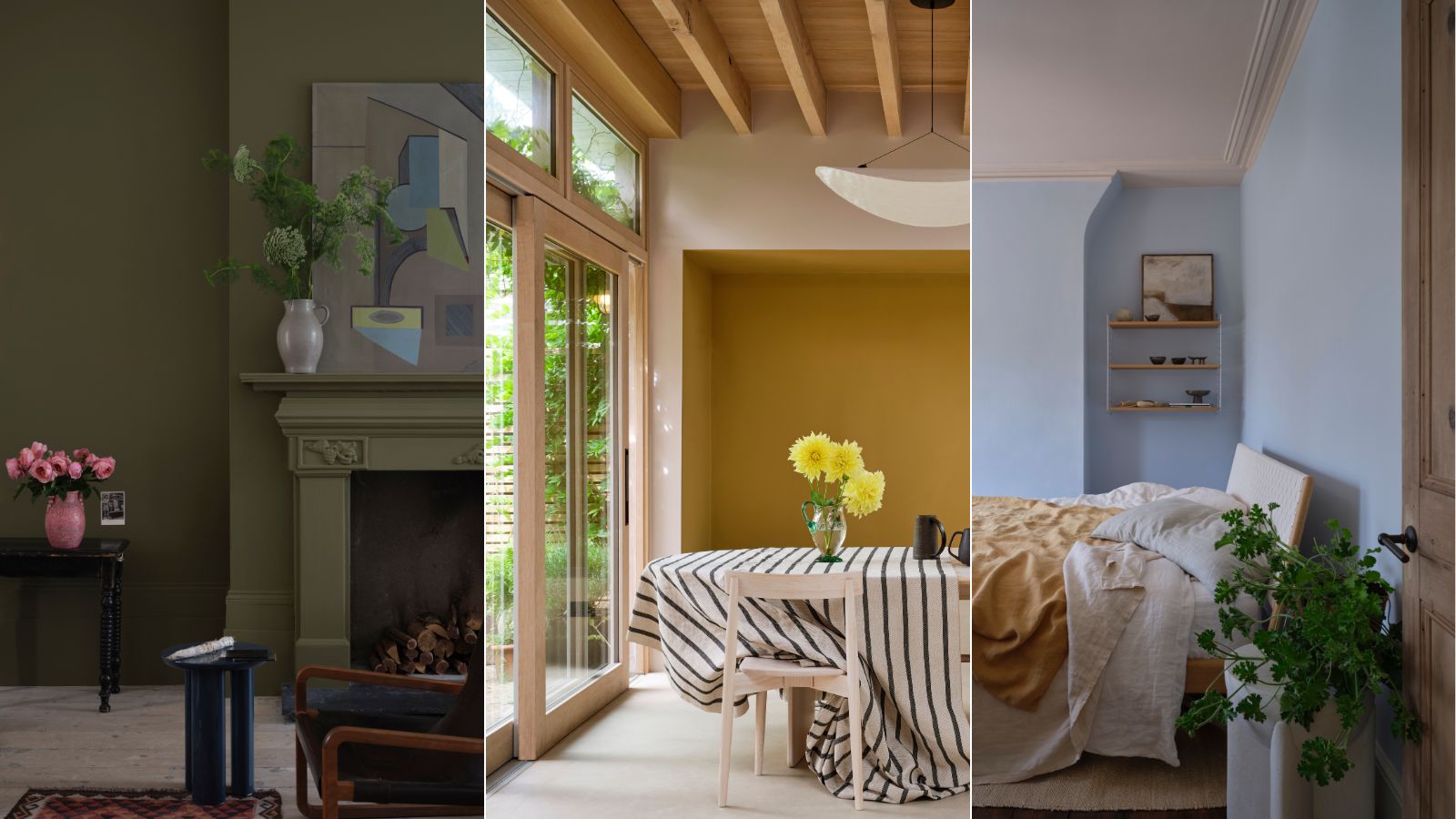
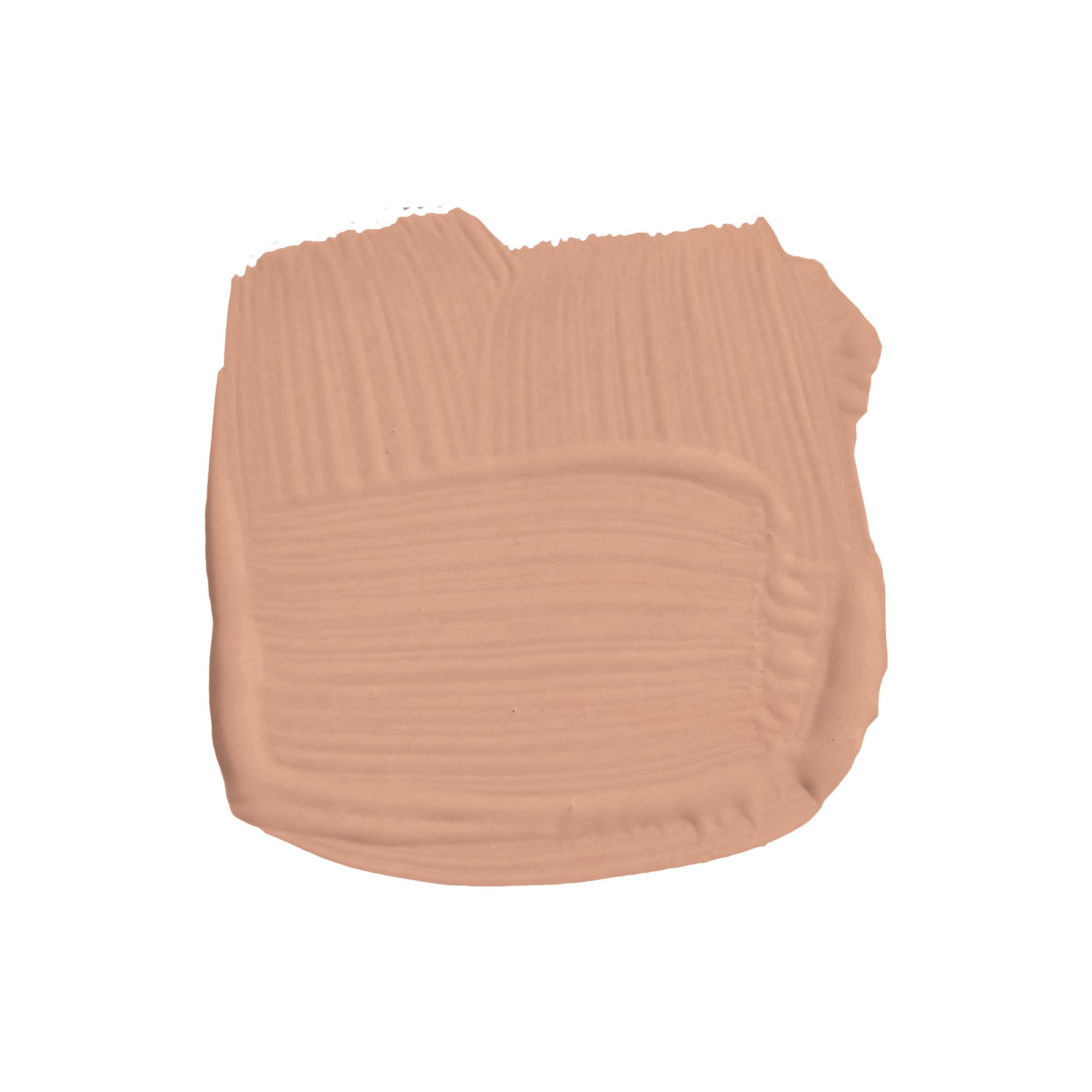
Scallop
Starting with a light neutral paint, Scallop is described by the paint brand as a 'softer salmon' when compared to the popular Dead Salmon which is darker in tone. In this light-flooded room, it makes for a warming neutral used across the walls, but we can imagine it reading more pink in darker rooms.
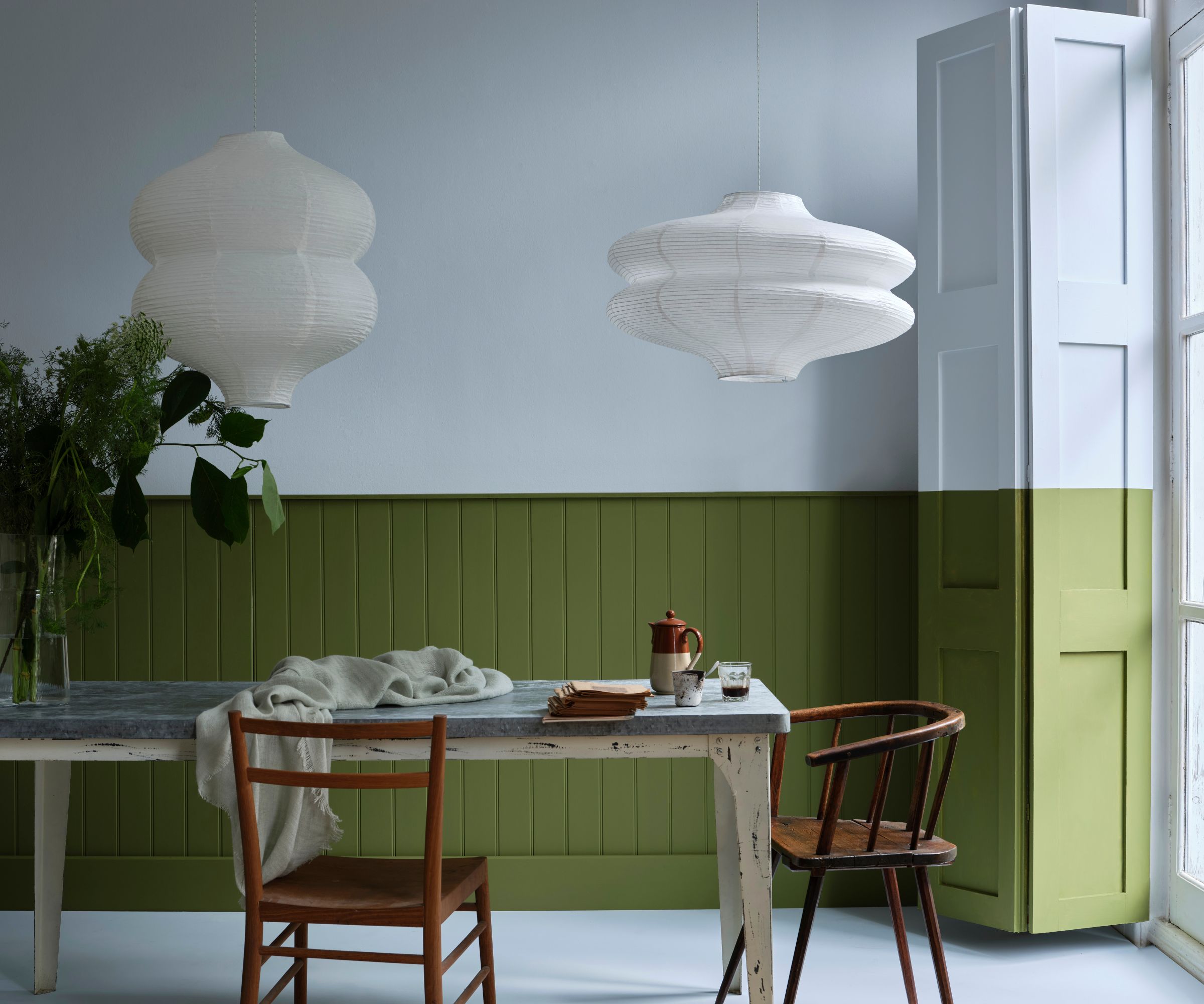
Dibber
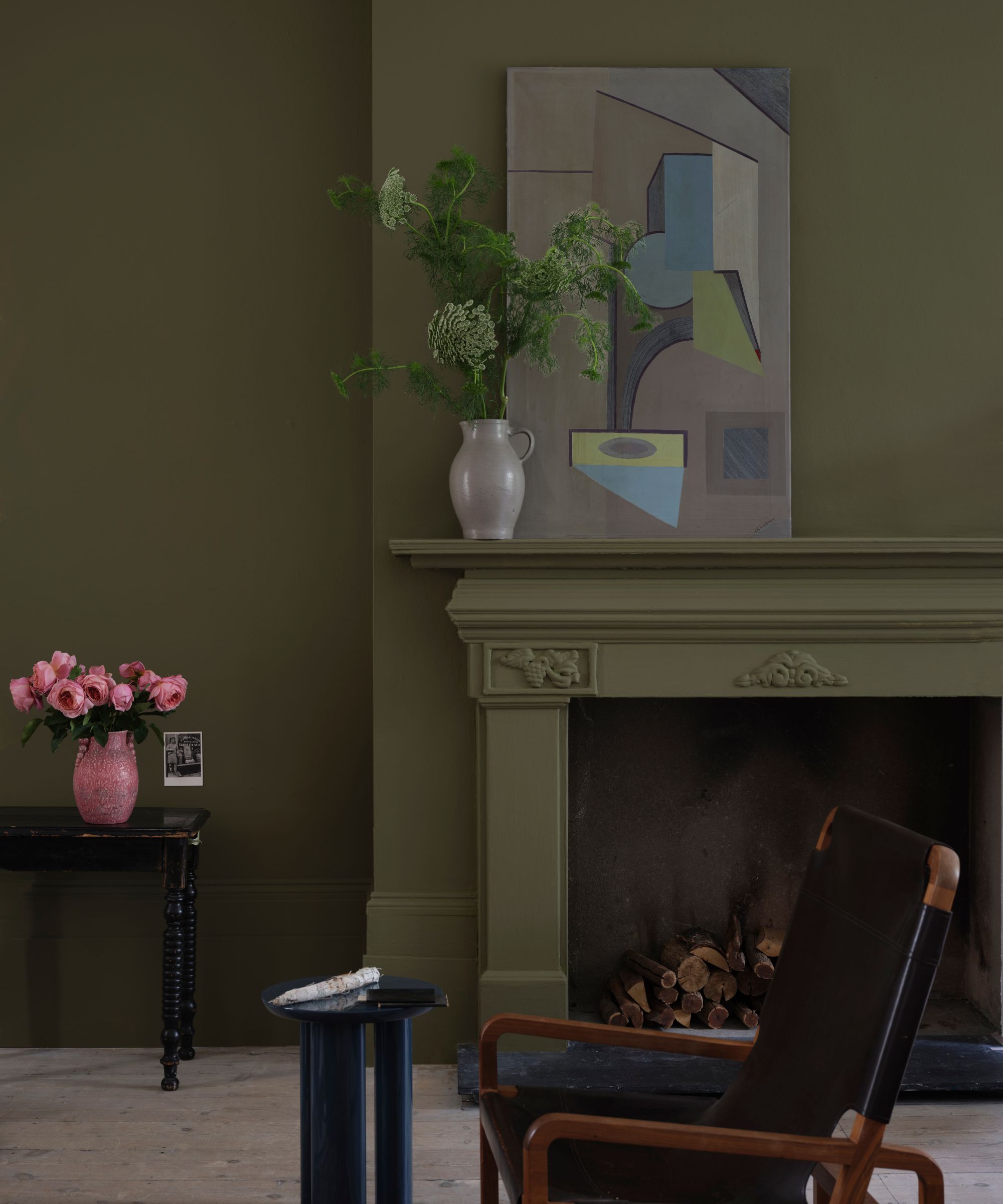
Farrow & Ball has many well-loved green paints, and that's only going to continue with the release of Dibber. Named after a traditional gardening tool, this understated green feels earthy and comforting, and we'd love to see it used with color drenching in small rooms.
Reduced Green
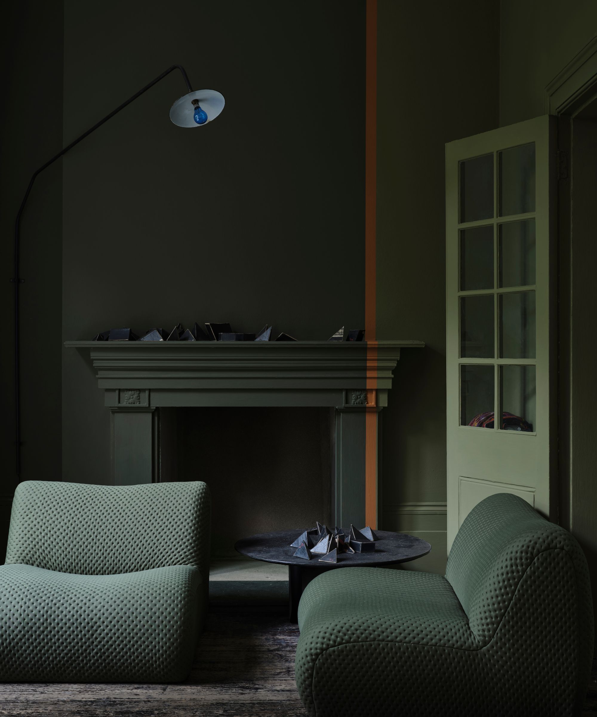
Continuing the theme of green paints, Reduced Green is a dark green paint that appears almost as brown. If you're usually drawn to decorating with neutrals, this is a great choice thanks to its toned-down pigment.
Sizing
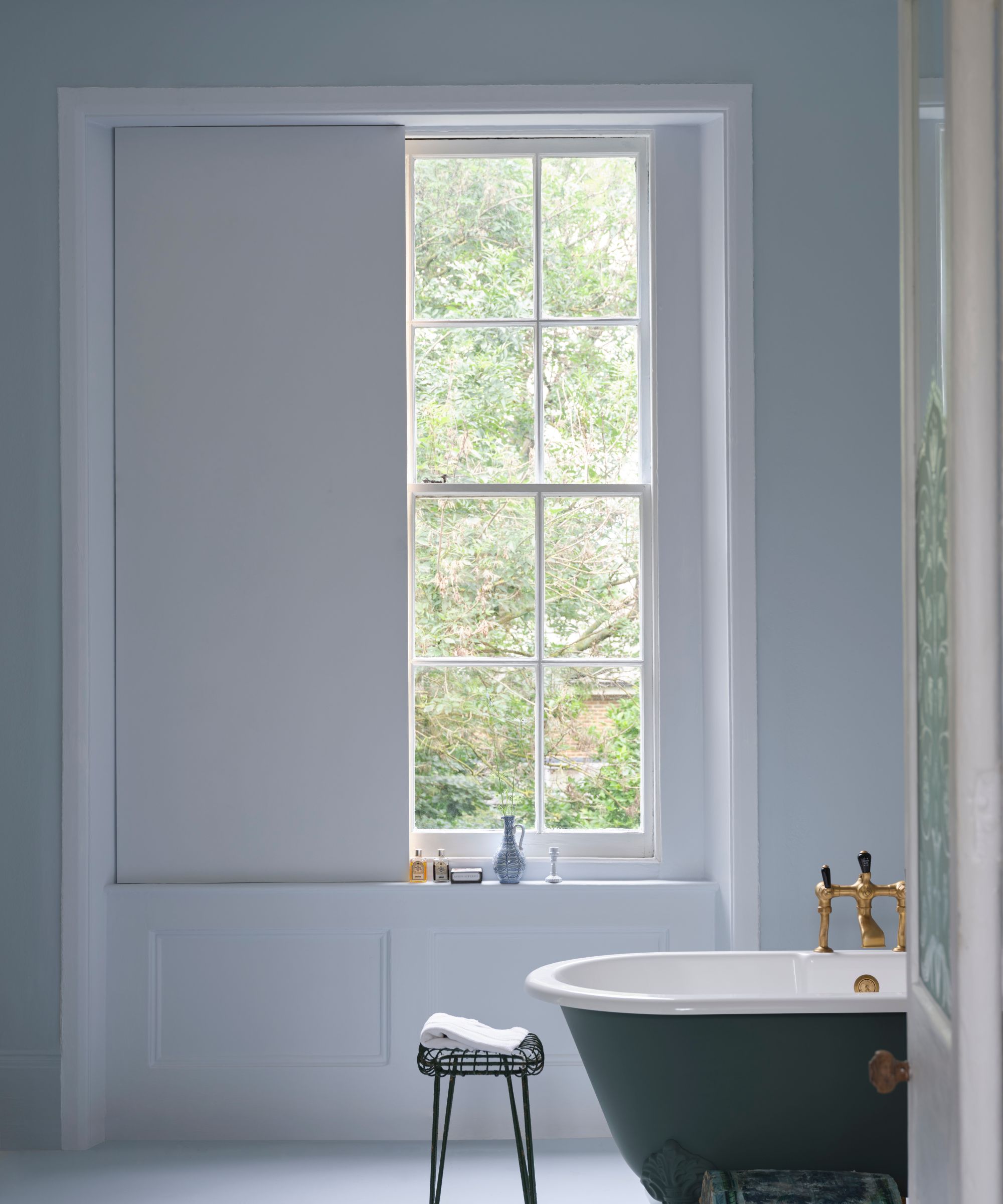
Introducing blue into the mix, Sizing is an incredibly pale blue paint that feels fresh and relaxed, making it a fitting choice for light and airy bathroom color schemes – as seen here on the window surround and shutters.
Naperon
Terracotta paints are expected to be popular this year, serving as a new neutral throughout the home. Naperon allows you to tap into this earthy color trend for a warming and slightly upbeat scheme.
Marmelo
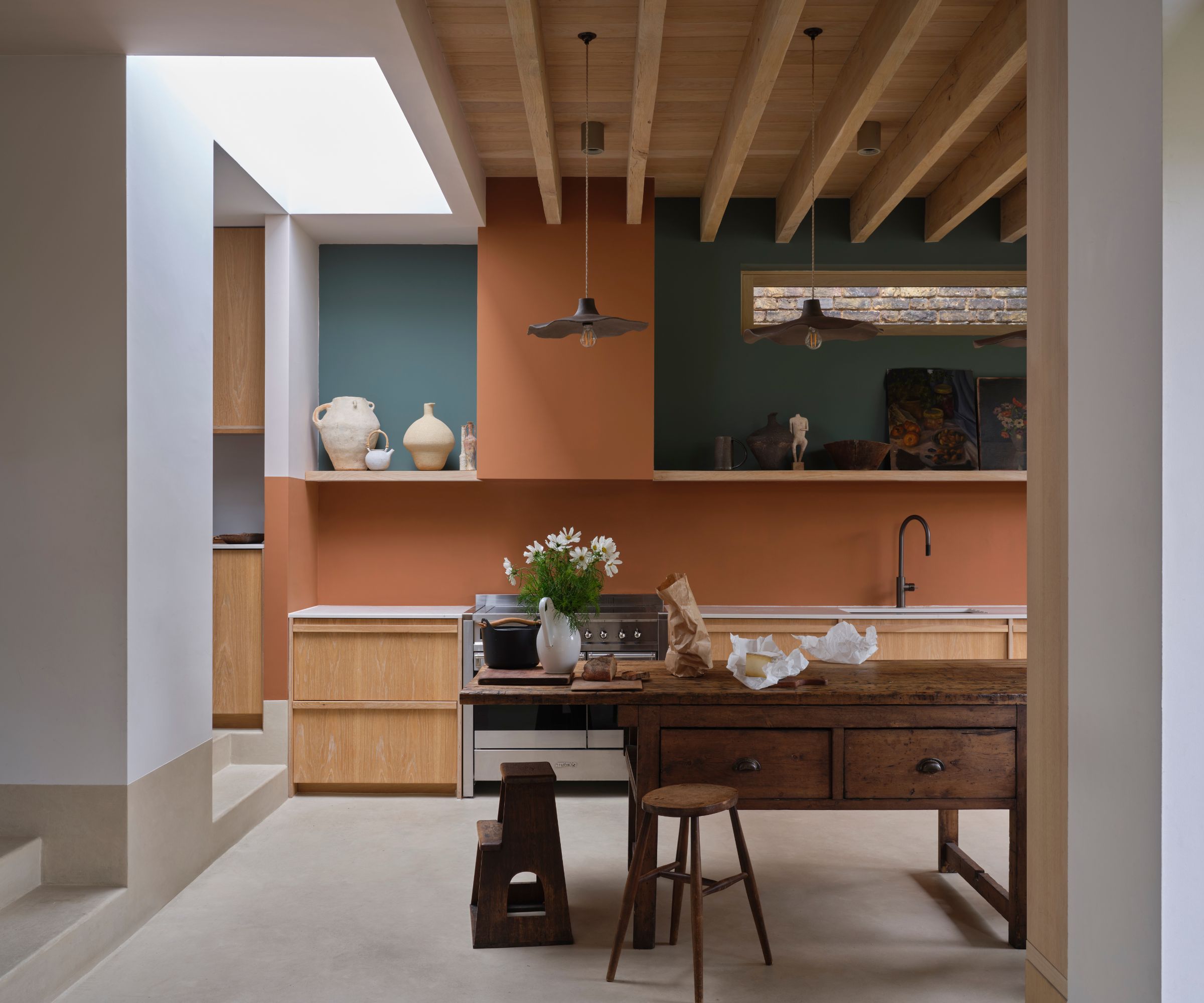
An in-between color that falls somewhere between orange and brown, Marmelo is a warming shade that brings life to spaces, as seen in this kitchen color scheme.
‘Marmelo, named after the quince that inspired marmalade, is one of my favorite new colors,' says Joa Studholme. 'Who could fail to be comforted by that familiar orange reminiscent of warm, buttered toast and conversations around the breakfast table?'
Kakelugn
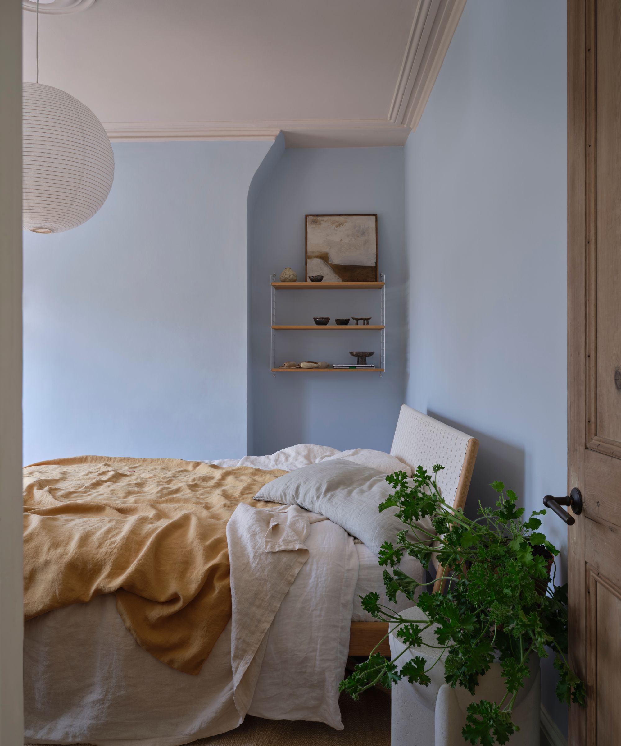
Kakelugn, named after the Swedish stoves, is another pale blue paint that's said by Farrow & Ball to be a 'cleaner' version of its existing Light Blue. A failsafe choice for bedrooms, this makes a restful wall color.
Douter
A muted gray-green, Douter is another in-between shade that adds intrigue and depth to any room.
'I also have a real soft spot for Douter,' says Joa. 'It sits somewhere between Inchyra Blue and Green Smoke, but it was really inspired by traditional brass candle snuffers and I always think candlelight brings a magical quality, whether it’s a dinner party or just a cozy evening in.'
Duster
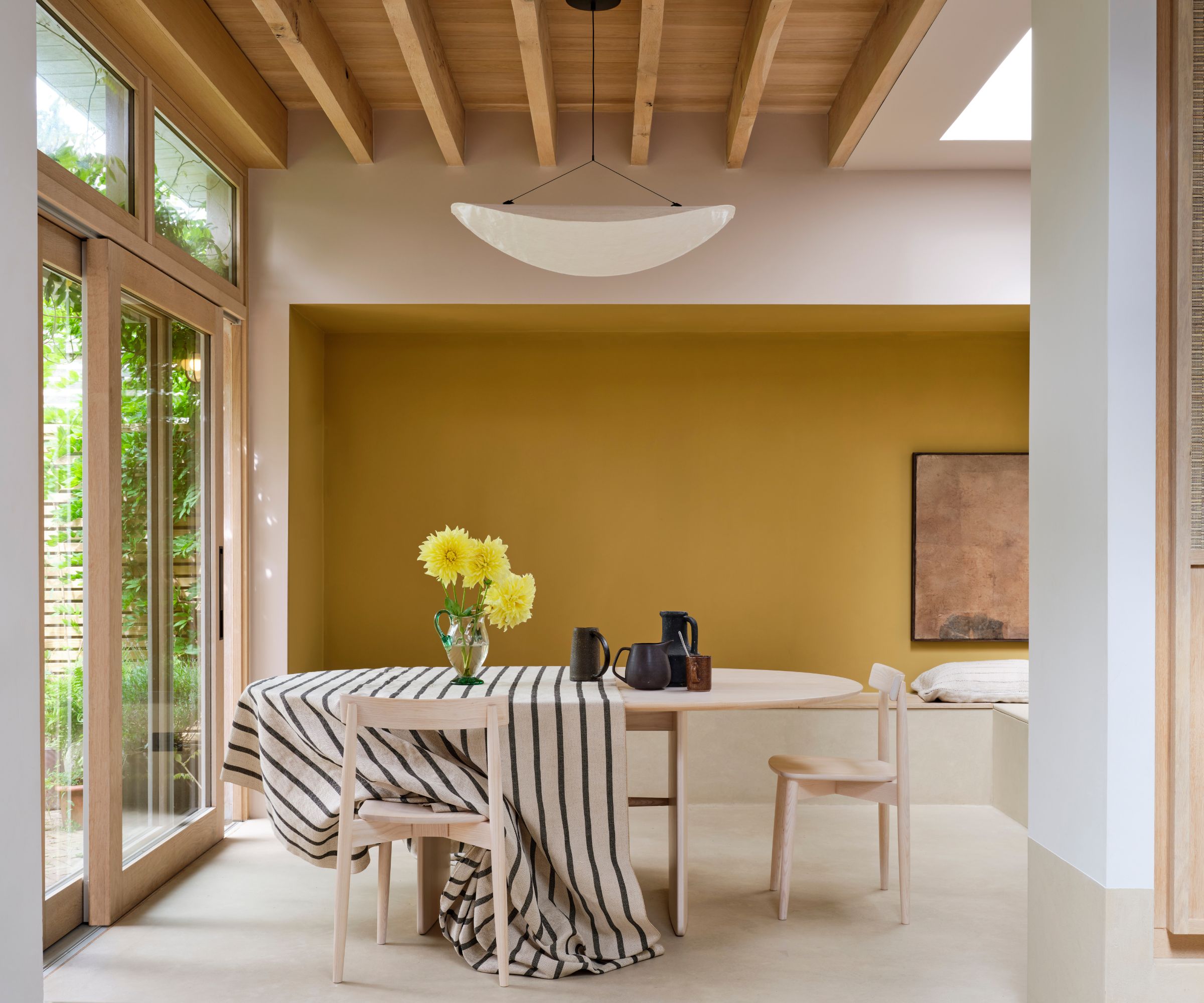
Duster is the final new color, but one of the most uplifting. A toned-down ochre, this liveable yellow paint takes its inspiration from nostalgic cleaning cloths and would feel at home in vintage spaces.
From the Archive – 3 Farrow & Ball colors making a comeback
‘I love delving into our Archive, there are some real treasures tucked away in there and I’m thrilled these three are getting another turn in the spotlight,' says Charlotte Cosby, Creative Director at Farrow & Ball. These three shades are also getting re-released alongside the new palette.
Etruscan Red
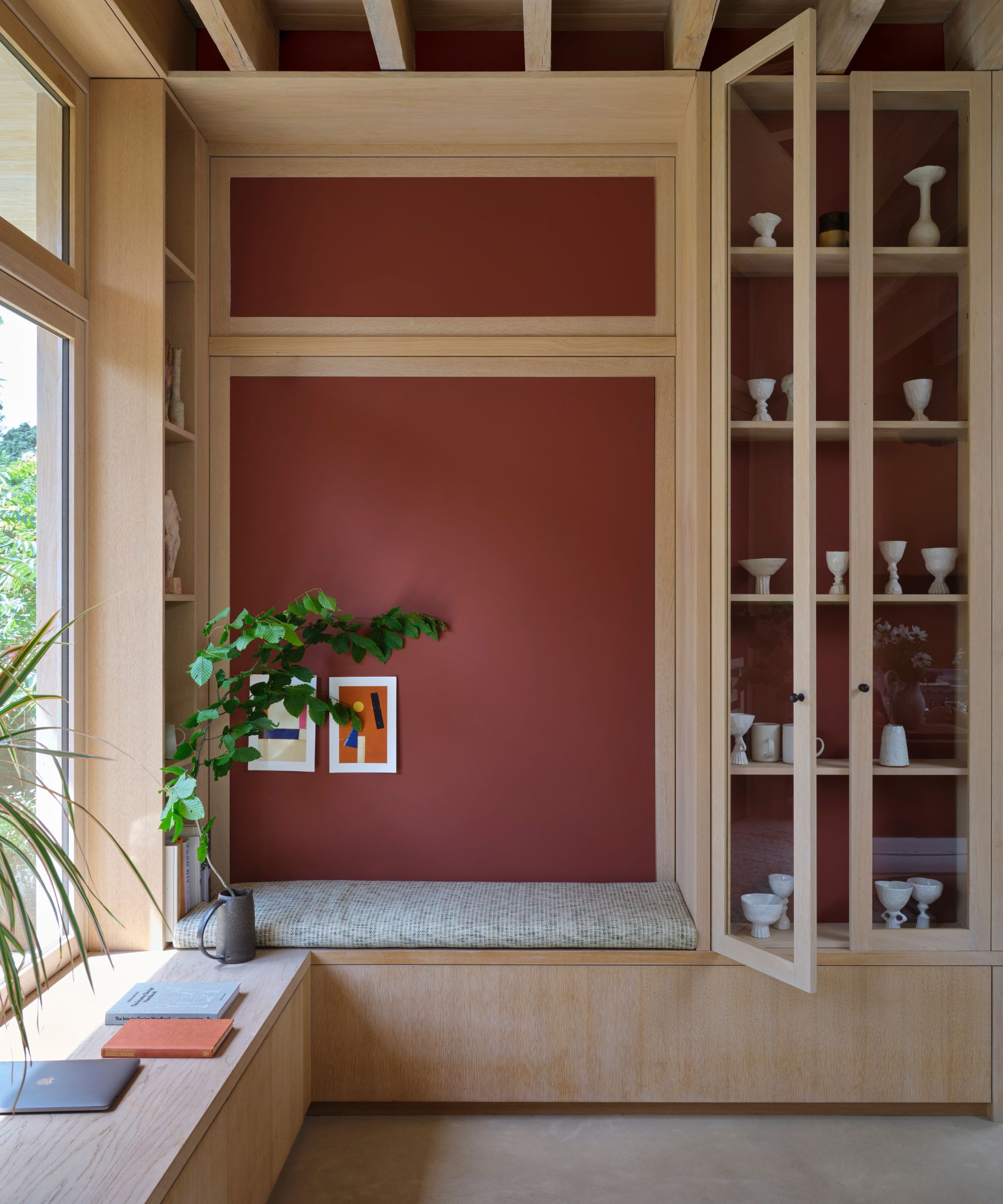
Farrow & Ball's Etruscan Red is a dark, brownish red that makes for a sophisticated take on the red trend. Slightly subdued and muted, we're excited to see more of this grown-up hue, whether in kitchens or dining rooms.
Broccoli Brown
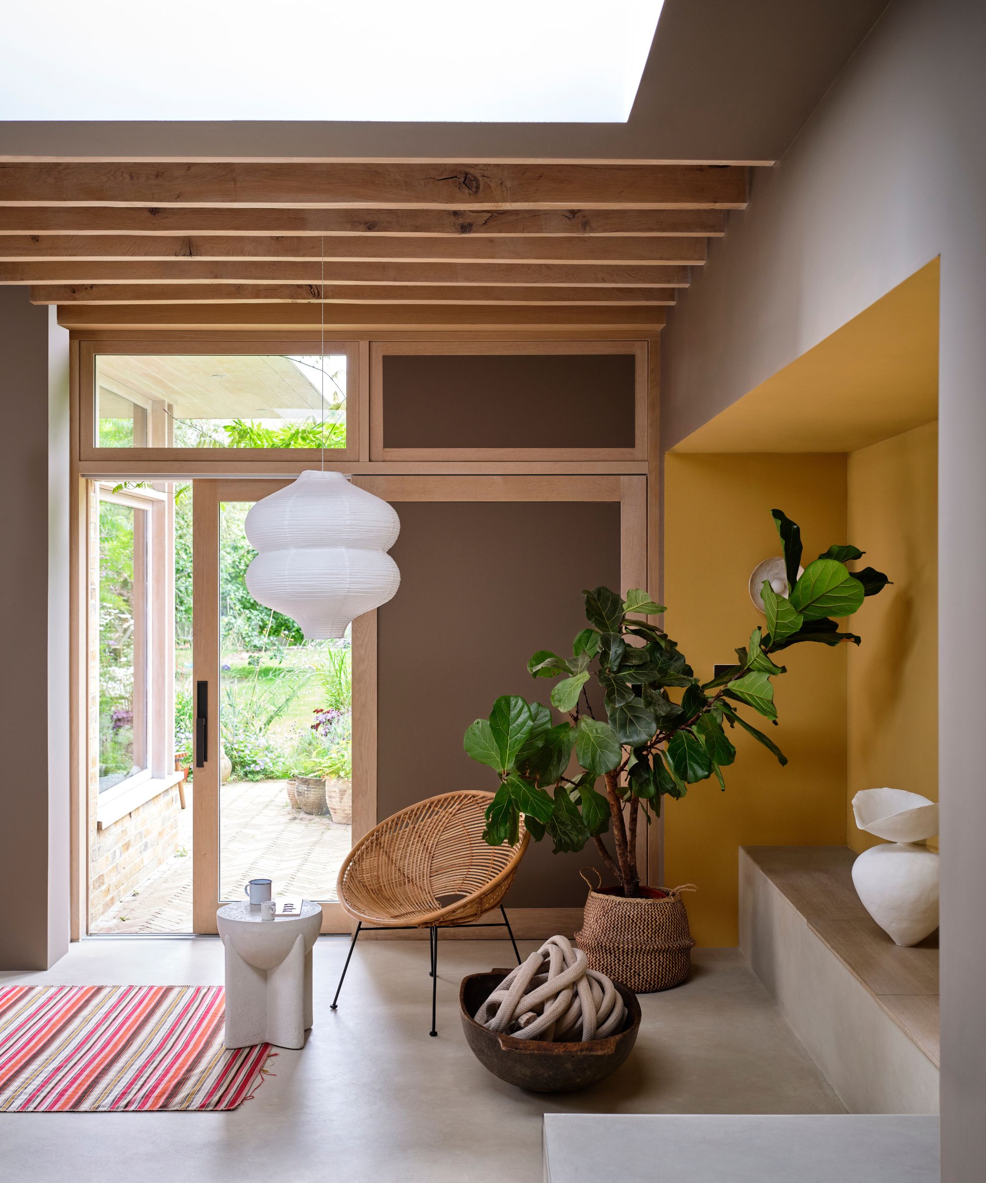
Broccoli Brown is a dark neutral paint that provides a liveable way to decorate with brown. Here it is used on the wall contrasted with the brighter Duster, but you could also use it in an all-neutral scheme for a calming look.
Sap Green
The third and final color to resurface from the Farrow & Ball Archive is Sap Green, an uplifting shade that brings warmth and a natural-world feel to the home, whether used in kitchens or smaller rooms.
Which of these colors is your favorite? From earthy tones to fresh blues, these paint colors have lots to offer your 2025 room color ideas. Each of the new paint colors will be available to shop online at Farrow & Ball from February 27th.