Farrow and Ball is known for its stylish range of paint colors, albeit with slightly unorthodox names (Dead Salmon is a favorite, for example). However, it's also known for being selective with its palette — it doesn't have endless paint colors, and it only rarely releases new ones.
The last batch came out in 2022, but excitingly, we're getting some new icons in color this February. Are these the shades that are about to become the next most popular Farrow & Ball paint colors? The next Railings? Or Downpipe? I think potentially so.
After looking through the renowned British paint and wallpaper brand's 2025 launch of 12 colors (made up of nine new and three from the archive), I've got some early favorites.
These are the new Farrow & Ball shades to know, and what they say about how we're decorating this year.
One thing I have taken away is that this rich and inviting palette is meant to be coupled up. Think rich browns with light blues and off-whites, and lush greens with terracotta reds.
With so many bold and beautiful color trends to inspire us, I ask, "why settle for only one?" Get your paint brushes ready and your creativity flowing, the February 27 launch date of Farrow and Ball's new color collection can't come soon enough!
The palette is a collection of hues that echo the shades of the world around by illuminating and indulging in the everyday, and I am not just talking about the natural world. Household items like dustpans, weathered candle snuffers, and aprons are among the objects that have inspired the cozy paint color shades. What tend to be small, unnoticed parts of the home, Farrow and Ball describes as "the hidden heroes of our fondest memories and the special touches that make a moment an occasion."
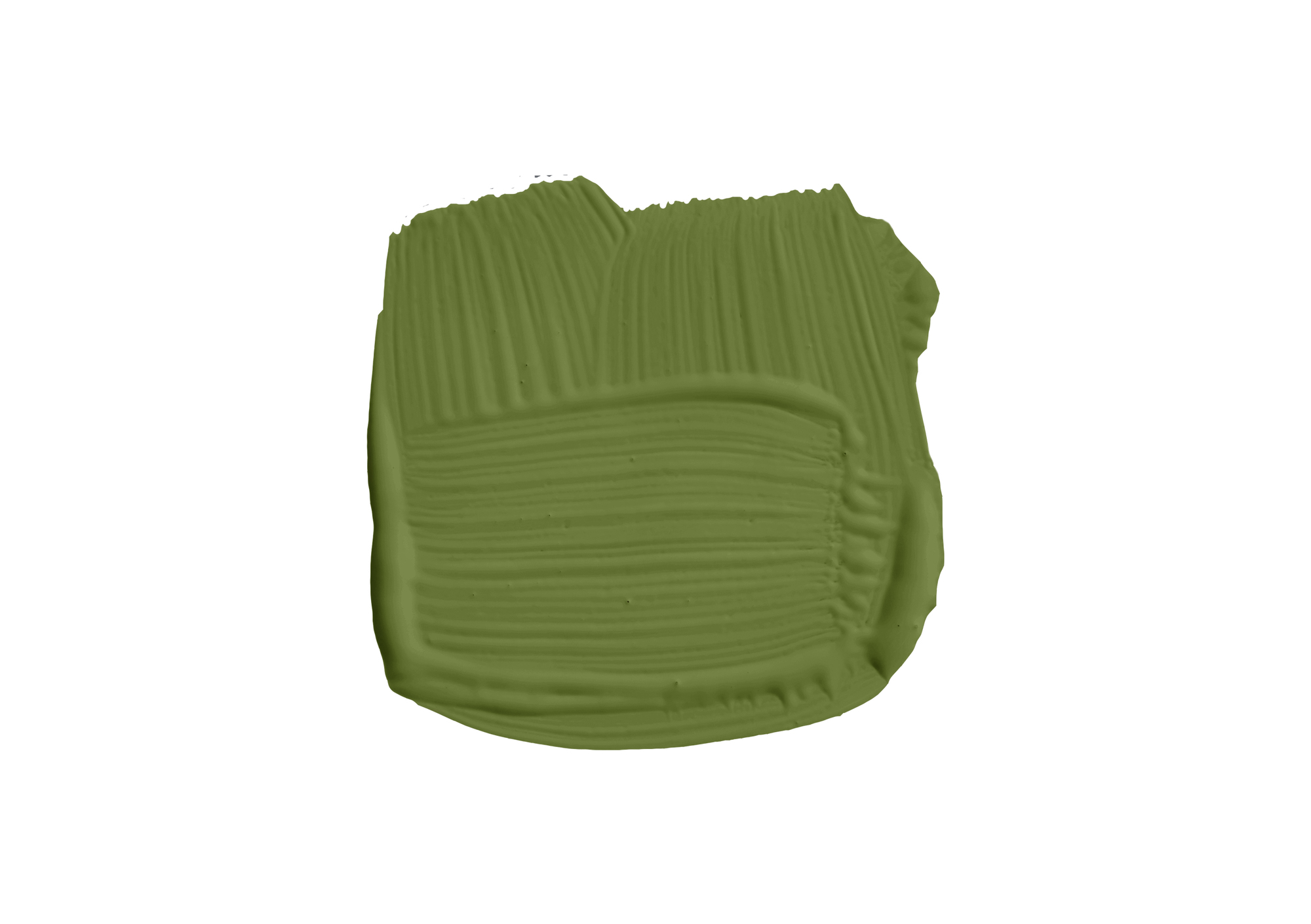
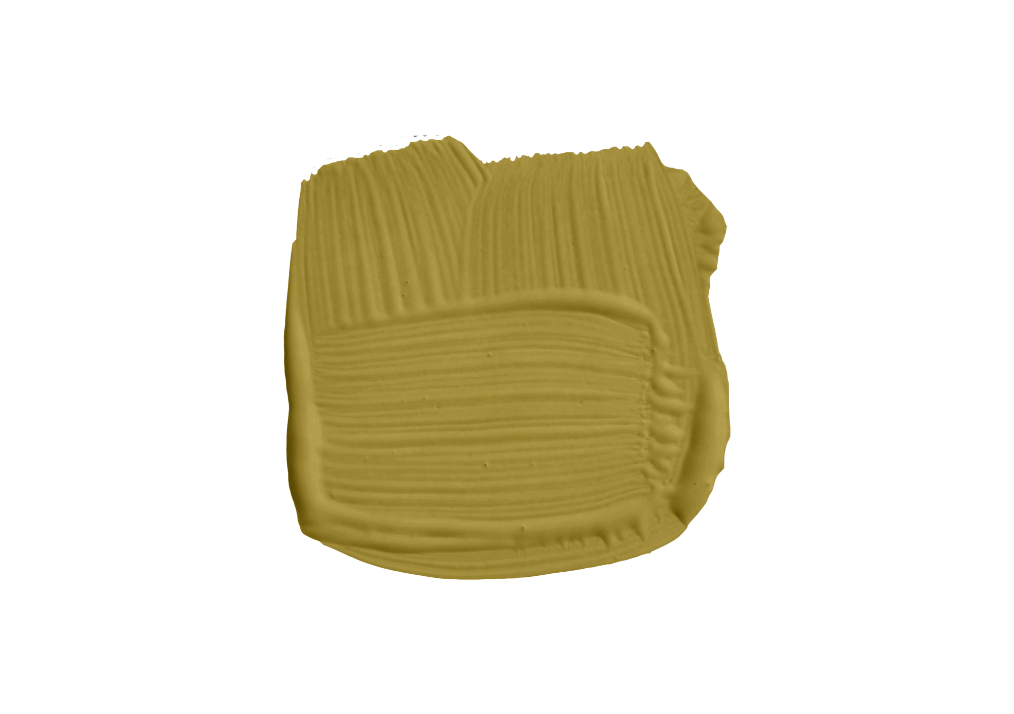
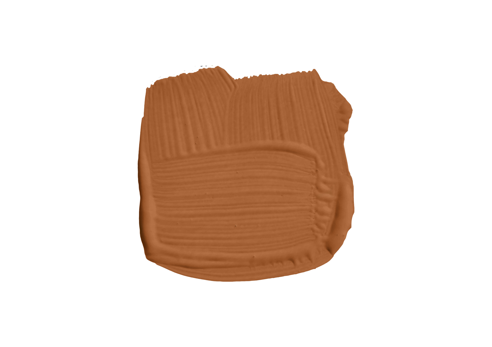
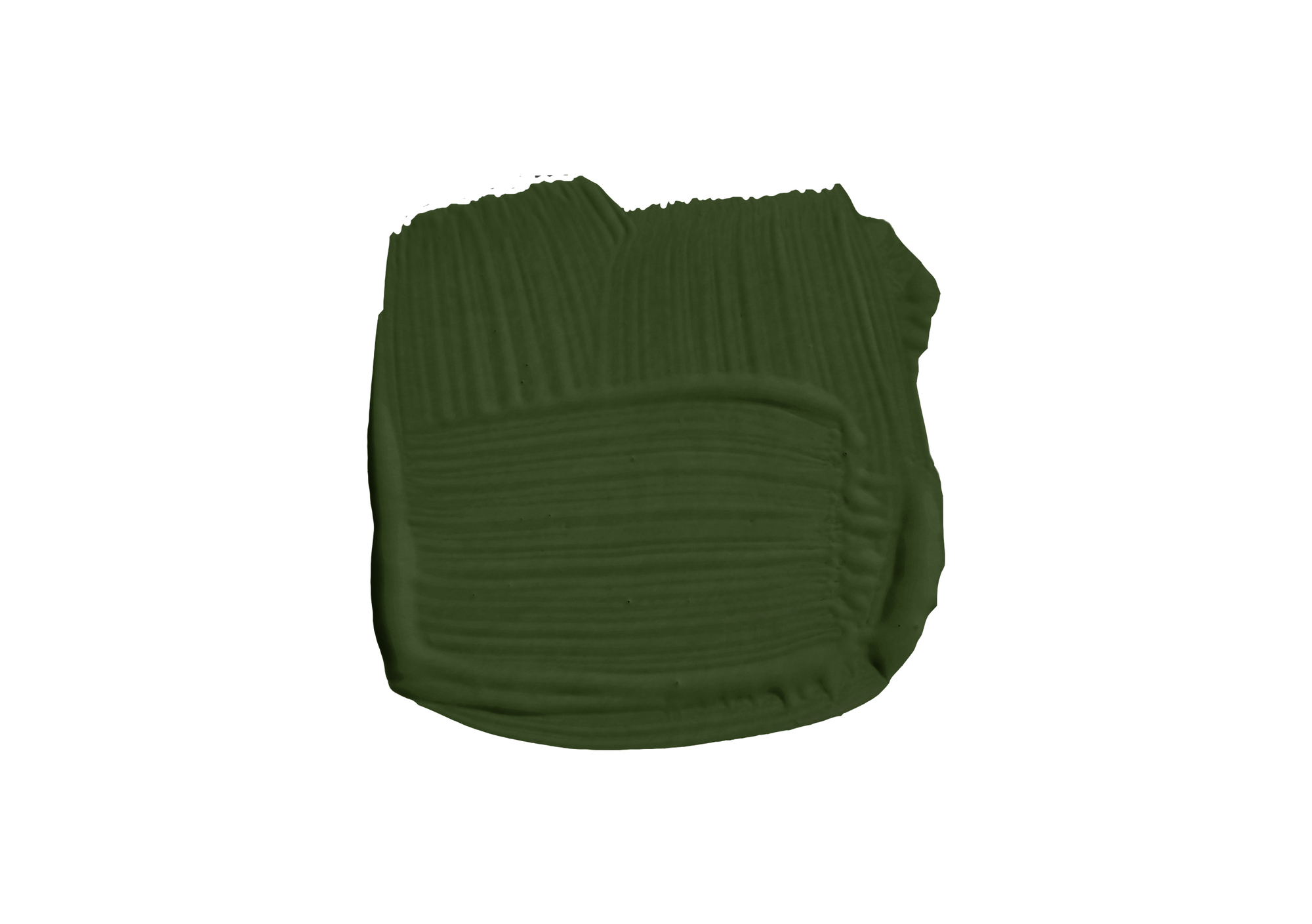
Joa Studholme, Color Curator for Farrow and Ball says, "This collection is all inspired by little treasures from around the house, deeply pigmented but slightly muted." Dibber is a muddy green named after the tool used by gardeners to create holes for planting seeds or bulbs. Duster is an aged yellow reminiscent of the familiar cloth used to clean homes worldwide. Marmelo, a favorite of Joa's, describes the warm orange as a "comforting and familiar orange reminiscent of warm, buttered toast and conversations around the breakfast table."
Just as these shades live harmoniously together in the home, so do the colors of the palette when paired together. What was meant to be a stand alone palette turns into a combination of welcoming color schemes.
View the Paint Collection

Worrying about what wall and ceiling paint combinations to avoid is a thing of the past with this palette, as the shades with more subtle undertones expertly play of the richer saturations.
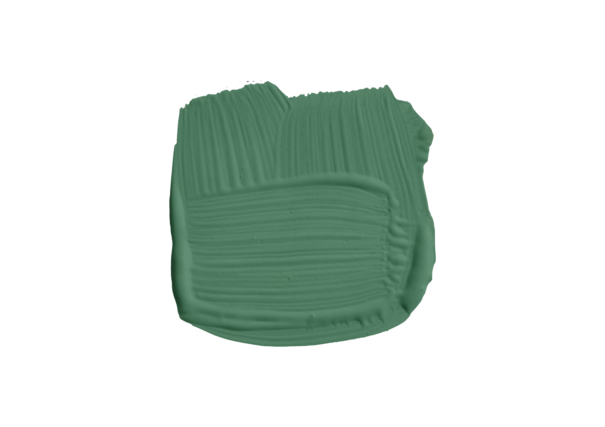
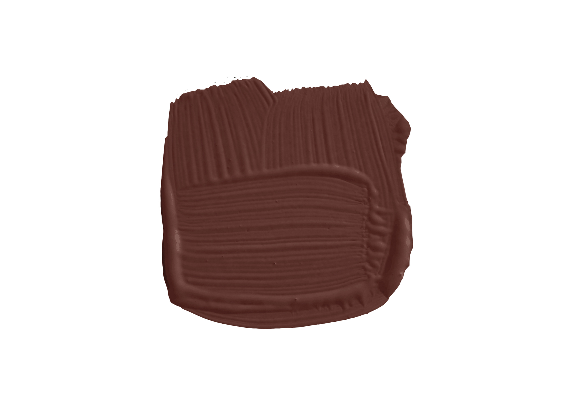
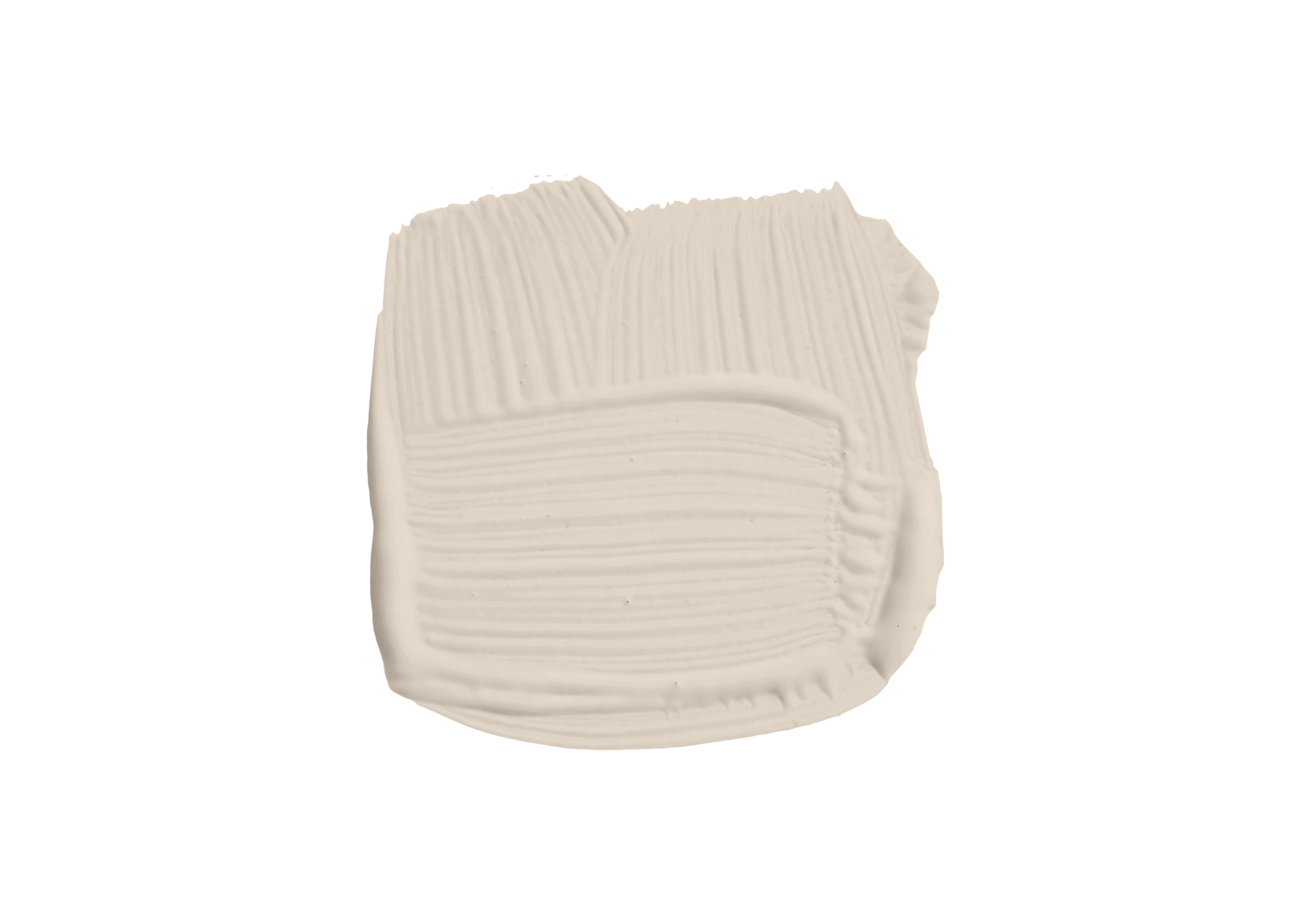
You might be wondering, "where are the neutrals?" However, the genius of such a color-rich palette is that the neutrals are hiding in plain sight—as the best neutrals paint colors tend to do. The most notable neutrals being, Muted Green, Mushroom Brown, Scallop, and Sizing.
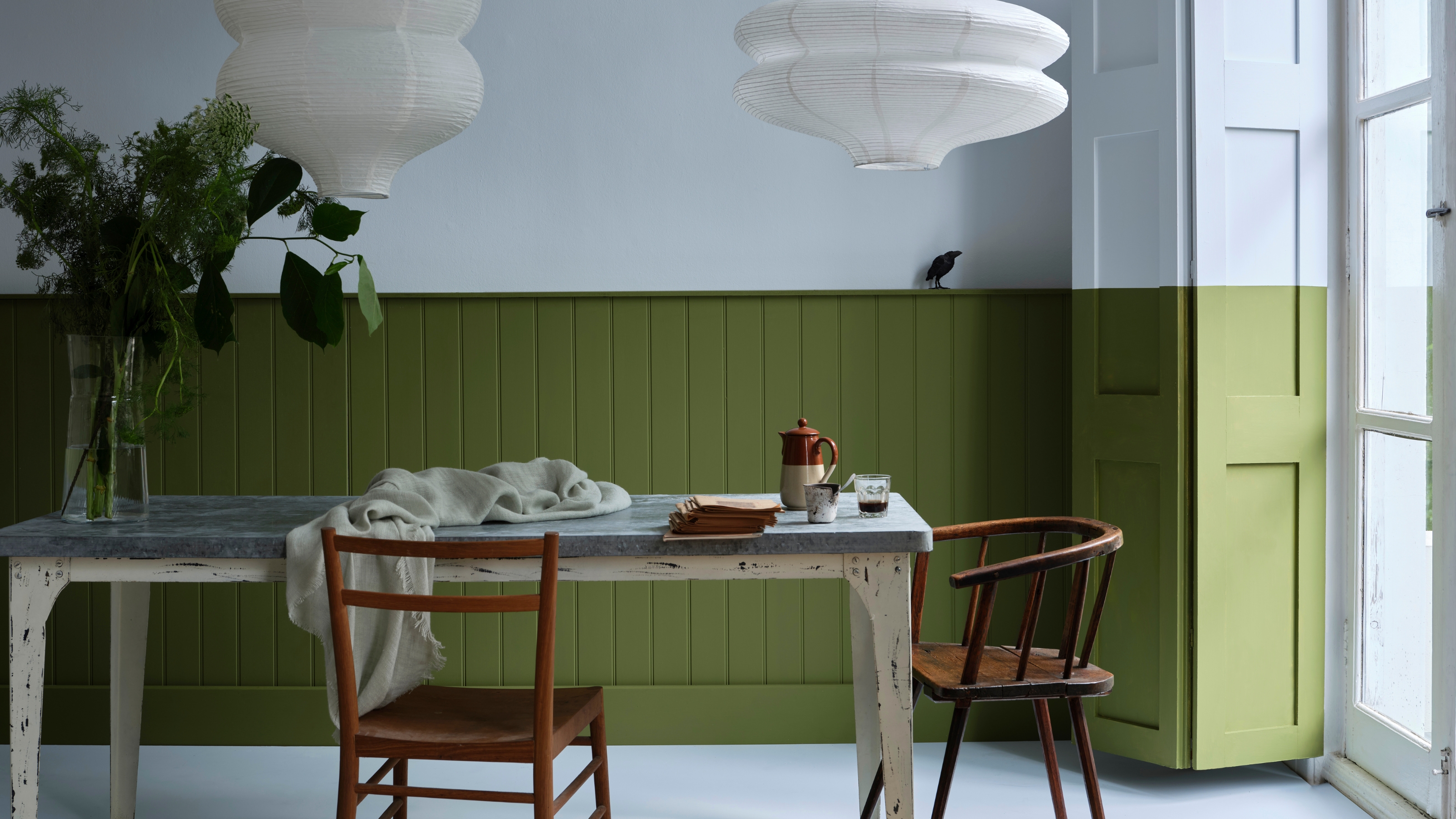
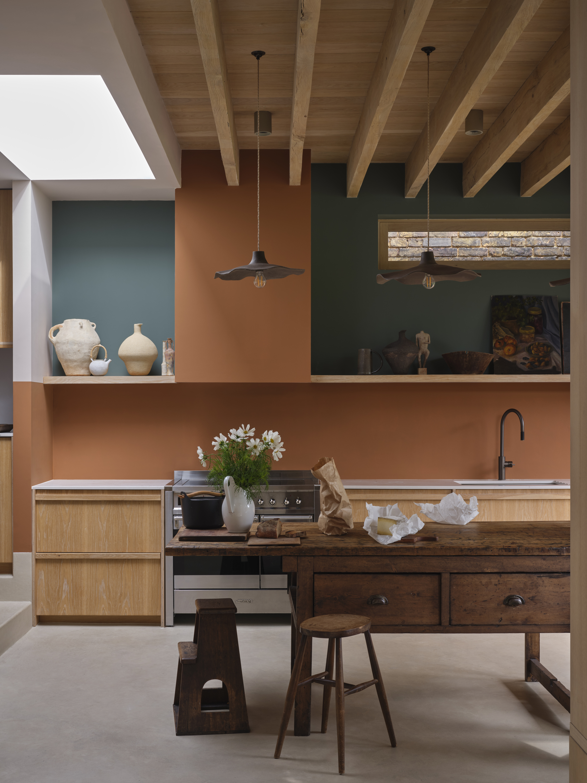
In the kitchen above, Marmelo is paired with bold Douter, both bold colors that draw on each other's warmth to create an inviting kitchen rather than overwhelmingly dark.
Douter, Joa predicts, is going to be this palette’s standout because "it’s the love child of two of our most popular colors, Green Smoke and Inchyra Blue, and has that smokiness, that tarnish, of the inside of an old brass candle snuffer." She suggests choosing it for rooms with high energy. "I’d pair with old Farrow and Ball favorite Mouse’s Back on the floor and Reduced Green, from this new palette, on the trim."
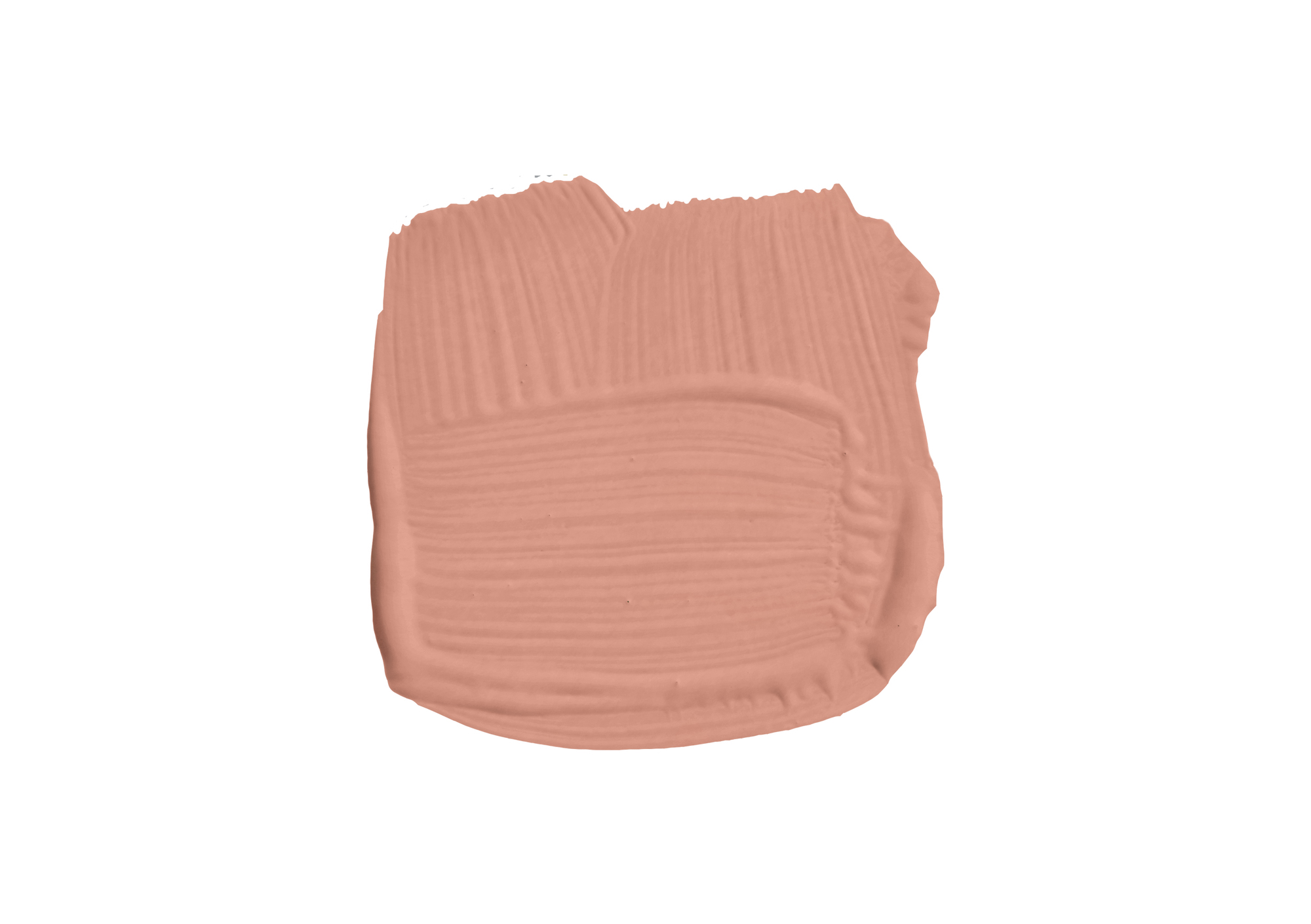
Or perhaps, Scallop, a lighter variation of the beloved Dead Salmon, and tie the room together with a neat little soft pink bow.
Color-drenching is a widely celebrated paint technique that allows you to dive head-first into color, but double-drenching, the chic sister of color-drenching, may have won me over with the help of these nostalgic color schemes.
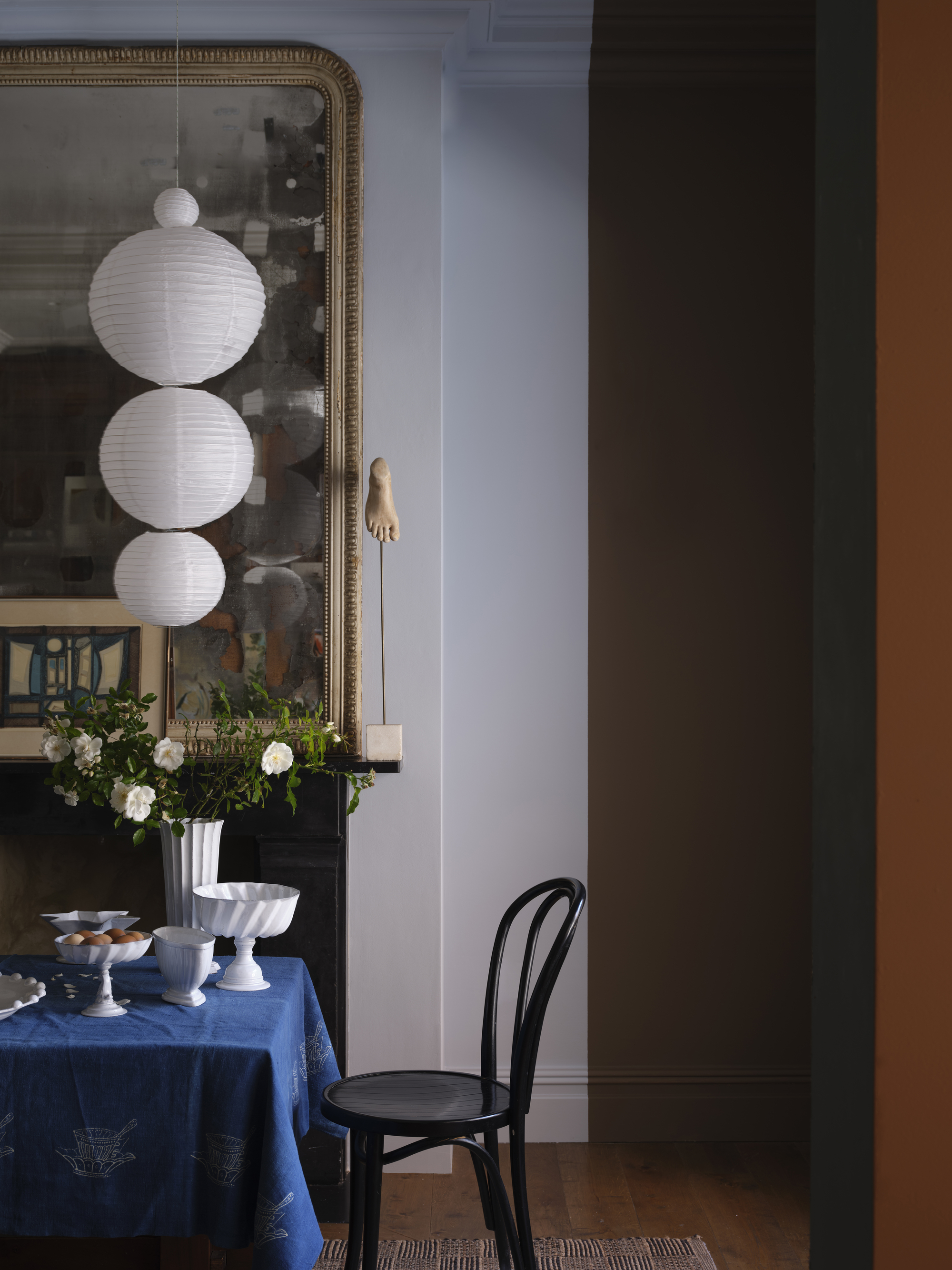
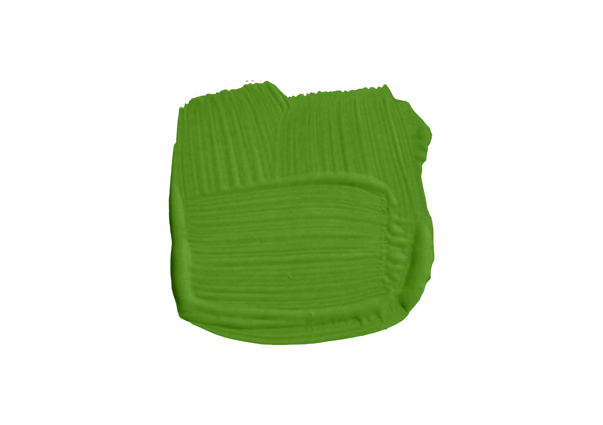
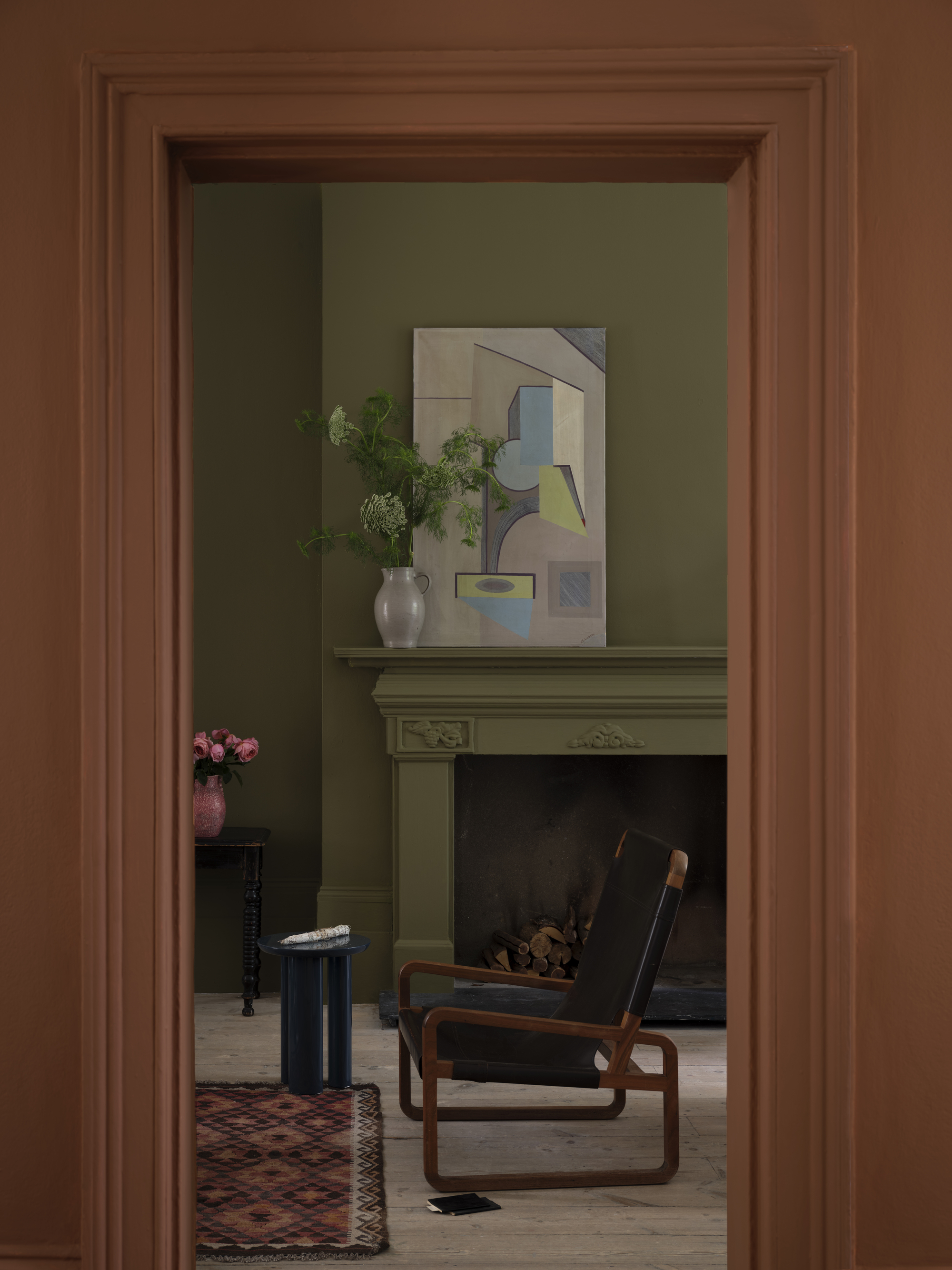
Naperon and Scallop, two shades close in pigment, would bring light and warmth to a pink kitchen idea. While opting for a bold combination like Marmelo, and the olive green shade Dibber, makes a statement in the room. Their complimentary tones bounce off of each other and feel alive in the room. You can see this pairing thrive in the living room image above.
Rich, warm nostalgic colors have quickly become the paint colors of the year. Farrow and Ball's new collection is swimming in them.
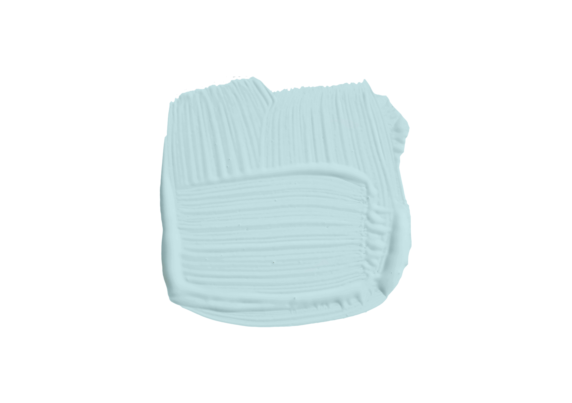
It is always an exciting day for interior enthusiasts when a paint brand announces new colors to experiment with. Even better when the palette is full of shades daring you to try creative combinations and playful pairs. Muted Green's mysterious richness and the light blue of Kakelugn may be my favorite color duo of the bunch; which paint color combinations will you be trying?