We love experimentation in logo design. So many new logos follow a formula of flat minimalism that it can be interesting when a brand achieves a unique identity with a different approach. But I don't think I've even seen a logo quite as experimental as that of the drinks consultancy and flavour laboratory Crucible.
Based in London, Crucible develops new recipes for drinks and works with drinks companies on brand engagement, particularly among bars and bartenders. As a creative hub with an experimental approach to all thinks beverage-related, it made sense for it to communicate that focus on research and development into its logo design. And that meant starting the way it might start when creating a new flavour: in the science lab.

Crucible's new logo was developed by Madalena Studio, whose founder, Chris Collicott was familiar with the brand, having made its previous logo design. This time he was inspired by the consultancy's hands-on approach to developing new drinks.
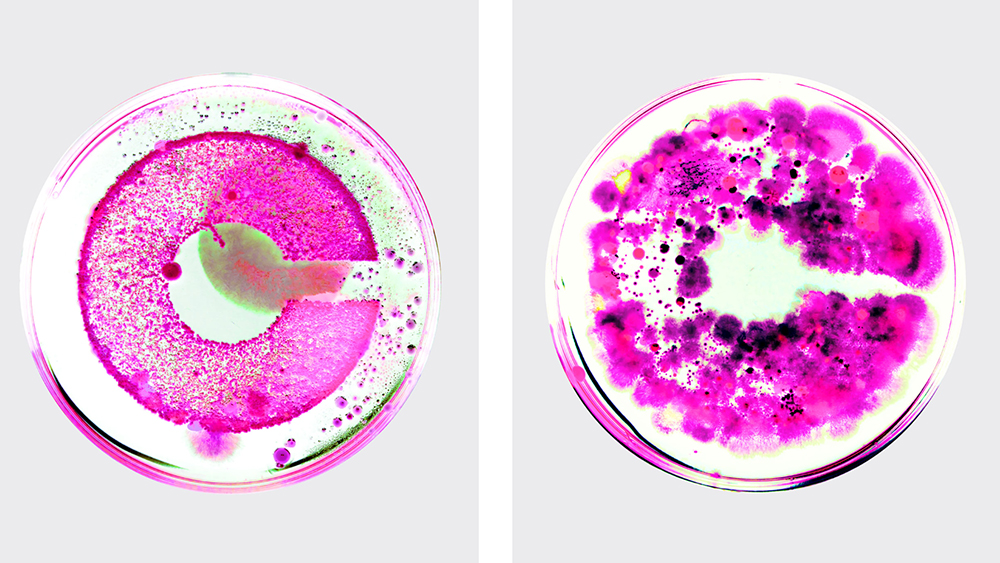
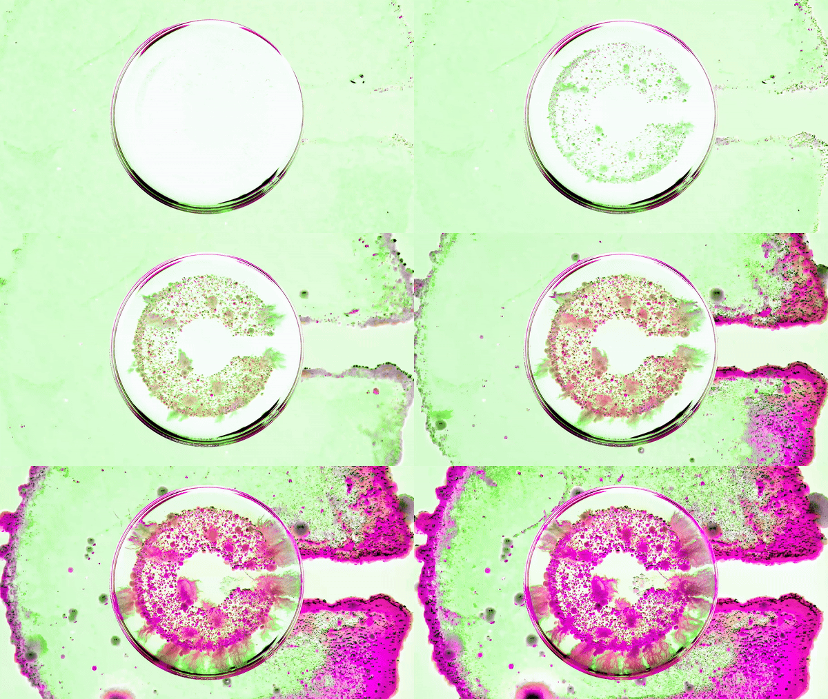
In a cross between logo design and science experiment, the brand created an organic, growing visual identity using bacteria and natural processes. Madalena Studio said the process involved swabbing samples, including aged kombucha and household food waste, onto around a dozen laser-cut cork logos, which were cultivated in petri dishes in a makeshift incubator in Chris's basement. They took photos of the results every few hours for almost two weeks, and then tweaked them to match Crucible's vibrant brand colour palette.

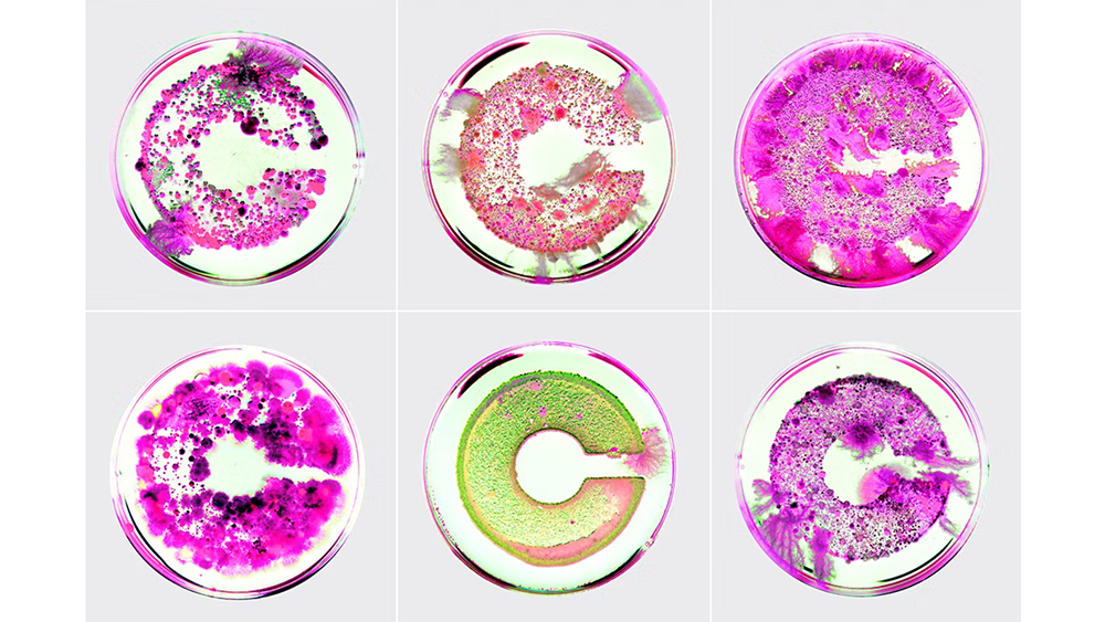
The result, which is believed to comprise mycelium, Streptomyces, Micrococcaceae, and Bacillus, is as radical as the process. Rather than creating a single static logo, the process resulted in an evolving logo design with dozens of potential options that are all very different but consistently recognisable.
I don't think lab-grown logos are likely to catch on, but the whole process defines Crucible's identity perfectly. The unexpected variations and imperfections create an original and organic feel while avoiding typical visual cliches associated with science.
For more new logo designs and rebrands, see the new Tropicana logo and the new Mozilla logo.


