- Hyundai design VP says owners are calling out for more buttons
- Changes to safety tests will put an onus on physical controls
- As a result, manufacturers are finally rethinking vehicle interiors
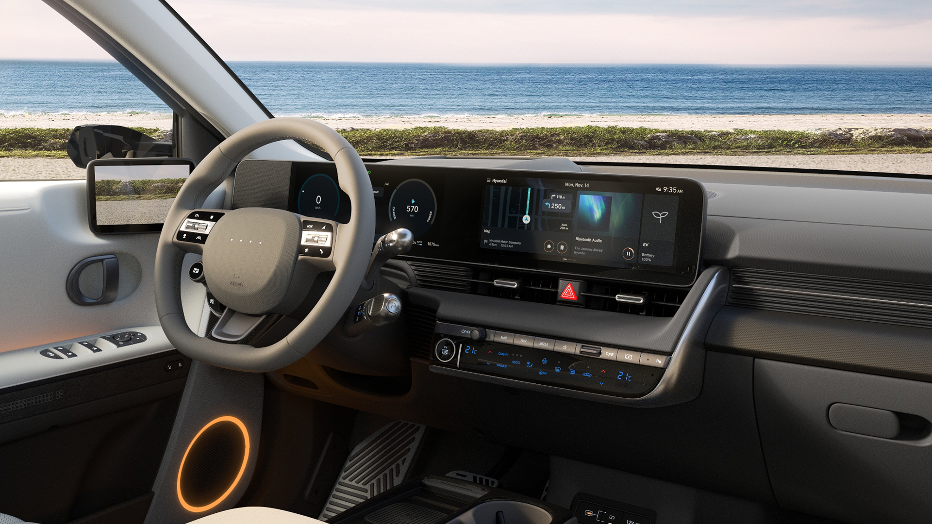
Hyundai is the latest manufacturer to go on record to say that it is reintroducing physical buttons to future vehicles, following customer backlash surrounding fiddly and often distracting touchscreen systems.
Hyundai Design North America vice president, Ha Hak-soo, recently revealed in an interview with Korea’s JoongAng Daily news website that the company had been taken in by the “wow factor” of massive screens and had neglected the ease and convenience of physical buttons.
“When we tested with our focus group, we realized that people get stressed, annoyed and steamed when they want to control something in a pinch but are unable to do so,” Ha said.
The company joins a growing list of automotive manufacturers than have seen fit to reintroduce physical controls for key functionality, with the likes of VW pulling a U-turn on its decision to go screen-only in early ID electric models following negative feedback from the press and general public.
VW’s then-CEO Thomas Schäfer said that the reliance on touchscreens "did a lot of damage" to the brand and it subsequently revised the infotainment offering during mid-life refreshes of the numerous models in the ID range to include proper, back-lit physical buttons for climate control, window de-misters and hazard lights.
What’s more, Europe’s premier passenger car safety body, Euro NCAP, said earlier this year that it would “incentivize OEMs to have physical, easy-to-use, and tactile controls of the main driving features like wipers, warning lights, and indicators,” its Technical Director, Richard Schram told Auto Express.
Analysis: Blame the Tesla effect

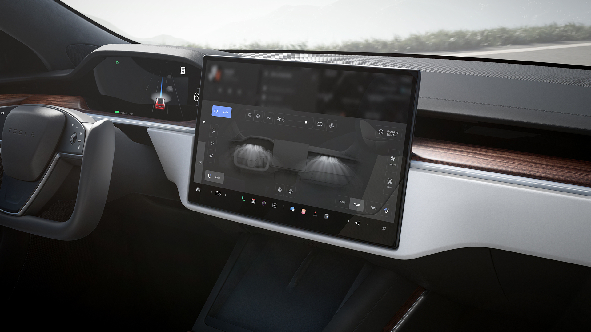
Although very few automakers will admit it, the trend for committing absolutely everything to a large touchscreen display is partly down to Tesla and its innovative use of tablet-style infotainment systems.
Before this, legacy brands had merely toyed with screens that were neatly embedded into the dash or centre console, often operated via a rotary dial and other switches.
Rewind to 2009, with the debut of the Tesla Model S, and Mercedes-Benz still had a physical numerical keypad for inputting phone numbers. Now, Tesla has taken things further by removing indicator stalks and other automotive mainstays.
Things have changed and in-car screens are most certainly here to stay, with Hyundai even revealing recently that it had partnered with German optical specialist Zeiss to work on a head-up display that spans the entire windshield.
But committing everything to a display and its numerous sub-menus is, on the surface level, frustrating and often downright dangerous. Having to hunt for a slider to adjust the temperature in the cabin is a chore, while asking a clunky AI-powered voice assistant to defrost the rear window is more hassle than simply pressing an easy-to-locate button.
Until we get to the point where highly autonomous vehicles do most of the driving, we still need physical switches and buttons to make life behind the wheel more convenient and safer.
After all, there’s a reason why an aeroplane cockpit looks the way it does and isn’t just a giant touchscreen computer.


