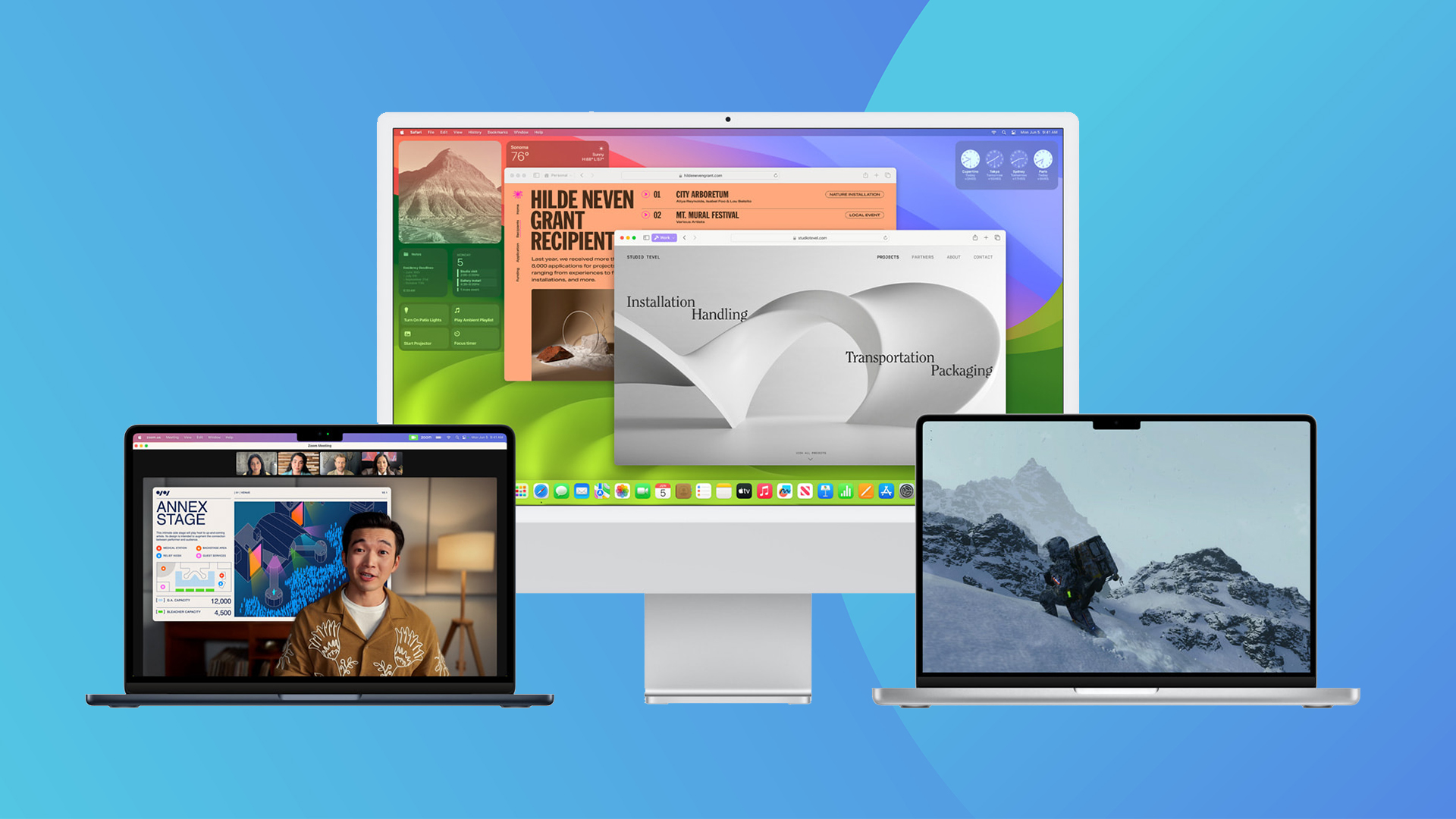
While Apple's blockbuster software updates for the iPhone, Apple Watch and Mac likely won't arrive until September (along with the iPhone 15), users are now able to give them a try thanks to the newly released betas. And it seems macOS Sonoma is reminding users of something else.
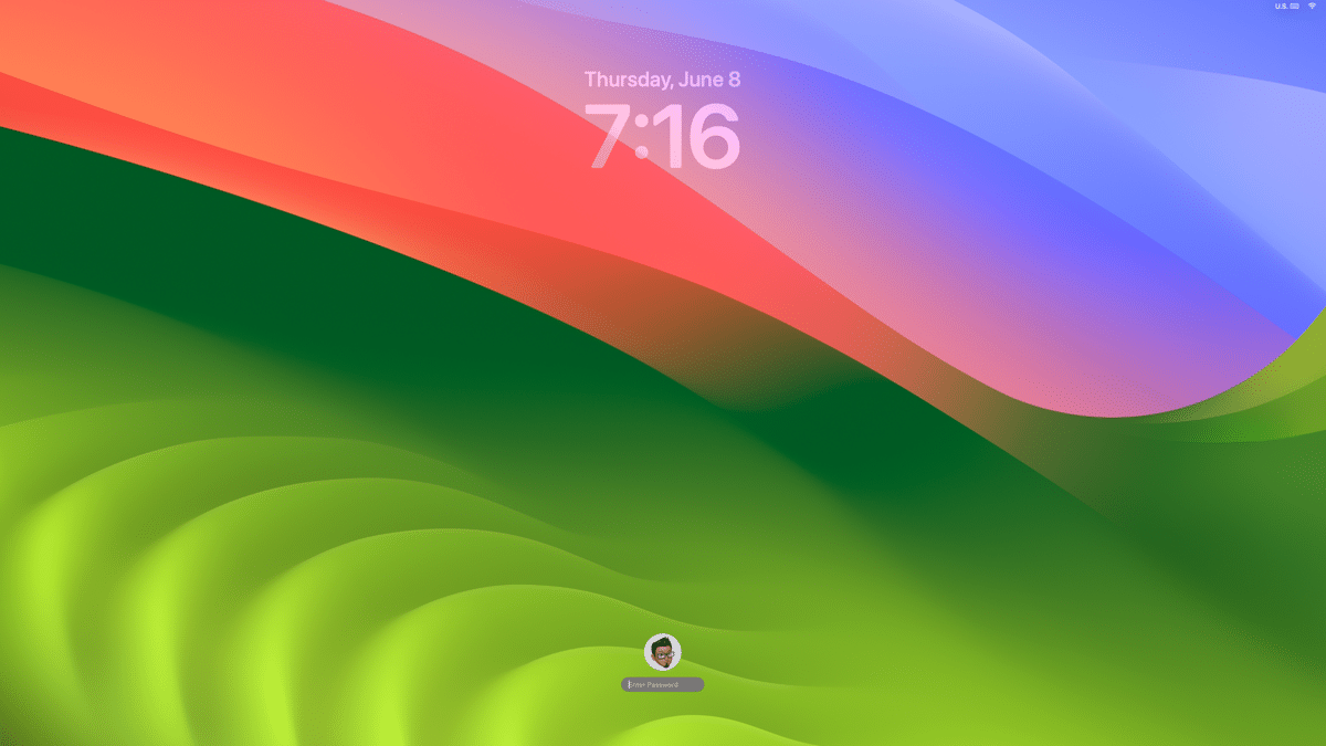
Sonoma brings desktop widgets to the Mac, along with enhanced screensavers and new video conferencing features. But the most noticeable change, it seems, is that macOS now looks a hell of a lot like iOS. Yep, it seems the Mac is starting to take serious design cues from the iPhone, at least from a software perspective.

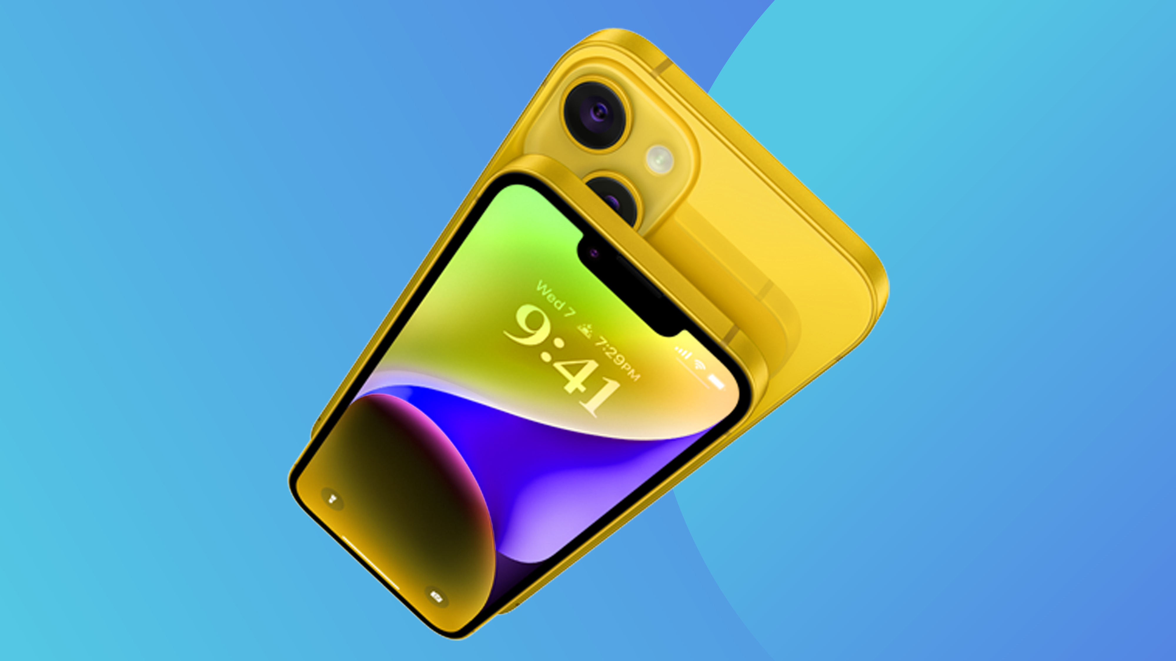
As argued by The Verge, Apple has been moving in this direction for a while, with Ventura looking more like iOS than Monterey, etc. etc. But with the addition of widgets and an iPhone-esque lock screen complete with a similar giant clock, you'd be forgiven for thinking that a Sonoma-equipped Mac is basically a giant iPhone.

And judging by the responses on Reddit, it seems users are torn about the increasing homogeny. "I’m into it. I think it’s great to have consistency across my devices, especially once we start synchronising widgets, lock screens etc," one user comments. But another argues, "They’re still fundamentally different tools, and merging the actual functionality makes no sense. Using a 6 inch touch screen is very different from a 14 inch keyboard and mouse, and it sucks that Apple has spent 15 years increasingly pretending they’re actually basically the same."

Time will tell whether the addition of mobile-first features such as widgets prove a hit on desktop. For my money, it's the ability to glance on the things for quick information on the go that makes them useful, so they might not translate to the Mac. But users have only had a few days to try Sonoma out, and any number so tweaks and bug fixes could make the cut between now and September. In the meantime, for the best MacBook experience around, check out the best MacBook Pro deals below.


