It's not all that often Farrow & Ball release new shades, so when they do, everyone gets excited. But we haven't seen a paint shade get this much hype in a long time. New addition Scallop is all over Pinterest already, and it's so easy to see why – it's the perfect neutral.
If you’re looking for something akin to a neutral paint but keen to steer clear of insipid non-colors, Farrow & Ball's Scallop is ideal for adding creamy, soft, dream-like neutral tones with a little more charisma, and a little less anonymity than other iterations.
Scallop is a lighter interpretation of the beloved 'Dead Salmon' – a highly Instagrammable and coveted deep salmon pink, which was so well-liked when it launched that it dominated the paint and color scene for a while. Scallop can be thought of as the less power-hungry little sister to Dead Salmon. It has a modicum of rose to it, a very pale tinge of ballet-slipper pink, but it is a whisper, not a shout.
If this sounds like the decorating solution you've been searching for, here we shine a light on how to introduce Scallop into your home to maximise its potential.
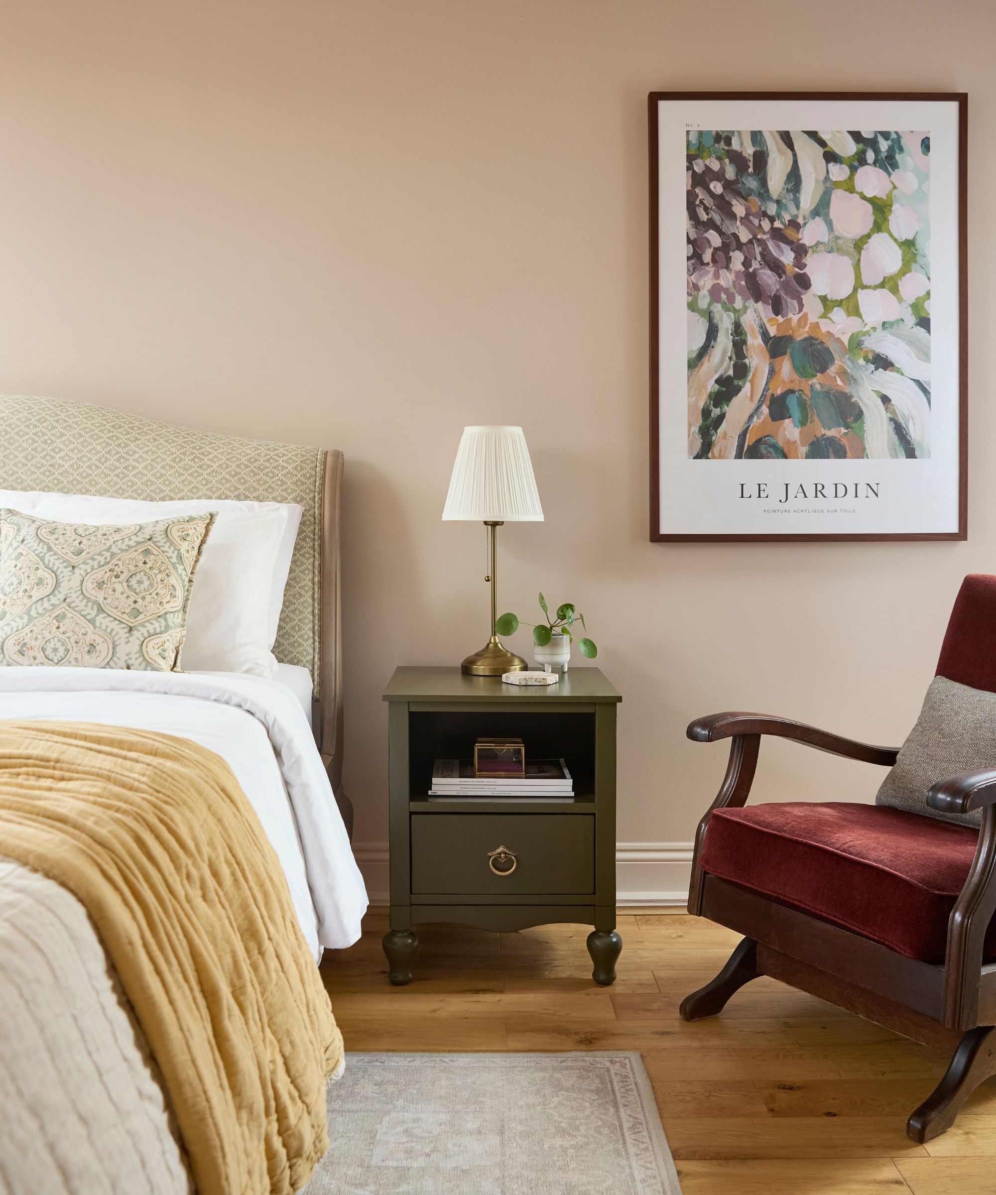
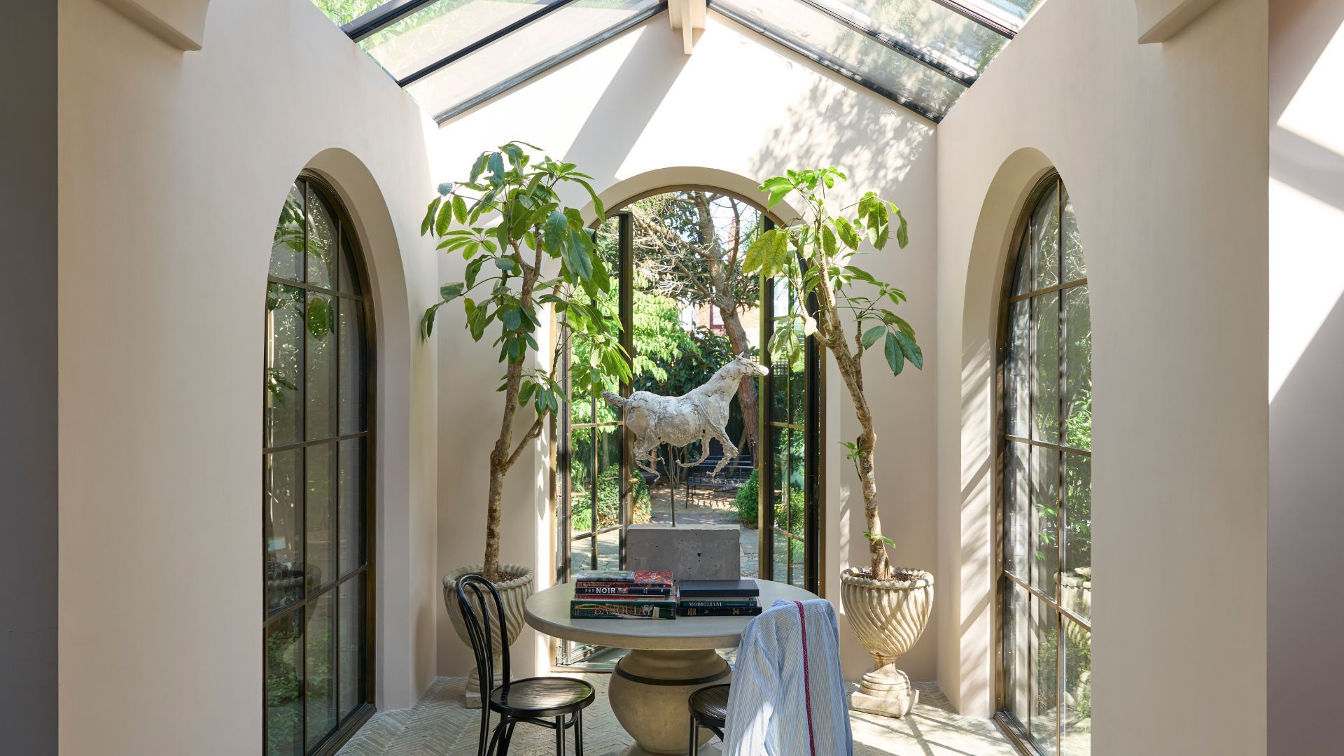
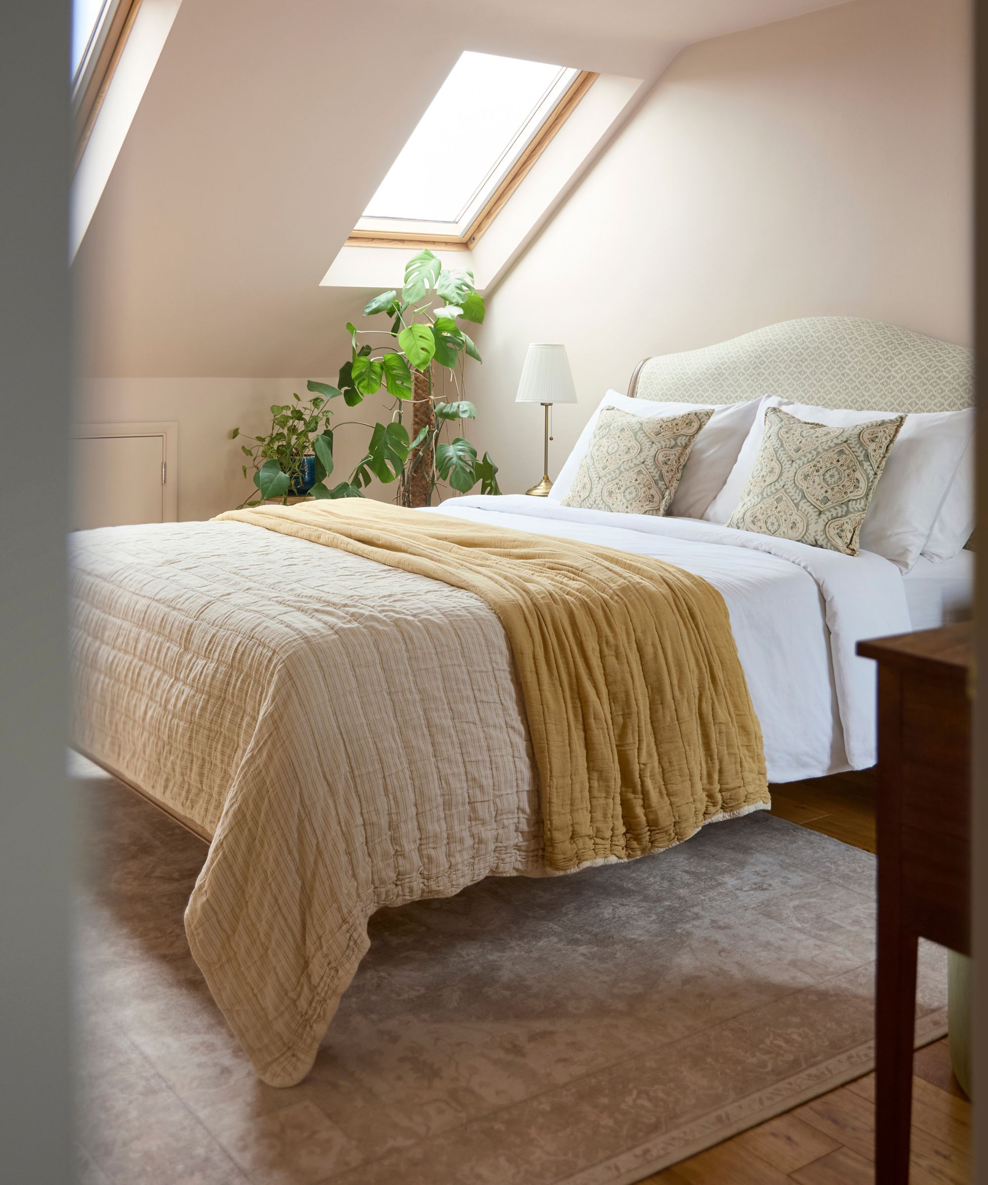
Scallop is a very soothing, calming color. As such, it is perfectly suited for bedrooms, bathrooms, and areas of the home where the intention is restfulness. If in your mind’s eye you have gendered associations with pink paint, rest assured, there is nothing overly sweet or twee about this sophisticated pastel pink tone. As such, it would look equally at home in hallways, kitchens, and rooms flooded with natural light, such as garden rooms or conservatories.
'Scallop has universal appeal,' explains Patrick O’Donnell, Brand Ambassador at Farrow & Ball. 'See it as your decorating friend for trim, ceilings, or walls. The slightly ‘dirty’ quality to it (think of it as a less clean version of Pink Ground) stops it ever feeling too pretty or neat.'
It's all very well loving a color from a small swatch, but how does it behave when in situ, and how does it behave with the mercurial play of light most rooms around the home are subject to? Scallop has a wonderful reaction to light, whether flooded with natural light or deprived of it.
'It has a gentle warmth when hit with lots of light, but neutralizes to a nuanced off-white in full daylight,' Patrick explains. 'However, come evening when lamps are on, it has a wonderful ethereal quality. The pink notes are very discreet, which means it will respond as a great foil to most decorating tastes and styles.'
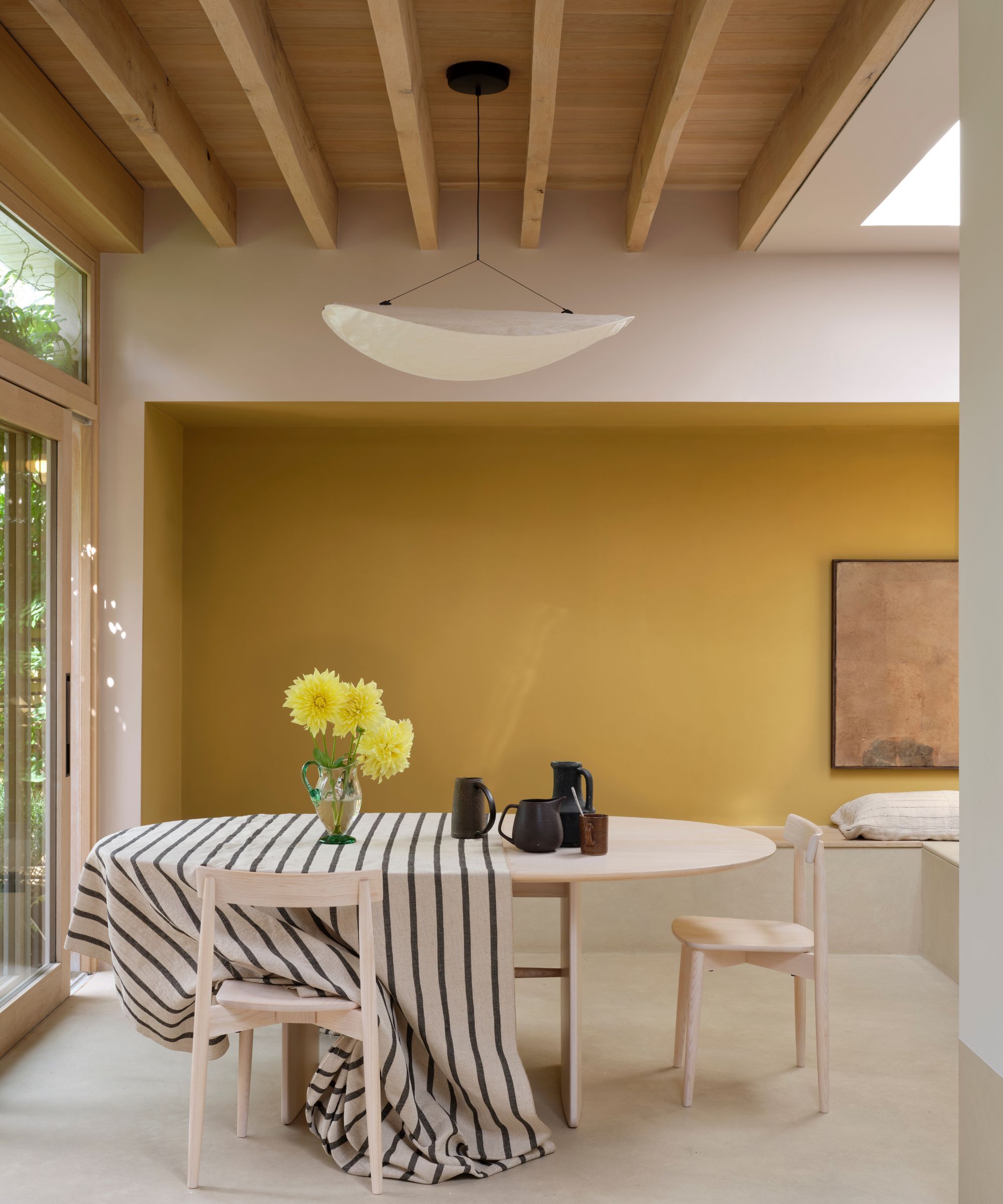
'It’s incredibly flexible,' says Patrick. 'Try using it as a trim or ceiling color for bolder choices on your wall. It will pair effortlessly with muddy browns such as Broccoli Brown, through to drab khakis like Treron or Dibber, or with bolder poached quince colors like our new Marmelo. It will play to almost anything.'
The creamy blush undertones in Scallop work marvelously well as a companion to warmer colors; a room covered head to toe in Scallop with chocolate brown internal doors would make for a beautiful pairing.
It would also pair beautifully with mossy green paints, and since pale pink and red are always happy bedfellows, a room with walls painted in Scallop and woodwork painted in Farrow & Ball's Eating Room Red would be a match made in heaven.
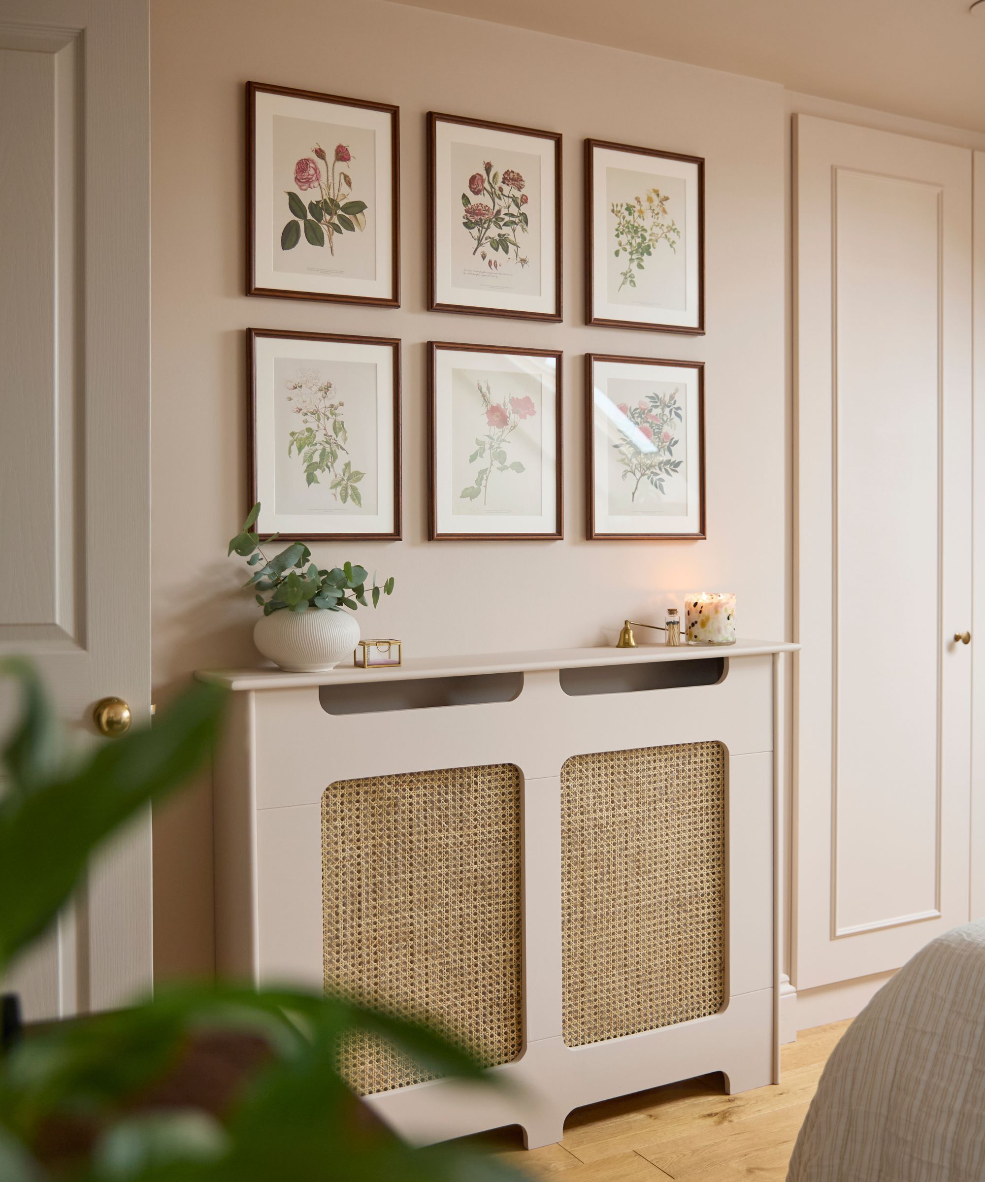
This variable, understated rose-tinted neutral, has a wonderful quieting effect and brings a comforting hush to a room. If you’re trawling the internet for bedroom ideas and feeling uninspired by other iterations of beige, ivory, and creams, Scallop will deliver the desired effect of a serene, calming neutral, but with notably more personality. If you're on the prowl for traditional hallway ideas to ensure your home makes a warm, welcoming first impression – not a cold, steely, somewhat chilly entrance – then this is a color well worth considering.