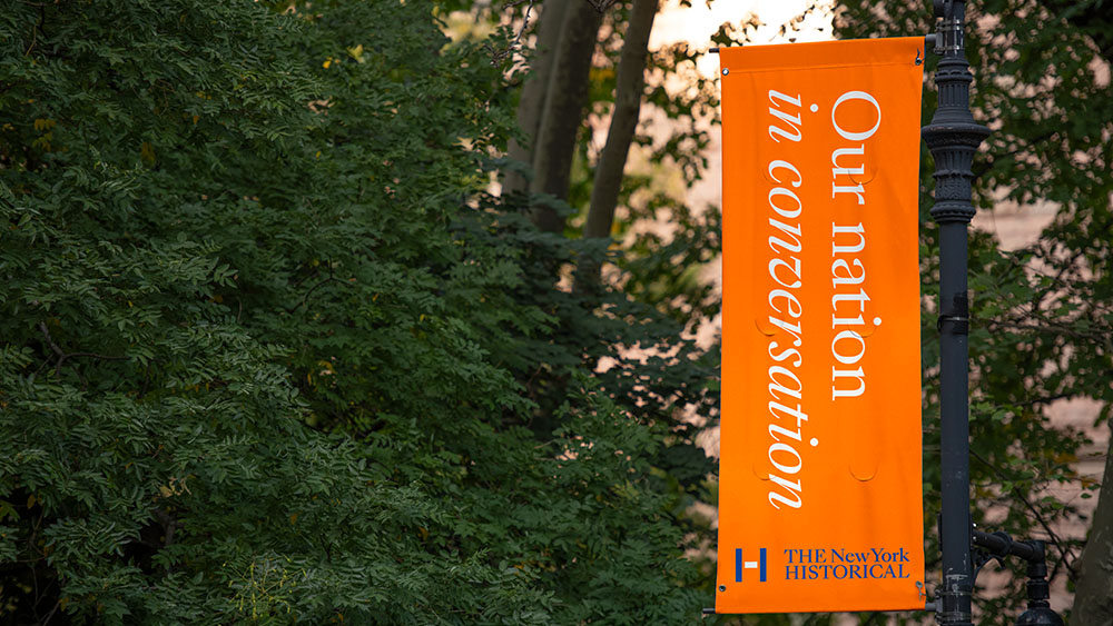
As the US approaches the 250th anniversary of independence next year, the New York Historical Society has undergone a major rebrand to redefine its 220-year role in American culture. With the tagline “Our Nation in Conversation", the museum aims to bridge divides and enrich the public understanding of America’s past, present and future.
Led by Lippincott, the rebranding process recognised a need to address a growing fragmentation in the national conversation. The result was to present the museum, now simply The New York Historical, as a place where diverse perspectives and stories converge to spark discourse.
Lippincott delivered a new logo design, color palette and other visual assets, while the museum is preparing to open the new Tang Wing for American Democracy in 2026. As part of our How we Made series, I spoke to the creative consultancy's Global Creative Director Brendán Murphy, Senior Design Director Devin Sager and Eric Tsytsylin, Partner, Strategy to learn how they approached the project.
What was the brief?
Brendán Murphy: Like most projects, there is the stated and unstated brief. The stated brief was to reimagine The New York Historical Society brand to clarify its role and impact ahead of its 220th anniversary and the opening of its new wing dedicated to American democracy.
The unstated brief allows you to read between the lines, and comes from visiting the museum, meeting with the board, staff and museum goers. The building holds, amongst other elements, a museum and library of ordinary and extraordinary treasures. But the building was physically living in the shadow of its larger and more well-known neighbours; it was seen as a place, and not a destination. Its eclectic offering had camouflaged its focus, and it had a name, but, arguably, not an identity.
This became our brief, our mandate. To help make it a destination. To highlight The New York Historical’s importance and role, leading and engaging in a fact-based conversation of democracy. To create a name and bold visual identity that respected its past and positioned it in the world of today.
How did you work together on the project?
Brendán Murphy: There are two types of teams. Teams based on capabilities, including strategy, naming, voice, logo, motion, and web. We of course had folks from each of these disciplines. But for a cultural project like this, it’s equally important to have a team of passionate volunteers and collaborators who are curious about history. We also made sure the team mirrored the diversity of the American melting pot, who come from various places, and who can bring quite different skills, experiences and perspectives to enrich the conversation.
How did you come up with the tagline "Our Nation in Conversation" and how did this inform the rest of the identity?
Eric Tsytsylin: “Our nation in conversation” actually began as an internal strategic platform. We pretty quickly realised that the organisation’s superpower was its ability to make connections and spark dialogue between different artifacts, artworks, ideas, eras, and individuals; the museum’s Gallery of Tiffany Lamps, for instance, isn’t just a passive repository of precious objects, but an active conversation-starter about art, labour, memory, and who gets credit.
“Our nation in conversation” also subtly clarified the institution’s scope – all of American history, not just New York’s – and drew much-needed attention to the literal conversations that took place throughout the New York Historical’s public programming. At a certain point, it just became a no-brainer to also use the idea as the brand’s external tagline and assert its role as a beacon and forum for our national dialogue.

Tell us about the new logo.
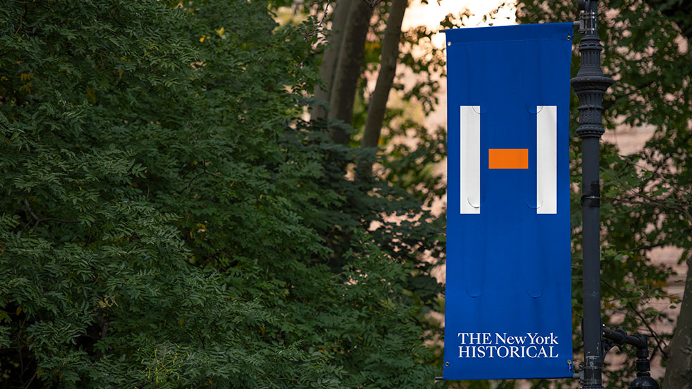
Brendán Murphy: On the surface, the logo is quite simple, H for History, H for the Historical. But the historical subtext behind the H is a richer story. The crossbar in the H borrows from the hyphen in the original spelling of New-York. And we’ve imbued it with new meaning, symbolizing a bridge connecting opposing views, people, cultures, generations, ideas, and objects across time.
Devin Sager: The contemporary symbol is also paired with a new name and classic serif name-style, Sang Bleu from Swiss Typefaces, that highlights a shorthand for the name, The Historical. The colors are rooted in New York and American history: the orange in the palette is a nod to the state’s origins as a Dutch colony, while the blue references the union of the American flag.
What was the role of motion in the project?
Devin Sager: Motion is a powerful tool for engaging audiences, simplifying information, highlighting key ideas, and bringing stories to life. At the heart of our brand strategy is the concept of connection, embodied by the hyphen. We’ve used motion to activate the hyphen as a storytelling device, transforming it into a connector that evokes conversation between people, ideas, and eras. By applying motion selectively, especially during key moments, we amplify its impact and create more memorable experiences.
What challenges did you come across?
Brendán Murphy: I’d say there were less challenges and more big questions centred around the institution’s beliefs, role, and what they’d be signaling through this evolution of identity. Change can be hard, and it’s filled with what-ifs that are colored through different experiences and goals. But the study of history is a study in the dialogue of change.
What does the word society mean today? Does it reflect who we are or who we want to engage? What are the implications of changing our name? Do we need a symbol? What meaning do we want to build into it? Everybody else uses the symbol alongside the name... is it okay to separate them? These questions help challenge your thinking and make projects fun.
Eric Tsytsylin: Every rebranding project is an archaeological dig of sorts, but you can imagine it was an especially overwhelming exercise for a 220-year-old organisation with 400 years of American history in its archive. Finding a coherent, singular thread through all of it – especially without being too navel-gazey or backwards-looking – was a challenge. Having a decisive client and a clear strategic ambition helped us focus and prioritise the most relevant and compelling truths to bring forward in both the strategy and identity.
Which part of the process did you enjoy the most?
Brendán Murphy: Taking a seemingly insignificant typographic element like a hyphen, connecting the dots to build meaning into it, and seeing the story come to life across the system in the form language including motion. We had some wonderful symbol options. But the opportunity and history in this idea, connected with everyone, making it a giving idea that will continue to connect and drive new conversations as The Historical grows and evolves.
Eric Tsytsylin: Working on the New York Times (which, by the way, got rid of its ‘New-York’ hyphen in the 1890s!) ad that ran just a few days prior to Election Day was definitely a highlight. I still find print ads to be the purest test of an identity’s clarity and resonance, and it was quite moving to be able to tell the story not only of the rebrand but also the importance of respectful, fact-based conversation and dialogue at this consequential moment in our nation’s history.
Devin Sager: I loved the messy middle. Through our shared insights and collaborative dialogue, we were able to craft a solution and a compelling narrative that both honors the rich heritage of this 220-year-old institution and charts a bold path forward for the future of The Historical.

What's your favorite part of the finished work?
Brendán Murphy: I love the clarity of thought and execution. Our collective teams, Lippincott and The Historical, brought a rigor, and clear focus to the idea and storytelling, and made sure that the identity did not lose its way across the various channels.
Eric Tsytsylin: The bigger applications – signage, advertising, website – tend to get the most attention, but I’ve really enjoyed seeing the identity activated in smaller moments: a LinkedIn post promoting an upcoming talk; an illuminated version of the logo at coat check; the interior imagery of an envelope being mailed to prospective donors. Ultimately, brands are built through each of these small, daily interactions repeated many times over, and I’ve loved seeing The New York Historical make the brand their own while still honoring the essence of the strategic and creative platforms we delivered. History is a living, breathing discipline, and so too is brand.
Devin Sager: I love seeing the work come to life and step beyond the theoretical. It’s incredibly rewarding to see it out in the world, knowing we’ve developed a comprehensive visual system and a set of tools that are not only easy to implement but also fully align with and support the ambitions of The New York Historical.
How do you think this identity will help the New York Historical stand out among other institutions?
Brendán Murphy: This starts with the role we want to and can play in people's lives. New York is rich in cultural opportunities, and its streets and geography are steeped in history. Bringing a focus to The New York Historical’s purpose, A nation in conversation, and the investments that the Tang family are creating in the new wing and community programs, opens the door to a different type of dialogue and relationship than its neighbours, The Natural History Museum or The Met. The evolution in the identity that sheds some of the perceived stuffiness of the former name, helps create a destination that allows more people into the conversation.
What's the feedback been like so far?
Eric Tsytsylin: We’ve received overwhelmingly positive feedback from visitors, Board Members, staff - and especially from many everyday New Yorkers who are discovering this 220-year-old gem for the first time. Across these audiences, “Our nation in conversation” rings true as a strategic and creative idea, and the bold new identity energises them about the institution’s future. Some have lamented the loss of the hyphen but are delighted when they see it’s been given new life and meaning in the ‘H’ symbol.
We think our client, Louise Mirrer, President and CEO of The New York Historical, said it best: “Reimagining an institution with 220 years of history is not for the faint of heart. Lippincott took on the challenge with passion, crafting a brand that reflects the best of who we are, and that will continue to shape who we are becoming.”
We’d love to thank Agnes, Louise, Ken and The New York Historical team for their partnership, trust, and what they made possible on this journey. And Christian Schwartz of Commercial Type, and Swiss Type, for their generous support of the programme's system typefaces.
To learn more about the rebranding project, visit Lippincott's website and New York Historical.
