Pity the poor art and design journalist tasked with seeking out new and exciting stories about branding over the last month. Since 24 July, a single chaotic rebrand has hogged the headlines – and here we are, writing about it again. Elon, if you could just leave the 'X' logo alone for a second, that would be great. Cheers.
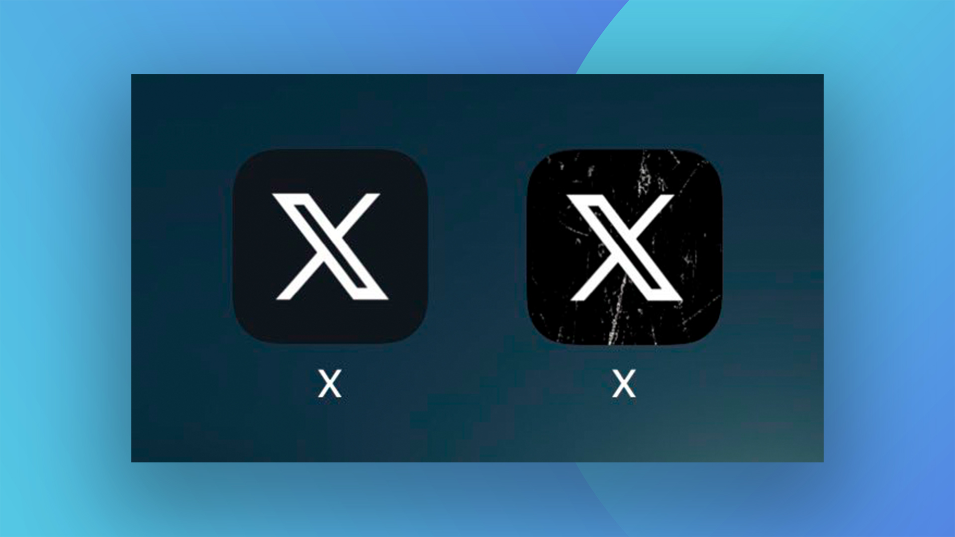
So what's new? One word: grunge. The app icon on users' home screens has changed again, with the addition of 'distressed' white marks atop the black background. And if you're thinking it all looks a bit 'How do you do, fellow kids?' You're not alone. One of the best logos of all time, this ain't.
The grunge effect has only been in place for a few days, but users are already taking to X (that's never going to feel natural to write) to mock what looks like a blatant attempt to inject some edginess into the design. Musk says "The cracks & scratches better represent this product that I love," but it seems most users aren't buying it.
elon musk’s obsession with masculine aesthetics is so childish like i’m sure he buys shampoo in scents like “steel war” and “smokey conquest” https://t.co/DEEM9QKXdUAugust 15, 2023
help why does it look like a 12 year old put a vsco filter over it https://t.co/phxRCLy6DdAugust 15, 2023
impressive how they managed to make it look ever tackier https://t.co/6SGxKdj3xFAugust 15, 2023
From tweaks to the boldness of the X to the hasty installation (then un-installation) of a massive X-shaped light in San Francisco, this rebrand has been nothing if not, er, dynamic – with new changes rolling out on a weekly – if not daily – basis. Still, if you're not a fan of the new (new) home screen icon, fear not – there is a way to reunite yourself with the bird.