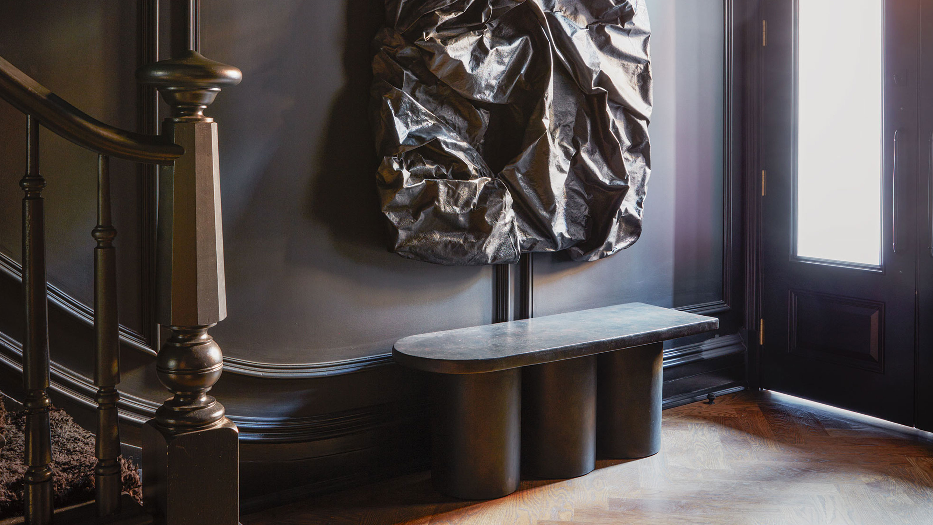
Some of the most exciting spaces you'll see in homes today are entryways. Of course, it's all about making a good first impression, so entryway ideas are becoming more dynamic, combining design and function better than ever.
They can also act as a microcosm of your design style — a hint at what's to come when you move beyond your home's entrance and begin to explore. I love this idea that an entryway can be a boiled down version of a home's full story — an excerpt, if you will, that's meant to tempt you to want to know more.
That doesn't mean that an entryway has to defer to the rest of the house, or that it should be an afterthought, however.
Here, we've picked 16 brilliant examples of entryways that all deliver something different through an exciting design quirk to inspire you to up your entrance game.
1. Make it a gallery
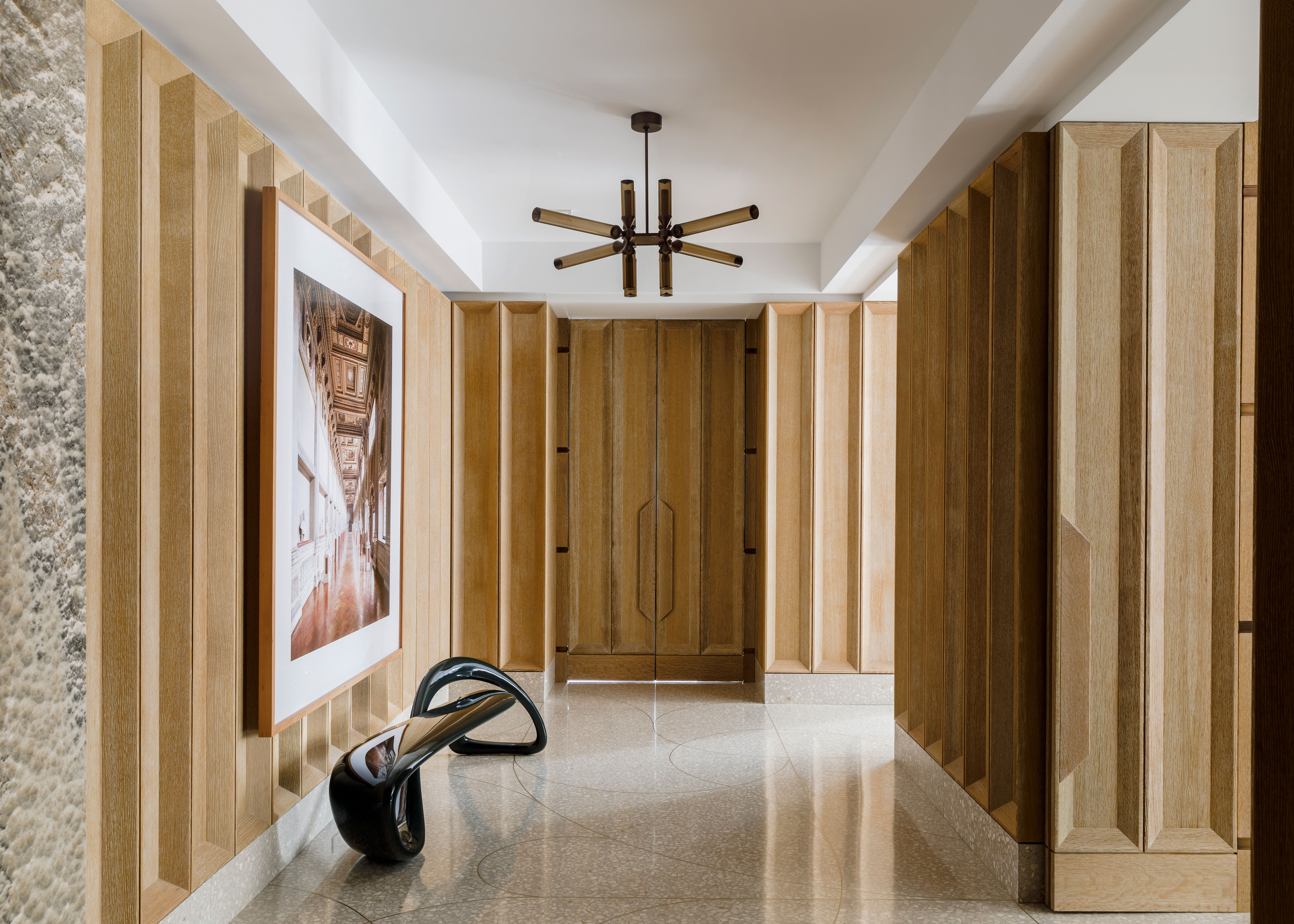
If you want an entryway that makes an impactful impression, filling it with art is no bad idea — and if you have the space, it's one of the best rooms to turn into a mini gallery for your favorites. Don't just save the good stuff for your living room ideas — remember, an entryway is a space that everyone will see.
With its intriguingly paneled walls, this entryway designed by MKCA in New York is the ideal spot to display the owner's collection.
"The regulated fluidity of circulation allows for sprawl across multiple rooms, while also celebrating and activating the formal gallery space, which is such a hallmark of a classic Park Avenue apartment in New York," says Michael K Chen, principal of MKCA.
Whether a single stand-out piece, wall art or sculpture, or gallery wall, there's a way to make your entryway ideas revolve around art.
2. Add a conversation starter
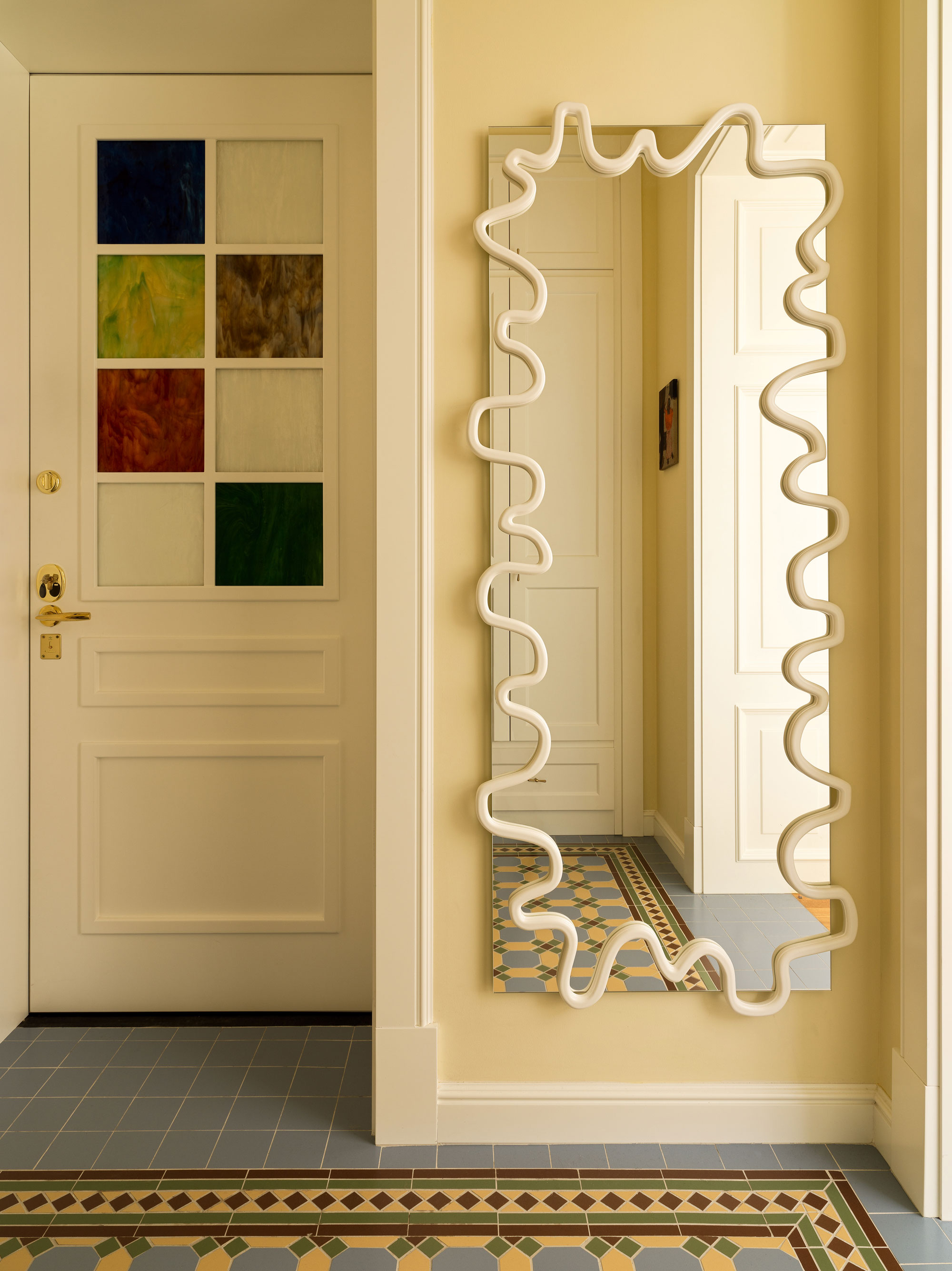
We love the idea of including one amazing thing in a space that can spark the imagination, and in an entryway spark conversation with visitors, too. In this pale yellow entryway, it's a statement door that brings a dash of color to the room.
"It all started with the incorporation of stained glass windows for the doors," says Elina Mussakulova of Studio sdelaemremont. "The colors of the glass were quite limited, but we like how we combined the chosen ones into one complete picture and added a complementing wall color."
This space packs in entryway ideas with the wow-factor, from the stained glass door to the wavy mirror and floor tiles that create the effect of an entryway rug.
Price: $179
Capture the look of the wiggly mirror used above with this wavy design from Crate & Barrel.
3. Break the rules and go dark
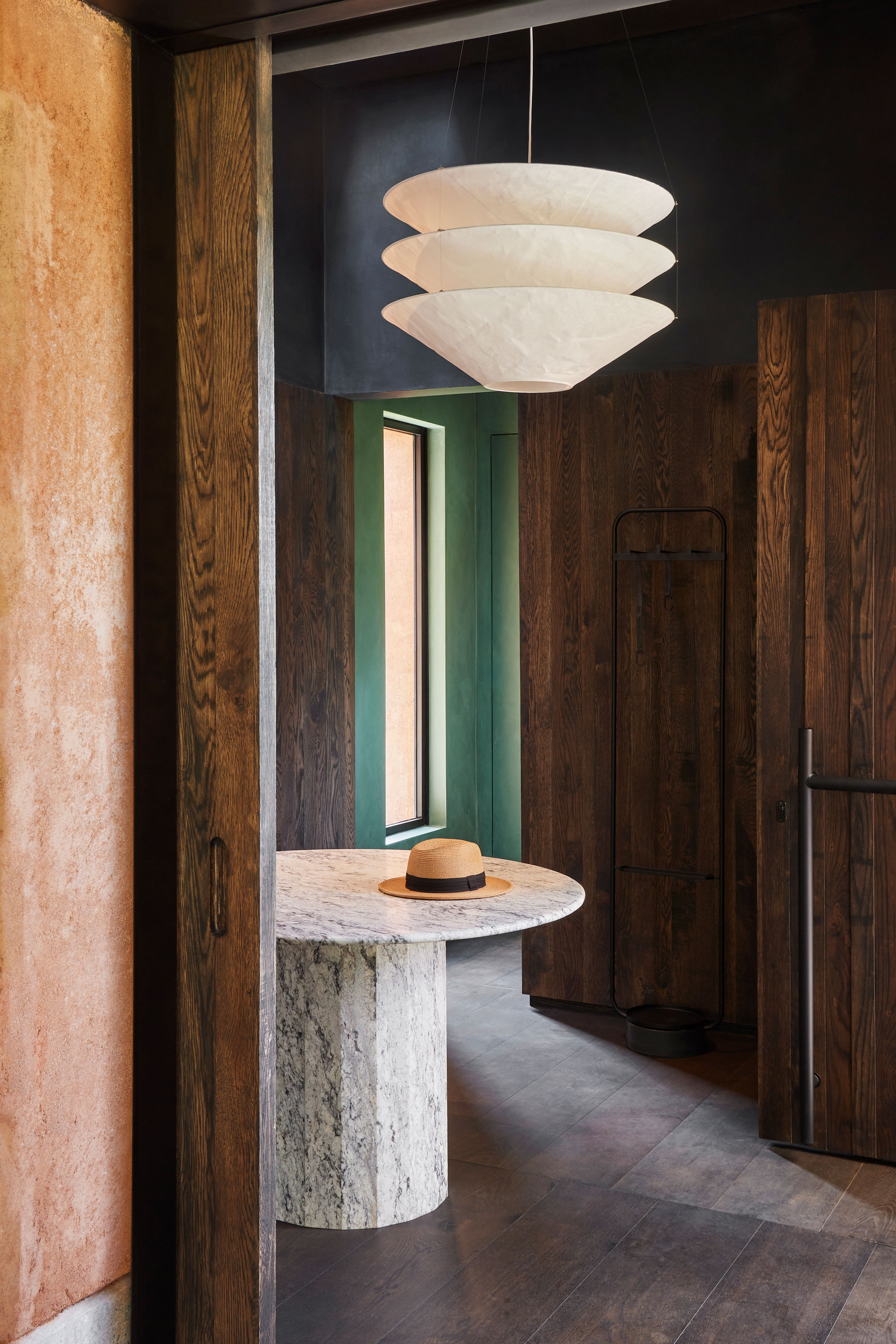
In what's typically a smaller space in the home, you'd expect it makes the most sense to keep the walls light to help the space feel bright and airy, but sometimes, it's better to lean in and embrace dark entryway ideas for a more dramatic design scheme.
"This entrance/lobby was intentionally dark, in contrast to the rest of the living space, that's full of light," says Antoine Simonin, founder of Parisian design practice STUDIO ASAÏ. "The lamp and the light are precious objects of the room."
Price: $699
It may not be an exact match, but this tiered pendant design does the same job as the one used in the entryway above.
4. Choose a fun lighting fixture
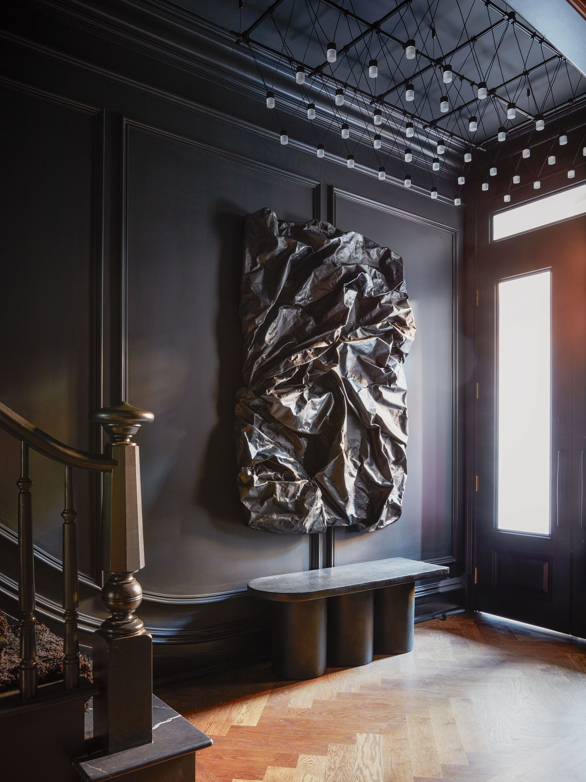
Good lighting is the secret weapon in your arsenal of entryway ideas, but more on that later. As well as wanting your space to appear bright and welcoming, include lighting that wows, night or day, to give your entryway top-to-bottom appeal.
In this entrance by designer Crystal Sinclair, a monochromatic palette creates an instantly intriguing vibe, but the spectacular entryway lighting installation is the crowning jewel.
"I'm really drawn to vintage lighting," Crystal tells us. "Something about it just adds character and charm to a space! It also creates a unique space because each vintage light is usually pretty unique — you're not going to find it next door anywhere."
5. Think creatively about flooring
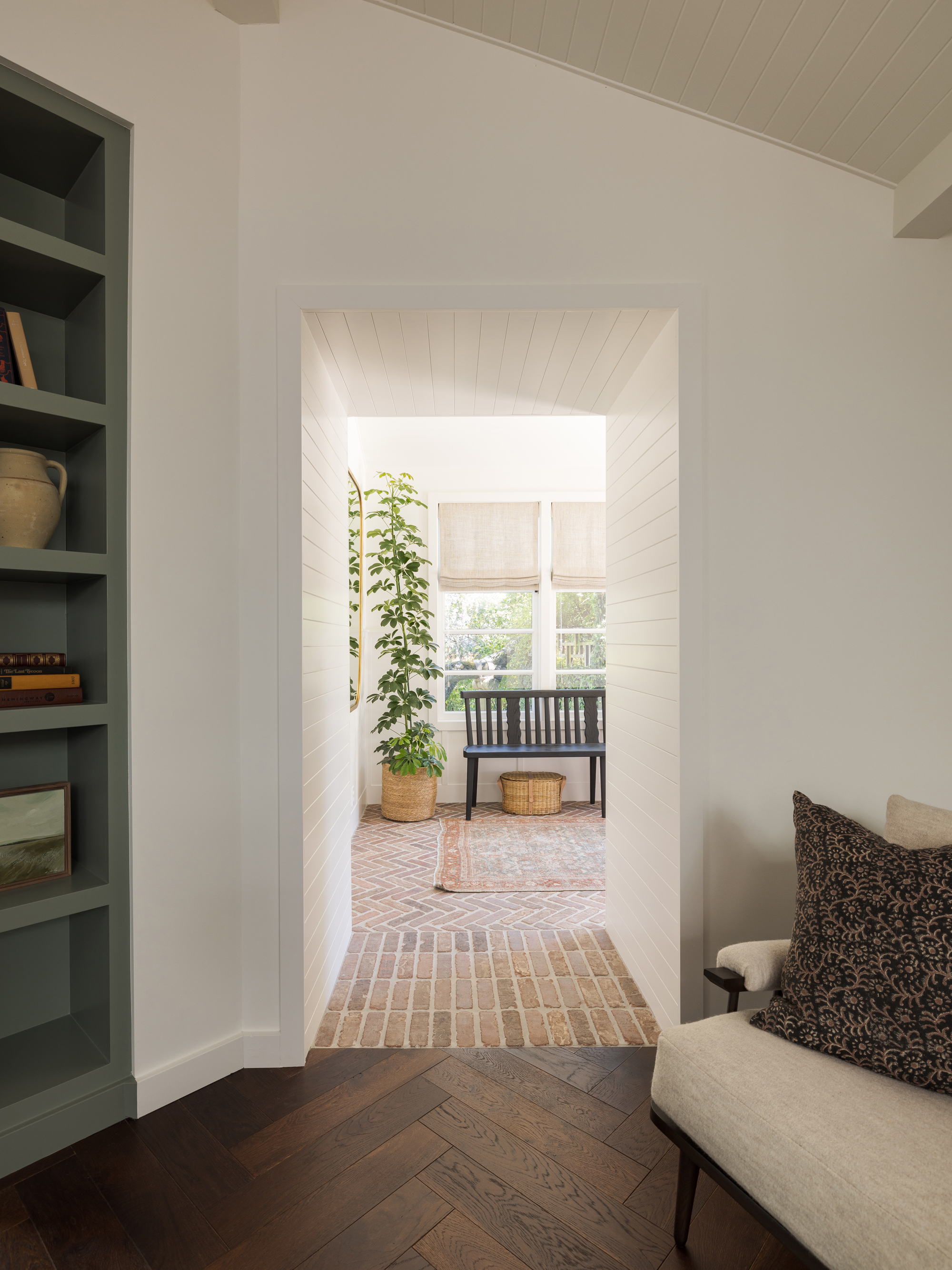
Because you're working with a space you don't have to spend all your time in, you can get creative with entryway flooring without running the risk of tiring quickly of your choices. If you're designing a small entryway too, it can be a spot to play with exciting patterns, textures, or colors that might feel too domineering on a larger scale.
However, entryway flooring needs to also be durable. Fortunately, there are choices that are tough enough to meet the needs of your entrance, while also offering up that all-important wow factor.
"When we first talked to the clients about features for their home and their style, they mentioned loving brick patios and brick fireplaces," interior designer Katie Monkhouse explains of this interesting brick flooring choice. "The two fireplaces in the home were being updated with stone so when we were working through options for the new flooring we came up with the idea of a brick moment in the entryway. It is a super practical flooring material for a high-traffic entryway and also sets the tone for the house when you walk in."
But it wasn't just the choice of material that made this flooring have real visual impact. "We loved the idea of laying the brick in a herringbone to create a connection to the herringbone wood in the main living space," Katie adds, "but we also had created a thickened opening that led you into the main house so we decided to use that area as a transition point in the pattern and laid the brick as a soldier course. That change in pattern is one of my favorite details in the house, it really feels so intentional."
6. Zone your entryway
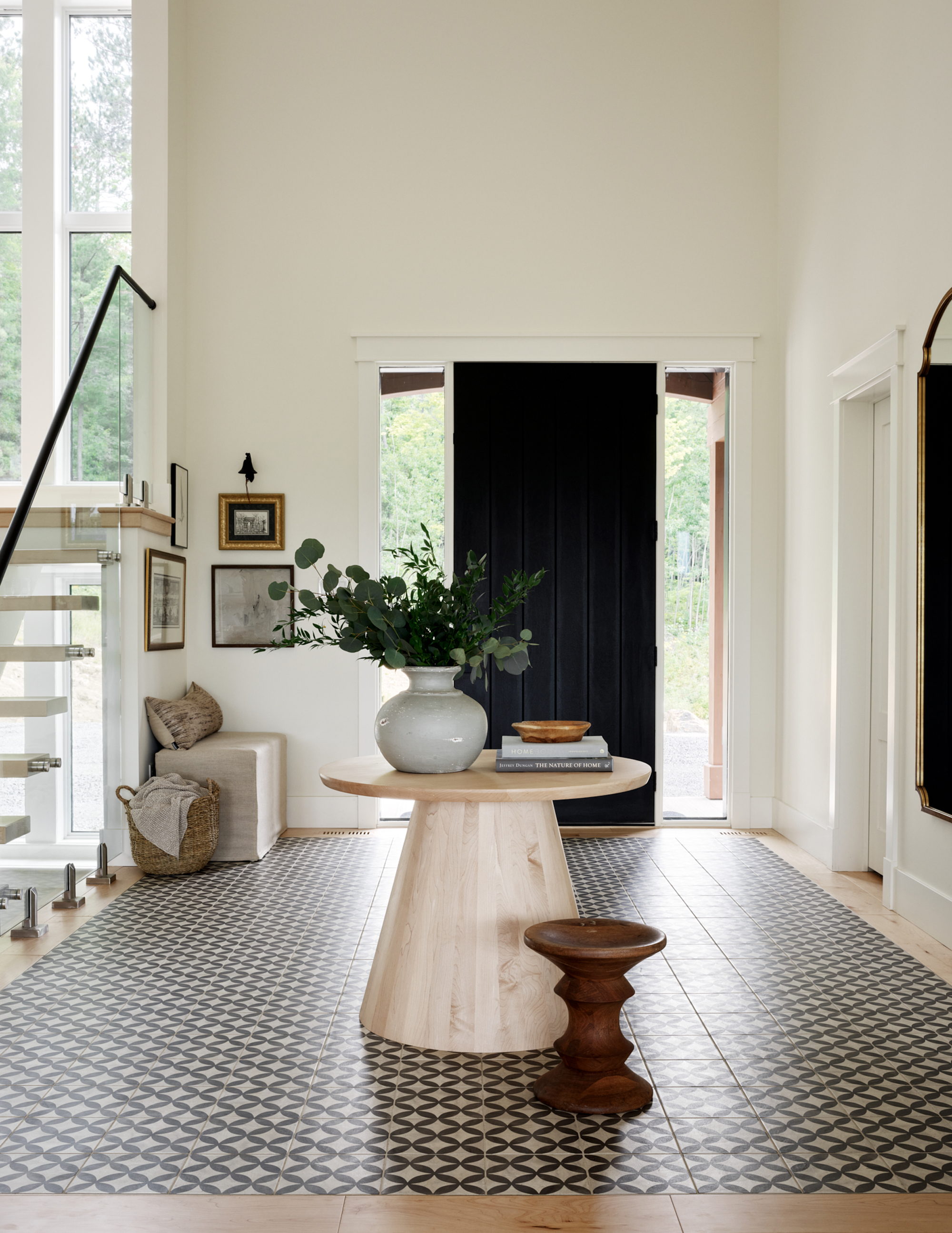
Whether you're dealing with a larger, open-plan entryway, or you've just carved out a small entryway area to create the effect of an entrance where there isn't really one, visual cues can help to demarcate it from the rest of your room. Furniture placed in exactly the right spot, a cleverly used color block of paint, and even the positioning of lighting can all help zone an entryway to make it feel distinct. Alternatively, you could try this idea by interior designer Candace Plotz, who used contrast flooring to highlight the entryway within this larger space.
"A foyer is the first impression of a home, and it was important to me to set the tone for the rest of this off-the-grid country home," Candace explains. "The floor tile adds a lot of visual interest and impact to this space, all while being extremely durable. Black and White will always be a classic in my mind; standing the test of time."
Using a border around the edge not only acts to highlight the proportions of this ample space but creates the feel of a luxuriously sized area rug, yet remaining easy to clean and hardwearing, so perfect for a busy entryway.
7. Streamline an entryway with uniform doors
Your home's entryway acts as a transitional space, and will usually branch off to the many other rooms in your home that surround it. That can, unfortunately, make the wrong entryway start to feel like a glorified corridor, a gallery of doors leading elsewhere.
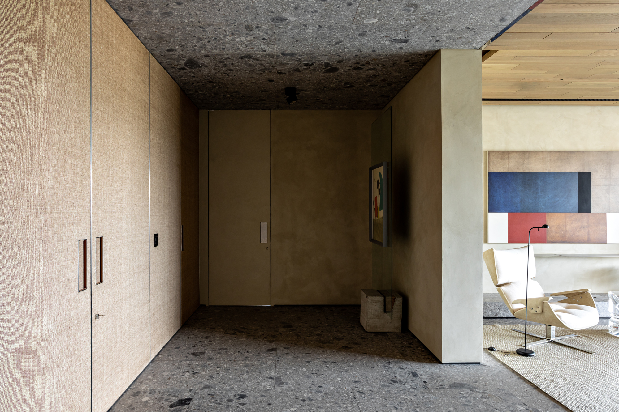
However, by incorporating hidden doors into your entryway, or opting for oversized, uniform doors as in this apartment entryway designed by Brazilian architecture firm Meireles Pavan arquitetura, you can help them recede into the background, creating a sleeker overall look.
"The entrance doors divide the entrance hall from the elevator to the interior of the apartment and also hide the door that accesses the bedrooms and the toilet from the living room," explains architect Brunno Meireles, co-founder of Meireles Pavan arquitetura. Combined with the wall color, these doors feel low-impact, creating a space that almost feels cave-like.
"We wanted to have a minimum of visual interference in the entrance hall to give more emphasis to the works of art with Lina Bo Bardi's easels," Brunno tells us, "so we chose the natural straw on the doors to contrast with the Italian ceppo di gre marble."
8. Include an entryway table for flow
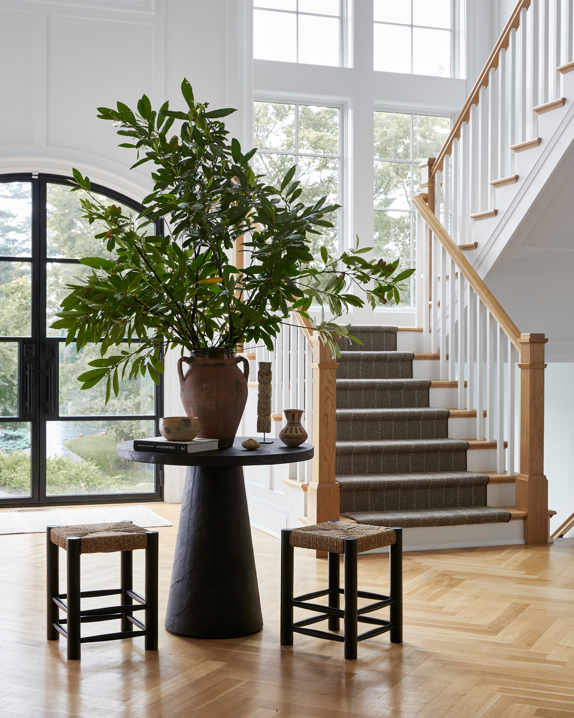
Entryway tables are one of my personal favorite interior design trends of the moment. Space permitting, they're a brilliant way to add a focal point to a foyer, and with the right entryway table decor, they can really set out the stall for what the rest of your home is going to deliver style-wise. "It's a great place for styling pieces and florals or branches when someone first enters the home and creates a special moment right when you walk in the door," explains Brittany Hakimfar, founder of Far Studio.
However, they can have a practical function in an entryway too. "A round entrance table can really set the tone and flow of an entry," explains Brittany. In a larger entryway, it creates pathways that make a space more instinctual to traverse. In this modern entryway, Brittany also included stools around the table, a spot for pulling on shoes, or waiting for the family to get ready as you're leaving the house.
9. Introduce statement furniture for impact
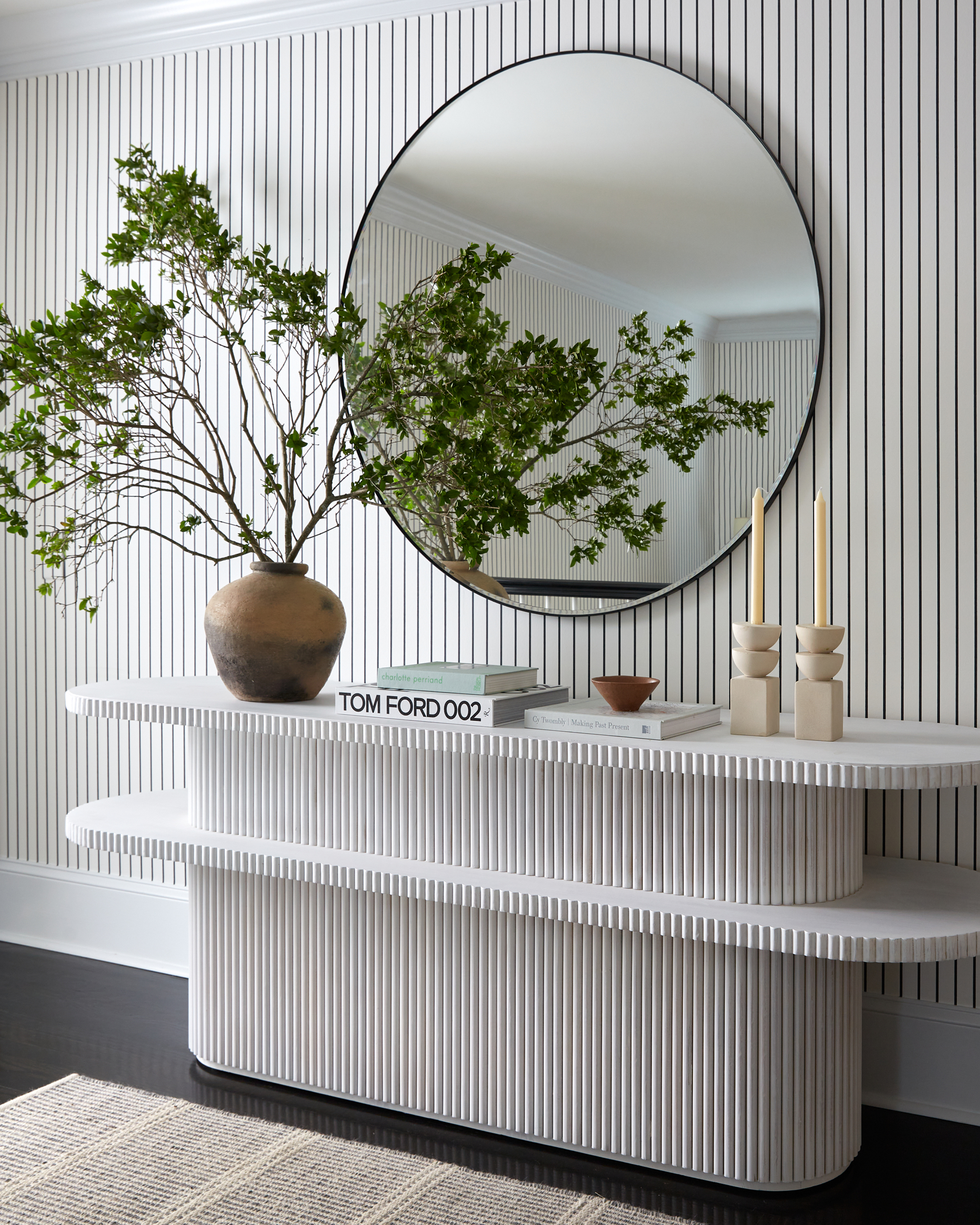
An entryway is often comparatively pared back furniture-wise compared to the other rooms in your house, which means you've only got a few pieces through which to create the look and feel you're searching for.
Why not, then, pick furniture that's going to make a real statement? That was Brittany of Far Studio's idea when selecting this inspired console table.
"With this console, we really wanted to create a moment — it was a blank wall that screamed for something unique and when we saw this piece we knew it was perfect," Brittany tells us. "Both the fluting and the multi-tier allow for a lot of dimension and unique elements and a great place to style with console table decor like accessories, branches, and books. The round mirror above completes the space and adds great reflection."
10. Build a layered lighting scheme
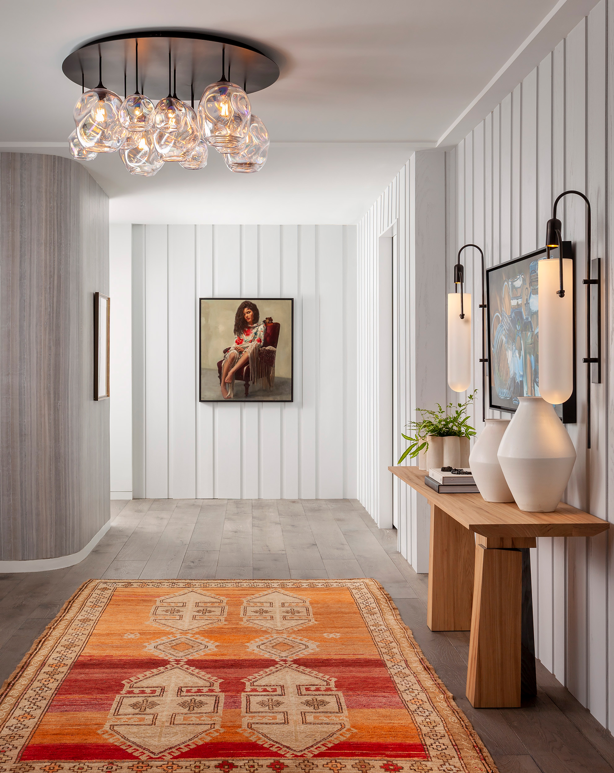
As you'll have no doubt seen if you've made it this far, entryways come in all shapes and sizes. Some are small and dark, others large and light-filled. There are plenty of ways to make a small entryway look bigger and brighter, but if you're faced with a space devoid of natural light, then you'll need to rely on your entryway's lighting scheme to make up the shortfall.
The key to a rich, layered lighting scheme is ensuring you've covered all the bases in the types of lighting you include. You need that ambient lighting that properly illuminates your space — ideal for switching on when you enter back into your home in an evening, but also consider task and accent lighting, too. In an entryway, task lighting might not be as important as in other rooms in the house, given that you're unlikely to spend excessive amounts of time in this space, but accent lighting is where your entryway can really shine.
Installing lighting insets into the floor and sconces that wash the wall down with light, highlighting your wall decor or architecture, can be particularly effective in an entryway and makes for a good base level light for this room after the sun goes down.
11. Create a layout that works with statement lighting
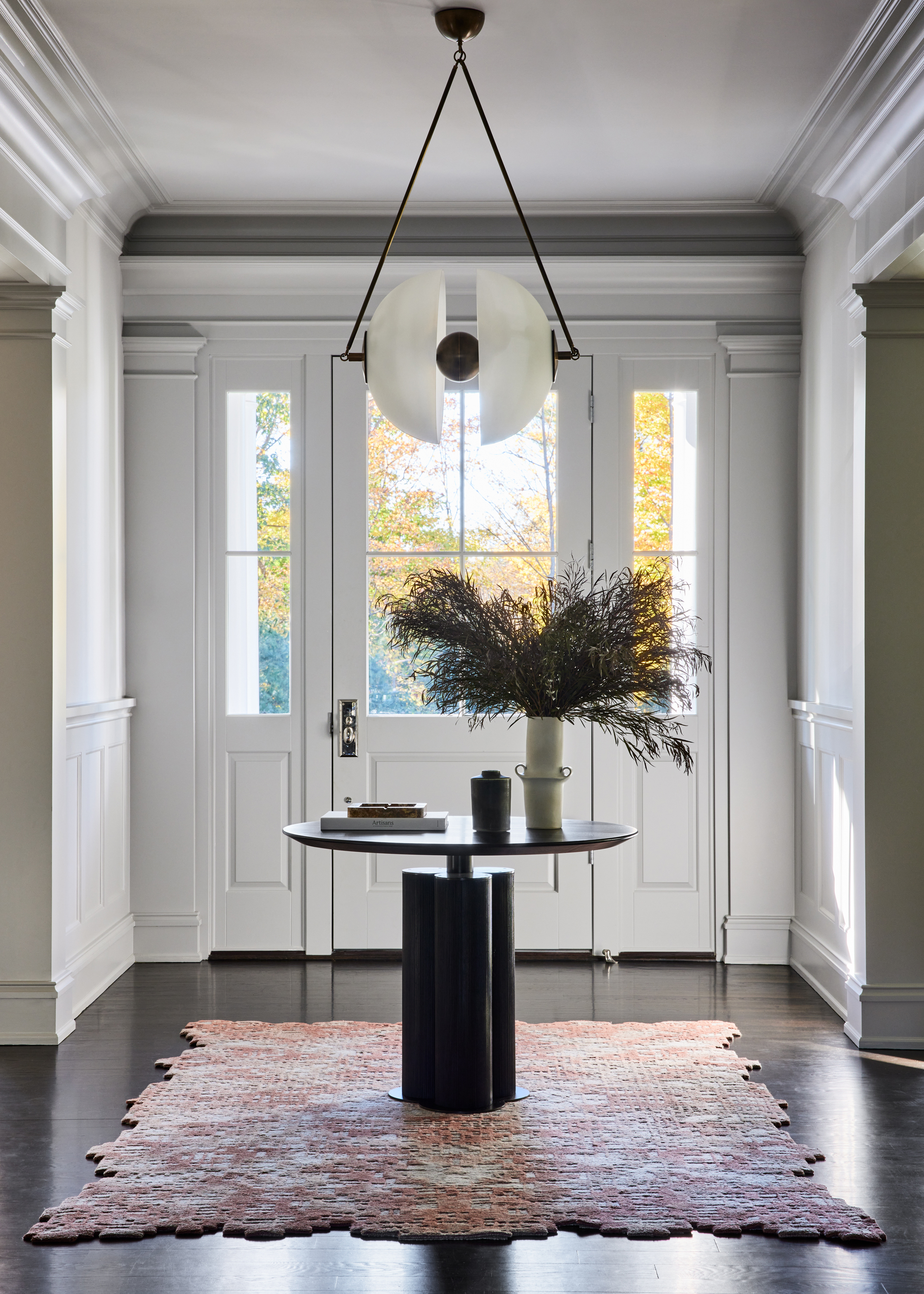
Integrating interesting lighting can be tricky in entryways, for the reason that they don't naturally provide the same areas where you can drop lower-hanging pendant lights (which are, let's face it, usually the best-looking lights). In the rest of your home, your pendant lighting can sit comfortably over a coffee table, dining table, or kitchen island, without disrupting the flow of a space or running the risk of someone hitting their head.
In an entryway, you have a few options. Either stick with recessed or semi-flush lighting, incorporate pendant lighting if you have the headroom to do so, or create a layout that creates no-walk areas which means you can introduce lower-level lighting.
Interior designer Monica Fried introduced an entryway table into the foyer of this family home, for example, allowing for a statement light fixture to be the first thing you see when entering the home. "We wanted the space to be chic and elevated but welcoming," Monica explains. "The family loves to entertain and this entry makes a great first impression."
12. Think about the view when you enter your home
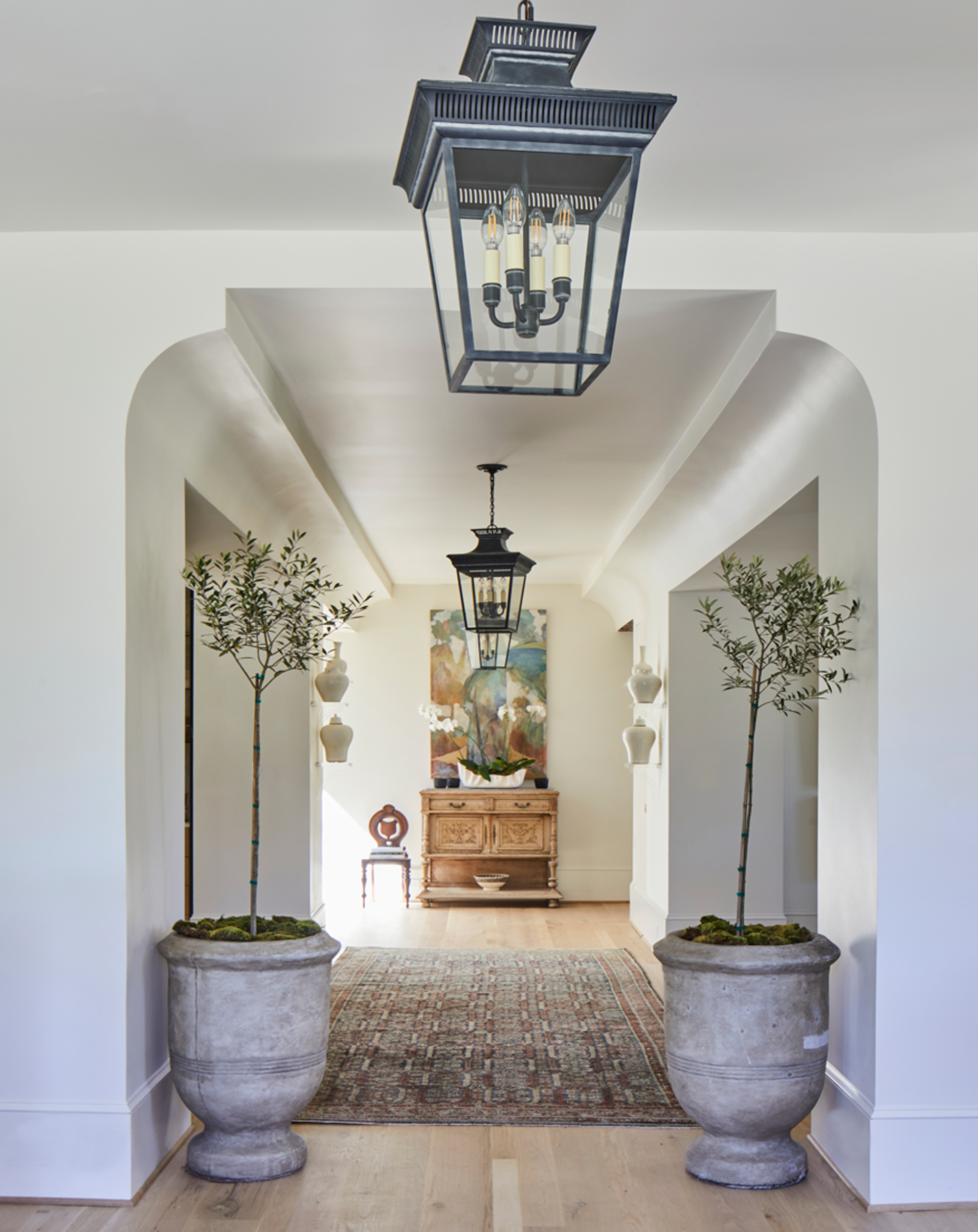
This view, or vista, when you first enter your home shouldn't be overlooked. Even if the rest of your home is impeccably designed, you've squandered both your first impression and that sense of joy when you return home if the entryway doesn't live up to it.
In this home, created by design and construction firm Riverbrook, a picture-perfect space has been created that draws the eye through the hallway. It's an example of where symmetry can really have an amazing effect in interior design, from the light fixtures to the indoor trees, both highlighting the architecture and creating an entryway with a real magnetism that draws you into the home.
13. Design in the perfect perch
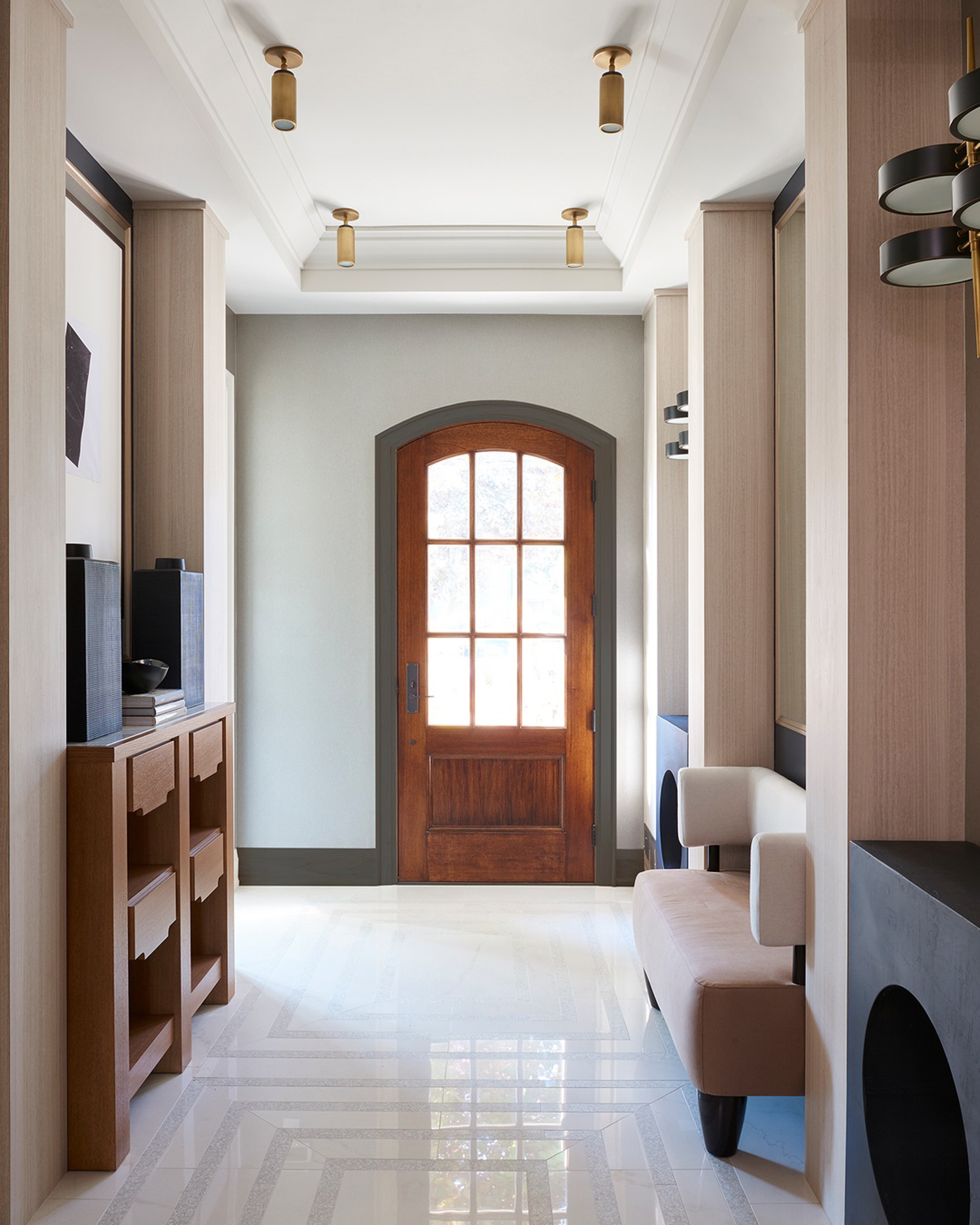
If space permits, introducing seating into your entryway is essential. But, even small entryways can find room for a small perch for putting on shoes before you leave the house.
Built-ins are a great way of introducing storage and seating that uses space efficiently, however, they can also add bulk which can make an already small entryway feel smaller.
For this entryway, designer Stacey Cohen created a modern look with custom furniture built into recesses. The bespoke bench is comfortable and generously sized for the space, while feeling lightweight and retaining the sense of space in the entryway.
14. Design a mudroom into an entryway
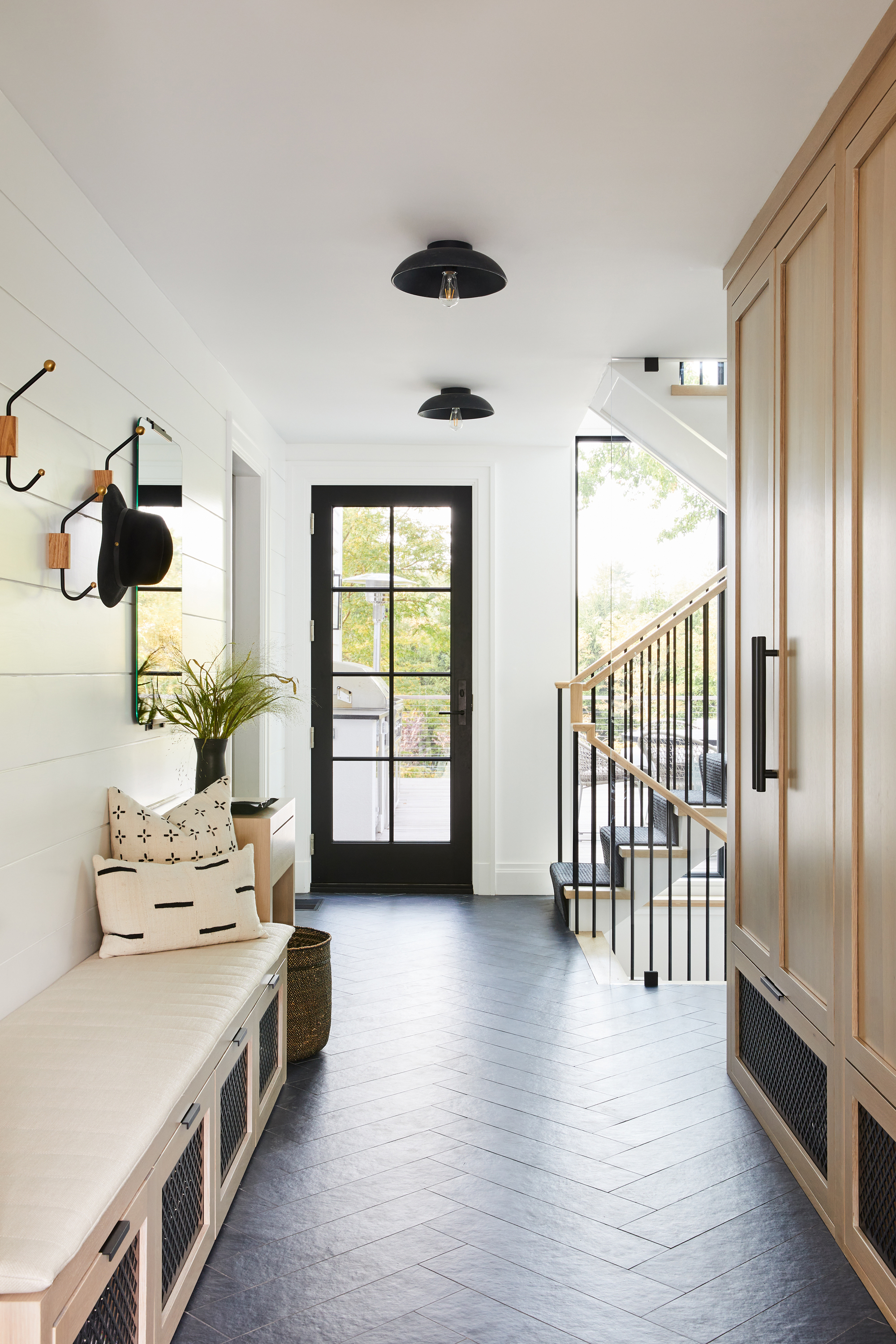
In a busy family home, the entryway will need to be able to stand up to some wear and tear. Incorporating entryway mudroom ideas is a clever way to have an entryway that acts as an airlock between the outside world and your home, ensuring that dirt and debris don't make it into the rest of your house.
Mudrooms don't necessarily have the same luxury appeal as a main entryway to your home, but while you may have your 'show' entrance for guests, take a leaf from these clients of designer Monica Fried, who made a side entryway the family's principle entrance and installed a mudroom set up there.
"As part of the renovation of a classic Colonial home we updated the home’s side entry with new boot room millwork and a floating staircase in front of floor-to-ceiling windows," explains Monica. "This entrance serves as the family’s day-to-day entryway."
Alongside a bench and coat hooks, the space is also packed with storage. "We designed the oak millwork with metal grills at the show drawers and plenty of closed and open storage. The space is both super functional and stylish," Monica says.
15. Transition from smaller to larger spaces
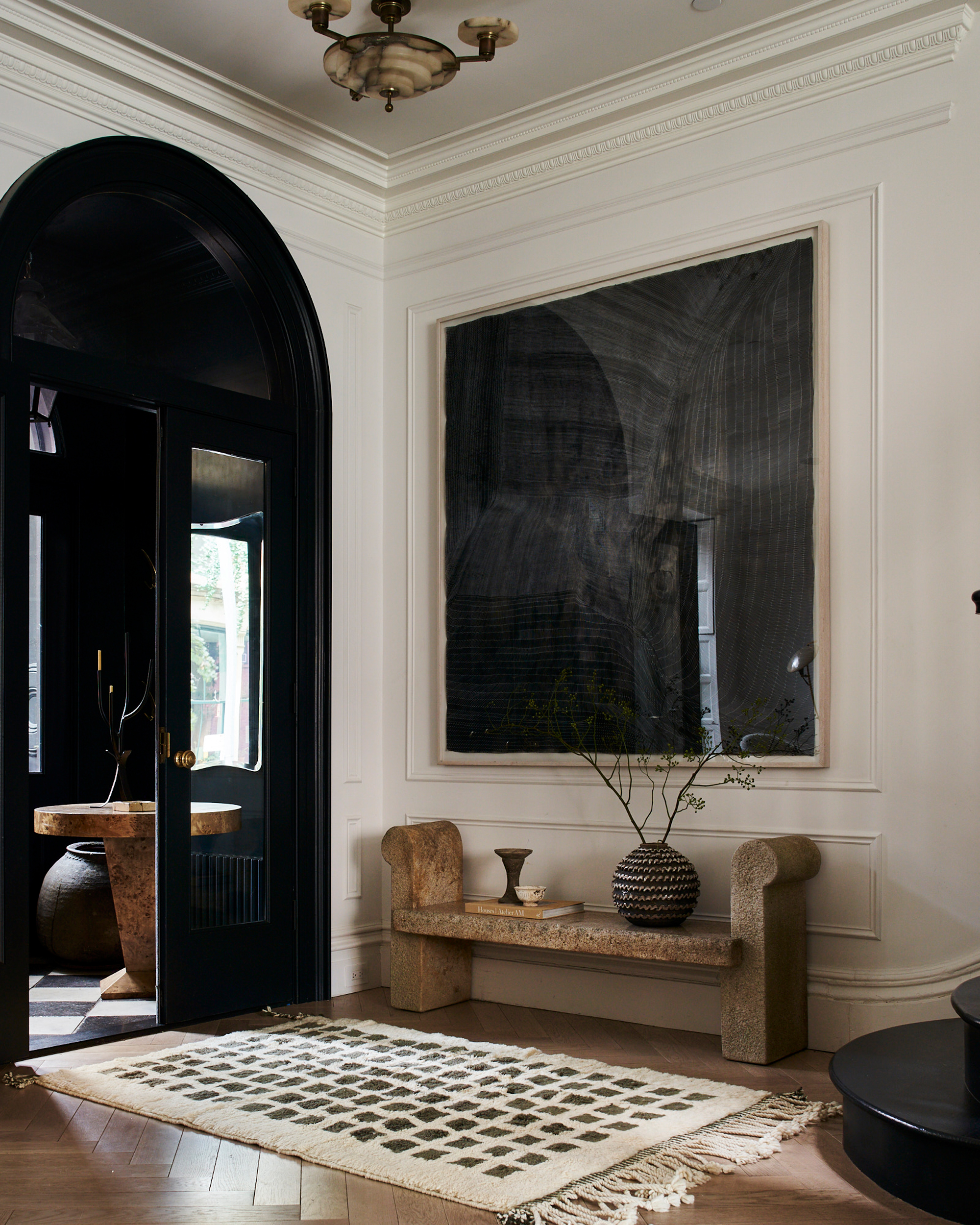
One of my favorite ever design tips was actually given to me about designing a backyard. The idea is that by creating 'pinch points' — smaller, narrower spaces — that lead into a larger space, you amplify the effect of the reveal.
Unless you're building from scratch or doing some serious reno work, you won't necessarily have the ability to create an entryway that does this architecturally speaking, but the idea translates across different design techniques and can even be achieved with paint.
Take, for example, one of my favorite entryway designs (above), in the Brooklyn Townhouse belonging to interiors superstar Athena Calderone of Eyeswoon. With a small foyer leading into the main entryway — the architecture does have this 'small to big' transition that makes this entrance particularly spectacular, but the effect is only amplified by Athena's paint choices. The dark antechamber of the entryway leads into a bright, open space with the home's staircase — it's all in the power of this contrast.
16. Use pocket doors to created versatile spaces
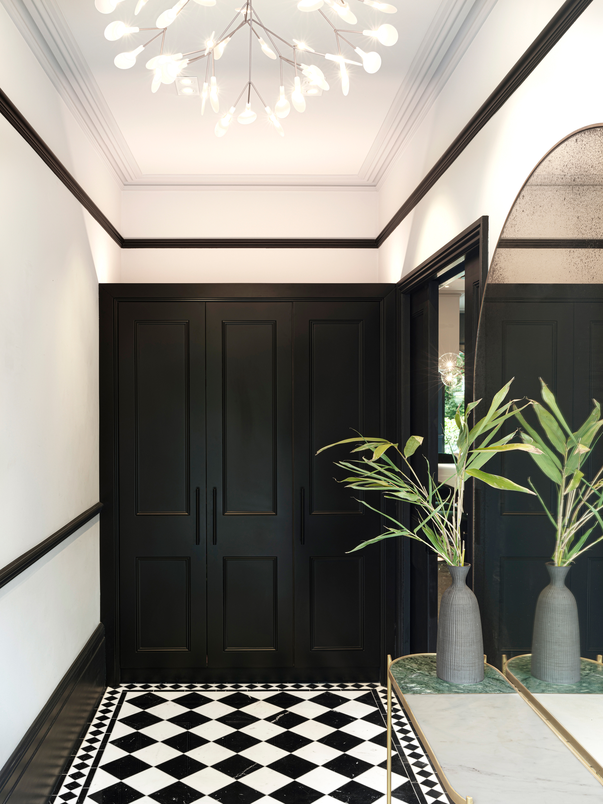
In this design of a London townhouse by LLI Design, an enclosed entryway leads through to the main living spaces. Design director Sam Lee used pocket doors to connect the two rooms, ensuring that not only do these spaces flow better into each other, but they're also versatile, too.
In the daytime, the doors can be recessed into the walls, allowing the living room to benefit from the natural light and space from the entryway, while at night, the entryway can be closed off, creating a cozier evening atmosphere.
FAQs
How do you make an entryway where there is none?
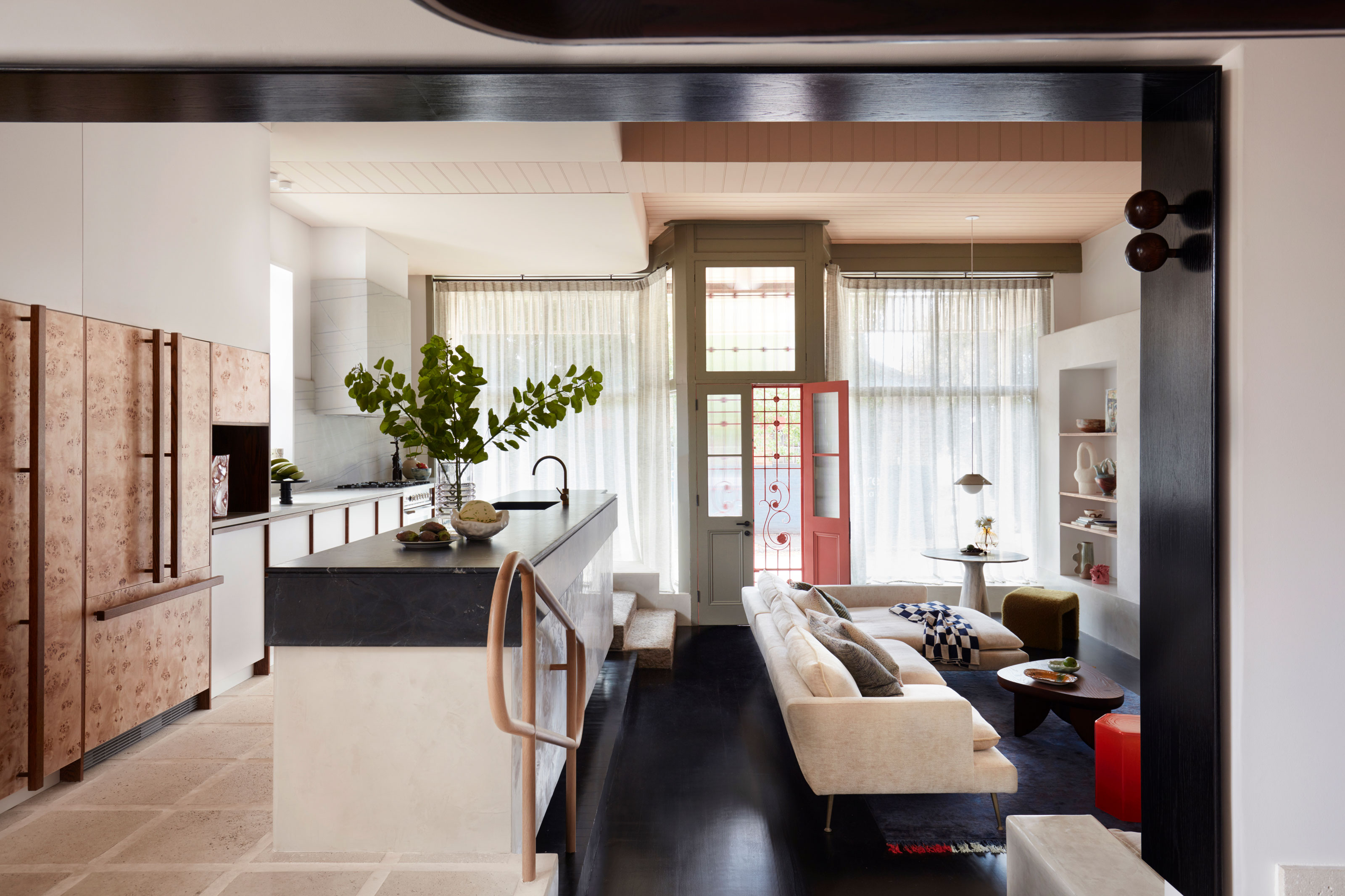
In some homes, front doors open up straight into a living space with no entryway. but it's still possible to create the feel of an entryway, even if you don't strictly have one. The trick comes down to how you work to zone an entrance area.
Looking to the ceiling or floors is a quick way to indicate this space has its own function. An area rug will neatly outline where exactly you're considering your entryway to be while centering a ceiling light just as you walk in the door will also create a visual point of reference that centers this space.
It's possible to create an entryway with room dividers, too. Screens, built-in furniture, and partitions are more solid examples of how you can do this, but other simple devices such as interior curtains or freestanding pieces that divide up your space can also work.
If you haven't got room in front of the door to make an entryway, consider creating space for it to the side. In this open-plan kitchen living room, YSG Studio set a small table to the side of the door, adjacent to the seating area. This gives a natural space to be drawn towards when you enter — a place to throw down keys and perch to take off shoes.


.jpg?w=600)


