
Emma Roberts is adored worldwide for her acting, spanning multiple genres, including rom-coms and horror. But who knew she could also achieve such success in merging "genres" within her home?
The actress's living room is a perfect example of this. Designed by LA-based design duo Pierce & Ward, it features warm woods, soft creams, and, most notably, two pink armchairs that interrupt the otherwise neutral palette. However, despite their varying tones, they work seamlessly in the overall space. It's a reminder that you can experiment with pink living room ideas while keeping things sophisticated.
While some homeowners may prefer to color drench their room and stick to a theme, adding in tasteful accent pieces can be a great way to embrace color without detracting from a more "clean" or "mature" aesthetic. Here's how Emma's living room strikes the dream balance.
Investing in chic pieces of furniture in muted shades is an inspiring way to maintain a living space with a simple palette that's timeless while finding ways to sprinkle in essences of your favorite colors – including pink, a color often associated with childhood, Barbie, and more "cutesy" decor.
Think about it – imagine those two pink armchairs in a dusty blue or perhaps a muted green. Those would likely look great, too, as they're colorful without being too "stand out" and becoming an eyesore. But try to envision a neon orange chair in their place, and the harmony of the entire room will fall off balance.
This is what many may refer to as the "blank canvas effect": because Emma's living room is completely composed of neutral tones and unobtrusive features, it's a fantastic place to insert color as an accent. But because the room's palette strays outside of true neutrals – gray, white, and black – warmth is introduced, meaning bright colors like neons, bold reds, and vibrant shades will feel somewhat jarring.
Elana Mendelson, a luxury interior designer and the owner of Elana Designs describes exactly why these two pink chairs add the perfect amount of charm to Roberts' home. 'The pink armchairs in this living room serve as a perfect example of using color intentionally within a neutral space,' says Mendelson.
'The refined and sophisticated undertones of the pink chairs lean warm rather than overly bright or pastel, allowing them to blend with the other pieces of furniture, the overall color palette, and bring a visual break from the browns without overpowering the space.'
Shop The Look

This chair shares the rounded features and dusty pink shade of Emma Roberts' living room duo. Since the pink isn't incredibly bright it's able to better blend in among an otherwise neutral palette.

The round cushions on the back of Emma's pink seats stand out, but if your chair doesn't come with some these affordable options from Target are perfect to help recreate the look.
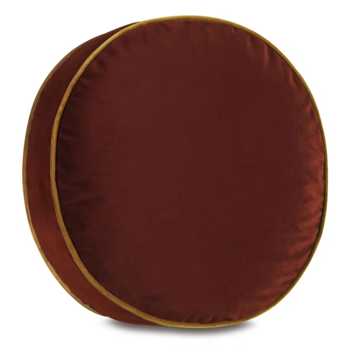
This brown-hued cushion from Wayfair is an almost perfect match for the one seen on Emma Roberts' lefthand couch. It's listed as the color 'orange' as orange hues are mixed into the brown, creating a copperness in the shade.
So say goodbye to homogeneity and no longer live in fear of embellishing your home with sunny yellows, beautiful blues and beyond, for these colors can more than likely meld together with your pre-existing decor if you take time to consider the correct shade.