Unless you've spent the past week in isolation at a mountain retreat, you've probably heard something about the Jaguar rebrand. A colourful ad that resembled a spot for fashion brand and a new logotype with no big cat in sight prompted people to sound the death knell for the iconic British car maker.
Even Elon Musk, not exactly a man known for great rebranding (X, anyone?, was quick to mock. Where are the cars? he wanted to know. Well, last night Jaguar revealed some – or design concepts at least. And they look like something Musk would love.
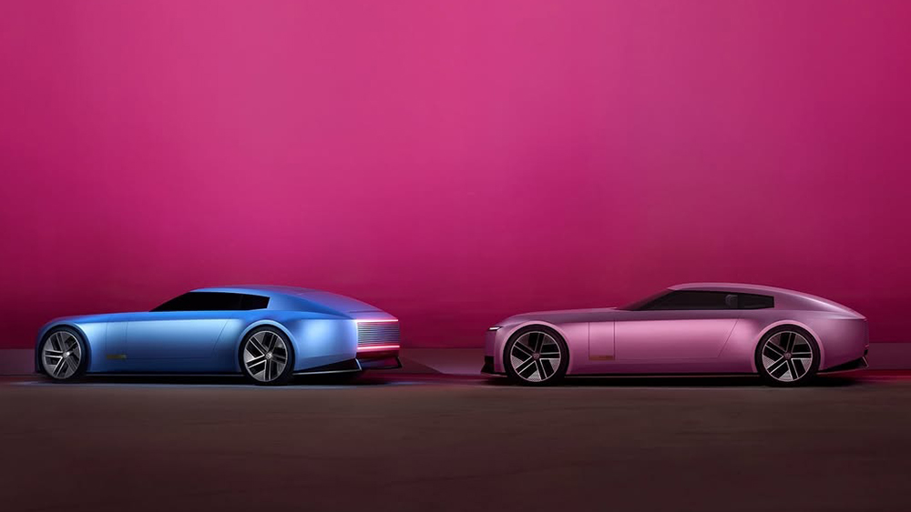
At Miami Art Week 2024 at 1am UK time, Jaguar Chief Creative Officer Gerry McGovern unveiled the Jaguar Type 00 concept in two colours: London Blue and Miami Pink. The two-door vehicles won't go into production, but we're told the styling and detailing will influence a road-going Jaguar slated for 2026.
McGovern began his presentation by clarifying that the controversy created over the past week was entirely intentional, drumming up more publicity than a concept car reveal would normally achieve. "Getting attention in today's world is not easy," he pointed out. "...we're delighted to have your attention."
But the rebrand wasn't just controversy for the sake of it. McGovern seems to have seen it almost as Jaguar's duty. "Controversy has always surrounded British creativity when it's been its best," he said, highlighting people like David Bowie and Vivienne Westwood as his own creative heroes. He also mentioned Jaguar as breaking the rules with its classic E Type back in the day.
"Create new objects of desire," were the words he gave in his brief to his team, he says. And that's what they did, recapturing the essence of Jaguar's innovation in colossal proportions fit for the social media age.
While, the new tagline is 'copy nothing', anyone involved in design know that such an ambition is pretty much impossible. Plenty of influences can be seen in Type 00 design (yes, including Lady Penelope's Rolls). We thought the leaked Jaguar images looked like a Barbie x Action Man collab, but it's hard not to also see the influence of the Tesla Cybertruck in the Type 00's colossal proportions and chunky low poly-looking lines.
It seems Jaguar adopted Musk's obsession with trying to make a car that looks 'futuristic'. But Jaguar's vision is a vehicle that more people will find desirable. The gaudy look could have big appeal among many people who can actually afford the things, while the Cybertruck looks like a tin shed on wheels.
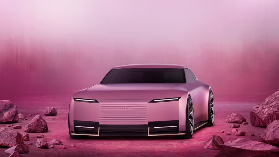
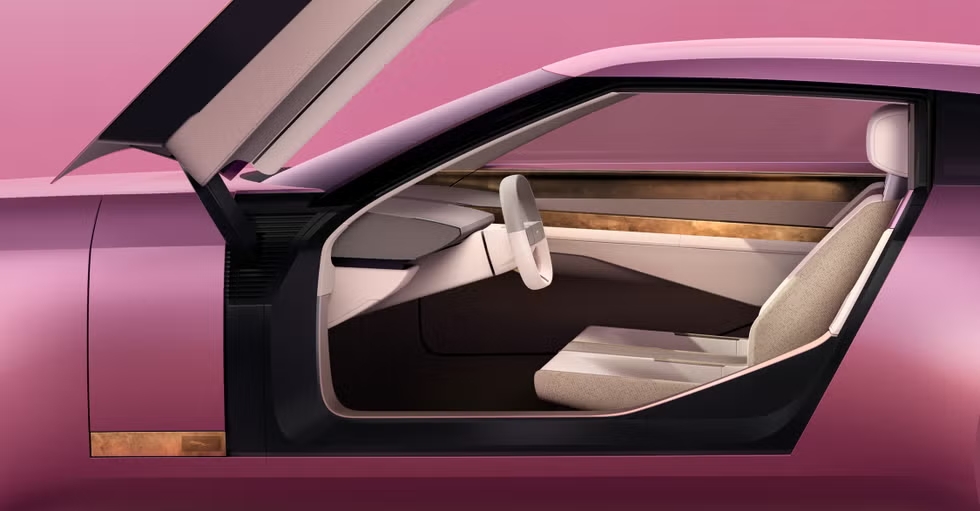
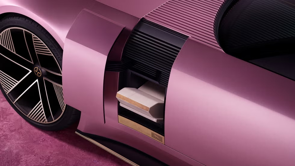
Much has been made of the new sans-serif Jaguar logotype, which mixes caps and lowercase letters, but there's a plethora of symbolism in the vehicles, not just a single logo. This includes a 'strikethough', which must be the single most pretentious symbol in car branding, but nothing is accidental, and the identity is starting to make sense. It could even sway new converts to electric vehicles.
Can you cope with more car brand controversy? Check out the new Audi branding and our pick of the best car logo rebrands.


