When The Walrus was founded, in 2003, it was modelled after established magazines like Harper’s, The New Yorker, and The Atlantic, and it took their approach to visual presentation, featuring high-quality photography and original illustrations. It was a time when budgets were enormous—at least by today’s standards. In 2005, The Walrus’s art department had a staff of six people, including a photo editor. Today, we divide our resources over different channels and have added digital staff, producing as many stories exclusively for web as are destined for print.
But, in an era when many publications have walked away from high-quality visuals, our commitment to original art has remained steadfast regardless of whether we’re publishing the print edition, posting on our website, or sharing work on an ever-increasing number of social media platforms, including Facebook, Twitter, LinkedIn, and Instagram.
It may seem anachronistic to invest in art when it’s assumed that speed and news value are more relevant to page views. But our years of publishing have shown that audiences continue to love illustrations. Indeed, The Walrus’s striking images have become a point of differentiation when online articles are often accompanied by stock photos or bland, templated visuals. Perhaps the rapid growth of social media over the past decade has underscored that, as with any kind of content, quality and originality stand out.
It takes time and skill to commission illustrations that are as thoughtful as the articles they reflect, and The Walrus’s art department is very good at it. Since our annual Summer Reading issue is a particular showcase of illustrations, I asked our team to talk about their process.
“To me, illustration is a way of thinking,” says design director Paul Kim, who studied graphic design and illustration at the University of Manitoba before joining The Walrus as an intern more than fifteen years ago, when he started out producing spot illustrations. “It [uses] half drawing skills, half thinking skills. You’re trying to tell a story.”
The Walrus currently commissions over 100 illustrations a year from a network of contributors across Canada and around the world. Kim (who creates many of The Walrus’s distinctive covers himself) says he is drawn to artists whose work shows a strong sense of concept. The cover of this issue, by Melanie Lambrick, depicts two lamp-lit readers tucked inside a tent, silhouetted against the backdrop of the night sky—the latest twist on our traditional Summer Reading theme.
Most of the time, says senior designer Meredith Holigroski, commissioning is a two-way process. “If we have a specific idea in mind, we’ll mention it when briefing the artist. Our idea might even influence the choice of artist.” Illustrators can be tapped for their facility with representing architecture, people, or—as in one memorable case a few years ago—mountains.
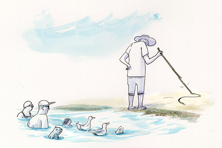
The Summer Reading package, which features a range of literary styles and voices, is usually assigned to an illustrator known for their artistic versatility. We asked this year’s featured artist, Halifax-based Alex MacAskill, to incorporate a wide range of subject matter, from seascapes to concert halls. This issue also contains a stand-alone graphic story, “Garbage Hill” by Winnipeg artist Jonathan Dyck. Kim and Holigroski, both from Winnipeg, were at first unsure whether the subject matter—a local landmark created from a repository of refuse—would resonate with audiences outside their home province, but they were won over by the enthusiasm of the rest of the editorial staff. “Garbage hills are more common across the country than we think,” says Holigroski, “and it’s an interesting concept to people who haven’t heard of them.”
I don’t think anyone expects or wants every article to be illustrated, nor is that a particular goal here at The Walrus. But, just as a picture is supposed to be worth 1,000 words, illustrations show us something narratives can’t. One of the rewards of working on each issue’s editor’s letter with award-winning illustrator Graham Roumieu (creator of the Bigfoot books and animated series) is seeing his witty, incisive interpretations. Often, the preliminary sketches, which are based on my rough drafts, seem to have the final word. I hope the illustrations in this Summer Reading issue of The Walrus spark their own kind of conversation.


