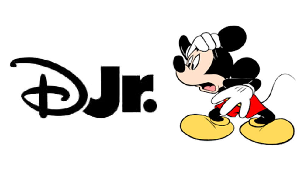
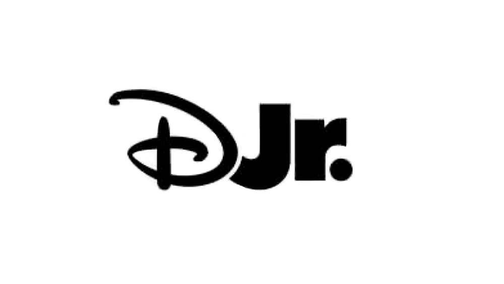
Disney has submitted an application to trademark a new Disney Junior logo, and fans have concerns. Where are Mickey's ears? Where's the colour? In fact, where is 75% of the television network's name?
In a much simplified design, the logo abbreviates the network to Djr, while a simple full stop is all that remains of the characterful Mickey-eared dot over the 'i' in the current logotype. And while the Disney ‘D’ remains instantly recognisable, fans aren't feeling the stripped down styling. It won't go down as one of the best Disney logos of all time.
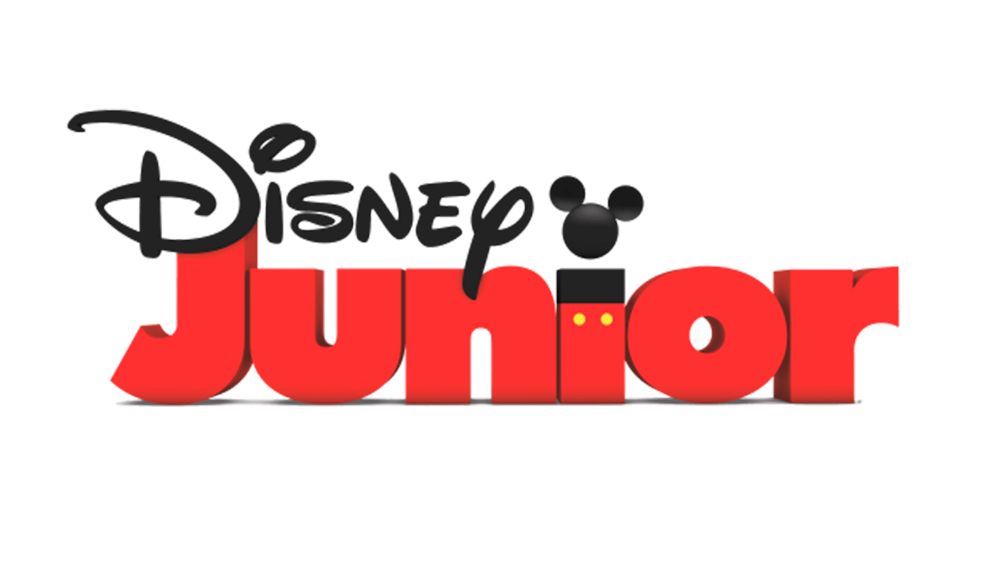
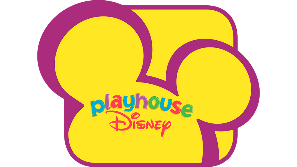
The Disney Junior logo has already been simplified (remember the rainbow lettering and yellow and purple ears of the Playhouse Disney logo?) and is often used without the Mickey colours, following a trend we've seen in branding in general. But some fans think the new design, which was submitted to the United States Patent and Trademark Office on 24 January, is taking things too far.
Some welcomed the design when it was shared by the fan account, DTVA News, on X.com, saying it was about time the network had a rebrand. But others were less sympathetic. "Yet another example of oversimplified logos," one person wrote. "Having the Disney D without the Mickey Mouse ear looks weird to me. Its omission is especially odd here because it could've worked as the dot on the J in junior," someone else wrote." Others still miss the Playhouse Disney logo.
It it provides some reassurance, I think fans don't need to worry yet. There's been no official launch for the logo, and if Disney Junior does use it, I suspect that it might be as a complementary abbreviated design rather than the main identity. It would make sense for use in small applications, such as social media avatars, where the existing full logo currently looks rather squished. Still, they could have tried to get the ears in.
Meanwhile, people are still debating the legibility of the D in the Disney logo. Also see our pick of the best entertainment logos and our YouTube logo history.