It's hard to say whether blue and red really go together well. It’s a divisive question in the world of color theory. While these two hues aren’t traditional complements (in strict color-wheel terms, blue pairs with orange, and red finds its match in green), their contrast is undeniably powerful.
If you're wondering what color goes with blue, it seems that red may be its lucky companion. "Their relationship is more connected to psychophysiological reactions and cultural associations rather than strict chromatic complementarity," explains color expert Massimo Caiazzo. Red revs up the nervous system, while blue dials it down, creating a dynamic that designers and artists have used to dramatic effect for centuries.
Of course, the success of a red-and-blue pairing depends on the precise shades in play. Leatrice Eiseman, executive director of the Pantone Color Institute, swears by a timeless favorite: "Deep navy blues will always work with any shade of red as navy is a classic, basic, perfectly balanced hue."
So, with a few designers agreeing that these colors make the perfect pairing, what about the rest? Do red and blue really go together?
Do Blue and Red Go Together?
Decorating with primary colors will always have its peculiarities, in terms of sophistication, but if you take things in a brighter direction — say cobalt and cherry — and the energy shifts. "The high saturation of both colors makes them highly visible and suitable for contexts where attention needs to be drawn," notes Massimo Caiazzo. Meanwhile, Sheri Peterson, past president of The International Association of Color Consultants/Designers, takes a more scientific approach: "Red and blue must share the same saturation and value (lightness and darkness) to be compatible." In other words, a bold red might demand an equally intense blue to hold its own.
If the idea of red and blue still feels risky, consider the role of undertones and supporting hues. "Cool blues with cool reds create an electric and modern contrast, while warm blues with warm reds offer a more harmonious and enveloping combination," says Massimo. And to help the duo play nicely together? "Neutral tones work well with blue and red — shades of gray, for example, as they are unobtrusive and don’t interfere with the compatibility and mood that blue and red produce," advises Leatrice Eiseman.
Even yellow, Sheri points out, can complete the trio as part of a primary color scheme. The bottom line: Blue and red might not be natural partners, but with the right choices, they can make for a striking, high-impact pair.
Without further ado, here are a few ways you can bring blue and red together in your home. Here’s how eight designers have made it work.
1. Try Color Blocking
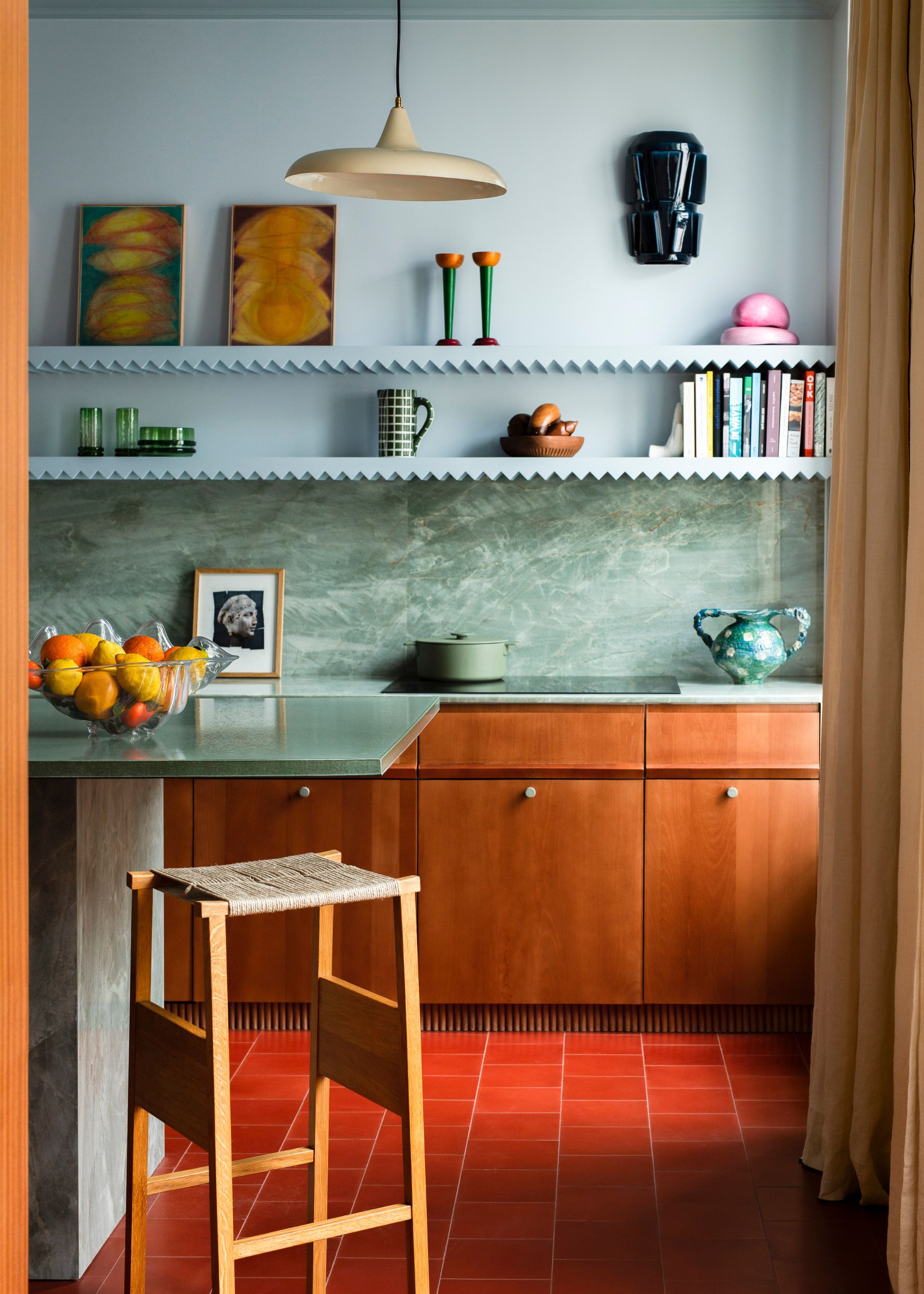
In this Parisian kitchen, blue and red aren’t just coexisting — they’re color-blocked with intention, creating a bold yet balanced interplay of warm and cool. "The kitchen stands out with a palette of blues contrasting against a brick-red floor, creating a vibrant horizon," says Rebecca Benichou, founder of Batik Studio.
The terracotta-hued tiles form a strong, grounding base, while powdery blue scalloped shelves draw the eye upward, defining the space with crisp, geometric contrast. The warm wooden cabinetry and green marble counters and backsplash act as a bridge between the two, ensuring the color-blocking feels cohesive rather than stark.
2. Use Wallpaper as a Bridge
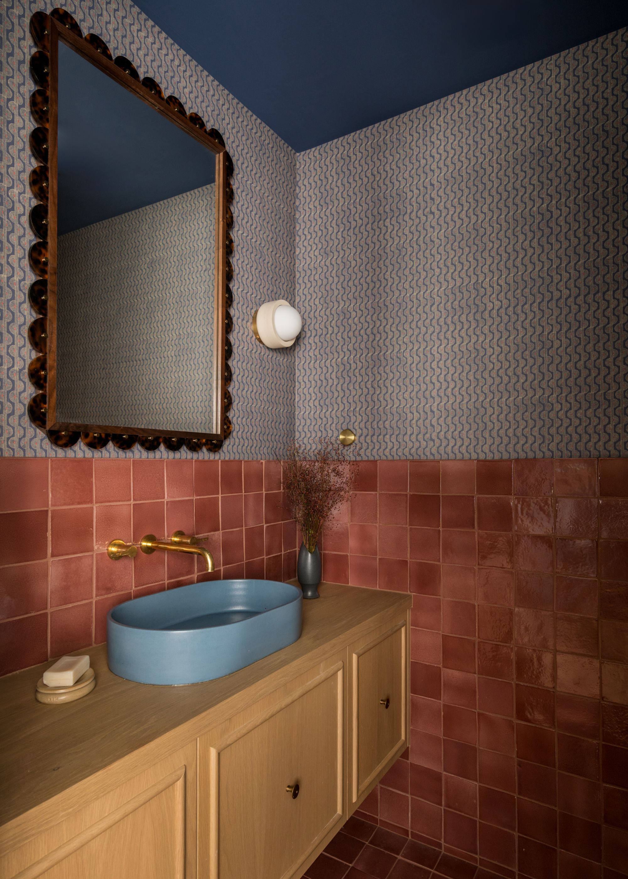
In this moody, jewel-box space, the bathroom wallpaper seamlessly connects the bold red tiles and the saturated blue ceiling, weaving the two hues together with its wavy pattern.
"Since the room has no natural light, we steered in the opposite direction by hugging the room and covering every inch with color," says Abbie Naber, principal designer of a. Naber Design. The terracotta Zia Tile cotto tiles wrap the walls. The powdery blue sink introduces a sculptural contrast, while brass fixtures warm up the palette.
3. Embrace the Power of Paint
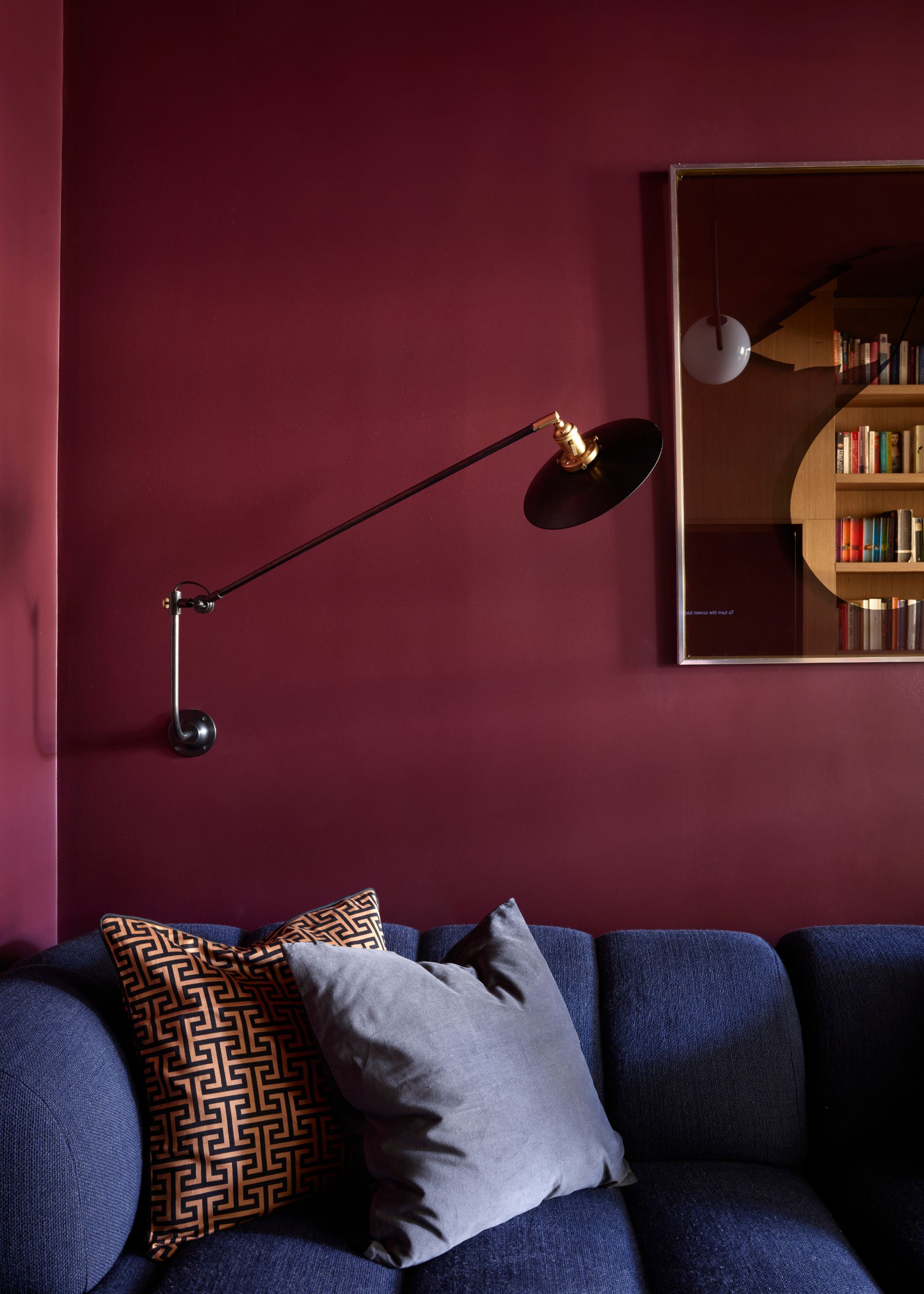
By swapping out predictable grays for a moody 1970s-inspired palette, Cat Dal, principal of Cat Dal Interiors, created a snug that’s a masterclass in bold color pairing. The trick? Floor-to-ceiling paint — which certainly makes for a cozy paint color.
"We applied a rich Burgundy red (Farrow & Ball’s Brinjal) to the walls and ceiling and paired it with a decadently curved sofa in a complementary deep dark blue," she says. The result is a cocooning space where deep, velvety hues create a sense of warmth and sophistication—perfect for retreating to at the end of the day.
4. Dial Up the Texture
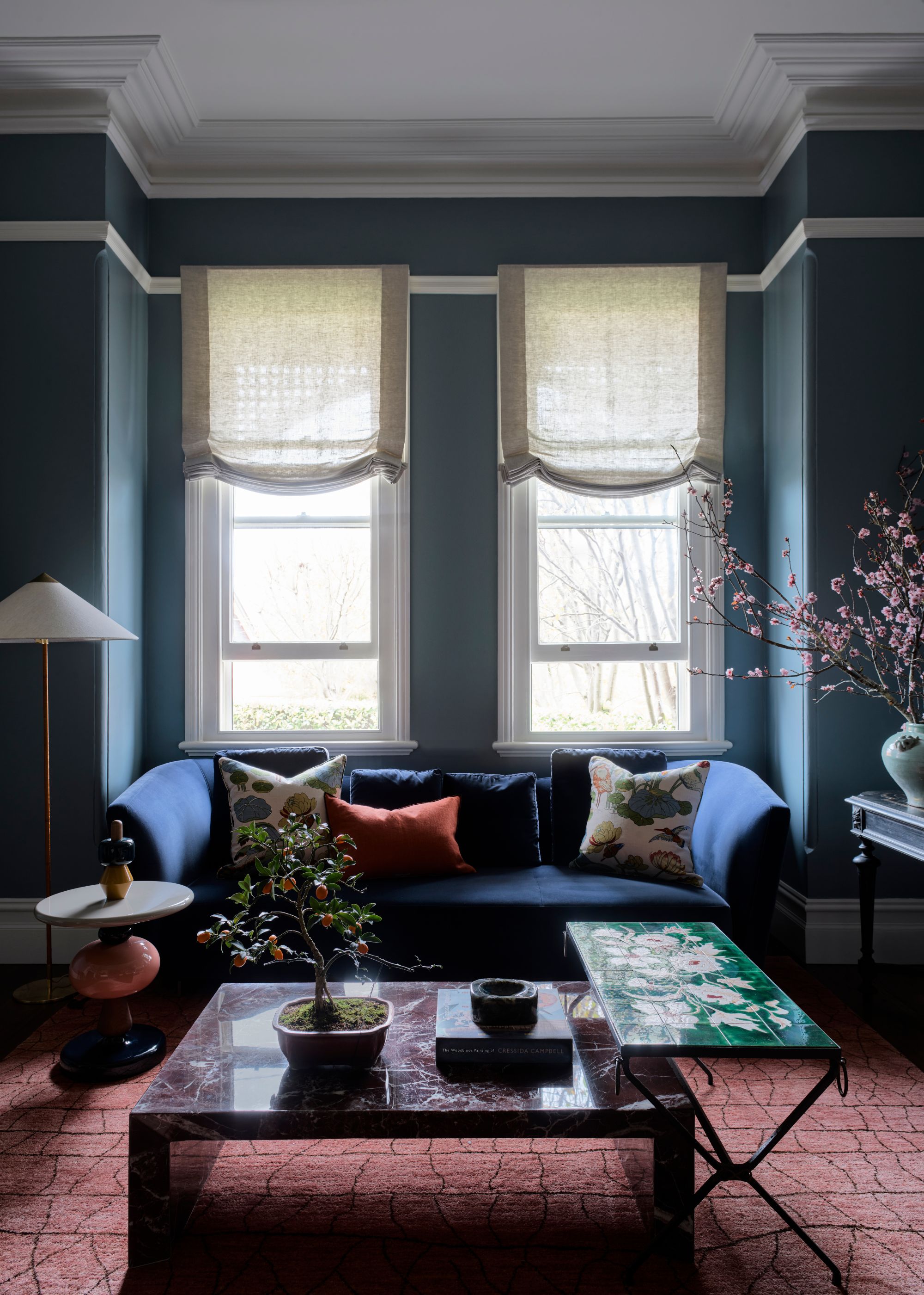
In this refined yet inviting living room, blue and red are layered with intention. "Blending blue and red hues in a living space is a bold yet sophisticated design choice that creates a dynamic and visually engaging atmosphere," says Shannon Shlom, founder and principal of Duet.
Here, the design studio decorated around a navy blue sofa that acts as the calming foundation, while a muted terracotta rug and rust-hued pillows inject vibrancy without overpowering the space. The texture is key to ensuring the palette feels rich rather than stark. "Layering textures, such as velvet cushions, woven throws, or patterned rugs, enhances the depth of the palette," notes co-principal Dominique Brammah.
5. For Impact, Try a Stark Transition
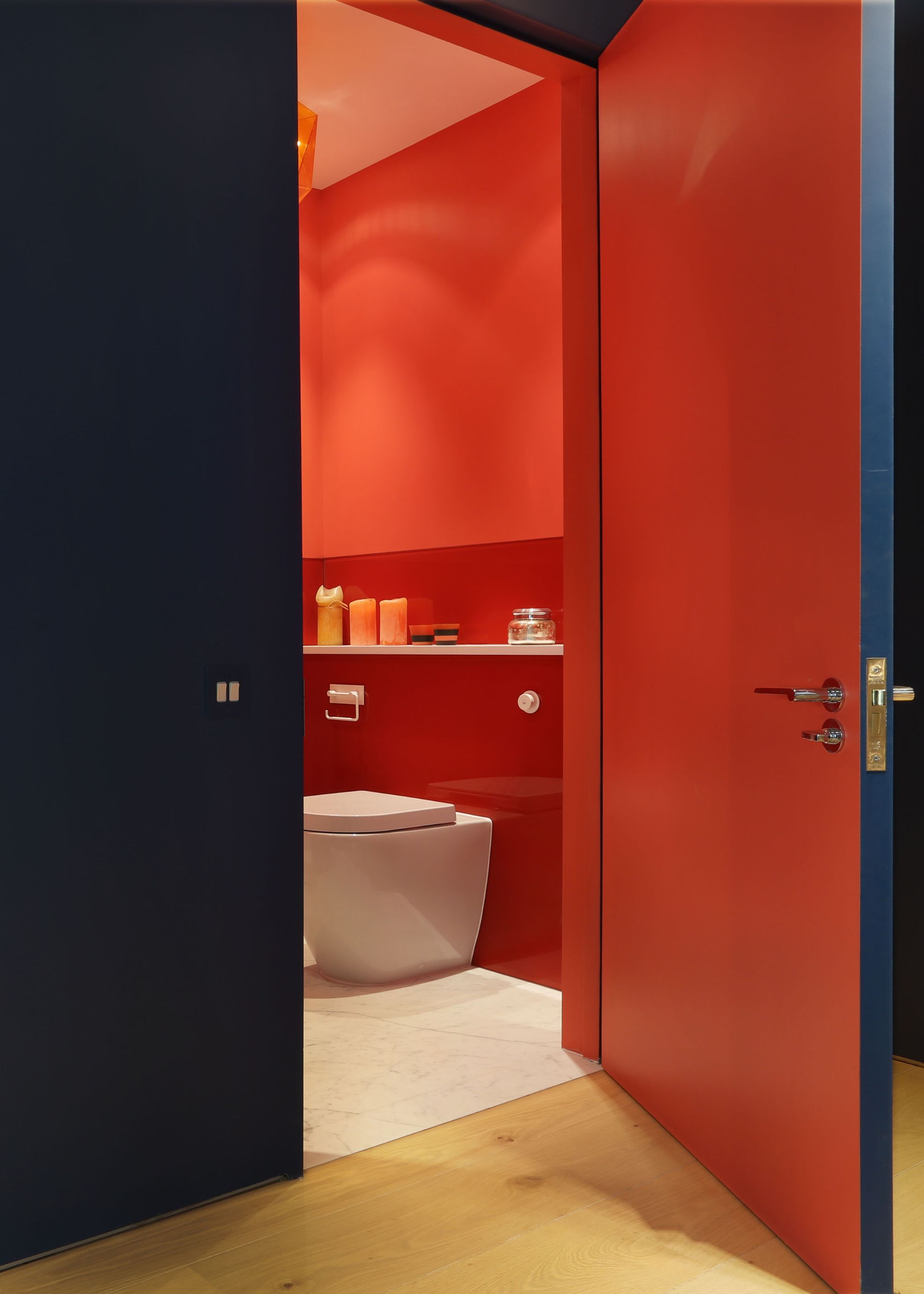
In this dramatic yet deliberate pairing of color, deep navy and bold red work in tandem to shape the mood of the space and make for the perfect dark color scheme.
"We kept the staircase a navy blue as we had no natural light and wanted it to feel quite moody and mysterious, and chose the pinkish red of the bathroom to contrast with that and feel warm and inviting," says Tom Bartlett of Waldo Works.
The result is a striking transition — one that shifts from shadowy and immersive to vibrant and enveloping in an instant.
6. Keep the Backdrop Neutral
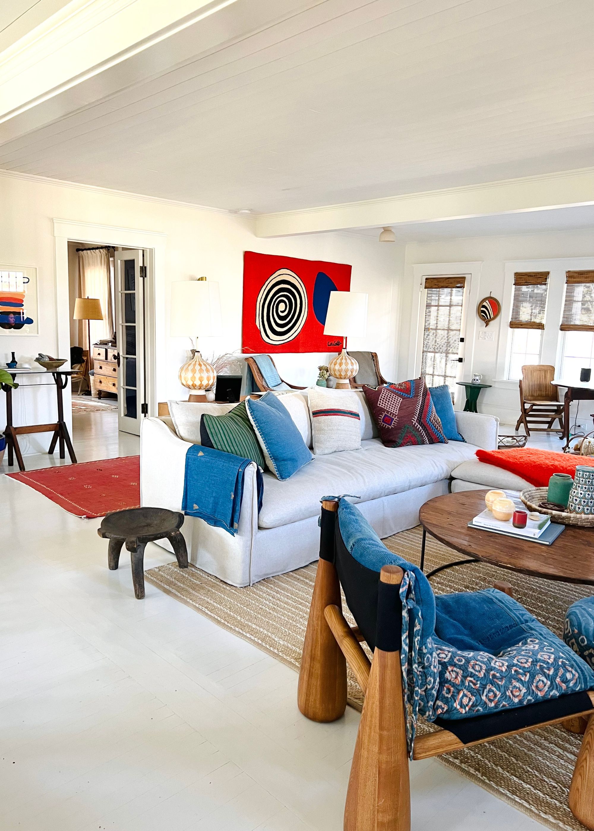
In this layered living space, red and blue weave through the design in a way that feels both vibrant and lived-in.
"We intentionally kept the walls and sofa a neutral tone, like a blank canvas, so we could have a little more fun with the bright poppy art and patterns in the pillows," says Kate Towill, founding partner and creative director of Basic Projects.
The saturated hues stand out against a neutral backdrop, creating a look that is equal parts dynamic and inviting.
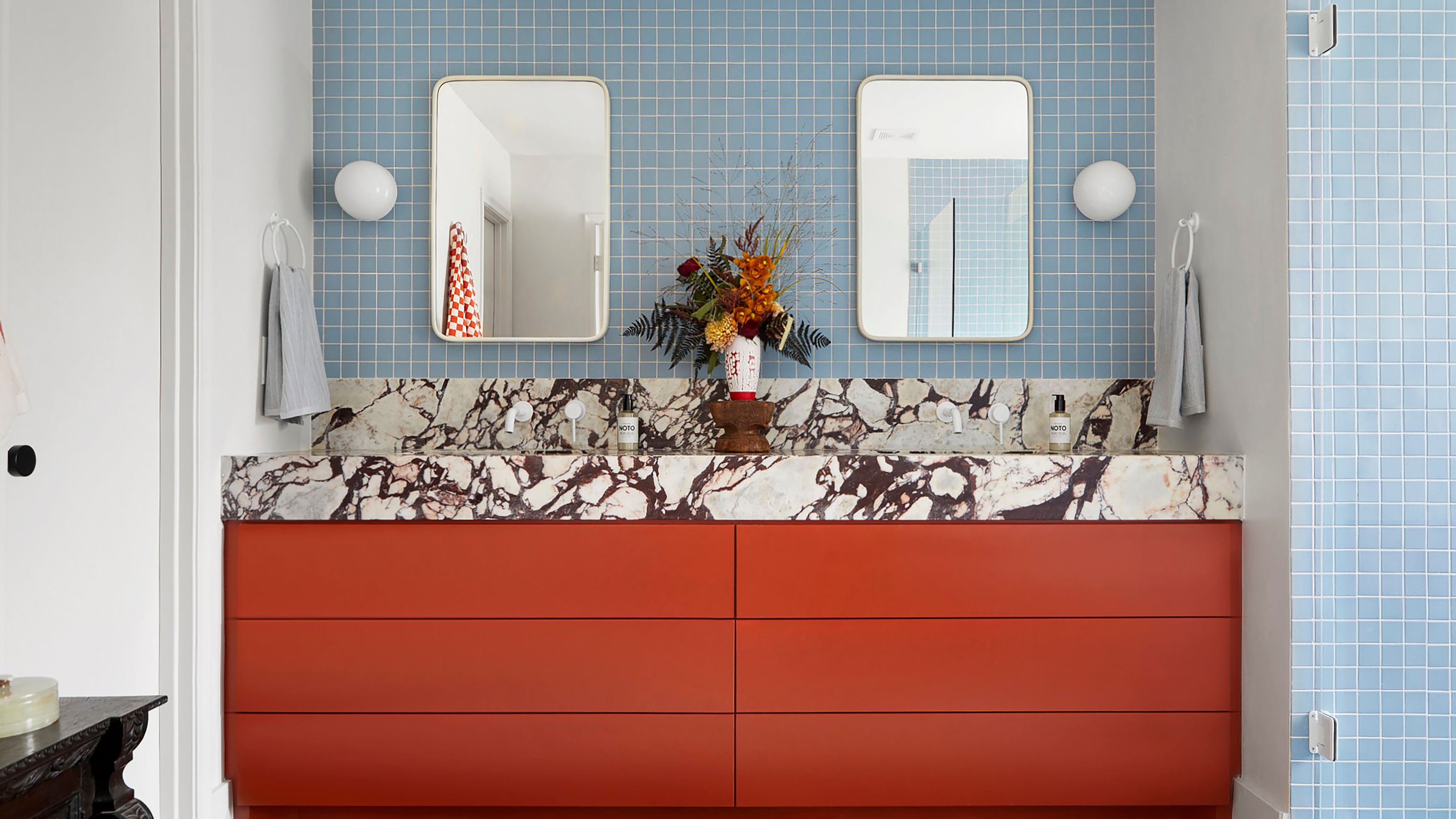
7. Adopt a Bold, Unapologetic Vision
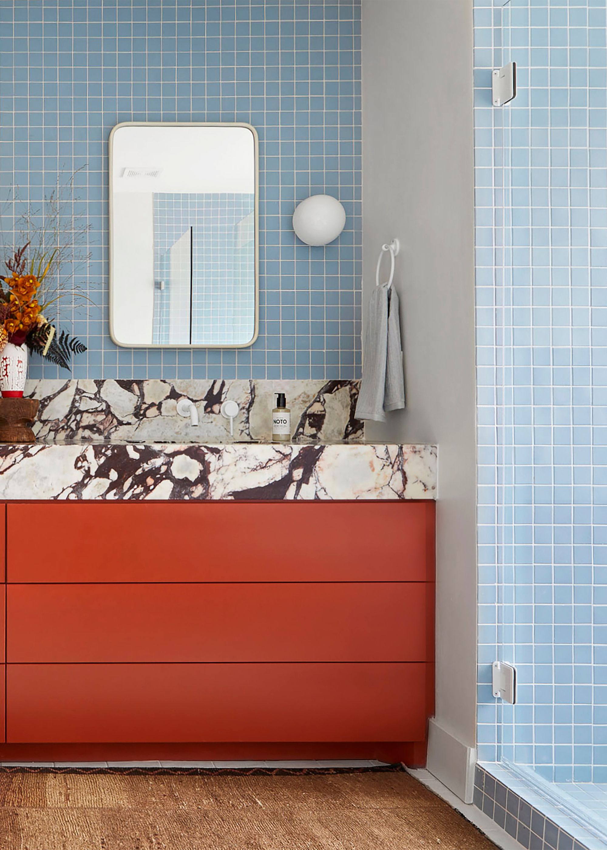
In this bathroom, deep rust-red cabinetry sits in bold contrast to a grid of powdery blue bathroom tiles — a pairing that feels both fearless and intuitive. "We don't intentionally lean into conventions or design 'rules.' We go hard on things we're excited about and let it flow," says Punch World Studio designer Sara Garza.
The striking Breccia Capraia marble countertop — veined with inky purples and oxblood reds — ties the hues together, adding a sense of organic movement to the composition. That energy pulses through every detail, from the warm earth-toned rug to the playful checkered hand towels. "What really draws people to this space is the sense of fearlessness it embodies," she adds.
8. Think Of Blue As a Neutral
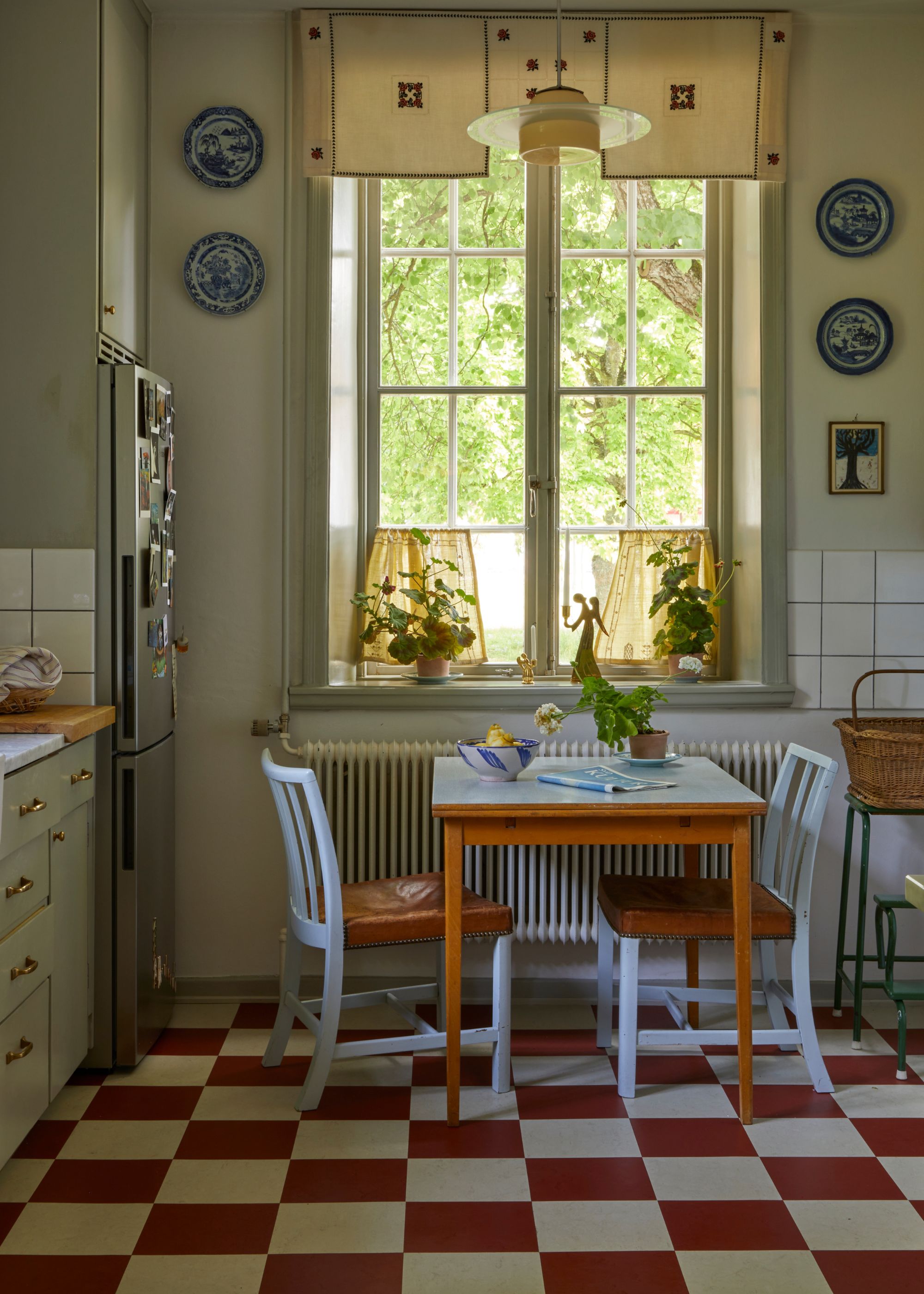
In Beata Heuman’s Swedish kitchen, light blue takes on the role of a neutral, allowing bold red accents to shine while maintaining a sense of balance.
The soft blue-painted chairs, trim, and dishware create a quiet backdrop, offsetting the warmth of the red-and-white checkerboard floor — the flooring is the ideal color to go with light blue chairs and table.
Rather than competing for attention, the blue elements anchor the space with their soft, grounding tone.
Ultimately, blue and red prove that contrast can be just as compelling as harmony. While they might not be natural complements, their push-and-pull effect creates energy, drama, and even balance when paired with intention. Whether you lean into their vibrancy or opt for deeper, moodier shades, the key is to match their intensity and undertones for a cohesive look. And if the combination still feels bold, grounding neutrals like gray, white, or beige can help tie everything together.
For those looking to push the palette further, a third hue can bridge the gap—yellow completes the primary triad, while purples and greens create unexpected depth. As with any color pairing, it’s all about experimenting until you find the right mix for your space. Now you know that blue and red go together, find out whether blue and green go together...