Determining the population of crammed megacities can be difficult, but a series of population spike maps have made the task much clearer.
These maps visualise population density as spikes, with the height of each spike representing the volume of people living in one area.
Alasdair Rae, a former professor of urban studies and planning at the University of Sheffield, used the EU’s population density data, and mapping tool Aerialod to create the 3D-rendered maps.
With no borders between nations or states on the images, they provide an insight into human migration and settlement.
Traditional population density maps are coloured but flat, making it more difficult to know how dense an area is in comparison to another. Dr Rae’s maps help break down population density, where each spike on the largest global map represents two square kilometres while on subsequent maps, each spike represents 1 square kilometre.
The placement of the largest population clusters is particularly eye-opening, with the maps showing the highest population densities along the coasts worldwide.
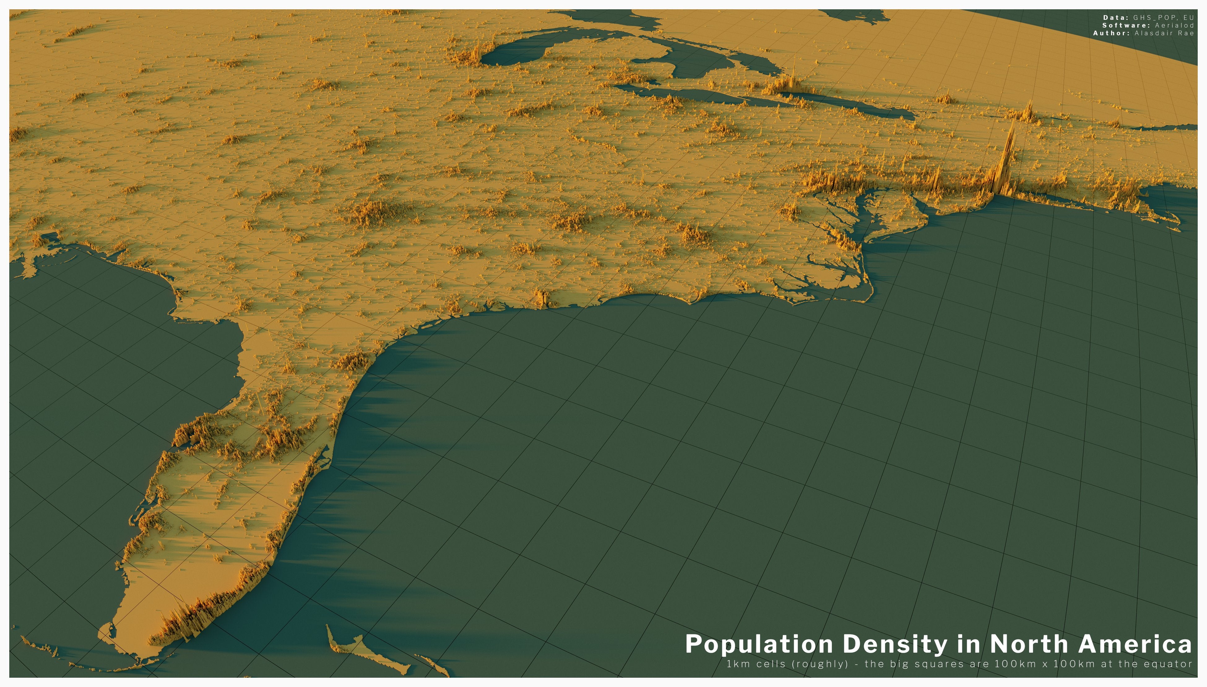
The map of the US shows that large population clusters lie along the east coast, in particular within the northeast corridor of Boston, New York City, Philadelphia and Washington DC. The cities are home to a total of 51 million people, making up 15 per cent of the US population.
Clear visible clusters also exist in Florida, Illinois, Georgia and Texas. The population towards the west of the country is sparse, but Los Angeles and the Bay Area, both in the state of California, show spikes almost as high as those in New York City.
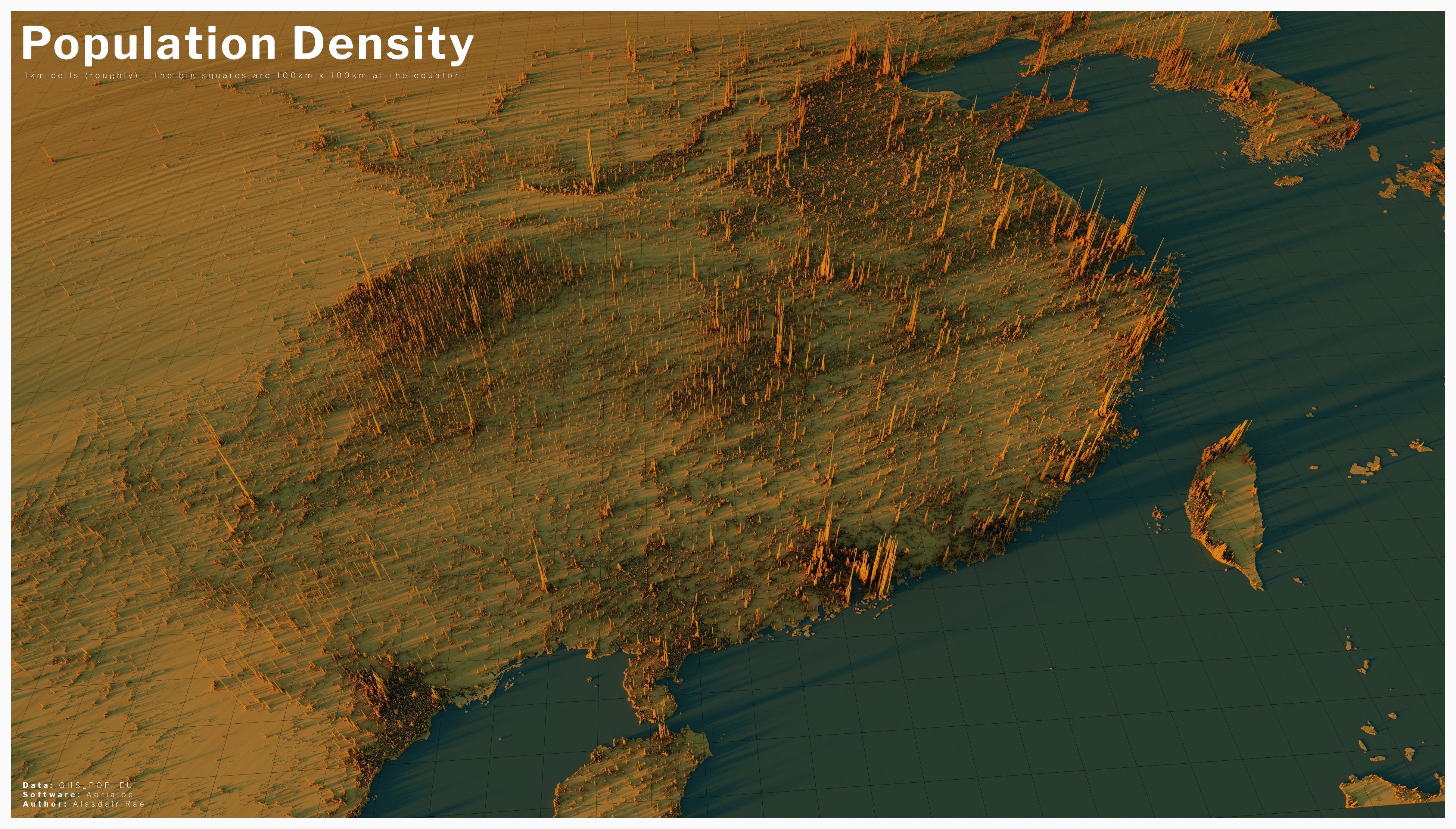
China and its surrounding neighbours demonstrate massive clusters of urbanisation. While large density centres around Hong Kong, Guangzhou, and Shanghai are well known, cities such as Chengdu and Chonqing are part of massive population centres of between 15 and 25 million people each.
The maps also show that more than 93 per cent of China’s population lives in the eastern part of the country.
The spike maps also give us a new insight into the distribution of the world’s population, they only show a part of the global picture.
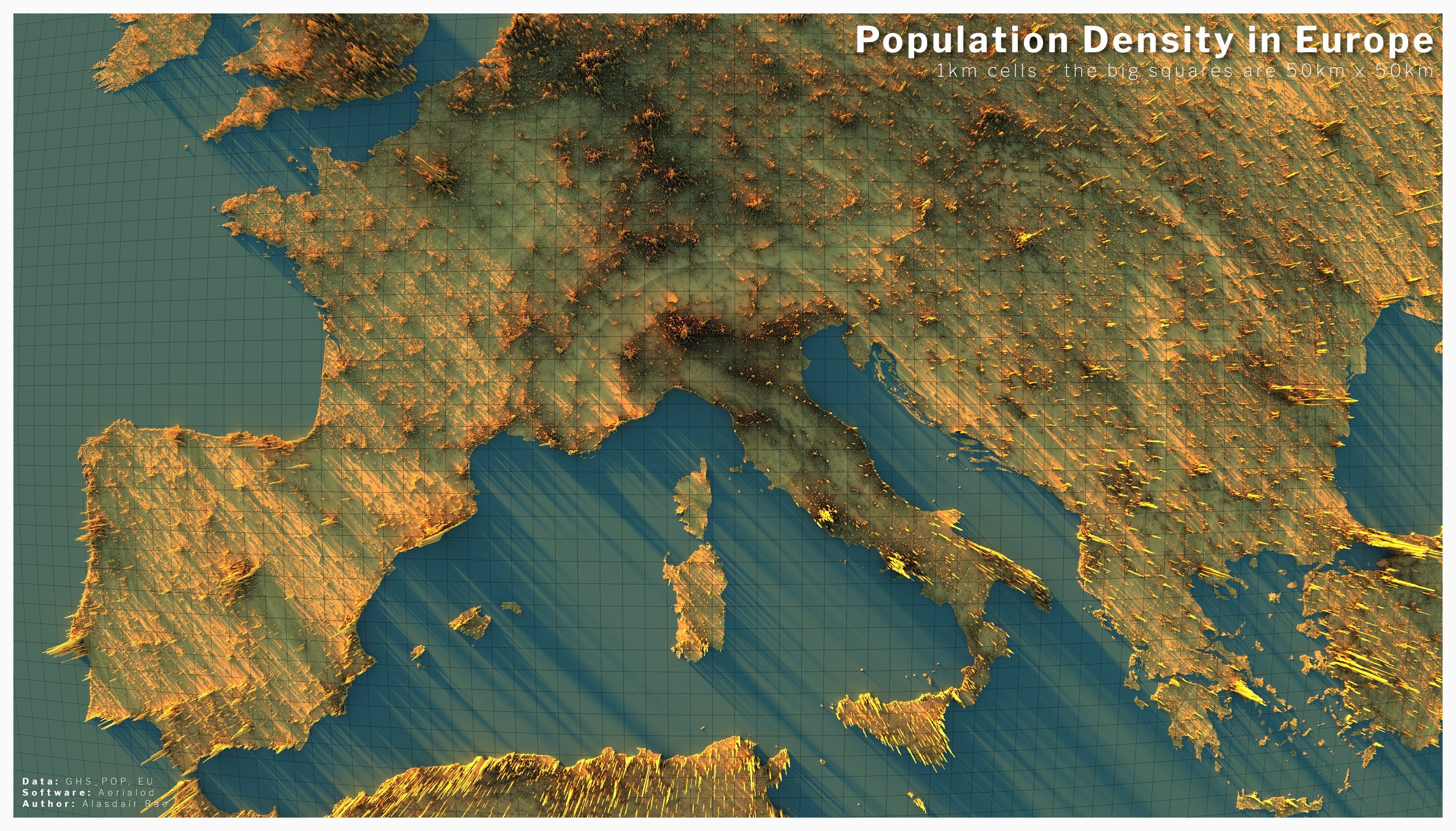
They can also tell us a little about the terrain of a region. For example, the map of Africa shows a sparse area that makes up the Sahara Desert, while a clear, curved strip in Europe shows where the Alps are situated.
While Dr Rae’s initial creation of the maps began due to spare time during Covid lockdowns, he hopes to continue creating more maps and showcasing more details of the world’s demographic trends and geographic constriants.