Music streaming platform Deezer has revealed a brand new visual identity, complete with new logo and a redesigned mobile app. The service might not be as ubiquitous as the likes of Spotify or Apple Music right now, but thanks to its new splash of paint, it's certainly one of the most striking from a visual perspective.
At the heart of the rebrand – quite literally – is a new heart-shaped logo. It's a bold departure from the previous 'equaliser' design, and along with the rest of the new look, it's delightfully colourful and energetic. (Looking for more design inspiration? Check out the best logos of all time.)
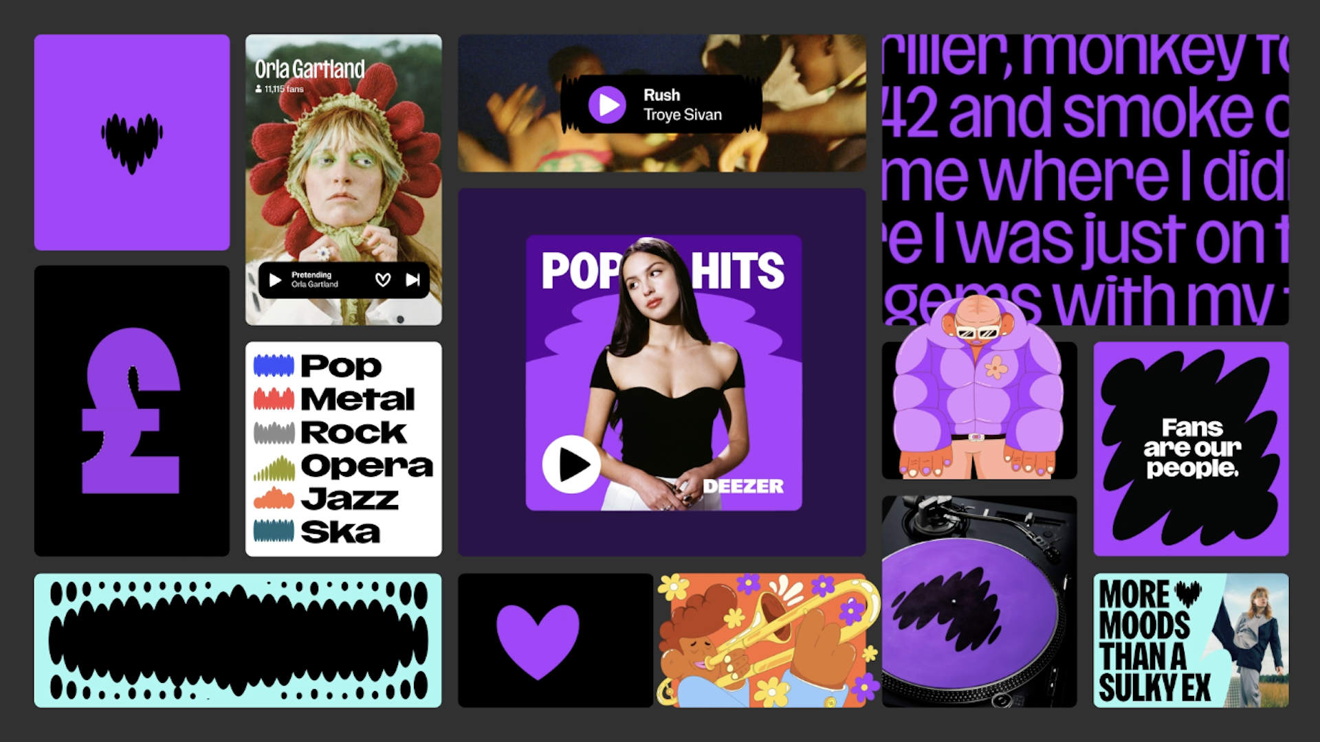
Where music comes alive.Together with @deezer, we developed a refreshed brand identity that embraces music as the beating heart of life and reflects Deezer’s bold, fresh, and quirky personality. Coinciding with the launch of an enhanced mobile app and web experience, this… pic.twitter.com/qt6nyVPC7yNovember 8, 2023
Designed by Koto, the new visual identity is designed to reflect a strategic shift towards a new brand purpose, with the brand "reinventing itself as an experience services platform, with expression and connection as guiding principles to help artists, fans and partners to be and belong through music."
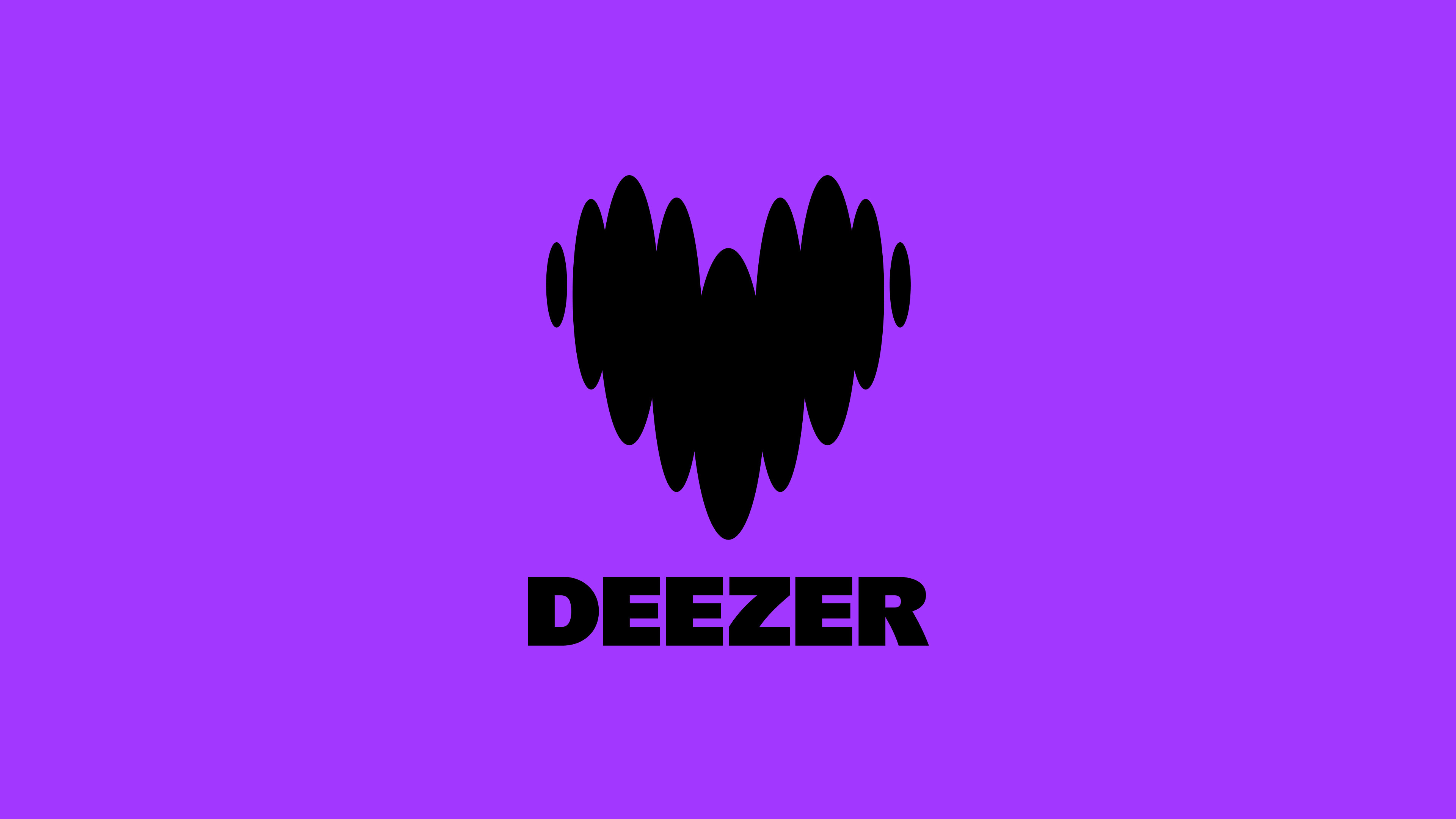
The bold, fresh and quirky new aesthetic includes the introduction of "Deezer purple", a hue that the brand says hopes to be akin to how "Netflix is associated with red and Spotify with green." The logo, meanwhile, symbolises a beating heart. "The heart represents the love of music, building a sense of belonging. Its shapes vary to represent beats and rhythms. The logo transitions between two dynamic states: one grounded in humanity, much like a heartbeat, and the other intertwined with music, mirroring music," Koto says.
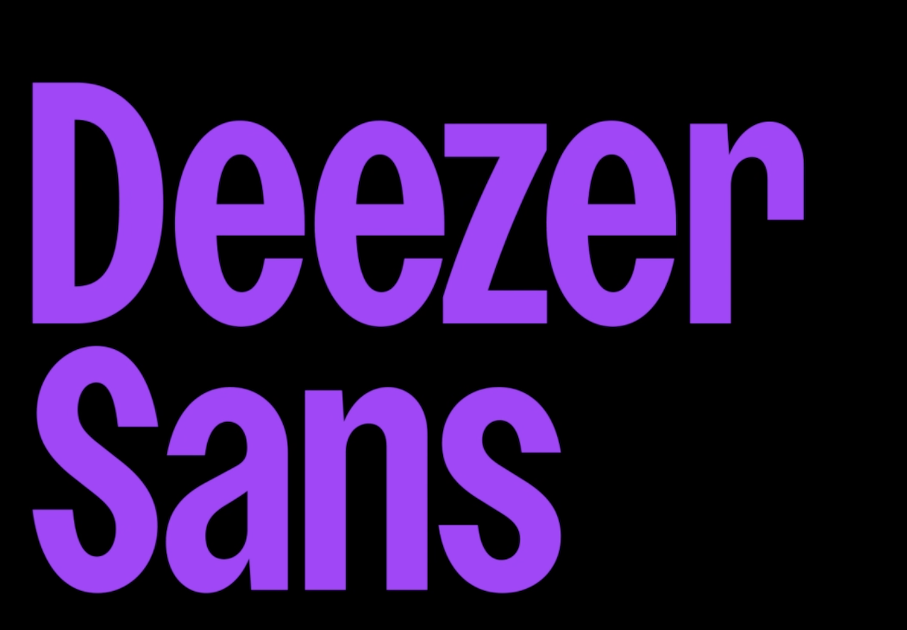
Also key to the rebrand is Deezer Sans, a new typeface created in collaboration with NaN type foundry founder Luke Prowse. In a press release, Deezer describes the typeface as embodying "versatility as a variable font, offering a range of widths to cater to diverse brand requirements, whether for marketing materials or playlist covers.
“Refreshing our visual identity gives us an opportunity to tell our story in a more emotional way, connecting with music fans, artists and strategic partners through visual cues that let people know that with Deezer, they can live the music to the fullest,” said Maria Garrido, CMO, Deezer. “It’s a necessary step in our evolution as a brand and as a company, ushering in a new era and empowering everyone to be and belong through music.
Overall, it's super fun and striking rebrand, and arguably more characterful than the likes of Apple Music and Spotify. That said, there's some pretty fascinating design work going on within the playlist artwork on the latter.