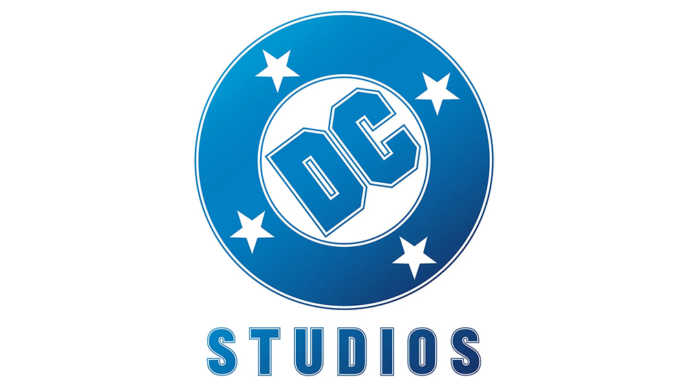
Sometimes the best new logo is the old one. It took DC Comics a long time to realise that, but it finally got there. Chief creative officer Jim Lee revealed the new DC logo at San Diego Comic-Con on Friday, and long-time fans will have felt a sense of déjà vu, and also relief.
The new design is a slight variation on the logo that appeared on almost every DC comic for almost thirty years, from 1976 to 2005 (also see our pick of the best comics logos). It's a welcome return of a classic and shows that rebranding sometimes isn't necessary.
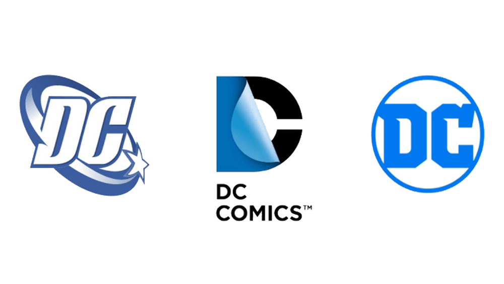
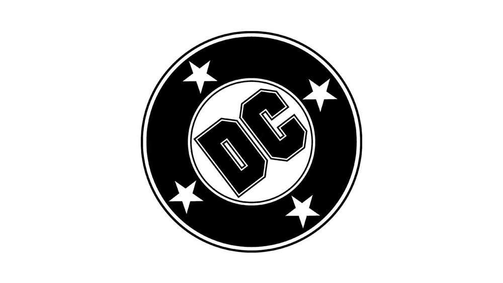
The classic 'DC Bullet' was a circular badge surrounded by a black circle and four five-pointed stars. Designed by Milton Glaser, creator of the 'I Love NY' logo, the design became iconic during the golden age of comics since it appeared in the top left corner of most DC publications. It remains the DC logo for many fans, and it makes sense to for the company to recognise that after almost twenty years of largely unnecessary redesigns.
The logo was modernised in 2005 to adopt slanted letters and a single star in orbit around them. It wasn't great. The logo was updated again in 2012, with a cold corporate design showing the 'D' peeling away to reveal the 'C'. Pentagram's 2016 update introducing a simple circle containing the DC letters was a step back in the right direction, but now DC's realised that it already had the logo it needed: the classic Glaser design, albeit now with the addition of a gradient.
DC says the Glaser logo will begin appearing on comics and merchandise from October and will also be used on DC Studios film and TV projects for consistency. Meanwhile, DC also unveiled a new chain-breaking Superman motion graphic to introduce its movies, starting with next year’s Superman (see the video above). It goes for a simpler approach compared to recent multi-character intros, which co-CEO Peter Safran said was inspired by the "simplicity of the MGM lion".
Here’s the video that played at #SDCC before the logo reveal. 🧜♂️ pic.twitter.com/YWq15zaDKUJuly 27, 2024
For more rebranding news, see the new Mazda logo and the new Raiders logo. We also have a round up of the best Olympics logos.