
In a major breakthrough for women's reproductive rights, the very first over-the-counter contraceptive pill has become available in the US. Commemorating the launch of Opill is a fresh visual identity that celebrates this “giant leap for women’s empowerment” with poise and pride.
Typically packaging design for women’s products falls victim to convention, echoing a history of pink-taxed products or minimalist sterile packaging designed for discretion. Opill breaks the boundaries with its bold design, asserting itself as a groundbreaking piece of history free from shame and secrecy.
Created by design consultancy Elmwood in collaboration with pharmaceutical company Perrigo, the new identity was an opportunity to carve a unique brand from scratch. Speaking to Creative Bloq, Rob Dyer, Associate Creative Director at Elmwood London says the project allowed the team to “build meaning into a new name and set a new benchmark for reproductive health through a meaningful brand language that breaks free from the norms of traditional contraceptive design.”
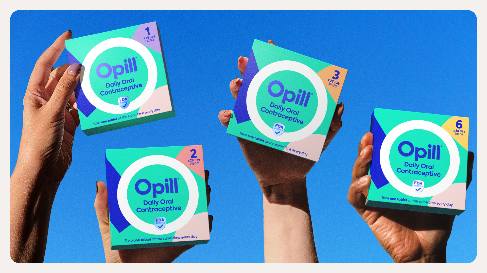
The new visual identity centres around the 'O' wordmark which features a halo design. With a focus on accessibility and strength, the design "becomes a beacon for protection: a motif that speaks to Opill’s simplicity, convenience and ease of use." Complementing the wordmark is a fresh block letter font. The curved, open typeface brings a subtle softness to the design while the addition of the freehand marker style font adds a welcoming human touch to the design,

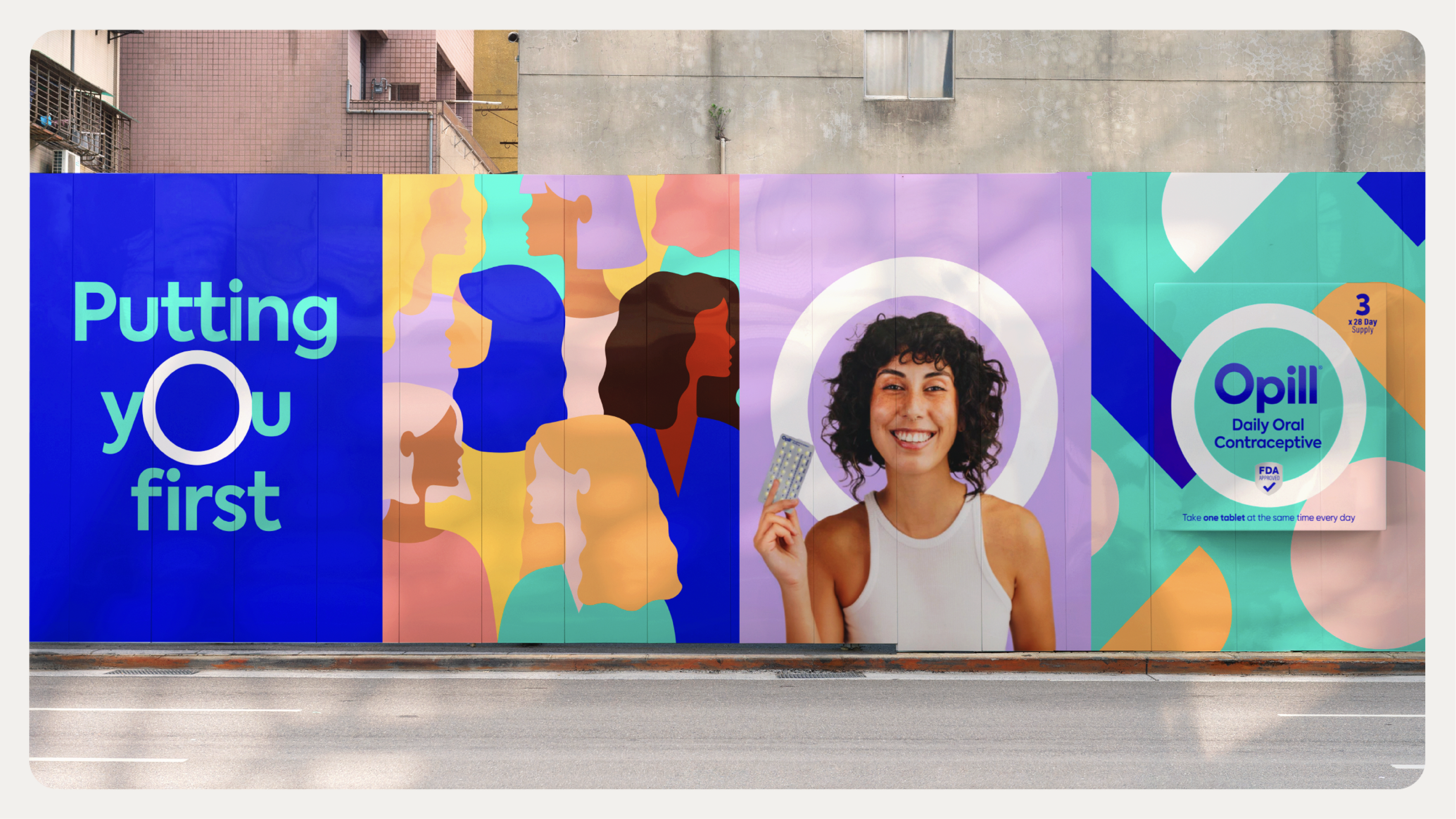
"We wanted to make a bold statement with the design that reflected the cultural impact the switch could make and speak to a new generation for whom being proactive about sexual and reproductive health isn’t something to be ashamed of," Rob says. Moving away from the sterile visuals of pharmaceutical branding, the design features a bright colour palette of corals, lilacs, and yellows that appear as free-from shapes, creating "a visual metaphor for the arcs of the world around us."
"The pack design is courageous within the category, but it all builds from the single-minded idea of protection," says Rob. "The success of what we’ve built at a brand identity level lies in its ability to act as a flexible and distinctive design system," he adds. On tackling a brand with such social stigma, Rob says "You navigate it by converting powerful insight, born of your target audience and market context and weave that into a clear creative idea that sits at the core of what that brand stands for, from which all experiences are built."
Naturally, it wasn't a project without complication, as Rob reveals "having to balance both efficacy and empowerment," was a challenging feat. "That tension between choice and control means striking a balance as a brand, whilst allowing the assets to flex accordingly in different places to dial up Opill’s different aspects," he adds.
When asked what he was most proud of throughout the design process, Rob says "Through our powerful partnership with Perrigo, we’ve been able to create something that can truly stand proud as a first of its kind within the world of reproductive health in the U.S."
Opill's new visual identity is a testament to the importance of design, resulting in a brand that embodies empowerment. Its sleek, contemporary visuals paired with soft human touches expertly balance Opill's pioneering spirit with a sense of familairity and comfort – a harmonious homage to a brighter future for reproductive rights.
For more design inspiration, check out Elmwood's Gen Z-inspired Skittles brand refresh that embraces the nonsensical. If you're after more empowering branding, check out The Period Conversation – a project that embraces organic design to get the dialogue flowing around menstruation.
Have you created some standout branding? Enter the Brand Impact Awards today.