[I have updated and basically rewritten the post in light of new information that allows me to explain matters much more clearly, I think.]
This year's entering class is the first since admissions decisions were constrained by the Supreme Court's ban on racial preferences in the SFFA case, and lots of interesting data have been coming out. Some elite universities like Yale, despite swearing in an amicus brief that there was no way to retain racial diversity without using preferences, have seen their "underrepresented minority" demographics barely change. Others, like MIT and Johns Hopkins, have seen their Asian American populations increase with a concomitant decrease in Hispanic and Black matriculants and little change in the percentage of white students.
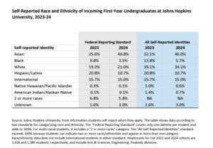
For those interested in how SFFA has changed college admissions stats, one pitfall to watch out for is that universities do not always report the data consistently. One way to report the data, preferred/required by the government, is to assign each student only one racial or ethnic (Hispanic) classification, regardless of how many boxes the student checked. My understanding is that if a student checks white and Hispanic (an ethnic classification), he is reported as Hispanic. If he checks two racial classifications, he is reported under a "multiracial" category. The total should add up to 100%, give or take a minor rounding up or down.
The other way to report the data is to count every student by every box they check. Thus, a student who checks both white and black will be reported in both the white and black percentages, instead of in the multiracial classification. In this context, someone with, say, Native American, black, Hispanic, and white ancestry would "count" for all four categories. As a result, the percentages will add up to over 100%.
Some universities that previously reported their data to the public (as in press releases and admissions material) the first way, one classification per student, are now reporting it the second way. So, for example, a school that reported 10% black students last year and reports 10% again, may in fact have, say, only 7% if they had reported the data the same way, along with 3% of students who previously would have been reported as multiracial rather than black.
Johns Hopkins seems to be one of the few institutions that have posted the demographic data in both formats for both 2023 and 2024. As you can see below, how a university reports the data can make a significant difference in the relevant percentages, but the basic story is the same either way: Hispanic and Black matriculants fell sharply, white matriculants were pretty steady, and Asian American matriculants rose sharply. And kudos to Hopkins for transparency.

The post Comparing Class of 2027 to Class of 2028 Demographic Data is Tricky (UPDATED) appeared first on Reason.com.


