Talking about flavour is admittedly tricky; a matter of hitting the right notes with words which effectively paint a taste picture most can grasp. But even then, what’s delicious to some will be 'meh' to others, thanks to cultural and taste profile differences. All to say that it’s clear why communicating flavour is a delicate art – as is crafting a product that resonates with consumers on a global scale.
By leveraging the four crucial principles I've outlined below, food, beverage and snack brands can craft experiences that are both easily understood by consumers and culturally resonant for today and tomorrow.
For more on branding, see the best rebrands of the decade series, or check out our piece on why sonic branding is changing everything.
01. Embrace universal sensory language
By tapping into a universal sensory language that transcends cultural boundaries, you can transcend cultural and geographical boundaries, allowing consumers from different backgrounds to understand and appreciate the flavours being offered.
Start with basic taste descriptors – sweet, salty, sour, bitter, and umami – that are universally recognised. These fundamental descriptors form the backbone of a language that resonates with a broad audience, so get comfortable with them.
You’ll also want to tap into common sensory experiences, like the crispness of an apple or the creaminess of chocolate – both things most of us have experienced firsthand, and can therefore recall quickly and often, fondly. These universally relatable experiences bridge cultural gaps, enabling consumers of nearly every background to envision both flavours and textures, which in turn makes products more appealing and also accessible. For example, by describing a beverage as having a 'refreshing citrus zing', a brand can immediately conjure a familiar and enticing taste experience – anywhere on earth.
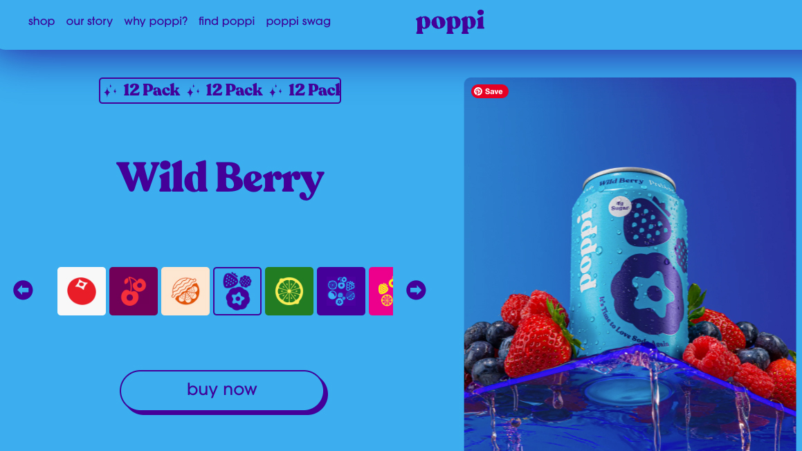
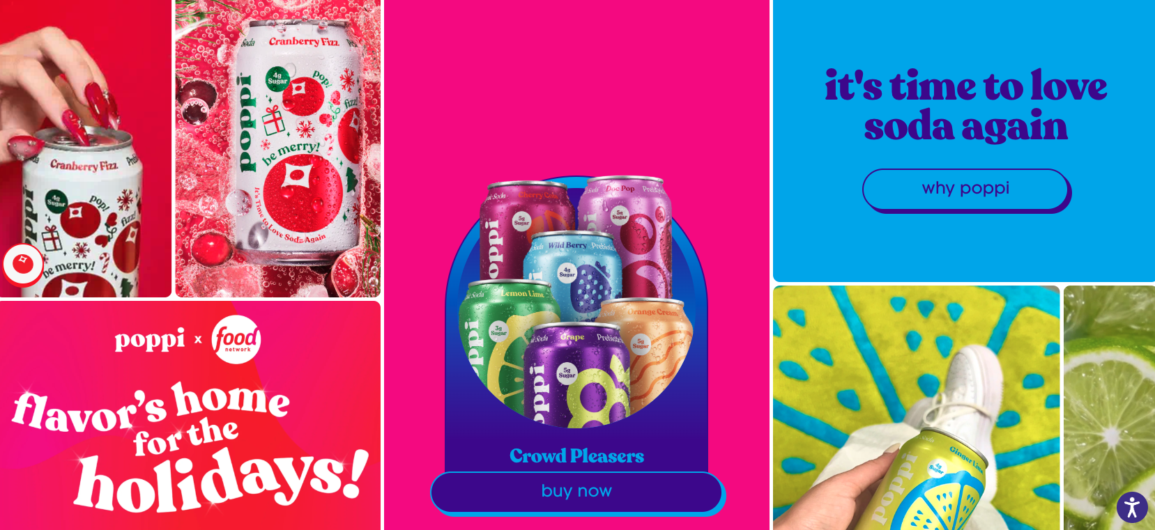
Who's doing it right? Poppi exemplifies this approach with its vibrant brand identity that leans into everything #nextgen. For example, by using abstract fruit iconography, they tap into digital culture while nodding to bold sweet familiar flavours, which consumers can quickly visualise and therefore interpret before even trying the product.
02. Have a solid narrative
You can’t make product compelling across cultures and continents unless you’ve built a solid narrative. Why? Because stories matter to all of us, thanks to their distinctive ability to evoke emotions and create connections. By weaving a narrative around your product, a brand can create an emotional bond with consumers – therefore making their product both more memorable and desirable. Win-win.
Crafting narratives that highlight the origin of ingredients, the craftsmanship behind the product, and the experiences that inspired its creation are equally essential. For example, sharing the story of a family’s traditional recipe passed down through generations adds a layer of authenticity and nostalgia, which often resonates with consumers on a personal level.
Furthermore, by describing the sequence of flavours that unfolds with each sip, bite or nibble creates anticipation and excitement, engaging the senses and elevating the overall consumption experience.
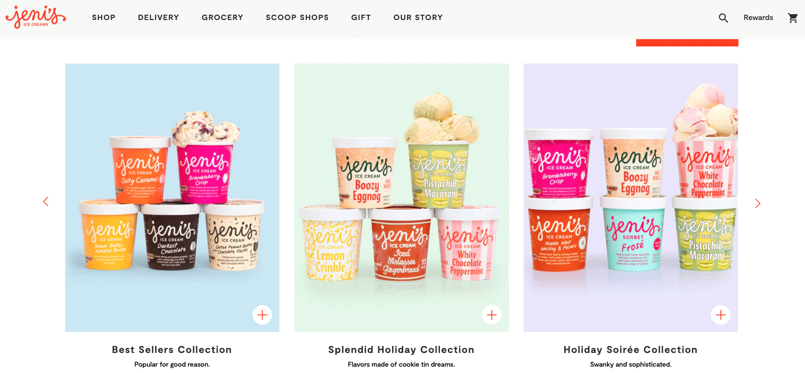
Who's doing it right? Jeni’s Ice Cream uses a playful, connected hand crafted drip-like font that immediately reminds consumers of the creamy, indulgent experience of whipped ice cream. The logo itself sets the stage for a taste experience, while the vibrant colors of the packaging reinforce this sensory message.
03. Use design and language to suggest taste

The visual elements of packaging – colours, typography, imagery and copy – play a significant role in shaping consumers’ perceptions. Now don’t get me wrong: colour theory is complex, influenced by culture, location, memory and generation. By understanding these influences, brands can strategically use colour to evoke specific taste associations.
Who's doing it right? Diet Coke leverages the colour silver to evoke a cool, slimming perception, which is particularly effective in the beverage sector. While silver suggests modernity and technical sophistication in other industries, in food, it can sometimes cue a metallic cold taste. This is where understanding cultural color nuances becomes crucial.
Who's doing it right? Chomps effectively uses a vibrant, youthful colour palette and a simple, engaging tone of voice, paired with a rustic style typeface, to suggest a crafted versus mass-produced experience. By using evocative words and phrases that describe the experience, brands can create a vivid taste picture in the consumer’s mind. Consider phrases like “velvety smooth,” “bursting with freshness,” or “rich and decadent” which all paint a sensory-rich image that entices consumers to try the product.
04. Weave in cultural differences
Preferences vary widely across cultures, influenced by everything from tradition to lifestyle and geography. What’s considered a delicacy in one region might be unfamiliar or unappealing in another—which is why brands must conduct thorough research to understand cultural influences over taste preferences before developing profiles, packaging design and strategies. In other words, you must balance universal appeal with cultural sensitivity.
A product targeted at Asian markets might emphasise flavours like matcha or lychee, which are culturally familiar. But this can work in the reverse also, as certain ingredients or combinations can be considered offensive or undesirable.
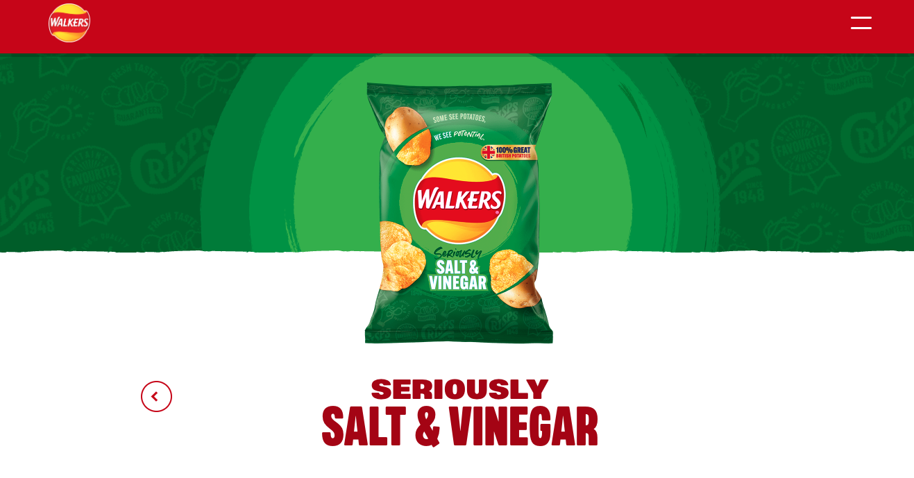
Who's doing it right? Walkers is a great example of a brand that understands the importance of cultural differences. The brand uses colour to suggest flavour, but this colour is not globally agnostic – Salt and Vinegar in the UK is green, representing a sharp, sourness cue, whereas in the U.S., blue is used to indicate the same flavour. This adaptation demonstrates how brands can successfully navigate cultural nuances.


