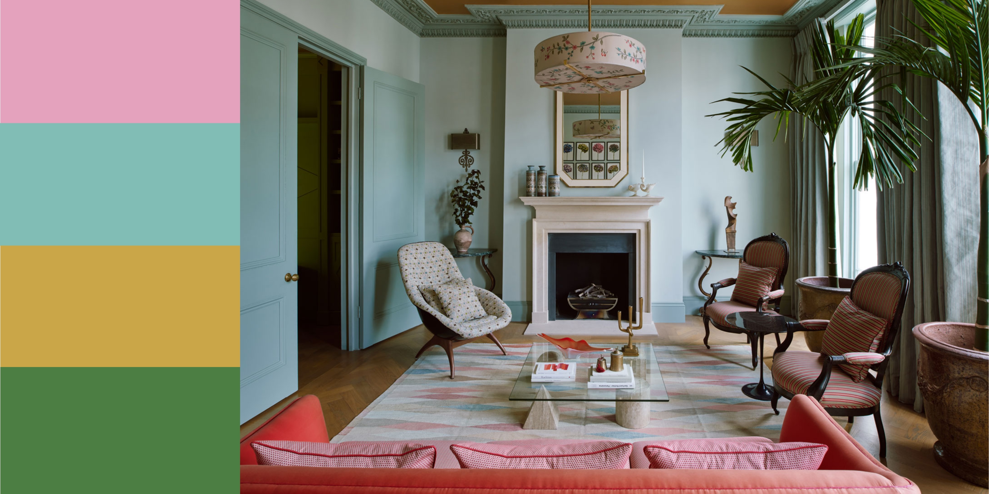
Although it's a soft hue, pink can sometimes feel like an intimidating choice owing to its association with being too sweet or too childish. However, there are plenty of chic, sophisticated colors that go with pink that will create an upscale, modern, and altogether grownup finish.
"Pink doesn’t have to resonate with children's bedrooms or overtly pretty spaces," says Patrick O'Donnell, Farrow & Ball's color expert. "It can be bold and modern too, even when using gentle tones."
But, decorating with pink doesn't have to be intimidating at all; it complements almost every color, from neutrals like ochre and beige to punchier combinations, like red and yellow. It's a warm hue that can create an inviting and elegant space.
See why designers and experts are saying pink color palettes are ideal for chic spaces, with top tips and color combinations below.
1. Green
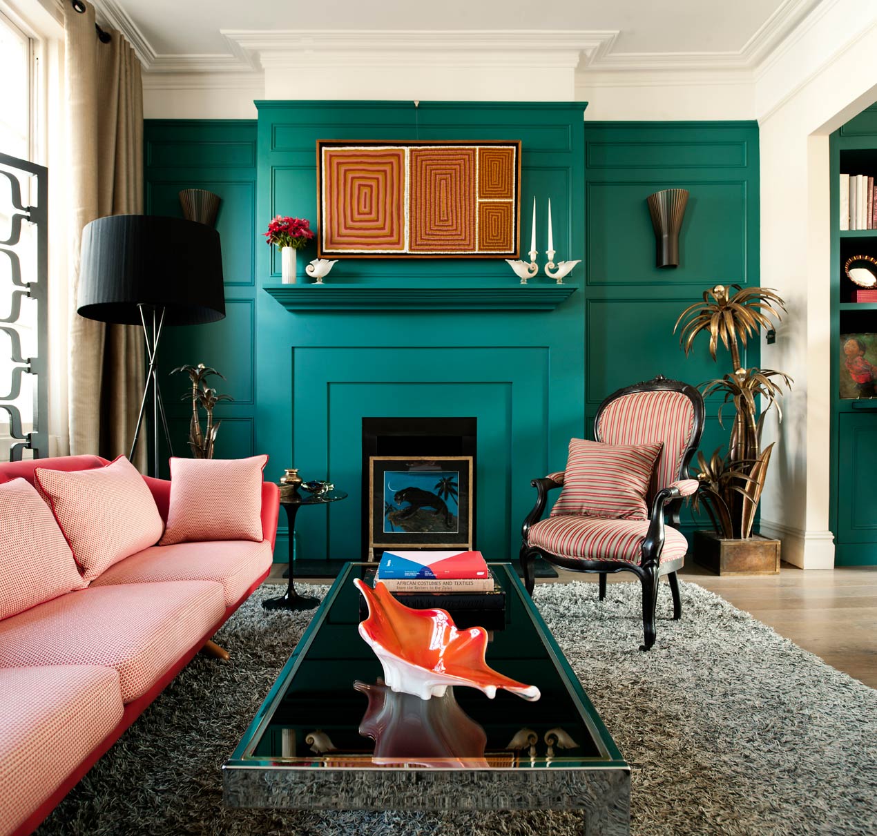
The biophilic link between pink and green means the combination works to create a relaxing, tranquil space, which makes it a great pairing for a serene bedroom. Yes, there's no question pink and green go together.
"Green and pink appear together often so appealingly in nature as an ombre, it feels easy on the eye and creates a relaxing feeling, reminiscent of an organic outdoor space," says Jo LeGleud, interior designer and principal of Maddux Creative. "Shades of sage green with blush pink work wonderfully well with a tertiary shade of apricot or lilac."
As well as a color that goes with sage green, Jo also suggests dark olive green with soft ochre as another winning combination for pink. Pea greens and apple greens also work well with rose pink for a pairing that's fresh and contemporary, or you can lean into punchier hues, like teal as a color that goes with pink in shades like magenta, for a vibrant, uplifting aesthetic, as seen in the living room above.
2. Gray
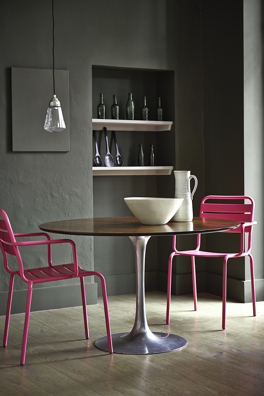
There are lots of colors that go with gray, and pink is certainly one of them. "Often 'hard; feeling, gray is a wonderful foil for a 'soft' feeling pink in equally balanced tones," says JoJo LeGleud.
She suggests that icy gray and a blush pink, deep stone gray with a rosy pink, and light stone grea with a soft pink parchment color are all great combinations.
Pink adds warmth and softness to gray, which is a neutral hue that pairs well with most colors.
"Pink adds warmth and softness, beautifully complementing cooler tones of gray," Little Greene's Ruth Mottershead says. "It can also highlight the warmer stone tones within gray, adding depth and creating a serene, inviting atmosphere that feels refined without being overwhelming."
For a contemporary twist, pair a hot pink, like fuchsia, with a deep, moody shade, such as Little Greene's Livid, which blends blue, green, and grey.
As for a good accent color for the pairing? "Black, like Little Greene Lamp Black, serves as an excellent tertiary color, offering a bold finish that’s perfect for woodwork, adding a defining frame to the room."
For a softer look, Patrick O'Donnell from Farrow & Ball, says: "Paler, brown tinged grays like Ammonite and Purbeck Stone can feel surprisingly warm and layer effortlessly with pinks, particularly salmon pink."
3. Blue
"Blue and pink combinations offer a wide range of possibilities, from lively and energetic to elegant and calming," says Little Greene's Ruth Mottershead. "Though they are often seen as opposites — blue evoking calm and coolness, while pink adds warmth and playfulness — together they create a refreshing, harmonious look.'
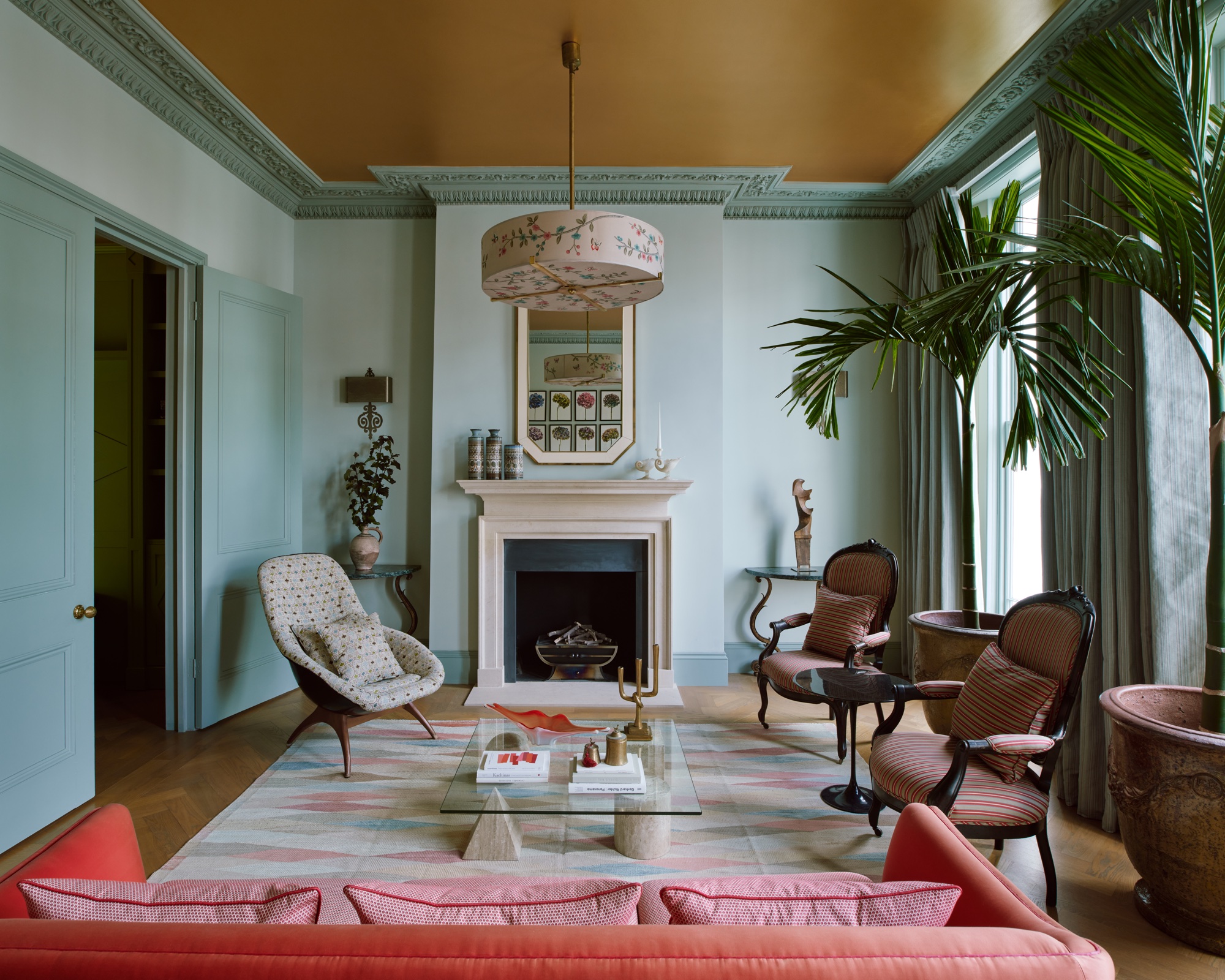
When choosing colors that go with blue, sky blues and dusty pinks can create a beautiful calming aesthetic, while punchier pinks can also work with soft blues, as seen in the living room above.
"Blue is generally a cool color and pink is warm, and playing with the nuances of these is interesting, perhaps choosing a warm blue with a cold pink," says JoJo LeGleud, who designed the space above.
As a color that goes with pink, deep, rich blue can really allow a brighter pink, like magenta, to pop. Ruth confirms that "more intense blues and pinks offer a cosy, cocooning feel, where deeper pinks stand out beautifully against darker, moody blues". But, she adds, soft pastel blues and pinks "evoke a tranquil, dreamy atmosphere, perfect for a nursery".
4. Yellow
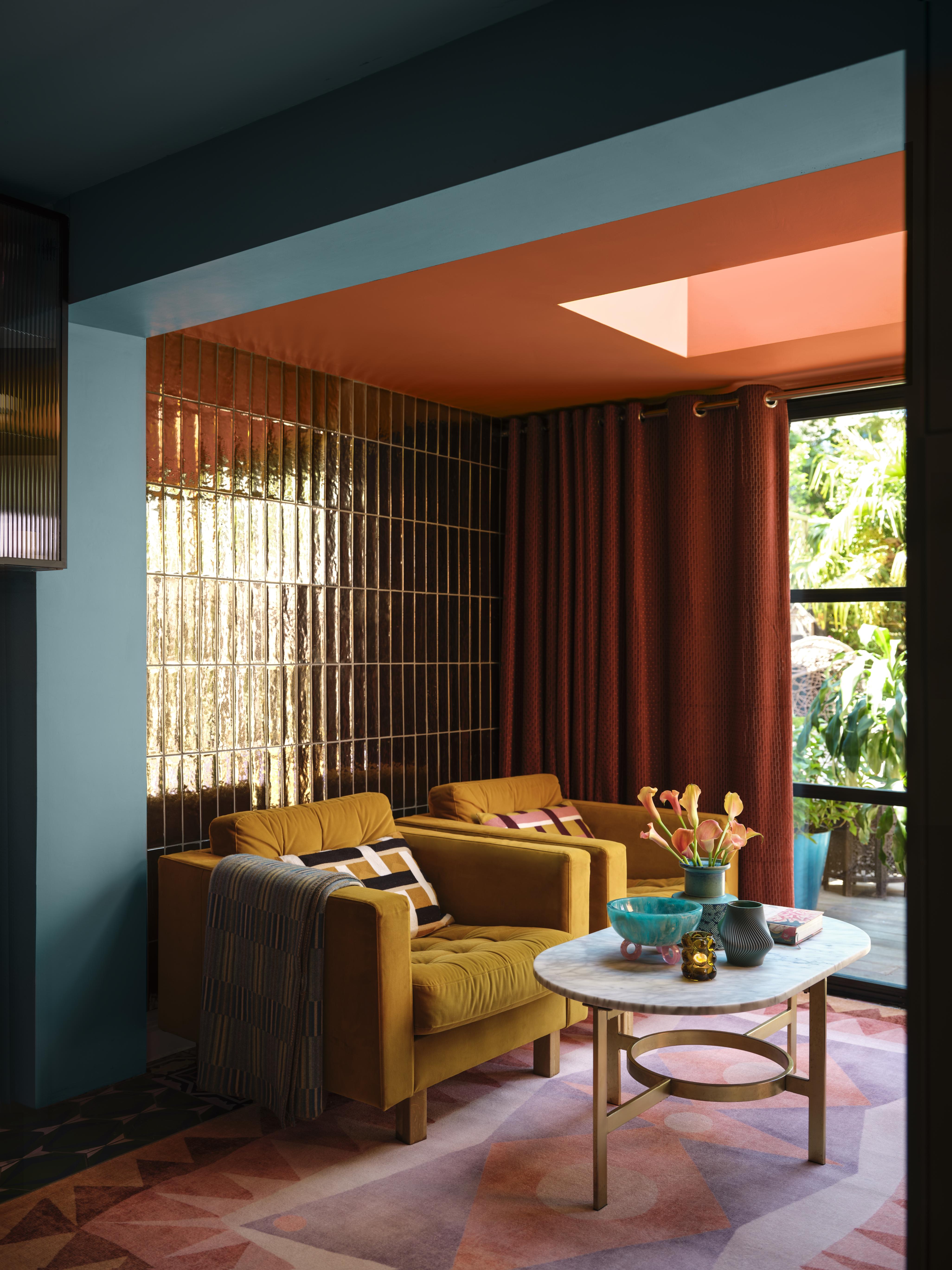
Whether you like it or hate it, yellow is an attention-grabbing color and one you won't forget. And, it is available in so many varying shades and tones that if you look hard enough, there's definitely a yellow you can find that appeals to you. But it is among the colors that go with pink? Yes, but it can be a bit tricky as if you don't choose the right tones of both, you could end up with a garish interior.
For those who like a more earthy, rooted interior can consider an ochre or dijon tones as colors that compliment pink. Even buttery, or medallion yellow is a great tone to bring home. But if it's a more energized interior you wish to create, consider a light shade of it like a sunshine or canary tone, and bring in a third color that goes with yellow like beige, cream, or gray to ground the scheme.
“Pink and yellow are two colors that don't have that much in common so it is important to choose the right shades of each," advises Helen Shaw, director of marketing (International), at Benjamin Moore. "A great way to approach this look is with a dose of retro glamor, opting for mustards and roses, whose warm undertones add instant coziness. Incorporate other rich hues such as terracotta, rust, and a warm-based blue to bring the scheme together. Finally add tactile elements such as velvet upholstery for a tailored, 1970s Halston-inspired effect.”
This clean, bright orange adds an inviting warmth to spaces with its golden tones.
5. Maroon
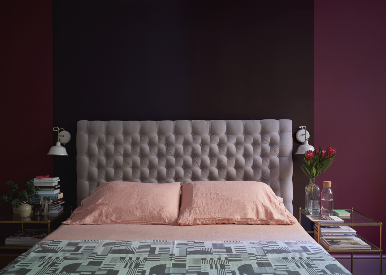
Among the colors that go with maroon, pink can feel a bit of a stretch. And that's only because both colors are strong, hold their own, and can feel bold. But it doesn't always have to be the case. A lighter pink can be a good balance against brighter, warmer purple, and in the right shade, can even play the role of a neutral.
"I am a huge fan of pairing dusty pinks, corals, maroon and cinnamon colors together," says Nicole Dohmen, founder of Atelier ND. "For the perfect combo, ensure they have the same warm undertones."
This timeless plum shade adds a luxurious feel while pairing with other colors and shades seamlessly.
6. Black
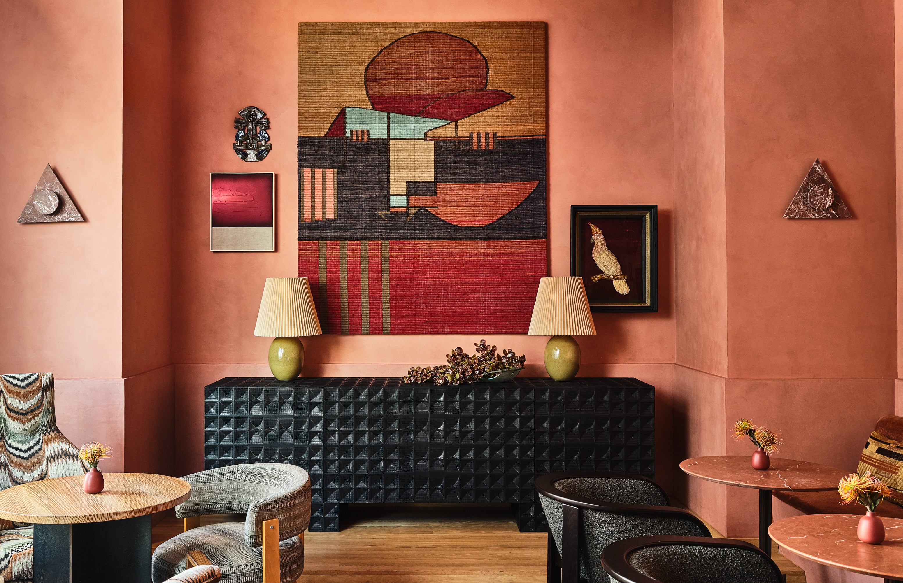
Black, though a dark neutral is one of the colors that complement pink and is loved by designers. That's because the combination has both depth and drama. Plus several colors go with black, meaning you can add more layering to the room which has black and a pink palette.
"The best way to pair pink and black – simple, you don't use real black," says LA-based designer Lucie Ayres. "You do an almost charcoal or a deep, deep green. That plus any pink – whether pale or hot pink – will feel fresh and modern. Doing a true black with any pink will read too 90s in my opinion."
Plimsole is a deep, rich color with dark blue undertones creating a sophistication to any space.
7. Pink
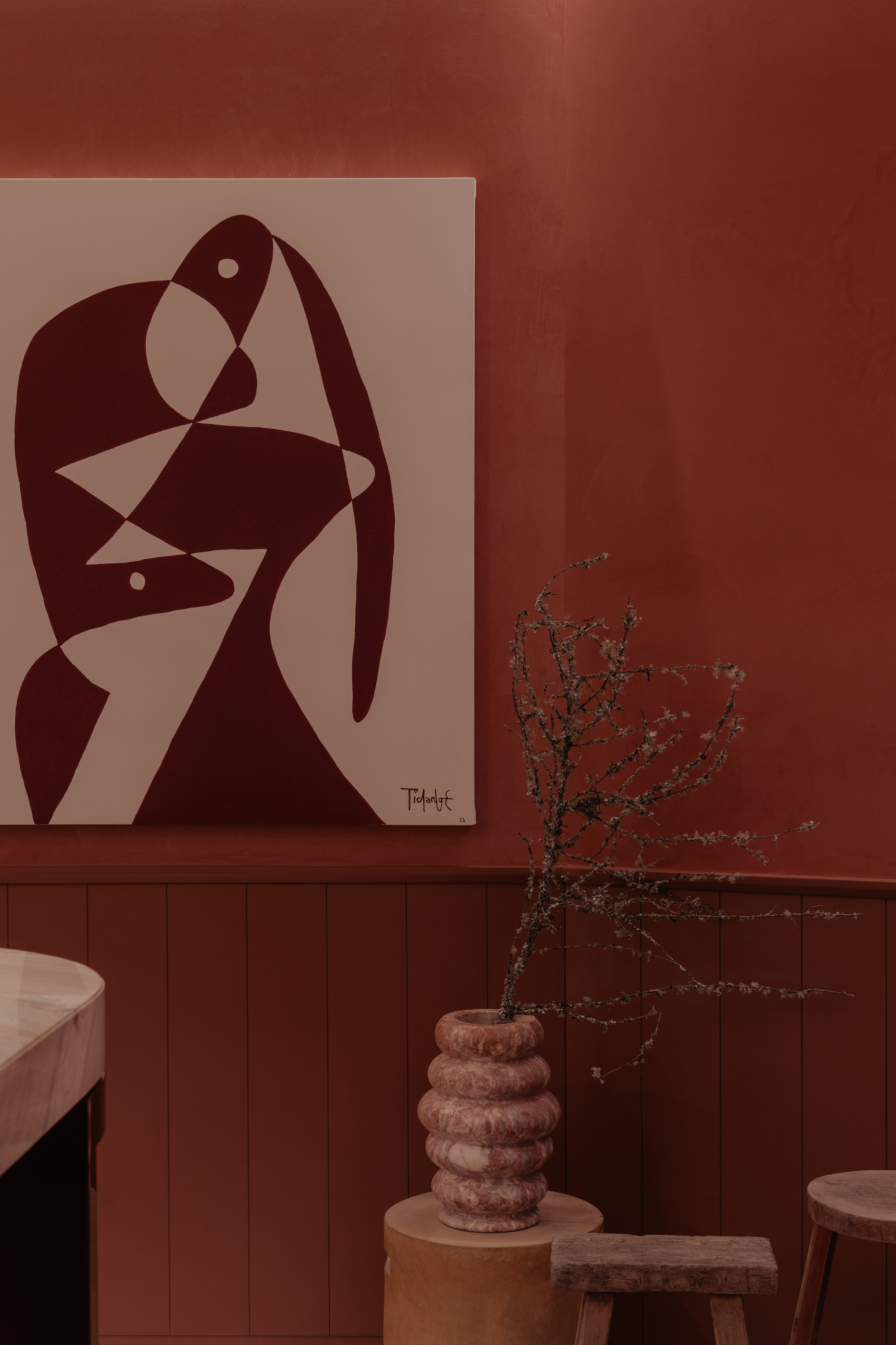
Yes, among the colors that go with pink is... pink. By color layering two shades of the same tone, you can create an interior that has depth and visual volume. Think of an earthy pink and a reddish-pink for a warm interior. Even two pinks of different color temperatures can do the trick.
"The color pink emerges as the central element, defying expectations and transforming the visual experience of the space, making us feel contained and warm," says Santiago Cuaik, founder and CEO of Cuaik. "To use two shades of pink in a room effectively, select a dominant pink for walls and large items, complement it with a contrasting shade for accents, incorporate neutral tones for balance, and add texture and accessories to create a harmonious and visually pleasing space."
"Pink layered with deeper or contrasting tones of pink can set a space apart," says Charlie Morrison, a designer at Topology. "As a standalone hue, it works well as both an accent color, and as a subtle backdrop."
This dusty, blush shade of pink simultaneously adds warmth and character.
8. White
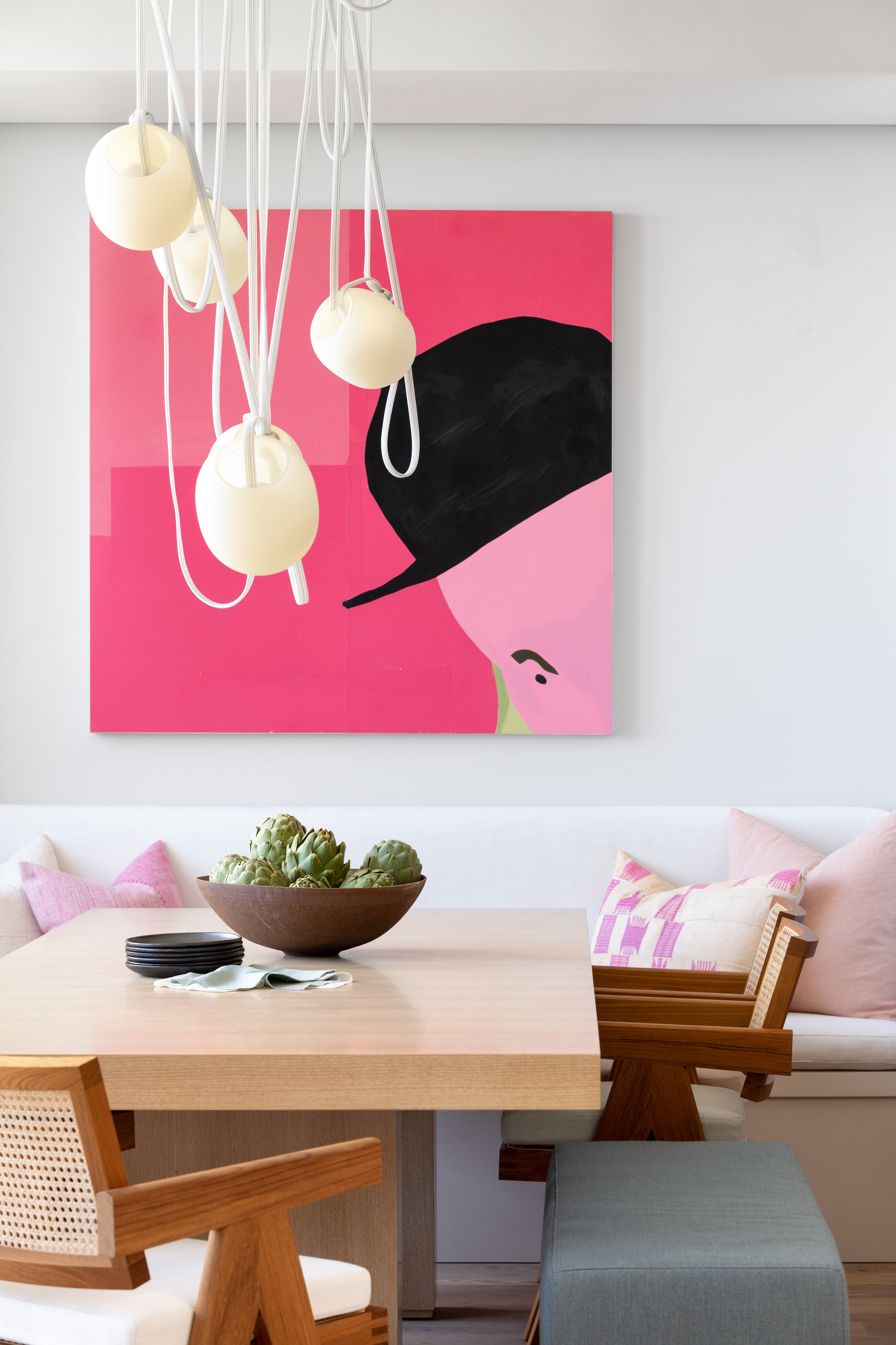
White creates a crisp and bold scheme when paired with rosy hues, and largely, decorating with neutrals is fairly easy. In this project by House of Hudson Interiors, white provides simplicity, and a good background and the boldness of the pink artwork really takes center stage. It's a versatile combination too, working with pale pinks and a bold fuchsia, all against a muted wall.
"Having pink as part of a pattern in a white fabric, or perhaps the drapery or rug is recommended," says Jennifer Morris, founder of JMorris Design. "Even a pop of pink on an all-white pillow could change the ambiance of a space. The color has soft, gentle connotations and is also a flexible tone. I think it’s a great balance with light and dark tones."
A classic neutral with just a hint of warmth, this shade is a staple for any home.
9. Emerald green
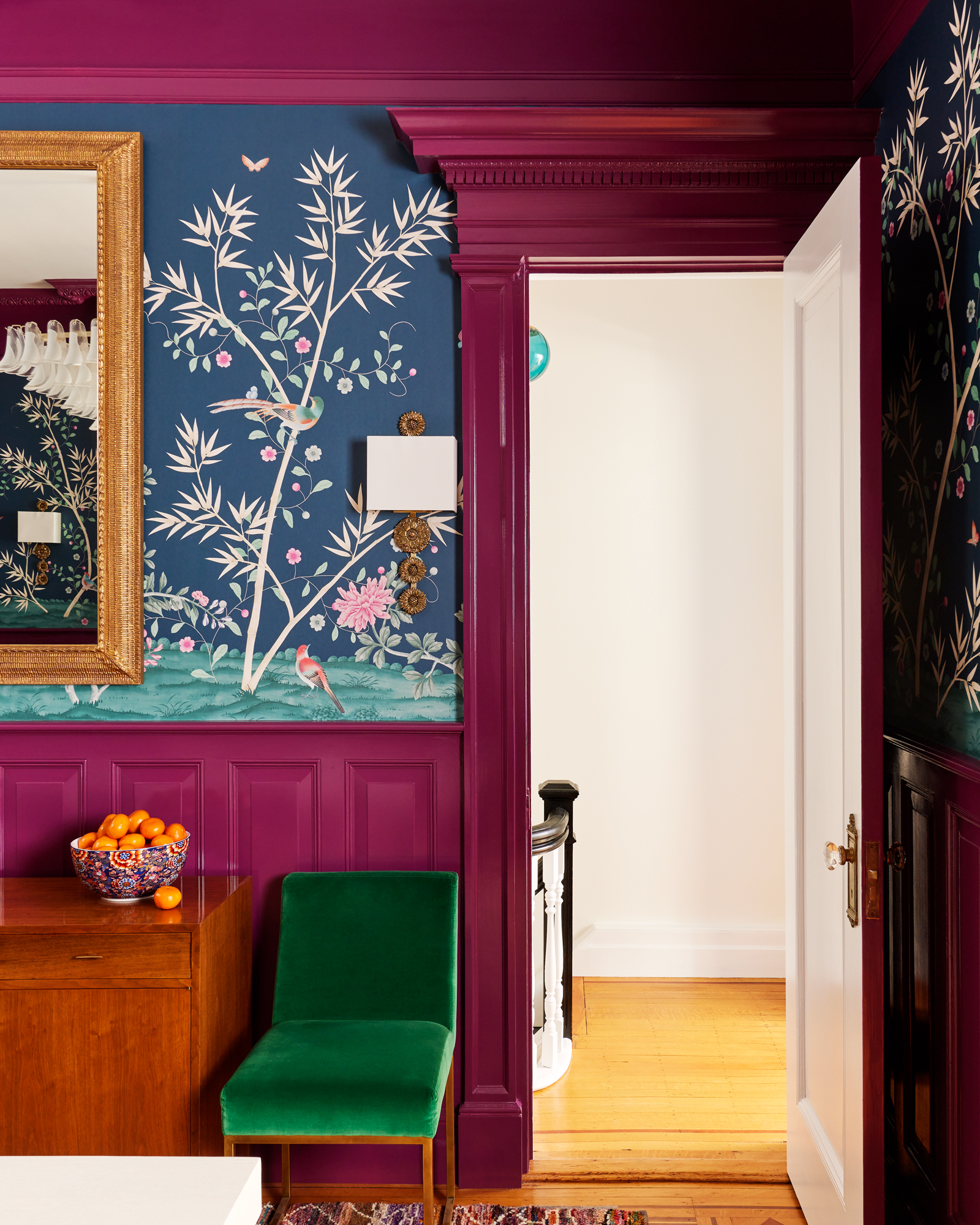
If you've always wanted a royal, high-end interior and were wondering how to decorate with jewel tones, then a combo of magenta pink and emerald green is highly effective. Pink, be it light, dark, or raspberry bright, emerald green works well as a color that complements pink because it creates a sense of balance.
"The atmosphere we wanted to create in this room was an enveloping one, with a feeling of warmth and comfort," says Erin Fearins, partner and lead interior designer at Studio SFW. "Our client loves color, so we wanted to make this dining space feel like a special jewel box destination, with a clash of raspberry pink and green."
10. Gold
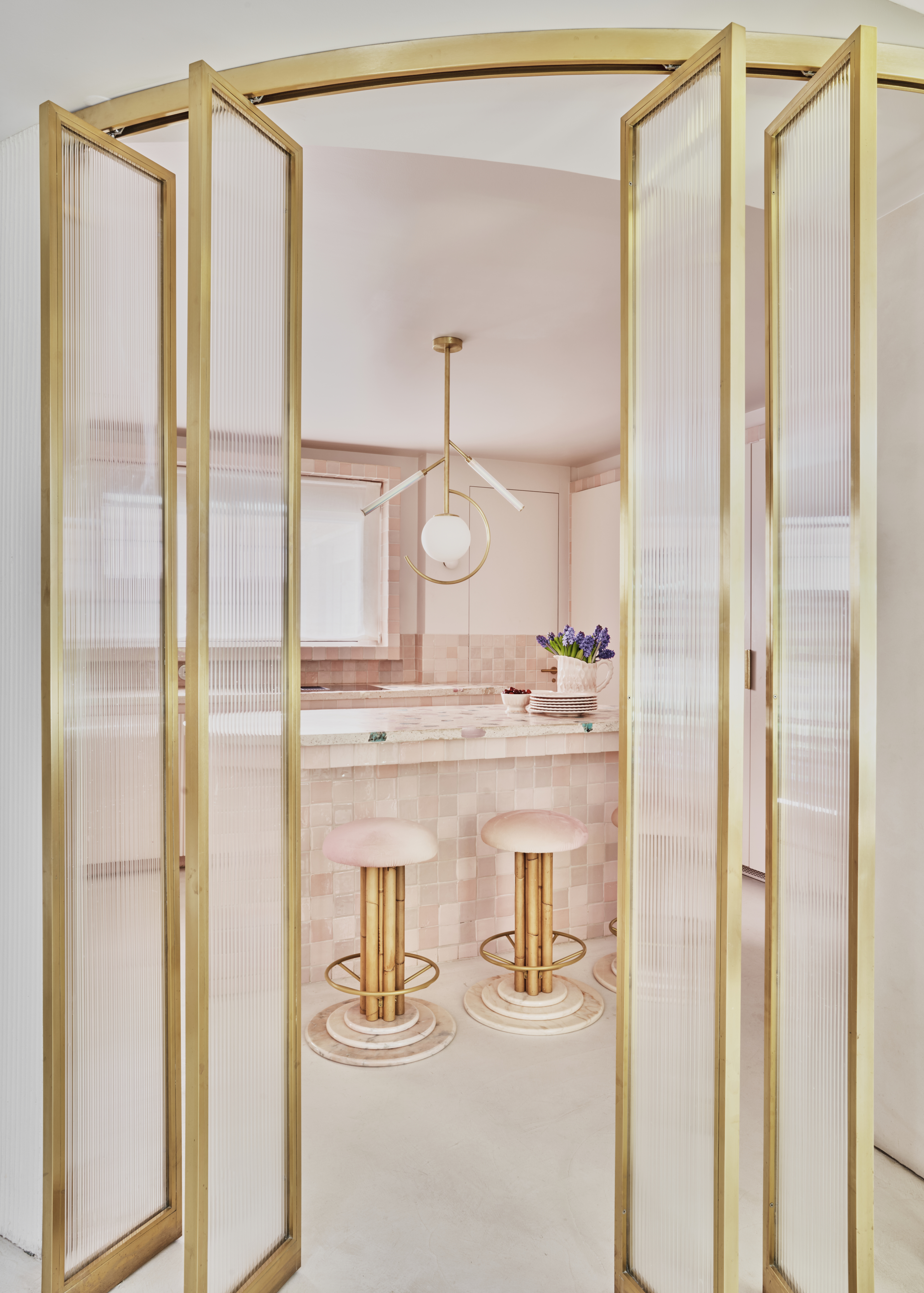
As one of the colors that go with pink, gold can feel luxe and imbue a space with a high-end feel. Avoid going for anything too light with anything too bright when choosing colors that go with gold — if you are drawn to lighter pinks, bring in a darker, aged brass tone whether it be in a piece of furniture or a metallic wallpaper. And, likewise, if you do want to go bright and shiny with your gold, pair it with a more muted blush pink shade.
"Use unlacquered brass as an accent to a pink interior as it feels incredibly romantic, classically French, and just timeless," says interior designer Lucie Ayres.
11. Orange
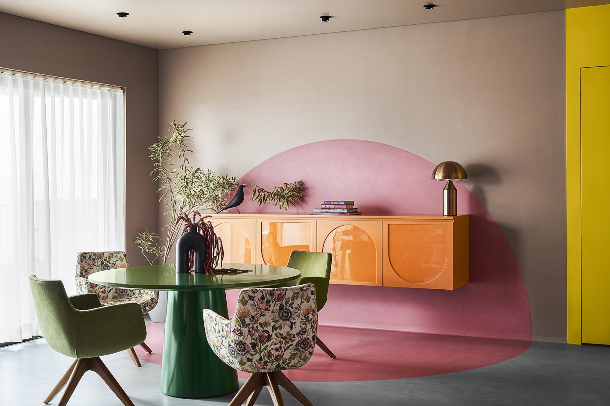
For a vibrant interior, choose colors that go with orange, such as pink, as the two tones work well together because they are located so close together on the color wheel. From hot pinks and vivid oranges to more muted tones of blush pink and terracotta, this is a fun pairing that adds warmth and playfulness.
In this scheme, the designer has gone bold with other colors that complement pink. "We used salmon pink and juicy orange as the main story visible at the dining credenza," says designer Prashant Chauhan, founder of Zero 9. "Also the bright orange sofa recliner with the backdrop of pink and blue forms an interesting clash in colors."
Both colors are playful and beautiful, so they work fabulously in a social space such as a kitchen, living room, or dining room. The juxtaposition of hot orange and a cool-toned pale pink is simultaneously retro yet elegantly contemporary.
Orange Aurora adds a playful warmth thanks to its strong undertones, perfect for a vibrant pop of color.
What Color Contrasts Most with Pink?
If you want to design an interior that's bold, eye-catching, and filled with personality, you could look at the color wheel in interior design to choose the absolute opposite of pink. In this case, it's green. These two tones paired together are a guaranteed way to amplify a design.
What’s the Complementary Color of Pink?
As red is the base color of pink, a green would be the complementary color of pink.
"Pink and green are a natural combination," agrees Ruth Mottershead. "When placed together, these complementary colors create a dynamic contrast that is visually striking whilst maintaining a harmonious balance, making it a timeless choice in design."
But don't let this put you off using other pairings, as pink is an easy shade to use with a host of hues.
"Pink is an incredibly versatile color, with shades ranging from soft pastels to vibrant, eye-catching hues," says Ruth. "Pink seamlessly complements various color palettes and interior styles, whether adding warmth and energy or creating a gentle, soothing atmosphere."


